For those passionate about photography, perfecting photos often begins with color correction. By using GIMP’s versatile color tools, enhancing images becomes both accessible and cost-effective. The Levels and Color Curves tools in GIMP are powerful features for adjusting tones and giving photos a fresh and balanced look.
Understanding how to utilize these tools can dramatically improve the visual appeal of your images. The Levels tool is especially handy for color correction, while the Color Curves tool allows for fine-tuning adjustments. Learning how these tools differ and complement each other can greatly expand your editing skills.
Exploring advanced techniques, like those shared in GIMP tutorials, can guide users through correcting color casts and adjusting tones. This practical knowledge not only makes photos look more vibrant but also sharpens one’s ability to work creatively in the digital space.
Getting Started with GIMP
Beginning with GIMP involves learning its workspace, understanding basic color principles, and navigating through importing images and setting up your canvas. These basics provide a foundation for editing photos effectively.
Understanding the GIMP Workspace
GIMP’s workspace is designed for flexibility and convenience. It consists of several panels and toolboxes that help users edit images with ease. The main components are the Toolbox panel, which contains essential editing tools, and the Layers panel, where users manage different layers of an image.
Users can also customize the layout by moving and closing panels. GIMP supports combining multiple images through layers and offers extensive options for brushes and patterns. Knowing these functions helps streamline the editing process and enhances navigation efficiency.
Basics of Color Theory
Color theory is crucial for effective photo editing. It involves understanding the color wheel, which shows relationships between colors. Primary colors (red, blue, yellow) mix to form secondary colors (green, orange, violet), which then mix to create tertiary colors.
Complementary colors are opposite each other on the wheel, such as blue and orange. Using them side by side can make elements in an image stand out. Analogous colors sit next to each other and can create harmony. Grasping these basics enhances the ability to adjust colors accurately within GIMP.
Importing Images and Setting Up Your Canvas
Starting a project in GIMP begins with importing images. Users can open an image by navigating to File > Open. After selecting an image, it is essential to set up the canvas correctly. This can be done through Image > Canvas Size, allowing adjustments for size and resolution, depending on project needs.
Creating a duplicate layer is recommended before editing to preserve the original image. Users can right-click the image layer in the Layers panel and select Duplicate Layer. This method ensures changes are non-destructive and easily reversible. Setting up the canvas properly is key to an organized workflow in GIMP.
Fundamentals of Color Correction
Color correction is crucial for enhancing photos. It involves identifying color issues, interpreting the histogram, and setting white and black points for balanced visuals.
Identifying Color Issues in Your Image
Before starting color correction, it’s essential to pinpoint what’s wrong with the image. Sometimes, photos have a color cast, making them look too blue, red, or yellow. By understanding these issues, users can adjust colors accurately.
Observing skin tones is a practical approach. If skin appears unnatural, it’s a signal to examine color balance closely. For landscape photos, check sky and foliage colors. They can be indicators of color imbalance, too.
Using tools in GIMP, like the Curves tool, helps to fix these issues effectively. Adjusting curves can bring colors back to their natural state. This ensures photos look vibrant and true to life.
Using the Histogram for Color Analysis
A histogram is a graphical representation of the tonal values in an image. It’s a helpful tool for analyzing color distribution. Reading a histogram enables users to see if an image is overexposed or underexposed.
By examining the histogram, users can detect color imbalances. For instance, if the peaks are skewed to one side, it suggests a color shift. This requires correction to bring all elements into harmony.
GIMP makes utilizing the histogram straightforward. Users can see histograms for different color channels. This helps in making precise adjustments, ensuring that the image has a balanced range of tones.
Setting White and Black Points
Setting white and black points is essential in achieving proper contrast. It involves determining the darkest and lightest areas in an image. This process enhances details and ensures accurate colors.
By establishing these points, users calibrate the image’s brightness levels. This is important for bringing out details that might be lost in shadows or highlights.
GIMP provides users with tools to easily set these points. Correctly setting them can turn a dull image into a vibrant one. This simple adjustment often results in photos that look professional and polished.
Working with GIMP’s Color Tools
GIMP offers a variety of color tools that allow users to correct and enhance images effectively. These tools provide ways to adjust the image’s color balance, saturation, and tonal range. Each tool has its strengths, helping to make photo editing versatile and precise.
The Color Balance Tool
The Color Balance Tool in GIMP offers precise control over the colors in the shadows, midtones, and highlights. It allows users to adjust the balance of red, green, and blue to fine-tune the tones in an image. This is particularly useful for correcting color casts in photos, like making them less yellow or more vibrant.
A helpful feature includes preservation of luminosity, which prevents unwanted changes in brightness as the colors are adjusted. This ensures that the image doesn’t become washed out or too dark while correcting colors. By tweaking the sliders for shadows, midtones, and highlights, users can find the right color balance for their images, ensuring more natural and appealing results.
The Hue-Saturation Tool
The Hue-Saturation Tool provides options to adjust color properties across different parts of an image. It offers sliders for hue, saturation, and lightness, making it possible to alter the appearance of specific colors without affecting others. This tool is ideal for enhancing or muting particular colors to achieve the desired effect.
For example, increasing saturation can make colors pop more, while decreasing it can create a more muted tone. The tool also allows for fine adjustments by selecting specific color ranges to modify. This flexibility is beneficial for artistic projects or when specific color adjustments are needed without altering the entire image.
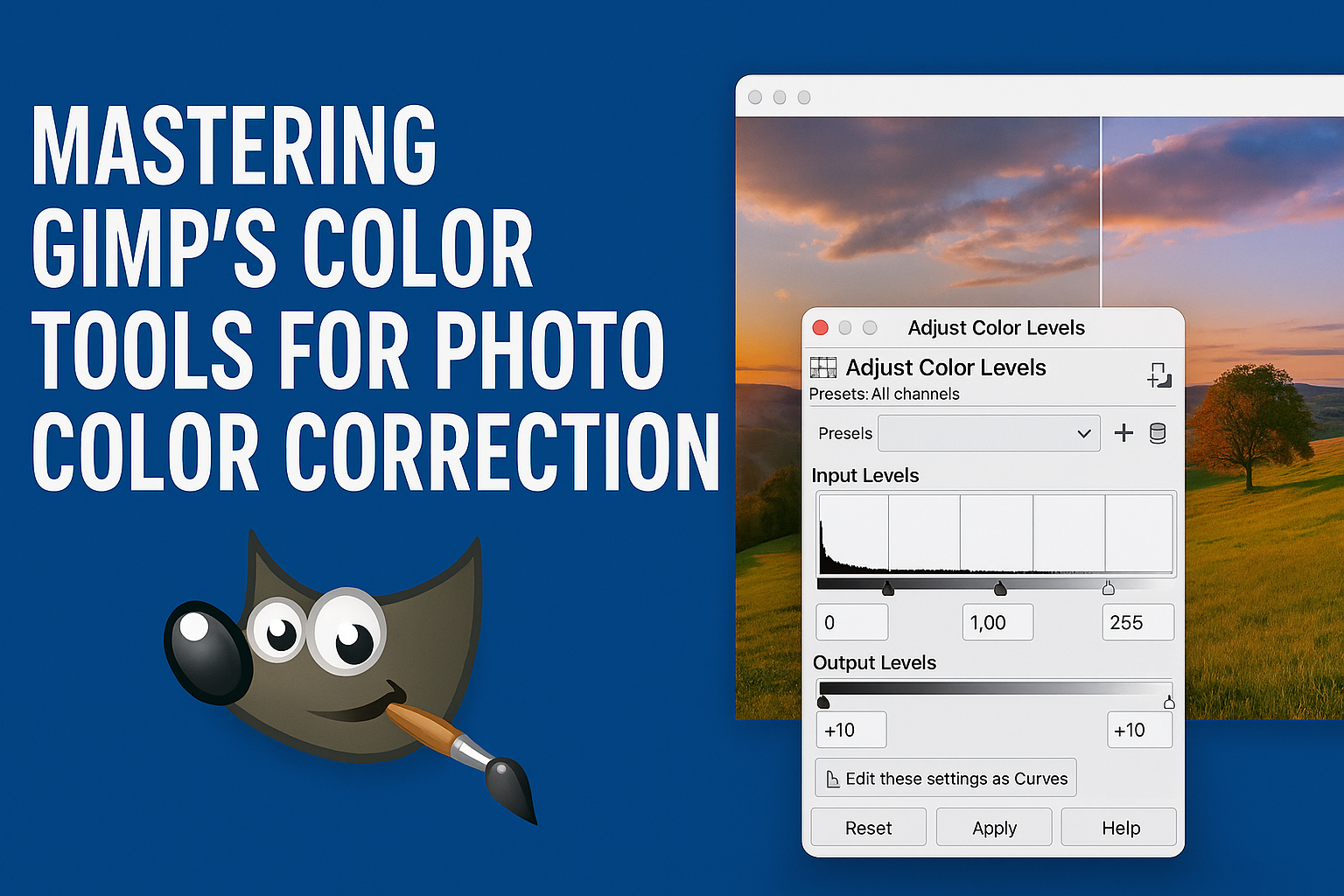
The Levels Tool
Using the Levels Tool is a straightforward way to enhance the tonal range of an image. It provides a histogram for visualizing the distribution of tones and sliders to adjust shadows, midtones, and highlights. This tool is essential for improving brightness and contrast, ensuring the photo has a balanced exposure.
One advantage of the Levels Tool is its ability to make quick corrections. Users can easily drag the sliders to remove gaps in the histogram, which often produce improved contrast and more balanced images. This tool is beneficial for both novice and experienced users aiming to correct the overall exposure and color tones efficiently.
The Curves Tool
The Curves Tool offers more advanced control over the tonal range compared to the Levels Tool. It allows users to manipulate the brightness and contrast with more precision by adjusting points on a curve. This tool is ideal for fine-tuning specific areas of an image that require subtle adjustments.
The advantage of using the Curves Tool lies in its flexibility. Users can create custom adjustments that impact the dark, mid, or light areas of an image. By pulling different points of the curve, they can create contrast enhancements, brighten shadows, or dim highlights. This results in a more tailored editing process that meets specific needs.
Advanced Color Adjustments
GIMP provides advanced tools for photographers to refine the colors in their images. These methods include using masks for selective adjustments, color grading to set the mood, and techniques to match colors across different images.
Selective Color Correction Using Masks
Masks are a powerful feature in GIMP that allows users to apply color changes to specific parts of an image without affecting the rest. By creating a mask, users can isolate an area and adjust its color to better match their vision.
For example, if a sunset sky appears too dull, a mask can target only the sky for adjustments. Using color balance or hue-saturation sliders, one can intensify the hues for a more vibrant look. This selective approach ensures that the adjustments enhance the intended areas while preserving the original look of the rest of the image. For more on precise adjustments, refer to techniques shared by Retouching Labs.
Color Grading for Mood and Tone
Color grading is not just about correcting; it’s about setting the emotional tone of an image. Different colors evoke different emotions, and photographers use this to their advantage.
In GIMP, tools like Levels and Curves help adjust the shadows, midtones, and highlights. By tweaking these, users can create a dramatic, neutral, or warm feel, aligning with their artistic vision. For instance, adding blue tones can create a somber atmosphere. Meanwhile, warm oranges and reds might suggest a lively setting. This process transforms the image from a simple photo into a storytelling piece. More insights can be found in guides available on sites like TechBytes8.
Matching Color Between Different Images
Ensuring consistency in color between multiple images is crucial, especially in series work. GIMP allows users to replicate the color palette of one image in another, maintaining a cohesive look.
The sample point technique can be useful here. By selecting a reference image and using sample points, users can note the color values. These values serve as a guide to adjust other images accordingly. This approach is particularly beneficial for ensuring all images in a set have a uniform appearance, whether for a photo album or a portfolio. For practical applications, informative resources are available, such as those by Davies Media Design.
Fixing Common Color Problems
Addressing color problems in photos can make a big difference in the result. This section covers correcting skin tones, fixing exposure issues, and restoring faded photographs.
Correcting Skin Tones
Skin tones can often appear too red, yellow, or washed-out in photos. Adjusting them in GIMP is essential for a natural look. To do this, use the Color Balance tool to add or reduce reds and yellows as needed. You can also work with the Hue-Saturation tool to tweak the colors more precisely.
Using the Selective Color method helps to target only the skin areas without affecting the rest of the image. This maintains the original tone for the overall scene while making adjustments only where needed. For deeper changes, use layer masks to work on specific areas without altering unwanted parts of the photo.
Fixing Underexposed and Overexposed Photos
Photos that are too dark or too bright can be challenging. The Levels tool in GIMP is great for correcting these issues. Adjust the shadows, midtones, and highlights to balance the overall exposure. This creates a more evenly lit photo and brings out lost details.
Sometimes, the Curves tool is better for more subtle changes. This tool allows for finer control by adjusting the curve to improve both shadow and highlight areas. For advanced color correction, combining both tools can offer exceptional results in achieving desired exposure.
Restoring Faded Photographs
Old or faded photos need special care to bring them back to life. Start by using the Levels tool to adjust the contrast and recover details. This helps to restore some depth to the image. Follow up with the Color Balance tool to correct any color casts that the aging process might have caused.
The Clone tool can also be useful to repair any small, damaged parts of the photo. For significant damage or large faded areas, consider using layer blending modes to overlay and gently restore lost colors. Restoring family heirlooms or vintage prints can be very rewarding with these techniques.
Creative Uses of Color in GIMP
Using color creatively in GIMP can transform ordinary photos into striking visual artwork. Whether it’s highlighting certain parts of an image with color or experimenting with different shades and lights, GIMP offers many possibilities for visual storytelling.
Creating Black and White Images with Color Accents
One popular technique in GIMP is creating black and white images that have certain parts filled with color accents. This method makes specific elements in the image pop and draws attention to them.
Users can start by converting the entire image to black and white. They can then use the Eraser tool to reveal the original color in select areas. Whether it’s the vibrant color of a flower or the bright red of a car, this effect can create a dramatic focus on important elements.
Layer masks are another approach to achieving this effect. By painting on the mask with gray shades, users can adjust the transparency of the colored parts. This offers precise control and allows for smooth blending between colored and monochrome sections.
Using Color for Dramatic Compositions
Color can add drama and intensity to photo compositions. By adjusting hues and saturation levels, users can shift the mood and impact of their images. For example, a photo taken at sunset might become more vibrant by enhancing the reds and oranges.
The Curves tool is helpful for these adjustments, allowing for fine-tuned color changes. Users can manipulate the color curves of red, green, and blue to create striking contrasts or harmonious blends.
Overlaying colors to emphasize subjects can also increase the drama. Users might opt to use GIMP’s gradient tool to cast a colorful shadow over parts of the image, adding depth and dynamism.
Experimenting with Color Filters and Effects
GIMP provides a variety of color filters and effects to explore creative ideas. Filters like “Colorize” or “Hue-Saturation” can completely change the feel of an image. These tools allow for exploring different atmospheres or styles without altering the original photo.
Layer blending modes offer another area for experimentation. By applying layers with varying opacity and blend modes, users can achieve a wide range of effects from subtle light effects to bold color enhancements.
Using GIMP’s wide range of filters and effects, photographers can tailor their photos to suit their artistic vision, adapting colors in imaginative ways. These tools encourage experimentation and offer endless possibilities for creativity.
Optimizing Workflow for Color Correction
Streamlining your workflow for color correction in GIMP can save you time and improve your results. By creating custom presets, utilizing batch processing for multiple photos, and exploring useful plugins, you can enhance efficiency and keep your photo editing consistent.
Creating and Saving Custom Color Presets
Crafting custom color presets can be a major time-saver. These presets allow you to apply preferred adjustments quickly without starting from scratch each time. In GIMP, users can adjust features like brightness, contrast, and color balance, then save these settings for future use.
To save a preset, make your desired adjustments, and use the “Save” feature within the specific tool dialog. Naming your presets clearly will help you remember their purpose later. Additionally, organizing presets into categories like “warm tones” or “high contrast” makes them easier to access and apply.
This strategy is especially useful when working on large projects with many photos, ensuring a uniform look across all images.
Batch Processing for Multiple Photos
Batch processing allows users to edit multiple photos at once, significantly cutting down on repetitive work. It’s particularly handy when you need to apply the same corrections to a series of images.
In GIMP, one can perform batch editing through scripts or plugins that automate tasks such as resizing, color adjustments, and format conversions. For those working with many images, plugins like BIMP (Batch Image Manipulation Plugin) offer user-friendly interfaces to create a queue of tasks.
Batch processing not only saves time but also reduces the chance of inconsistent edits. This method is ideal for professionals who deal with large numbers of photos regularly.
Using Plugins and Scripts to Enhance Efficiency
Plugins and scripts extend GIMP’s capabilities, making advanced workflows more efficient. For color correction, tools like G’MIC offer a wide range of filters and effects, streamlining complex edits.
Users can explore G’MIC’s features to apply sophisticated changes with just a few clicks. Scripts written in Python or Script-Fu automate repetitive tasks, allowing for personalized workflows that fit specific needs.
These tools enable users to complete complex color correction more quickly and with precision. Embracing these enhancements can dramatically improve productivity and the quality of the final images.
Saving and Sharing Your Corrected Images
Saving and sharing your images after color correction in GIMP are crucial steps. It’s important to choose the right file format for your needs, whether you are printing or sharing them online. Also, ensure accurate color representation and maintain image quality in different settings.
Exporting Images for Print and Web
When exporting images, they need to be in the best format for their intended use. For print, TIFF is often recommended due to its ability to retain high-quality details and color depth. It is a non-compressed format, which means the file sizes will be larger.
On the other hand, for the web, JPEG is widely used. It compresses the image size, making it easier to load web pages quickly without using more internet bandwidth than necessary.
Another option for the web is PNG. This format supports transparency and delivers images with better quality than JPEG at the cost of a larger file size. Thus, PNG is ideal for logos or images with text where clear edges are important.
Best File Formats for Color Accuracy
When considering color accuracy, several file formats are known for their reliability. TIFF files are excellent for printing due to their large color gamuts, capturing a full range of shades and tones.
PNG is another good choice if transparency is necessary while keeping colors vivid. The lossless compression of PNG ensures that no color data is lost during saving.
PSD, the Photoshop file format, can also be used in GIMP. It preserves layers, which is useful for further editing without losing color details. Note, though, that not every PSD feature may be supported in GIMP.
Sharing Color-Corrected Images Online
When sharing images online, social media and personal websites are popular platforms. JPEG is ideal here for its wide compatibility and smaller file sizes, ensuring fast upload times.
Adjust the image resolution to balance quality with quicker load times. JPEG files are compressed, so start with higher image quality in your edits to avoid noticeable reductions after compression.
For professional portfolios, using services like Adobe Portfolio or Squarespace can help maintain the best display quality by automatically optimizing images for display across devices. This prevents any odd alterations in color or clarity during uploading and is a viable option for maintaining consistency.