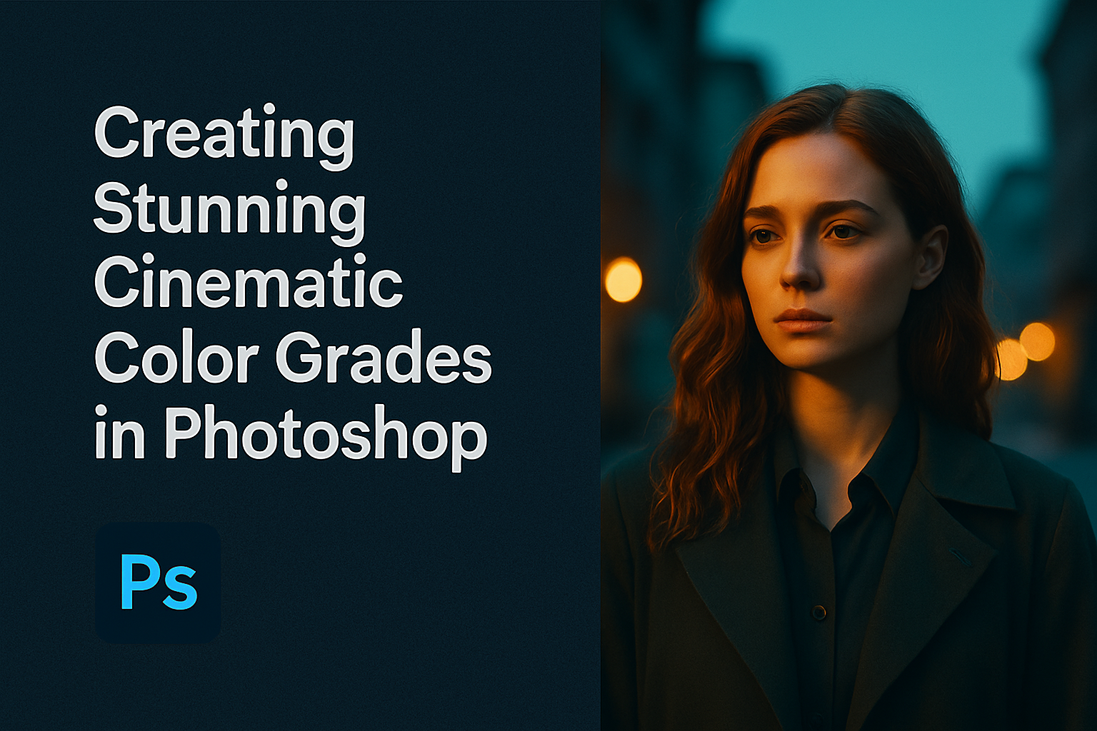
Creating cinematic color grades in Photoshop can bring your photos to life with rich and contrasting tones. The key to achieving a stunning cinematic effect is the use of complementary colors like teal and orange, a technique often seen in films. This method can enhance the drama and mood of your images, captivating your audience with a professional and polished look.
Photoshop offers various tools to apply these effects effectively. Features like the Camera Raw filter and Gradient Maps allow users to have precise control over color adjustments. For those seeking a more streamlined approach, actions such as the PHLEARN Cinematic Look provide quick and easy options for achieving these desired effects.
Whether you are editing photos for a personal project or professional work, understanding the techniques of cinematic color grading can significantly elevate the quality of your images. The use of these tools not only enhances aesthetics but also helps convey a story through visual means.
Fundamentals of Color Grading
Color grading dramatically influences the mood and tone of an image. Understanding the basics, like how the color wheel works and how color theory guides your choices, is essential. Using Photoshop’s tools effectively helps create striking cinematic effects.
Understanding the Color Wheel
The color wheel is a vital tool for anyone diving into color grading. It’s a simple circle that shows relationships between primary, secondary, and tertiary colors. Primary colors include red, blue, and yellow. They mix to create secondary colors, such as green, orange, and purple.
Knowing these relationships can help predict how colors interact. For example, complementary colors are opposite each other on the wheel, like blue and orange. Using them together can create contrast and make key elements stand out in an image.
The Role of Color Theory in Cinematic Grading
Color theory is all about how colors interact and the emotions they evoke. In cinematic color grading, it plays a key role. Warm colors like reds and yellows often bring warmth and energy, while cool colors like blues and greens can evoke calm or sadness.
Filmmakers use these ideas to set moods intentionally in their scenes. For instance, a desaturated palette can add drama, while more vibrant colors might suggest a lively scene. Understanding these emotional connections guides editors in choosing colors that match the story’s intent.
Introduction to Photoshop’s Color Tools
Photoshop offers a range of color tools perfect for color grading. The Curves tool allows users to adjust brightness and contrast with precision by tweaking the image’s highlights and shadows. Meanwhile, the Hue/Saturation adjustment is great for changing the intensity of specific colors without affecting the entire image.
Another powerful tool is the Gradient Map. This lets editors apply a gradient of colors across a black-and-white version of the image, creating a cinematic feel. Mastering these tools can transform a basic photo into something that looks like a still from a film, adding depth and emotion.
Getting Started with Your Project
Starting a cinematic color grading project in Photoshop involves careful preparation of your workspace and organizing your materials for a smooth workflow. Here, you will get tips on how to properly set up your Photoshop environment and manage your footage for the best results.
Setting Up Your Workspace
In Photoshop, creating an efficient workspace is key. First, adjust your panels to show only what’s needed. This can include the Layers panel, Adjustments, and any other relevant panels like History or Actions.
To arrange your workspace, drag panels to organize them. Group related panels and make frequently used ones easily accessible. You might want to save this setup by going to Window > Workspace > New Workspace. This way, you can return to it anytime.
Calibration is important too. Make sure your monitor is calibrated to get true colors during editing. Use a calibration tool if possible. Also, set your color settings in Photoshop by navigating to Edit > Color Settings. Choose a color profile that matches your project needs.
Importing and Organizing Your Footage
Begin by importing your footage into Photoshop. You can do this by dragging and dropping files into your project or using File > Open. Proper organization of your files is crucial to prevent any chaos during the editing process.
Create folders for different types of assets such as RAW footage, edited clips, and effects if needed. This organizational strategy keeps everything manageable and easy to locate. Naming folders and files descriptively can save time when searching for specific clips or images.
Ensure your files are in the right format. For still images, formats like JPEG and TIFF are common, while for videos, formats like MP4 or MOV work well. If needed, convert footage beforehand to prevent compatibility issues.
Basic Color Adjustments
Basic color adjustments in Photoshop can transform an image significantly. Using tools like Levels and Curves, tweaking Hue/Saturation, and achieving color balance can enhance the overall appeal and cohesion of any project.
Working with Levels and Curves
Levels and Curves are foundational tools for adjusting brightness and contrast. Levels allow users to adjust shadows, midtones, and highlights. By moving the sliders, a user can enhance the image’s dynamic range. Curves provide more control over tonal adjustments. Users can create points on the curve line to adjust individual parts of the image’s tonal range. This tool is perfect for making precise contrast changes. Beginners might find it challenging, but practice makes it an invaluable tool for those looking to refine image tones with accuracy.
The Power of Hue/Saturation
Hue/Saturation adjustments are key to altering the intensity and color of an image. Hue changes the colors, allowing users to shift the overall color scheme. This can be critical for achieving the desired mood or theme in a project. Saturation controls the intensity of colors, which can either be toned down for a more muted look or intensified for vivid imagery. It’s essential to balance saturation to avoid over-processing the image, maintaining a natural yet striking appearance. Lightness adjustments can be used to give the image a brighter or darker feel.
Color Balancing for Consistency
Color balancing ensures images maintain a uniform appearance across a series of photos or frames. This involves adjusting the balance between the red, green, and blue channels. A well-balanced image should not have any unwanted color casts. This process is crucial for projects that require consistency, such as photo series or film sequences. Many tools in Photoshop can assist with this, but understanding each project’s unique needs is key. For systematic adjustments, professionals often rely on Photoshop’s automatic features, but manual tweaks bring out the best results when attention to detail is needed.
Advanced Color Grading Techniques
In Photoshop, advanced color grading can transform a photo by focusing on specific colors, adding atmospheric effects, and creating reusable filters. This section explores selective color correction, the use of gradient maps for mood creation, and how to make a LUT to apply consistent styles across images.
Selective Color Correction
Selective color correction in Photoshop allows users to adjust specific colors without affecting the rest of an image. This technique can enhance or tone down certain hues, providing a balanced or dramatic look. By using the Selective Color adjustment layer, users can alter the intensity of colors like reds, greens, and blues.
This method is handy for correcting skin tones or emphasizing particular elements in a photo. Users can target color ranges and adjust sliders for cyan, magenta, yellow, and black. Mastering this tool gives photographers the ability to create a distinct mood or correct inconsistencies, elevating the image’s final appearance. Combining it with other tools can further refine results for a polished look.
Using Gradient Maps for Atmospheric Effects
Gradient maps help give images a cinematic feel by replacing the original colors with those from a gradient. This technique can be used to build atmosphere and depth in a photo. Assigning a gradient map involves selecting two or more colors to transition across the image, offering a seamless and professional look.
In Photoshop, users can apply gradient maps by selecting this adjustment layer and choosing a gradient that fits the desired mood. Options are nearly endless—think cool blues for calmness or warm oranges for energy.
Gradient maps are flexible, allowing adjustments in blending modes and opacity to achieve the best result. This feature can make photos appear more dynamic and cohesive, matching specific project themes or emotions.
Creating a Color Lookup Table (LUT)
A color lookup table, or LUT, can streamline the color grading process by applying a preset style across multiple images. This tool is valuable for maintaining consistency in a series of photos or videos. Creating a LUT in Photoshop involves curating the desired color palette and adjustments and then saving it as a LUT file.
To use, users first apply their preferred color changes to an image. Then, they export these adjustments through the ‘3D LUT’ option in the ‘Color Lookup’ adjustment layer. By implementing LUTs, photographers and editors can quickly apply complex color grades to numerous images, saving valuable time. It’s a favorite among professionals for its efficiency and ability to preserve a coherent visual style across projects.
Stylizing Your Images
Stylizing images in Photoshop can transform them with unique looks and vibrant effects. Using presets, custom styles, and blending modes, photographers can add creative flair and personal touch.
Applying and Modifying Presets
Presets provide a quick way to alter the mood of an image. They come with pre-set adjustments for colors, contrasts, and tones. Users can apply these to instantly change the feel of a photo. For those new to Photoshop, presets offer a great starting point.
Adjusting presets can further enhance the image. By tweaking settings like exposure, saturation, or tone curves, photographers can fine-tune and personalize the effects. This customization allows the user to maintain creative control, even when starting with a ready-made effect.
Handcrafting a Signature Look
Creating a signature look involves combining various adjustments to achieve a unique style. This might include changes to color balance, contrast, or sharpness. Photographers can experiment by applying different filters, curves, and color grading to craft a distinctive appearance.
It’s helpful to keep a record of adjustments that consistently produce appealing results. Save these settings as a new preset if desired. Over time, developing a signature look can help a photographer’s work stand out, making it recognizable and consistent.
Utilizing Blending Modes for Creative Impact
Blending modes in Photoshop offer more ways to style an image. These modes control how layers interact with each other, which can create dramatic effects. Commonly used blending modes include Multiply for darkening, Overlay for increasing contrast, and Screen for brightening images.
Experimenting with different modes can reveal unexpected results. Adjusting the opacity of the blended layers can fine-tune the effect further. For creative projects, blending modes can add layers of complexity and depth, giving images a professional edge.
Workflow Enhancements
To create stunning cinematic color grades in Photoshop, efficiency is key. Enhancing workflow through automation, actions, and batch processing can save time and improve consistency.
Automating Repetitive Tasks
Automation in Photoshop can significantly speed up the editing process. Using scripting, users can automate repetitive tasks, like resizing images or applying a specific filter. Scripts can be customized to fit individual needs, ensuring tasks are completed quickly and accurately. Photoshop’s built-in scripting support allows users to write their own scripts or download existing ones. This capability is especially helpful for professional photographers and designers who handle large volumes of images. By reducing manual work, they can focus more on creative elements, enhancing their final images effectively.
Photoshop Actions for Efficiency
Photoshop actions are another key tool for improving efficiency. Actions allow users to record a series of steps and apply them to other projects with a single click. This is particularly useful for tasks like color grading, where consistency across multiple images matters.
Users can create their own custom actions or download ready-made options online. By using actions, not only is the time spent on each image reduced, but it also ensures uniformity in adjustments. Bold actions such as setting up contrast curves or applying signature color tones can be integrated into these workflows. This helps professional editors maintain a consistent aesthetic in their portfolio.
Batch Processing Techniques
Batch processing is a powerful way to apply changes across many images simultaneously. With this technique, users can apply filters, resize images, or make color adjustments to a whole folder of images without interacting with each one individually. In Photoshop, this can be done through the automation menu, streamlining the entire process.
Batch processing is especially valuable for photographers working on large projects, like weddings or events, where hundreds of photos need similar edits. Applying a uniform cinematic look using previously saved actions or custom settings ensures a cohesive look for all images. This saves hours of manual editing and increases productivity.
Sharing and Exporting
Once you’ve mastered the art of cinematic color grading in Photoshop, it’s important to know how to share and export your work. Choosing the right file format and preparing images for different platforms can make a big difference in how your photos are viewed and appreciated.
Best Formats for Exporting
When exporting your beautifully graded images, selecting the right format is key. JPEG is a popular choice because it balances image quality and file size, making it ideal for web sharing.
For professional use or printing, TIFF offers higher quality with lossless compression, which preserves fine details in your photos. PNG is also useful if you need transparency in your image, though it tends to create larger files than JPEG.
Photoshop’s ‘Save for Web’ option is handy, especially for compressing images while maintaining quality. This option allows users to see file size changes in real time, helping in selecting the best balance between quality and file size.
Preparing Files for Different Platforms
Different platforms have unique requirements. For social media, compress the image to a smaller size to ensure fast loading times while retaining quality. For Instagram, use a square format, often sized at 1080×1080 pixels.
If you’re preparing images for blogs or personal websites, consider optimizing for faster loading. Keeping file sizes under 200KB generally works well.
For printing, retain high-resolution files in TIFF or high-quality JPEG formats. This ensures printed materials retain sharpness and vibrant colors. Make sure to match the color profile with the printer’s specifications to achieve the best results.