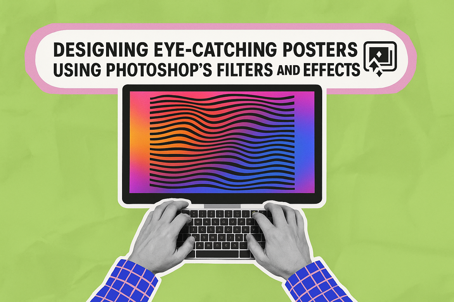
Creating posters that grab attention requires a blend of creativity and technical know-how. Photoshop provides a vast array of tools to help designers bring their ideas to life. Among these tools, Photoshop’s filters and effects stand out as powerful features to enhance visual impact.
These features allow designers to add depth and dimension, making a poster not only stand out but also communicate its message effectively. Whether it’s using gradients, shadows, or overlays, each effect can transform a simple design into something engaging and memorable. The key is knowing how to apply these tools in a way that complements the poster’s overall theme and purpose.
For those looking to explore creative possibilities, there are many tutorials available that focus on various techniques. By experimenting with different effects, designers can find unique styles that suit their specific projects, making the process both educational and enjoyable.
The Basics of Adobe Photoshop
Adobe Photoshop is an essential tool for creating stunning posters. Understanding its interface and using essential tools effectively can significantly enhance your design skills.
Understanding the Interface
Photoshop’s interface can seem overwhelming at first, but it’s built to streamline the design process. When opened, the software displays a workspace with key components such as the menu bar, tool panels, and the canvas area. The menu bar at the top provides access to all the main functions.
The tool panels on the left provide quick access to a variety of features like selection, cropping, and text tools. On the right, panels like Layers, History, and Properties help in managing your workspace efficiently. Layers are particularly important for poster design as they allow manipulation of different elements independently. Understanding how to navigate and utilize these sections can significantly enhance productivity and creativity.
Essential Tools for Poster Making
In poster design, some tools are more essential than others. For instance, the Move Tool allows quick repositioning of images or text, making it vital for arranging elements creatively. The Text Tool is crucial for adding and modifying text styles, sizes, and fonts.
Brush Tools let you add creative touches, useful for custom illustrations or textures. The Pen Tool is excellent for creating precise shapes and paths; it’s ideal for designing logos or complex shapes. Lastly, the Layer Styles option can apply effects like shadows or glows, helping in adding depth and flair to the design.
Familiarizing oneself with these tools can greatly increase efficiency and open creative possibilities in poster design projects.
Principles of Poster Design
Designing eye-catching posters involves understanding key design principles. These include creating a strong composition, using effective color combinations, and ensuring typography is clear and readable. Each element helps in making the poster attractive and easy to understand.
Composition and Layout
The composition of a poster is crucial. It determines how elements are arranged for maximum impact. Balance is key, whether it’s symmetrical or asymmetrical, to direct the viewer’s eye across the poster. The use of grids helps maintain alignment and organizes information neatly.
Visual hierarchy plays a significant role. Important details like the main message or call to action should stand out. Larger images, bolder fonts, or prominent placement at eye level can achieve this. White space, or empty space, is also vital to avoid overcrowding and allows elements to breathe and catch the viewer’s attention.
Color Theory in Posters
Colors set the mood and grab attention. Understanding color theory can aid in evoking emotions or highlighting important sections of the poster. Bright, bold colors often bring energy and excitement, while muted tones can convey calmness or seriousness. It’s important to choose a background color that contrasts with text for readability.
Complementary colors work well together. For example, pairing opposite colors on the color wheel creates a visually appealing effect. Analogous color schemes, using colors next to each other on the wheel, can create harmony. Consistent color use across different posters boosts brand recognition.
Typography and Readability
Typography affects how easily the information is understood. Font choice, size, and spacing are crucial in poster design. Simple, bold fonts are typically easier to read from a distance. Combining different font styles can add interest but should be done with caution to maintain clarity.
Hierarchy in text is achieved through size and weight variations. The most important information should be the largest, like the event name or date. Ensure there is sufficient contrast between the text and background for readability. Aligning text consistently and using bullet points or numbered lists can also enhance comprehension.
Getting Started with Filters and Effects
To create striking poster designs using Photoshop, understanding how to leverage its filters and layer effects is crucial. These tools help enhance the visual quality of your work by adding depth and style.
Exploring Photoshop Filters
Photoshop filters can dramatically change the look of your poster. They let you alter colors, add textures, and create special effects. This software offers a vast selection, from simple blurs to complex adjustments like halftone patterns and sketch effects.
One common technique is using the Gaussian Blur to add a soft focus. Another option is the Noise Filter, which can add a gritty texture to images. Beginners should experiment with these tools to find their preferred style. Adjusting these filters can help achieve the perfect balance of clarity and effect.
For those looking to blend styles, combining filters can be effective. For instance, pairing a blur with sharpening effects can add contrast and depth.
Applying Layer Effects
Layer effects in Photoshop add dimension and are essential for creating visually rich posters. They help in adding shadows, glow, and more to elements.
Drop Shadow is a popular effect that creates the illusion of depth. By tweaking distance, spread, and opacity, designers can make elements pop. Another useful effect is Outer Glow, which can highlight and make elements stand out.
Layer effects are nondestructive, meaning changes can be reverted easily. This feature encourages creativity without the fear of irreversible mistakes. Experimentation with Layer Styles like Bevel and Emboss can also add unique touches to text and shapes.
Advanced Techniques with Filters and Effects
Photoshop offers powerful tools to enhance and transform poster designs through filters and effects. By customizing filters and creatively combining them, designers can achieve truly unique and complex visual styles. These techniques can add depth and personality to any project.
Customizing Filters for Unique Styles
Customizing filters allows designers to create styles that are not only unique but also highly personalized. By adjusting settings within filters, such as intensity, angle, or texture, users can tailor effects to fit their design needs. For example, changing the blur radius in the Gaussian Blur filter can soften or sharpen an image focus.
Exploring other options within filter settings, like color balance or noise levels, provides even more versatility. Experimentation is key to discovering unexpected and pleasing outcomes that set designs apart. Keeping a record of settings used can help in replicating styles later. This practice helps in building a library of custom effects that can be utilized in future projects.
Combining Filters for Complex Effects
Combining multiple filters opens up endless possibilities for creating complex effects. For instance, layering gradient overlays with texture filters can add a sense of depth and dimension to the design. By applying different filters sequentially, users can achieve results that are not possible with a single filter alone.
To maintain control over the outcome, it’s helpful to use adjustment layers. These allow designers to tweak individual filters without affecting the entire image. Experimenting with various combinations helps in understanding how different filters interact and contribute to the overall effect. Keeping track of successful filter combinations is a smart way to streamline future projects. They can effortlessly recreate these intricate and engaging visuals.
Creating Eye-Catching Visuals
Using Photoshop to craft visuals involves blending textures, patterns, and image adjustments. These tools can make a poster stand out and grab attention.
Incorporating Textures and Patterns
Textures and patterns add depth to a design. They can turn a plain background into something visually interesting. Photoshop provides a variety of options to experiment with. Users can apply overlays to images for a unique look.
Examples include using grunge textures for a vintage feel or geometric patterns for modern designs. It’s important to adjust the opacity to ensure it complements, rather than distracts. Patterns and textures should highlight the main elements without overshadowing them. For those new to Photoshop, starting with simpler patterns can help build confidence.
Enhancing Images with Adjustments
Adjustments in Photoshop can enhance images significantly. This might mean tweaking brightness, contrast, or color balance. These changes can increase clarity and visual appeal. Tools like “Curves” or “Levels” help refine these adjustments. Using the “Hue/Saturation” feature can enhance or completely change colors, giving designers creative control.
Another useful tool is “Filters” to add effects such as blur or sharpen. Each adjustment needs careful consideration to avoid over-editing. Experimentation helps, but maintaining image quality is key. For beginners, using presets can be a helpful starting point. Exploring these features ensures the poster is eye-catching and vibrant.
Workflow Tips for Efficient Design
Designing posters effectively requires not just creativity but also good workflow practices. Streamlining processes can save time and enhance the quality of the final product.
Using Shortcuts and Actions
Photoshop offers a variety of shortcuts that significantly speed up the design process. By using keyboard shortcuts, designers can quickly perform actions like selecting tools, zooming in or out, and adjusting brush sizes. It’s helpful for users to spend some time learning these shortcuts to improve efficiency.
Another useful feature is Photoshop Actions. Actions allow users to record a series of steps and apply them to other projects with a single click. This is especially beneficial for repetitive tasks like adding effects or resizing images. Sharing these actions across teams ensures consistency in design and saves valuable time.
Layer Management Strategies
Organizing layers effectively in Photoshop is crucial for a smooth workflow. Naming layers clearly helps designers find what they need without wasting time. They should use groups to keep related layers together, which also makes it easier to work on complex projects.
Setting up a color-coding system for layers and groups is another great way to keep everything organized. Consistent use of color codes can quickly convey specific information about the types of content or their status in the design process. Locking layers that are not being modified can prevent accidental changes and ensure that the focus is kept on the necessary elements.
Incorporating Other Design Elements
Integrating vectors, illustrations, and smart objects can significantly enhance poster designs. These elements allow for creative flexibility and can help convey the intended message more effectively.
Adding Vectors and Illustrations
Vectors and illustrations add a unique touch to any poster. They can make the design more dynamic and visually appealing. When choosing vectors, it’s essential to consider the style and theme of the poster. Consistency is key; mismatched elements can make the design look unorganized.
Illustrations should support the poster’s message. Whether it’s a hand-drawn icon or a digital drawing, pick elements that align well with the color scheme and theme. Websites like Envato and GraphicRiver offer a wide range of vector graphics suitable for different projects.
Using scalable vector graphics (SVGs) is beneficial due to their scalability and quality retention. Unlike raster images, SVGs don’t lose quality when resized, which is perfect for posters of any dimension.
Working with Smart Objects
Smart Objects in Photoshop provide a non-destructive way to work with images and graphics. They allow users to edit details without losing quality, which is crucial when making numerous adjustments.
To incorporate Smart Objects, convert layers to Smart Objects by right-clicking and selecting “Convert to Smart Object.” This preserves the original data, letting designers tweak effects and transformations without affecting the core image. It also simplifies the process of updating graphics, as changes can be made in a separate file.
Smart Objects are especially useful for incorporating text effects or intricate designs that may need future adjustments. This flexibility is invaluable, saving both time and effort while maintaining the desired look of the poster.
Final Touches for a Professional Look
Completing a poster design involves refining every detail to ensure a sleek and professional appearance. Key elements include enhancing sharpness and ensuring the correct size for print, as well as exporting the design in appropriate formats for varying needs.
Sharpening and Resizing for Print
One of the first steps to achieving a professional look is sharpening the image. Photoshop’s sharpening tools, like Smart Sharpen or Unsharp Mask, can enhance details. Users should be cautious not to overdo it, as this can lead to noise or other distortions. The idea is to make the poster elements distinct and clear without sacrificing quality.
Resizing the poster for print is crucial. Always consider the print size when designing. Changing the resolution to 300 DPI (dots per inch) ensures high-quality printouts. Users need to check dimensions to match the printing requirements precisely. Keeping the proportions consistent avoids unwanted stretching or pixelation.
Export Settings for Various Formats
After perfecting the design, exporting it correctly ensures it maintains quality in different uses. Common formats include PDF, JPEG, and TIFF. PDF is ideal for preserving vector elements, making it great for professional printing. JPEG is suitable for web uploads but might not retain all details.
In Photoshop, use the Export As feature to choose the format. Remember to keep the color profile as CMYK for print and RGB for digital displays. This ensures colors appear as intended. Adjusting quality settings helps balance file size and clarity. Properly exporting the poster guarantees that all the hard work in designing truly shines through across mediums.