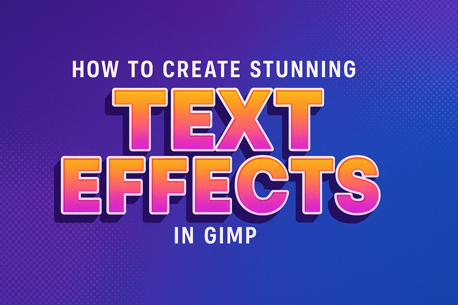
Creating stunning text effects in GIMP is a fantastic way to elevate any graphic design project. With just a few tools and techniques, anyone can make text stand out and capture attention. GIMP offers versatile features for crafting unique text effects, from gradients to 3D elements.
Whether you are a beginner or a more experienced user, learning these effects can greatly improve creativity and design skills. Tutorials and guides can help users master these techniques and apply them to different design contexts. By practicing these effects, users can enhance their projects’ visual appeal and professional quality.
Discovering how to use GIMP effectively opens up a world of design possibilities. From simple effects to more complex designs, GIMP provides tools that transform ordinary text into eye-catching visuals. This journey into text effects is both educational and enjoyable for any design enthusiast.
Getting to Know GIMP
GIMP is a powerful and free image editing tool widely used for creating amazing text effects. Its rich features, easy-to-navigate interface, and essential tools are perfect for beginners and advanced users alike.
Overview of GIMP Features
GIMP stands for GNU Image Manipulation Program. It’s a versatile software used for editing photos, creating graphics, and more. Users love its layer manipulation feature, which allows them to stack different elements for complex designs.
Another useful feature is the filter gallery. This lets users apply various effects quickly. GIMP also supports a wide range of file formats like JPEG, PNG, and TIFF, making it flexible for different projects. Plugins further extend its functionality, allowing users to add custom tools.
Navigating the GIMP Interface
The GIMP interface is user-friendly and can be customized to suit different workflows. It is divided into main sections like the toolbox, canvas, and dockable panels. The toolbox contains essential tools like brushes and selection tools, making it easy to start a project.
Users can also access menu items at the top for quick adjustments. Dockable panels, found on the sides, house layers, paths, and brushes. Users can drag and drop these panels to arrange their workspace efficiently. This setup helps in managing resources and switching between tasks easily.
Essential Tools for Text Effects
To create stunning text effects, GIMP offers tools like the Text tool for adding and editing text directly on the canvas. Users can change font, size, and color using the tool options. The Gradient tool is crucial for adding color transitions to text.
Another important tool is the Layer Effects feature. It allows for applying shadows, glows, and strokes to text layers. These effects can be further customized for intensity and spread. Also, the Path Tool helps in creating text along paths for unique designs.
Understanding Layers and Text
Layers in GIMP help organize your design by separating different elements like text, backgrounds, and effects. Adding text and formatting it properly are key steps to creating visually stunning designs.
Working with Layers
Layers are like sheets of transparent paper on which parts of an image are placed. In GIMP, this allows the user to edit each part separately without affecting the others. To manage layers, you can use the Layers panel found in the toolbar.
Creating new layers for each design element is crucial. It keeps your project organized and makes modifications easier. For instance, having separate layers for text and background allows you to change the background without disturbing the text.
To add a new layer, click on the New Layer button in the Layers panel. Name each layer to identify it easily. Adjust the layer’s opacity to blend it with others or keep it distinct.
Adding Text to Your Project
Adding text in GIMP is simple with the Text tool. Look for the Text tool icon in the toolbox or press ‘T’ on the keyboard. Click on your canvas where you want the text to start, and a text box will appear.
After typing, a text layer is automatically created in the Layers panel. You can reposition the text by clicking and dragging it to a new location. Remember to have the text layer selected when making changes.
For advanced effects, text can be aligned with paths or shapes. Refer to a tutorial on how to curve text in GIMP for creative presentations.
Basic Text Formatting
Text formatting in GIMP involves styling your text to enhance its appearance. Once text is added, various formatting options are available in the Tool Options panel.
Change the font style by scrolling through the list or search for a specific font by its name. Adjust its size and color to match your design objectives. Adding bold or italic styles can make text stand out.
Experiment with kerning and line spacing to achieve a balanced look. These adjustments can be made in the Text tool options, allowing for precise control over text appearance. Remember, keeping text readable is crucial, so avoid overly ornate fonts or clashing colors.
Applying Basic Text Effects
Applying text effects in GIMP can greatly enhance your designs by adding depth and visual interest. From creating shadow effects to using gradients, this section covers some fundamental techniques that are easy to apply and improve your text styling.
Creating Drop Shadows
Drop shadows give text a lifted appearance, adding depth and making it stand out. To create a drop shadow in GIMP, start by selecting your text layer. Navigate to Filters > Light and Shadow > Drop Shadow. This opens a dialog box where you can adjust settings like blur radius, opacity, and shadow color. Experiment with these options to achieve the desired effect.
Positioning the shadow correctly is crucial for a realistic effect. Try different angles to mimic natural light. Drop shadows can be customized to be subtle or bold, depending on the look you’re aiming for. This effect is popular for headers and important text elements.
Implementing Gradient Overlays
Gradients can add color transitions to your text, making it more visually appealing. To implement a gradient overlay, create your text and select the layer. Then, click on the Gradient Tool in the toolbox.
Choose a gradient style, like linear or radial, from the drop-down menu. Click and drag across your text to apply the gradient. You can customize colors by editing the gradient in the Gradient Editor. This technique is a great way to create dynamic, colorful text that draws attention.
Gradient overlays work well for backgrounds with a single color or simple designs. It’s a creative way to add life to your text without being overwhelming.
Utilizing Bevel and Emboss
Bevel and emboss effects give text a 3D appearance by adding highlights and shadows. To apply this effect, go to Filters > Decor > Add Bevel. In the dialog that appears, adjust settings like depth and softness to shape your text’s 3D look.
Bevel and emboss make text appear raised from the page. It’s useful for making text elements appear more solid. Play around with settings to get the best result.
Use this effect sparingly; it’s best for larger text like titles where legibility is maintained. It’s popular in logos and design elements where impact is key.
Advanced Text Effects Techniques
In GIMP, creating advanced text effects can transform ordinary text into eye-catching designs. Techniques such as crafting 3D text, using text along paths, and adding patterns and textures allow for more creative and dynamic visuals.
Creating 3D Text
3D text adds depth and dimension to typography, making it more engaging. Users can begin by selecting the text layer and using the “Perspective” tool to adjust angles and create a more realistic appearance.
Shadows enhance the 3D effect. Duplicating the text layer and filling it with a darker color helps simulate shadows. Offsetting this layer slightly will add to the illusion of text hovering above the surface. Gradient fills can offer a more polished look.
Bevel and emboss filters, accessible from the “Filters” menu, can add highlights and shadows to mimic a three-dimensional shape. When applied thoughtfully, these features truly make text pop.
Using Text along Paths
Text on a path can create curved or circular designs, adding flow and movement to text elements. Start by creating a path using GIMP’s Path Tool. Once the path is defined, activate the text tool and select the desired font and size.
After typing the text, users can position it along the path by right-clicking the text layer. Selecting “Text along Path” from the options fits the text to follow the path’s shape. The text can then be adjusted for spacing and positioning to achieve the best look.
Converting the text to a path allows further customization and alignment adjustments. This technique is useful for designing logos or any composition where text flow is essential.
Adding Patterns and Textures
Patterns and textures bring visual interest by adding depth and complexity to text. Begin with a standard text layer, then add a new layer above it. From the “Filters” menu, select “Render” to choose from available patterns or textures to overlay on the text.
Blending modes can enhance the integration of patterns and textures with text. Experimenting with modes like Overlay, Multiply, or Soft Light can produce diverse effects.
Using the “Layer Mask” option allows for targeted application of textures, letting users reveal or hide certain sections to create unique styles. This method of adding layers and blending helps in making text designs captivating and visually complex.
Custom Brushes and Patterns
Creating custom brushes and patterns in GIMP allows users to personalize their art, making it stand out. These tools enable adding texture and intricate details to designs. This section will focus on how to make custom brushes and how to design unique patterns.
Making Custom Brushes
In GIMP, crafting a custom brush begins by creating a new image. Set the size according to the desired brush effect. Common sizes range from 50×50 pixels to 100×100 pixels, but this varies based on the effect.
Once the image is prepared, draw the shape or pattern that the brush will replicate. Utilize layers for more complex designs. A brush can have different textures and transparency levels.
After designing the brush shape, export it by saving it as a .GBR file, which is the format GIMP uses for brushes. Navigate to the brushes folder in GIMP to save the file, and restart the program to see the new brush in the brush menu. Enthusiasts can learn how to create custom brushes, harnessing the full power of this feature.
Designing Unique Patterns
Designing patterns in GIMP starts with creating a new image. Consistent dimensions such as 500×500 pixels often give good starting results. Choose whether the pattern should tile seamlessly by focusing on edges that match perfectly.
Patterns can be created using shapes, colors, or existing artwork. Another approach includes manipulating images with filters or brush tools to achieve varied effects. Once the pattern is complete, save it as a .PAT file.
To use the pattern, place it in the patterns folder within GIMP’s directory. On restarting GIMP, the pattern becomes available for use in filling layers or selections. Custom patterns are helpful for backgrounds and textures, enriching overall design elements.
Color Manipulation and Blend Modes
In GIMP, color manipulation and blend modes allow users to change the look and feel of text creatively. These techniques help make text more visually appealing by adjusting colors and using different blending options.
Exploring Color Dynamics
Color dynamics play a crucial role in how text appears. GIMP provides various tools to adjust colors, such as Hue-Saturation and Color Balance. These tools can change the mood of the text and make it stand out. Users can create vibrant or muted tones to match the design theme.
Hue-Saturation: This lets users adjust the hue, saturation, and lightness of the text. By changing these parameters, the text can appear more colorful or subdued.
Color Balance: This tool helps by adjusting the shadows, midtones, and highlights. The trick is to make colors complement each other to enhance readability and style. Creating harmony in color choices can lead to more professionally designed text.
Blend Modes Explained
Blend modes are powerful features in GIMP that determine how layers interact with each other. They allow users to experiment with creative effects without permanently altering the original text.
Normal Mode: This mode displays the text as is, without blending effects. It’s a starting point for most designs.
Multiply Mode: This blends text with underlying layers by darkening it. It’s useful for giving a moody or dramatic impact.
Screen Mode: This lightens the text by brightening the combination of layers. It’s often used to create a glowing effect.
Users can test different modes to see how they influence the appearance. Using blend modes effectively can transform text into stunning visual elements that stand out.
Design Principles for Text Effects
Creating stunning text effects in GIMP involves understanding how elements like harmony, contrast, typography, and visual hierarchy play together. Proper use of these principles helps in crafting clear and appealing designs.
Harmony and Contrast
Harmony in text design ensures all elements work together seamlessly. Colors, shapes, and sizes need to complement each other to achieve a balanced appearance. This balance makes the text pleasing to the eye.
Contrast, on the other hand, highlights the differences between elements. By using contrasting colors or fonts, designers can draw attention to specific parts of the text. A dark background with bright lettering can make the text pop, improving readability and engagement.
A good mix of harmony and contrast can lead to text effects that are both striking and cohesive.
Typography Basics
Typography involves choosing and arranging fonts, sizes, and spacing. A well-chosen font can set the tone of the design. For example, serif fonts can give a classic feel, while sans-serif fonts are modern.
Consider the readability of the font at different sizes. Large text grabs attention, while smaller text provides details. Line spacing and letter spacing are also important. They affect how the text flows and influence how comfortable it is to read.
By mastering typography basics, designers ensure their text not only looks good but also communicates effectively.
Visual Hierarchy in Text Design
Visual hierarchy guides the reader’s eye through the text naturally. It involves using size, weight, and placement to show which parts of the text are most important.
Headings are usually larger and bolder to stand out. Subheadings and body text typically get smaller to indicate supporting information. Positioning text strategically on the page can create pathways for the eye to follow.
Using these techniques, designers can direct attention to key messages in their text design. Proper hierarchy makes the information easy to digest and understand at a glance, enhancing user experience.
Creating Animated Text Graphics
Bringing text to life in GIMP involves preparing text layers and applying animation techniques. This process can enhance the visual appeal of any graphic design project by making text dynamic and engaging.
Preparing Text for Animation
To start, setting up the text is crucial. Open GIMP and create a new project. Use the Text Tool to type your desired text on the canvas. Make sure each letter or word is on its own layer. This setup allows for individual movement, which is essential for animation.
After creating the text layers, use tools like the Move Tool to position each piece exactly where you want it to start. You may also want to change the font style or size using the Text Tool options at this stage. Adjust colors or add effects to each layer if needed.
Using the Layers Panel, organize your text layers. Duplicate layers to experiment with different styles without losing the original. Name each layer for easy identification during the animation process. This helps in maintaining order and efficiency while working on animations.
Animating Text with GIMP
Once the text is ready, it’s time to animate. Start by choosing an animation style. Basic styles include fade-ins, slide-ins, or rotations. For more advanced effects, explore tutorials on Izitru’s guide to text animation.
To animate, use the Animation Filters in GIMP. “Filters” > “Animation” offers several options. The “Playback” tool is also useful to preview animations as you work. Adjust the timing and sequence by ordering the layers correctly.
For smooth transitions, apply effects like Layer Modes or Opacity Changes. Test different combinations to see what works best. If necessary, export the animation as a GIF using the “Export As” option. Ensure all settings meet the desired output quality, keeping the file size manageable for easy sharing.
Saving and Exporting Your Work
When working on text effects in GIMP, saving and exporting are crucial steps. It’s important to choose the right file format for your needs and to ensure your files are optimized for both web and print environments.
File Formats for Text Effects
GIMP offers several file formats, each with different uses. For editable GIMP projects, saving in the native XCF format is recommended. This format keeps layers intact, allowing for future edits.
For most web applications, exporting just the final image to PNG or JPEG is ideal. PNG supports transparency, making it useful for logos or text with a clear background. JPEG is suitable for images where file size is a concern, but it doesn’t support transparency.
When preparing files for professional printing, using TIFF can be beneficial. TIFF files are larger in size but maintain the highest quality. This is important when your work is going to be printed in high detail. Understanding these formats helps ensure that the text effects remain crisp and clear.
Optimizing for Web and Print
Optimizing files involves adjusting settings based on how the end product will be used. For web use, focus on keeping the file size small without compromising quality. This can be done by adjusting dimensions and resolution. GIMP’s export features allow you to select the level of compression, which helps reduce file size.
For print, using a higher resolution, such as 300 DPI, is key. This ensures the text effects maintain their detail when printed on paper. GIMP allows easy setting adjustments for different resolutions, ensuring that the quality is maintained across various media. Proper configuration in these aspects guarantees that your text effects will look their best, whether on screen or in print.