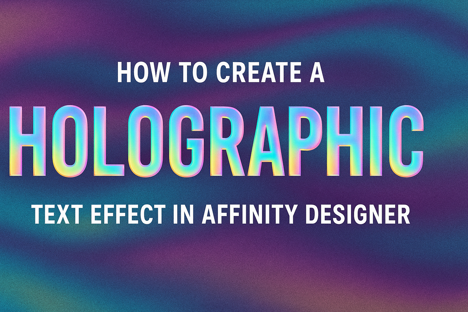
Creating visual effects can make designs pop, and a holographic text effect is a unique way to stand out. With the right techniques in Affinity Designer, anyone can achieve a stunning holographic look that captures attention.
This tutorial will guide readers through each step, making it easy to follow along.
This effect not only adds depth but also gives a modern touch to any text. By using layers, colors, and gradient techniques, they can transform simple text into something eye-catching.
This method is perfect for designers looking to enhance their projects with a stylish flair.
Whether for a logo, poster, or social media graphic, mastering this effect can elevate their design skills. Readers will find practical tips and helpful resources that simplify the process, ensuring they reap the benefits of this trendy style.
Getting Started with Affinity Designer
Affinity Designer is a powerful tool for creating stunning graphics and designs.
Understanding its interface and how to set up a document are the first steps to mastering this software.
Understanding the Interface
The Affinity Designer interface is user-friendly and well-organized.
It features a toolbar on the left side, where users can find essential tools like the Selection Tool and Shape Tool. The context toolbar at the top changes options based on the selected tool, making it easier to adjust settings.
On the right, users will see the Layers panel. This panel is crucial for managing different elements of a design.
Users can organize their artwork, apply effects, and make adjustments without losing track of individual parts. Familiarizing oneself with these panels helps streamline the design process.
Setting Up Your Document
Before diving into design, it’s important to set up the document correctly.
Begin by selecting File > New. In the dialog box, users can choose the document type, such as print or web.
Next, specifying the dimensions is essential. For example, a typical image might be 1920×1080 pixels for web or 8.5×11 inches for print.
Finally, setting the color mode is important. Opt for RGB for digital projects and CMYK for print.
Paying attention to these details at the start will save time and issues later in the design process.
Creating the Holographic Text Effect
To create a stunning holographic text effect in Affinity Designer, it’s essential to start with the right font and apply effective design techniques. This process involves careful selection and addition of text, layering gradients, and utilizing specific effects to achieve that eye-catching, shiny look.
Choosing the Right Font
Selecting the right font is the first step. A bold, sans-serif font works best for this effect because it tends to showcase the colors and gradients effectively. Popular choices include Arial Black or Montserrat.
Tips for Choosing Fonts:
- Thickness: Ensure the font is thick enough to display the holographic effect clearly.
- Styles: Look for rounded edges to soften the overall appearance.
- Readability: The font should still be legible at different sizes.
In this phase, he can explore various fonts to see which aligns with his vision. A font that is too thin may not convey the holographic effect convincingly.
Adding Text to Your Design
Once the font is selected, it’s time to add text to the design. He should create a new text layer in Affinity Designer and type out the desired words.
Key Steps:
- Add a Text Layer: Click on the Text Tool and draw a text box.
- Input the Text: Type the text and customize the size to fit the design.
- Positioning: Center the text on the canvas for balance.
Using a larger text size helps in showcasing the holographic details later. It also allows for more creativity in the application of color and effects.
Applying Gradient Overlays
Applying gradient overlays is crucial in achieving a holographic appearance. He should focus on using vibrant colors that mimic the look of holographic materials.
Steps for Applying Gradient:
- Select the Text Layer: Make sure the text layer is active.
- Add a Gradient Fill: Go to the Fill option and select Gradient.
- Customize Colors: Choose a mix of bright colors like purple, blue, and green.
Using multiple colors creates depth and dimension, mimicking the reflective quality of a hologram. She can adjust the angle of the gradient to see what looks best for her design.
Utilizing Layer Effects
Layer effects can really enhance the holographic look. By adding effects like glow or shadow, the text can stand out even more.
Important Effects to Use:
- Outer Glow: This gives a soft halo effect around the text.
- Bevel/Emboss: Adds a 3D effect, making the text appear as if it’s popping off the page.
To apply these effects, right-click on the text layer, select Layer Effects, and check the desired boxes. Adjust the settings until it feels just right. This final touch can elevate the overall appearance, making it striking and modern.
Enhancing the Holographic Effect
Enhancing a holographic text effect involves fine-tuning various elements to achieve a realistic and eye-catching design. This can be accomplished through adjustments in transparency, blend modes, and the application of filters and effects.
Adjusting Transparency and Blend Modes
To create a vibrant holographic text effect, adjusting transparency is key. By lowering the opacity of the text layer, the colors can blend more smoothly with the background.
Using blend modes can significantly change the appearance of the text. Modes such as “Overlay” or “Screen” can help produce a more luminous effect. Each mode interacts with the background differently, creating various visual results.
She should experiment with different combinations to find the one that looks best. This can lead to a unique and stunning appearance that enhances the holographic effect.
Using Noise and Blur Filters
Noise filters add texture to the holographic effect, making it more dynamic.
Applying a noise filter with low intensity creates a subtle grain that mimics the appearance of holographic prints.
In contrast, blur filters help soften the edges of the text, creating a smoother look. A slight Gaussian blur can work wonders, especially if used sparingly.
Together, noise and blur create a balanced effect that can elevate the quality of the design. They work in harmony to replicate the shimmering quality of real holograms.
Adding Final Touches with Flare and Sparkle Brushes
The last step in enhancing the holographic text effect is adding flair with brushes.
Flare and sparkle brushes can introduce captivating highlights that make the text pop.
These brushes can be used to apply bright spots or streaks of light around the text. Positioning them strategically helps emulate the shine typical of holographic surfaces.
To achieve a more realistic effect, varying the size and opacity of the brushes is essential. This variation creates depth, giving the text a more three-dimensional appearance. Experimenting with different styles of brushes will yield exciting results.
Exporting Your Design
When finishing a holographic text effect, exporting the design correctly is crucial. It ensures the artwork retains quality across various uses. Understanding the right file formats and export options makes a big difference.
File Formats and Export Options
Affinity Designer offers several file formats for export, each serving different purposes. Common formats include:
- PNG: Great for images with transparency and high quality. Ideal for web use.
- JPEG: Suitable for photographs and images without transparency. It compresses well, making file sizes smaller.
- SVG: Best for vector graphics and scaling without losing quality. Perfect for logos and illustrations.
To export, go to File > Export. The dialog will display format options. He or she can then select the desired format and adjust the settings such as resolution and quality. Always consider the intended use to pick the best option.
Saving for Web and Other Platforms
When preparing a design for web use, optimizing file size while maintaining quality is key. For this:
- Choose PNG or JPEG: PNG is best for images needing transparency. JPEG works well for non-transparent images.
- Set resolution: Aim for 72 DPI for web and 300 DPI for print. This balances quality and file size.
Using the export dialog, adjust settings like quality and size.
One can also use tools such as TinyPNG or ImageOptim for further compression.