Creating professional flyers can be a game-changer for businesses looking to make a strong impression. Adobe InDesign offers a wealth of tools and effects that can turn a basic flyer into a visually stunning piece. With InDesign, users can effortlessly craft eye-catching designs using features like Content-Aware Fit, which ensures images are perfectly framed.
InDesign’s powerful design capabilities enable users to add unique elements like modular shapes and varied color palettes. These features can enhance the flyer’s appeal and catch the viewer’s eye. By incorporating assets from the Creative Cloud Library, designers can easily include brand elements such as logos and colors, making the design process seamless.
For those interested in exploring these creative possibilities, learning to navigate Adobe InDesign is crucial. Design tips from experts highlight the importance of simple tools like shape creation and color adjustment to create compelling flyers. Let these tools inspire creativity and lead to professional-grade designs.
Getting Started with Adobe InDesign
Adobe InDesign is a powerful tool for creating professional-level flyers. It offers a range of features that make designing both fun and efficient. Here’s a look at the basics you need to know to get started.
Understanding the Workspace
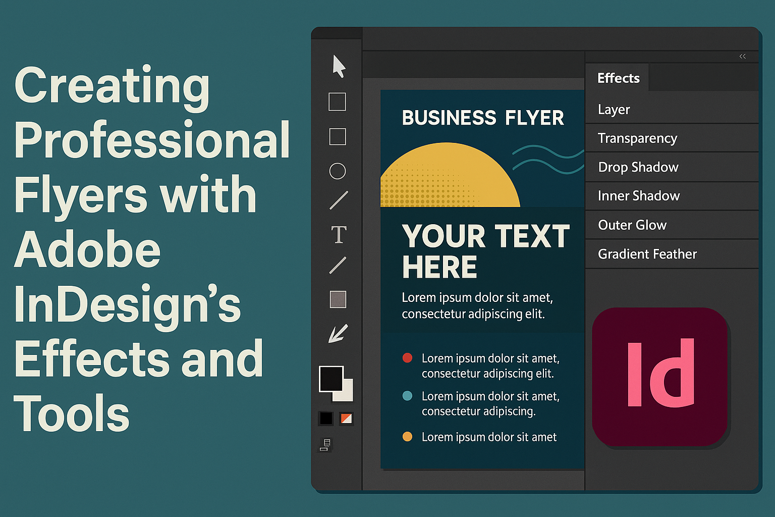
InDesign has a user-friendly workspace designed for ease of use. On opening the program, users will see a large central area for document editing, surrounded by helpful tools and options.
On the left, there’s a toolbar featuring key tools like the Selection Tool, Text Tool, and Shape Tool. On the right, panels offer options for colors, styles, and layers, allowing for swift customization.
The top menu provides easy access to frequently used functions such as saving, printing, and layout adjustments. Learning to navigate this workspace efficiently can save a lot of time.
Setting Up Your Document
Before diving into design, setting up your document correctly is crucial. Start by opening a new file. Users can choose from popular formats like A4 or customize with specific dimensions.
Next, define the margins and bleeds. Margins keep design elements from being cut off during printing. Bleeds allow images or colors to extend beyond the document’s edge, ensuring there are no white borders after trimming.
Finally, choose the correct color settings based on the project. CMYK is best for print, while RGB works well for digital designs. Each decision at this stage ensures the final product meets the desired quality and purpose.
Navigating Through Panels and Menus
Panels and menus in InDesign offer endless possibilities for design customization. The Control Panel displays options related to the selected tool, whether it’s text, images, or shapes.
The Layers Panel helps organize different design elements, making complex projects easier to manage. Layers can be moved, hidden, or locked as needed.
Access menus at the top for file management, editing, layout options, and more. The Type menu is especially helpful for text adjustments, offering options for fonts, styles, and effects. Getting comfortable with these elements enhances creativity and productivity in projects.
Fundamentals of Design
Designing a professional flyer requires a keen eye for color, font choice, and layout structure. Each element plays a crucial role in creating an attractive and effective design.
Working with Color Schemes
A good color scheme makes a flyer more appealing. Designers often start by choosing a primary color, which sets the tone of the flyer. Complementary colors can be used to add balance and contrast. Using colors that match the brand’s identity ensures consistency.
Adobe InDesign offers tools to experiment with different color palettes. Designers can try using the color wheel to find harmonizing colors. It’s important to keep the design simple. Overusing colors can distract the audience from the main message. InDesign’s built-in themes help guide these choices effectively.
Choosing the Right Fonts
The choice of fonts can greatly impact the readability and feel of a flyer. Selecting a font that reflects the message is essential. Serif fonts often give a formal feel, whereas sans-serif fonts are cleaner and modern. Using no more than two or three fonts keeps the design neat.
Font size is another critical factor. Headlines should stand out, while body text should be clear and easy to read. Adjusting line spacing enhances legibility. Adobe InDesign offers a variety of font styles and customization options. Testing different combinations helps in achieving the desired look and clarity in communication.
Implementing Basic Layout Principles
Effective layout guides the viewer’s eye through the content. A simple grid system helps in arranging elements logically. Aligning text and images creates a clean and professional appearance. It’s vital to ensure there is enough white space; this helps in highlighting important details without clutter.
Balance is key in layout design. Symmetrical layouts are more formal, while asymmetrical layouts can be dynamic and interesting. Using alignment tools in Adobe InDesign ensures precision. Grouping related items and maintaining hierarchy with headings and subheadings helps convey information clearly and effectively.
Incorporating Images and Graphics
Adding images and graphics to a flyer enhances its visual appeal and helps communicate messages effectively. Effective use of tools and features in Adobe InDesign can bring graphics to life, making a flyer stand out.
Placing and Formatting Images
To insert an image in Adobe InDesign, users typically start by opening the document and selecting the “Place” command. This can be done through the “File” menu or by using the shortcut “Ctrl+D” for Windows or “Cmd+D” for Mac. Once an image is chosen, it can be resized or cropped using the frame handles. Using the Content-Aware Fit helps in retaining the essential parts of an image within the frame, which is crucial for keeping the flyer informative and visually engaging.
When arranging images, maintaining a balance is key. Consider the placement to avoid clutter and ensure the flyer remains easy to read. Sometimes adding a border or shadow effect can make images pop. Experimenting with transparency and blending modes can also yield interesting results without overwhelming the design.
Using Vector Graphics in Flyers
Vector graphics are scalable without losing quality and are great for logos and illustrations. Adobe InDesign users can import vector graphics from applications like Adobe Illustrator. When using vector graphics, it’s important to pay attention to how they integrate with the rest of the flyer; they should enhance, not distract.
Using vector graphics allows for flexible design adjustments. They can be recolored, resized, and adjusted all within InDesign, providing a versatile tool for creating sharp, clear images. This is especially useful for maintaining consistency in brand colors and style across marketing materials.
Creating Custom Shapes and Icons
InDesign offers a range of tools for creating custom shapes and icons. The shape tools allow users to create basic designs that can be further customized with the Pen Tool or Pencil Tool. These tools enable the drawing of intricate designs directly on the workspace.
Creating custom icons can help a flyer maintain a unique touch while also communicating a message effectively. They can be styled with colors, gradients, and patterns. It’s essential for designers to keep the intended message in mind while creating these shapes, ensuring they contribute positively to the overall design of the flyer.
Mastering Text Effects
Mastering text effects in Adobe InDesign can elevate any flyer project. With the right typography techniques, text wrapping and styling, and effects like drop shadows, designers can create visually appealing and professional designs that captivate viewers.
Typography Techniques
Typography is the foundation of good design. In Adobe InDesign, users can explore a variety of font styles and weights to create striking text effects. Opting for bold typefaces can make headlines stand out, while using lighter fonts offers a clean look for body text.
Kerning and tracking adjustments refine the spacing between letters and words. This creates balanced text blocks, which enhances readability and style. Additionally, exploring creative options like letterpress effects can give text a vintage feeling, perfect for adding character to a design.
Using tools for aligning and justifying text ensures everything is neat and aligned properly. Employing these techniques helps users create clear and attractive designs, capturing the reader’s attention seamlessly.
Applying Text Wrap and Styles
Text wrap in InDesign allows users to fit text around images or shapes, a crucial skill for any designer. When a flyer includes images or graphics, it is essential to ensure that the text wraps naturally around these elements.
To use this feature, designers can select the object and adjust the wrap options to fit the layout neatly. Consistent styles across a document keep the design cohesive. This means using similar font styles, sizes, and colors throughout.
A step-by-step guide offers insights on arranging text, ensuring that the design looks professional and polished.
Adding Drop Shadows and Other Text Effects
Drop shadows add depth to text, making it pop visually. By tweaking the opacity, angle, and distance of shadows, designers can create subtle or dramatic effects as needed. This effect helps the text stand out without overwhelming the design.
Other effects like glows or bevels can add an extra dimension. For example, using a subtle glow behind text can make it glow softly. Knowing how to combine these effects is crucial for crafting dynamic designs.
InDesign provides various preset styles, making it easy to apply multiple effects with just a few clicks. These tools, when used appropriately, enrich the overall design and style of the flyer, attracting more viewers to the message being conveyed.
Utilizing InDesign’s Effects and Tools
Adobe InDesign provides a variety of tools and effects that can help create eye-catching flyers. These features add depth, texture, and professionalism to any design project, making it stand out from the rest.
Exploring Transparency and Blending Modes
InDesign offers transparency settings that can help create engaging visual effects. By adjusting the opacity of different elements, users can craft layered designs that seem to float over each other.
Blending modes let elements interact in unique ways. For example, using the “Multiply” mode, colors darken and combine, creating rich textures. Alternatively, “Screen” can lighten and create a soft look. Understanding these interactions is key for designers wanting dramatic effects.
Practicing with these modes can help designers find which settings best suit their project’s needs. Adjusting these settings can result in fresh and personalized designs every time.
Working with Effects like Bevels and Emboss
Bevel and emboss effects add depth to flyer designs, making elements appear 3D. By tweaking the settings, users can change how light interacts with their shapes, shadows, and highlights—resulting in realistic appearances.
Designers can adjust the direction and intensity of these effects to achieve different looks. A subtle emboss creates delicate textures, while a strong bevel can make text or images pop off the page.
These effects are perfect for titles or key images in a flyer. When used wisely, they add sophistication and professionalism without overwhelming the design.
Leveraging Gradient Feathers and Gels
Gradient feathers allow designers to fade images or colors smoothly. By blending from solid to transparent, flyers can have a polished and elegant look. This is useful for backgrounds or creating soft transitions between elements.
Gels can add color overlays, offering hues that unify different parts of a design. By applying a slight red or blue gel, designers can maintain a consistent color scheme throughout the flyer.
Combining these tools, InDesign helps create seamless and artistic visual effects. Whether working on a simple or complex design, these features ensure cohesive and visually appealing outcomes.
Advanced Techniques
Diving into advanced techniques enhances the look and functionality of your flyers. Using effects like layering can create depth, while interactive elements engage viewers. Ensuring your design is ready for print is also crucial.
Incorporating Interactive Elements
Interactive elements can transform a static flyer into an engaging experience. In Adobe InDesign, designers can integrate elements like hyperlinks, buttons, and animations to capture attention. These features are especially useful for digital flyers shared online or through email.
By using interactive elements, designers can guide viewers through the flyer, encouraging them to explore further or take action. Adding buttons can lead to websites or videos, enriching the viewer’s experience. To ensure functionality, it’s important to preview and test these interactive components before distribution, focusing on user-friendly navigation and seamless integration.
Ensuring Print-Ready Flyers
Preparing a flyer for print involves several critical steps to ensure it looks professional. Adobe InDesign offers tools to check that the document meets printing standards. Using the preflight tool can help identify potential issues such as missing fonts or images.
Setting the correct margins and bleed areas is also crucial to avoid unwanted trimming. Designers should ensure that the color settings are suitable for print, typically using CMYK instead of RGB. Exporting the final document as a high-resolution PDF is often recommended, as it preserves the design’s integrity and optimizes it for professional printing services.
Efficient Workflow Tips
Creating professional flyers in Adobe InDesign can be streamlined by mastering key features and techniques, enhancing productivity. Employing master pages, using shortcuts and automation, and organizing assets are crucial for an efficient workflow.
Using Master Pages Effectively
Master pages in InDesign are powerful tools. They allow consistency across your flyers by maintaining uniform elements like headers, footers, and logos. To get started, set up a master page with these common elements once, and apply it to multiple pages.
This approach saves time, reducing repetitive tasks. If there’s a change, just update the master page and all linked pages will automatically reflect the change. This ensures that any amendments made need little additional effort.
Using different master pages for various sections can add variety to your designs without losing overall consistency. Understanding and utilizing this feature significantly enhances productivity, making the flyer creation process smoother.
Shortcuts and Automation
InDesign offers numerous shortcuts that can save time during the design process. Learning keyboard shortcuts for frequently used tools can make work feel more efficient. For example, “T” for the text tool and “V” to return to the selection tool are invaluable.
Automation can also be achieved through the use of scripts. Scripts can automate repetitive processes, like formatting text or applying styles, further speeding up the workflow. InDesign’s ability to customize shortcuts lets users tailor the software to their preferences, further boosting productivity.
Adopting these strategies simplifies tasks and keeps designers focused on creativity rather than repetitive actions, enhancing their efficiency significantly.
Organizing Assets with CC Libraries
Adobe Creative Cloud Libraries provide an effective way to manage and organize design assets. By using CC Libraries, designers can easily store and access text styles, colors, and graphics, ensuring that all elements remain consistent across multiple projects.
This tool also allows for easy collaboration. Team members can share libraries, ensuring everyone uses the same assets. To organize assets efficiently, it’s useful to label and categorize them thoughtfully. This practice minimizes the time spent searching for assets, allowing for a quicker workflow.
Leveraging Creative Cloud Libraries helps streamline the design process, making project management much more manageable and efficient.
Review and Final Adjustments
After completing the initial design of a flyer in Adobe InDesign, it is essential to focus on finalizing the details. This stage ensures everything is polished for both print and digital formats, maintaining a professional appearance that effectively communicates the intended message.
Proofreading and Preflight Checks
Before sending your flyer to print, thoroughly review all text for spelling and grammar errors. It’s helpful to ask someone else to proofread, as fresh eyes often catch mistakes you might miss. InDesign includes a preflight panel to alert you to issues like missing fonts or image resolutions that are too low.
Preflight checks ensure that the document meets all necessary requirements. These tools identify potential errors related to print specifications, such as missing links or incorrect color modes. Addressing these alerts is crucial to avoid issues during printing.
Color Correction and Output Preview
For accurate color reproduction, carefully adjust and correct the colors in your flyer. Use InDesign’s color management tools to ensure that colors appear consistent across different devices and printing methods. Setting the right color profiles is critical for maintaining brand integrity.
InDesign allows users to preview the design in the intended output format. This feature helps in visualizing how the flyer will look in print versus digital media. Reviewing the flyer in different light conditions and settings can prevent unpleasant surprises when it’s printed.
Exporting Final Design for Print and Digital
After making the necessary adjustments, the flyer needs to be exported in suitable formats for both print and digital use. When exporting for print, selecting Adobe PDF (Print) with high-quality settings ensures all elements are sharp and clear. For digital distribution, save it as an interactive PDF with clickable links.
InDesign offers settings to optimize your file for specific outputs. Configurations like including bleed areas and selecting the appropriate resolution guarantee the flyer meets industry standards. Choosing the right export settings reduces file size for faster digital sharing without compromising quality.