Creating a standout brochure can help a business make a strong impression. With the right tools, anyone can design a professional brochure that catches attention and shares important information clearly. Using Photoshop, designers can craft layouts that not only look appealing but also communicate effectively.
Photoshop offers endless possibilities for creativity. Whether the brochure is for a small business or a large corporation, understanding how to use the software’s features can transform ideas into visually stunning designs. This guide will explore key tips to make this process smooth and successful.
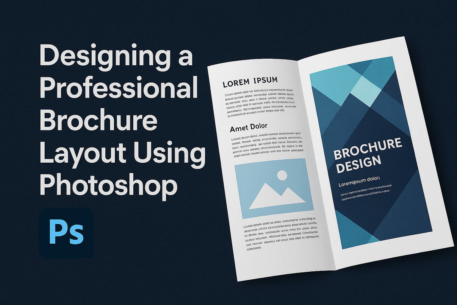
Learning to design with Photoshop requires patience and practice, but the results are rewarding. For those wanting to dive into the process, following guides like this Photoshop tutorial provides clear, step-by-step instructions.
Understanding Brochure Design Basics
When designing a brochure with Photoshop, start with understanding the brochure’s purpose and audience. Then, choose suitable layouts and focus on key design elements. This ensures the brochure effectively communicates its message.
Purpose and Audience of Your Brochure
Knowing the purpose of a brochure is key. Is it to inform, advertise, or educate? Identifying its main goal helps in deciding content and design. Similarly, understanding the audience is crucial. Are they potential customers, existing clients, or stakeholders? Each group responds differently to colors, fonts, and language.
Tailoring the design to both purpose and audience ensures the brochure’s effectiveness. For a business audience, use professional tones and layouts. For casual audiences, a relaxed style might be better. Always prioritize what appeals to the viewer.
Types of Brochures and Their Layouts
Brochures come in various types. Common types include bi-fold, tri-fold, and z-fold. Each serves different needs. A bi-fold brochure has four panels, providing a straightforward layout. It’s perfect for simple presentations. A tri-fold offers six panels, allowing detailed information with clear breaks. It’s great for step-by-step guides or detailed presentations.
Layouts must align with content. For a service brochure, a tri-fold may be ideal to separate services clearly. Visual examples help in understanding these distinctions and can be used in planning the design stages.
Design Elements and Principles
Effective design relies on certain elements. Balance, contrast, alignment, and repetition play significant roles. Balance creates harmony by equally distributing elements. Contrast emphasizes important content, making it stand out. Alignment keeps the layout structured, providing a clean look.
Color choice is crucial. It sets the mood and grabs attention. Fonts should match the brochure’s tone. Decorative fonts can be used for headings, while simple fonts maintain readability.
Remember to include visuals like images or graphics. They not only beautify but also convey messages faster than words. Employing high-quality images and illustrations can enhance the brochure’s appeal.
Getting Started with Photoshop
Designing a brochure in Photoshop begins with familiarizing oneself with the workspace, understanding key tools, and setting up the document correctly. These steps ensure a smooth design process for creating a professional and appealing brochure.
Navigating the Photoshop Interface
Photoshop can seem complex at first. Understanding the layout of the interface is essential. At the top, there’s a menu bar with options like File, Edit, and Image, which contain vital functions.
On the left, the toolbar offers access to various tools. Users can find items like the Move Tool or Text Tool, which will be used often.
The right side usually houses panels like Layers and History. These help in organizing and keeping track of changes. It’s important to know how to arrange panels according to personal workflow needs. A customized workspace can significantly improve efficiency.
Essential Tools for Layout Design
A brochure’s design relies on several key tools in Photoshop. The Move Tool lets designers position elements precisely. The Text Tool helps in adding and styling text, which is critical in conveying messages effectively.
The Shape Tool can be used to create geometric shapes, frames, and backgrounds. Selections are often made using the Marquee Tool, allowing users to select specific areas for edits or adjustments.
The Layer panel is particularly important. It provides a clear hierarchy of elements, ensuring each part of the design can be independently modified. Experimenting with opacity and blend modes can add depth and creativity to the design, allowing brochures to stand out.
Setting Up a Brochure Document
The first step for creating a brochure is setting up the document. In Photoshop, select “File” and then “New” to start a new project. It’s essential to set the right dimensions and resolution.
For a standard brochure, users might choose a size of 11” by 8.5” for a classic tri-fold layout. Setting the resolution to 300dpi ensures print quality is sharp.
Setting up guides helps organize layout sections. These guides act as boundaries, ensuring important text and images don’t get cut off. They also help maintain symmetry and alignment, contributing to a polished final product.
Creating the Brochure Framework
When designing a brochure in Photoshop, setting up a solid framework is critical to achieving a professional look. This involves organizing your layout using guides and creating a flexible multi-panel format that fits the brochure type.
Working with Guides and Grids
Using guides and grids in Photoshop helps align elements neatly. Start by opening a new document. A typical size for a brochure is 11″ x 8.5″, but this can vary depending on your needs. Guides are crucial for ensuring consistent spacing and alignment across the brochure.
To set guides, enable the ruler by pressing Ctrl + R (or Cmd + R on Mac). Drag guides from the ruler onto the document to set margins. Ensure there is enough space for text and images, preventing them from being too close to the edges. Equally spacing these guides will aid in maintaining a balanced design.
Grids are equally important. They provide a detailed structure and assist in aligning elements symmetrically. Go to View > Show > Grid to activate the grid view. This makes it easier to position text boxes and images within the layout consistently.
Creating a Flexible Multi-Panel Layout
The layout should be versatile, allowing room for various content types. For a tri-fold brochure, divide the page into three equal sections. Create panels by using the guides set earlier to mark fold lines. This ensures each section has clear borders and separation.
Consider what content will go into each panel. For example, the front may have a catchy image or title, while the inside panels cover detailed information. Adaptability is key, so ensure the layout caters to different content elements, like text blocks, images, and headlines.
Photoshop layers help manage this flexibility. By organizing layers for each panel, the design can be easily adjusted. These steps in planning a multi-panel layout make sure the brochure is both functional and visually appealing.
Color Theory and Typography
When designing a professional brochure layout, understanding the use of colors and fonts is essential. The right color palette and font choices can make a brochure more engaging and readable.
Selecting a Color Palette
Choosing the right colors sets the tone of the brochure. Colors can evoke emotions and grab attention. Designers often start by considering the brand’s identity or the mood they want to convey.
Using the color wheel can help in creating a balanced color scheme. Complementary colors, which are opposite on the wheel, offer contrast. Analogous colors, which are next to each other, provide harmony.
It’s important to also consider color psychology. For example, red can evoke excitement, while blue may signify trust. Avoid using too many colors as this can be overwhelming. A simple palette of two to four colors often works best.
Understanding Font Choices
Font choice influences the brochure’s tone and readability. Serif fonts, like Times New Roman, are often seen as traditional, while sans-serif fonts, like Arial, offer a modern feel.
Using too many fonts can make a design look chaotic. A typical guideline is to use no more than two to three different fonts in a brochure. Typically, one font is used for headings, another for body text, and possibly another for subheadings.
Font size matters too. Headlines should be larger to stand out, while body text should remain readable.
Hierarchy and Readability in Text Layout
Establishing a clear hierarchy helps guide the reader’s eye through the content. Headings, subheadings, and body text should have distinct sizes.
Using bold or italic styles can emphasize important points. Lists or bullet points can break up long text and make information easier to digest.
Alignment also plays a role in readability. Text that is left-aligned is generally easier to read compared to centered or justified text. Also, adequate spacing between lines and paragraphs aids in a better reading experience.
Adding and Editing Images
Images play a crucial role in brochure design by catching the reader’s attention and conveying messages. Selecting quality images and editing them skillfully enhances the overall impact.
Choosing the Right Images
Selecting images for a brochure requires considering their purpose and message. They should be high-quality and relevant to the content. Opt for images with high resolution to ensure they look clear when printed. Visual consistency can be achieved by choosing images with similar tones or themes, contributing to a cohesive look.
Stock photo websites offer a variety of choices, but original photos can provide a unique touch. When taking original photos, focus on good lighting and composition. It’s important to make sure that the images align with the brochure’s theme and target audience. This coherence strengthens the connection between text and visuals, making the brochure more engaging.
Basic Photo Editing Techniques
Photoshop provides several tools for editing images to enhance their appearance. Cropping is a fundamental technique to focus on the subject or remove unnecessary elements. Adjusting the brightness and contrast can make images more vibrant and eye-catching. The Clone Stamp Tool is useful for fixing blemishes or removing unwanted objects.
Color correction might be necessary to ensure visual harmony when the photos are placed together. Using filters can also add a uniform style to different images. Learning to balance these edits is crucial; over-editing can make images look unrealistic and unattractive.
Incorporating Images into the Layout
Positioning images in the brochure layout requires careful planning. Align images with text to maintain a clean and organized appearance. Grid lines can help ensure elements are aligned and balanced throughout the pages. Overlapping images slightly might add a dynamic and layered look.
Consider white space around images, as it helps them stand out and keeps the layout from appearing crowded. Captions or short descriptions can be added to provide context to the images. Consistently using a specific style for borders or frames can also be effective, contributing to a polished and professional design.
Design Enhancement Techniques
Enhancing a brochure design in Photoshop involves using layers, shapes, and final touches effectively. These techniques help create a polished, professional look that captures the viewer’s attention.
Using Layers Effectively
Layers are fundamental in Photoshop, offering flexibility and control. They allow the designer to experiment without permanently altering the overall design. By organizing layers properly, one can quickly edit specific elements.
Using layer masks is crucial for non-destructive editing. Masks help hide parts of an image without deleting them. This allows easy adjustments and is particularly useful when blending images.
Layer styles add depth to elements like text and images. Incorporating effects such as drop shadows or glows can make the brochure visually appealing. Grouping layers for similar elements keeps the project tidy and easier to manage.
Incorporating Shapes and Graphics
Shapes and graphics add visual interest and structure to a brochure. They guide the reader’s eye through the design and highlight important information. Simple geometric shapes can create balance and lead the viewer from one section to another.
Custom shapes offer unique visual flair. Using Photoshop’s Pen Tool or Shape Tool can help create bespoke designs. Graphics can include logos or icons, aiding in branding and storytelling.
Images should be integrated carefully. Ensure high resolution to maintain quality in print. Layer blending modes can be used to integrate graphics seamlessly with the rest of the design, creating cohesive visual narratives.
Adding the Final Touches
Final touches are key to creating a polished brochure. Adjusting color tones and contrasts impacts the overall mood and readability. Use tools like adjustment layers for fine-tuning colors without altering original layers.
Typography must be clear and readable. Proper kerning, line height, and spacing ensure that the text is not only legible but also aesthetically pleasing. Choosing complementary fonts can also enhance the design’s appeal.
Proofreading and reviewing are essential before finalizing. Ensuring accuracy in text and alignment in design helps maintain professionality. Exporting the final design in appropriate formats, such as PDF for printing, keeps the layout intact.
Exporting and Reviewing Your Brochure
Once your brochure design in Photoshop is complete, the next steps are crucial. Choosing the right format for printing ensures your design maintains its quality, and carefully reviewing it helps catch any errors.
Best Formats for Printing
When exporting your brochure for printing, format choice is key. The most common file formats are PDF, TIFF, and JPEG. A PDF is often preferred for its ability to preserve fonts and images with high quality. TIFF files offer excellent resolution, making them ideal for professional printing.
JPEG might be used for simpler projects, but its compression can affect quality. Always check your printer’s specific requirements regarding file size and color mode. Ensure you’re using CMYK color mode as this is standard for print. Proper formatting minimizes risks of printing errors.
Final Proofing
Before sending your brochure to print, conduct a thorough proofing session. Double-check all text for spelling and grammar mistakes. It’s easy to miss typos after spending hours on design, so have someone else review it, too.
Confirm that all images are clear and appropriately placed. Verify that margins and bleeds are correctly set to avoid unwanted cuts. Print a test copy on a normal printer to see how the layout looks in physical form. This step helps identify any unexpected issues in print, rather than on screen.