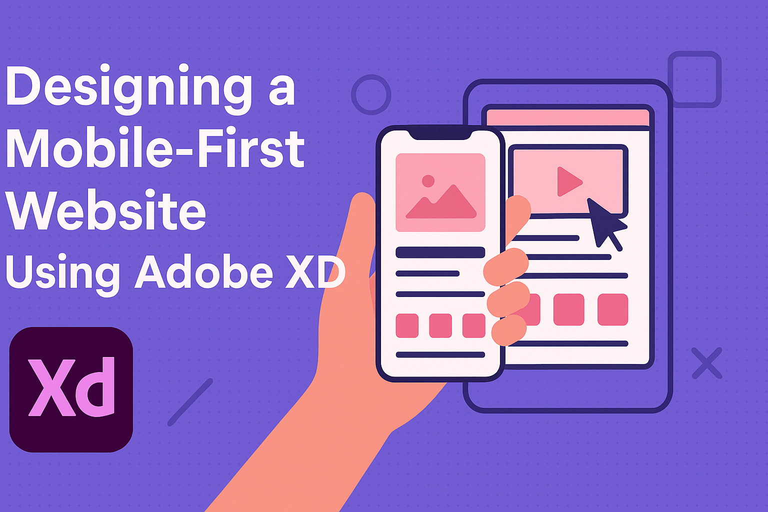
Creating a website in today’s digital world requires a mobile-first approach. With the increasing use of smartphones, users demand seamless browsing experiences on smaller screens. Adobe XD is an excellent tool for designers aiming to build responsive, mobile-first websites with ease.
Designers can start by focusing on the mobile version of the site to ensure that all essential elements are visible and functional on a small screen. This method helps prioritize content and features that are crucial for user engagement.
Once the mobile design is nailed down, scaling up to larger screens becomes more straightforward. Utilizing Adobe XD’s artboards and interactive prototypes can streamline this process, creating designs that adapt beautifully across different devices.
Understanding Mobile-First Design
Designing for mobile-first involves creating a website that prioritizes mobile functionality. This approach ensures users have a great experience on small screens. It emphasizes simplicity, speed, and essential content display. The following sections discuss essential parts and comparisons of mobile-first design.
The Mobile-First Approach
The mobile-first approach focuses on making websites work well on smartphones and tablets before scaling up to larger devices. This method helps designers prioritize necessary content and features. They must carefully choose what to display on smaller screens since there’s less space to work with.
Using tools like Adobe XD helps in creating wireframes and prototypes specifically for mobile devices. Designers can test navigation and layout efficiency early in the design process. This way, they ensure that the user experience is seamless and intuitive from the start.
Benefits of Mobile-First Design
One major advantage of mobile-first design is improved user experience. A better user experience can lead to longer site visits and higher engagement rates. Websites built with this approach tend to load faster since they initially cater to smaller screens with fewer resources.
Designers can also focus on core content and features, reducing the clutter that sometimes exists on larger screens. This approach can improve search engine rankings since Google prioritizes mobile-friendly sites. Websites designed this way can also handle scaling for different screen sizes, making them more adaptable.
Responsive vs. Adaptive Design
Choosing between responsive and adaptive designs is important for mobile-first strategies. Responsive design adjusts layouts fluidly based on screen size, ensuring consistency across devices. This approach ensures a seamless transition from mobile to desktop views without multiple versions.
Adaptive design uses predefined layouts tailored to specific devices. It selects the best layout for a device once it’s detected. Each method has its benefits, but responsive design is often preferred for its flexibility and ease of maintenance.
Designers need to weigh the pros and cons of each approach to meet their project goals effectively. Both methods aim to enhance user experience while maintaining a clean website look on any device.
Getting Started with Adobe XD
Adobe XD is a versatile tool used for designing user experiences and prototypes. This section will cover some of its key features, how to set up a new project, and the most important parts of the workspace.
Overview of Adobe XD Features
Adobe XD is designed for creating interactive prototypes and user interfaces. It combines tools for design, prototyping, and sharing, all in one app. This makes it easier to move from concept to finished project.
One standout feature is the ability to design using artboards, which are flexible canvas areas for different sections of a project. Users can connect these artboards to create interactive prototypes. It also supports 3D transforms, letting designers create dynamic, layered designs.
Collaboration is a strong point in Adobe XD. Users can easily share designs and get feedback through Adobe’s collaboration tools. This allows teams to work together seamlessly no matter where they are.
Setting Up an Adobe XD Project
Starting a new project in Adobe XD is straightforward. Upon opening the app, users can choose from various device templates like mobile phones or tablets. This helps ensure designs fit well on different screens.
After choosing a template, users can create artboards that represent different pages or parts of the app. Adding elements like images, text, and shapes can be done using the tools provided.
Adobe XD also allows importing assets from other Adobe apps, such as Photoshop, to enhance design projects. Designers can create components and reusable elements, saving time for similar design items across different artboards.
Familiarizing with the Workspace
The Adobe XD workspace is laid out to streamline the design process. On the left, there’s a toolbar for quickly accessing design tools. These include selection tools, text tools, and drawing shapes.
The center area is the canvas, where artboards can be placed and arranged. This is where the main design work happens. Designers can zoom in and out using simple keyboard shortcuts.
On the right side, the properties panel gives options to tweak elements. Users can adjust colors, sizes, and positions. This panel changes based on what’s selected, so it’s intuitive to use while designing.
With practice, mastering the Adobe XD workspace can significantly boost design efficiency and creativity.
Designing for Mobile
When designing for mobile platforms, it’s crucial to focus on intuitive interfaces, user-centric approaches, and accessibility. Each of these aspects plays a vital role in delivering a seamless experience for mobile users.
Best Practices for Mobile Interfaces
Creating mobile interfaces requires attention to simplicity and clarity. Screens are small, so the design must prioritize essential actions and content. Users should be able to navigate easily. Buttons and touch targets should be large enough for easy tapping.
Visual hierarchy is key. Important information should be at the top, and less critical details toward the bottom. This structure helps users find what they need quickly. Consistency in design elements—such as colors, fonts, and icons—supports user familiarity and ease of use.
Fast loading times are crucial too. Optimized images and streamlined code improve performance. Efficient use of space and minimal scrolling enhance the experience, ensuring users engage without frustration.
Creating a User-Centric Design
User-centric design starts with empathy and understanding user needs. Conducting surveys and usability testing can help identify user preferences and pain points. Gathering insights helps prioritize features that matter most to users.
Personas are valuable tools. They represent typical users’ goals and behaviors, guiding the design process toward relevant solutions. Designing with real user habits in mind ensures that the app or website feels intuitive and meets user expectations.
Feedback mechanisms are essential. Allowing users to leave comments or report issues can provide valuable insights. Encouraging feedback helps refine the design over time, resulting in a product that continuously evolves to meet user needs.
Accessibility Considerations
Accessibility is a fundamental aspect of mobile design. It ensures that all users, including those with disabilities, can interact with digital products. Features like screen readers and adjustable text sizes make content accessible to people with visual impairments.
Contrast is essential for readability. Using high-contrast colors enhances visibility for users with low vision. Clear labeling of buttons and links supports screen readers, ensuring every element is understandable.
Navigation cues like headings and landmarks help users orient themselves within a website or app. Consistent and logical structure aids those using assistive technologies, leading to a more inclusive user experience. Designing with accessibility in mind ensures equal access for all users.
Creating a Wireframe
Designing a mobile-first website involves creating a clear and functional wireframe. This step helps in organizing different elements and structuring the user journey effectively.
Wireframe Components
A wireframe includes basic, essential elements like headers, footers, navigation bars, and content placeholders. These components are crucial in mapping out where text blocks, images, and other interactive elements will be placed on the page.
Headings are usually larger or bolder to signify importance. Buttons and links are often marked with symbols or labels to indicate interactive areas. Spaces for images are typically represented by boxes with an “X” or another simple marker. These visual cues make it easier to visualize the final design without detailed graphics.
Building the Basic Structure
The basic structure of a wireframe is like the skeleton of a website. In Adobe XD, users can draw rectangles, lines, and placeholders to define the main layout. The goal is to organize all elements in a way that guides users smoothly through the content.
They start with a single column layout for mobile, ensuring that text and images adapt to various screen sizes. Keeping it simple helps focus on essential functions and user interactions. Utilizing Adobe XD efficiently, designers can quickly adjust these elements to get the optimal layout.
Refining the Wireframe
Refining involves continuously testing and adjusting the wireframe based on feedback or additional requirements. It means tweaking the arrangement of components and optimizing for usability and aesthetics. This step enhances the navigation flow and makes sure that each element serves its intended purpose.
During this stage, designers may use the prototype features in Adobe XD to create interactive links. This allows stakeholders to test the user journey. Refinement is critical for catching potential design issues, ensuring the website is both functional and visually appealing.
Working with Assets and Elements
Designing a mobile-first website using Adobe XD requires effective management of visual elements. This involves utilizing UI kits, managing assets efficiently, and integrating icons and vector graphics seamlessly.
Utilizing UI Kits
UI kits are collections of design resources that offer pre-made elements for web and app interfaces. They help in creating consistent and visually appealing designs. In Adobe XD, users can access various UI kits tailored for different platforms, like iOS and Android. These kits include buttons, icons, and other components that can be customized.
Using UI kits speeds up the design process. Designers can quickly drag and drop elements onto their artboards. This ensures a cohesive look without starting from scratch. Adobe XD also allows updates to these kits, integrating the latest design trends and guidelines. It simplifies the task for designers to ensure their work remains current and user-friendly.
Managing Assets
Assets in Adobe XD include colors, character styles, and components. Proper asset management is crucial for a streamlined workflow. Designers can organize assets within the Assets panel, which is a central location for easy access and updates. This helps maintain consistency across designs and allows for quick changes.
It is beneficial to name assets clearly and use folders for organization. Adobe XD also allows for the creation of linked assets, which can be reused across multiple projects. When an asset is updated, all linked instances refresh automatically, saving time and ensuring unity across designs.
Integrating Icons and Vector Graphics
Icons and vector graphics are essential in enhancing user experiences on mobile sites. Adobe XD supports vector graphics, allowing designers to import, create, and edit these elements within the app. One powerful feature is the ability to resize vector graphics without losing quality, essential for responsive designs.
Icons can be sourced from Adobe’s integrated tools or imported from external libraries. It’s crucial to maintain style consistency with other design elements. Making use of vector graphics’ scalability ensures that your designs appear crisp and professional on any device. Consistent integration of these elements supports a visually coherent and effective mobile-first website design.
Interactive Prototyping
Interactive prototyping with Adobe XD is a crucial step in web design, offering a hands-on way to visualize user journeys. It helps designers connect different pages, incorporate small animations, and refine designs through tests and feedback.
Linking Screens Together
In Adobe XD, connecting screens is simple and effective for creating a seamless user flow. Designers can use the Drag or Tap triggers to link different pages.
By selecting an element, a user can choose a destination screen. This process makes it easy to map out how users will move through a website or app. Adjusting interactions, such as clicking a button to go to another page, is quick with the Property Inspector.
Links can also be adjusted for timing and animation effects, ensuring smooth transitions. This interactive approach gives a clearer vision of how the final product will function. Creating a flowchart-like series of connections provides both designers and stakeholders with a better understanding of the overall project.
Adding Micro-Interactions
Micro-interactions enhance the user experience by offering visual feedback and creating engaging transitions. Adobe XD allows the setup of simple actions like hover effects or button presses. These small effects can significantly impact how users perceive software.
To create them in Adobe XD, designers can choose Triggers and Actions to define what happens on different events, such as a hover or click. A subtle change in color or a small animation can make the design feel interactive and responsive.
These interactions can be easily customized using properties like easing, duration, and destination. The ability to fine-tune these details ensures that the web design feels intuitive and polished.
Testing and Iteration
Testing is a vital part of the prototyping process in Adobe XD. By sharing prototypes with others, feedback is gathered to refine the design. Adobe XD’s sharing capabilities permit easy distribution to stakeholders or team members.
Users can interact with prototypes, providing real-world insights into usability. Gathering this feedback helps identify pain points or areas for improvement. Designers may iterate on their designs based on this input, making necessary adjustments.
Regular testing and iteration with Adobe XD allow the design to evolve. Missteps are addressed promptly, ensuring the design meets user needs effectively. The iterative approach works towards a smoother final product, highlighting the advantages of interactive prototyping.
Design Consistency
Maintaining design consistency is crucial for building a solid website experience. Key elements include effective use of color and typography, employing a grid system, and ensuring consistent branding.
Using Color and Typography Effectively
Colors and typography play a massive role in design consistency. Colors should be chosen carefully to reflect the brand’s identity and mood. A limited color palette helps in maintaining a cohesive look and feel. Adobe XD offers tools to create and apply consistent color schemes across different pages.
Typography is equally important. Fonts should be readable and consistent across the site. Using too many fonts can disrupt the user experience. Designers can set text styles and headings within Adobe XD to maintain uniformity. Adjusting font size and style for different devices ensures readability and visual appeal.
Employing a Grid System
A grid system aids in aligning elements on a web page. It brings structure and unity to the design, making it appear balanced and organized. In Adobe XD, grids help designers maintain consistent spacing and alignment of elements.
Designers can adjust grid columns to match different screen sizes for a responsive layout. A grid system enhances the visual hierarchy, guiding users’ eyes in a predictable flow. It is especially useful when designing mobile-first, ensuring elements adapt seamlessly across devices.
Consistent Branding
Brand consistency involves using visual elements that reflect the brand’s identity across all pages. Logos, imagery, and tone of the website should align with the brand’s message. Adobe XD allows designers to incorporate brand assets such as logos and color swatches directly into their projects.
Ensuring consistent branding means keeping elements like logos at the same size and position across pages. Brand guidelines should be followed to maintain a familiar look, building trust with users. A consistent voice throughout the site keeps the brand message clear and strong.
Designers looking to expand their skills can explore resources like the Adobe XD for Responsive Design Guide to better understand these concepts in practice, ensuring all aspects of design consistency are thoroughly covered.
Previewing and Sharing
Designing a mobile-first website with Adobe XD involves previewing the designs on various devices and efficiently sharing them for feedback. The process allows designers to ensure usability and gather valuable input from stakeholders.
Previewing Designs on Mobile Devices
To see how designs look on mobile devices, Adobe XD offers a feature that displays prototypes in real time. This requires connecting the mobile device to the desktop using a USB cable. When the device is connected, any changes made in Adobe XD are instantly updated on the mobile screen.
This feature is useful because it highlights how the design responds across different screen sizes and orientations. Designers can interact with the design just like a user would, which helps identify navigation and layout issues early in the process.
Setting up this preview is simple. Ensure that both desktop and mobile versions of Adobe XD are up to date, and check that the devices are authorized for use. This hands-on approach saves time and offers a more authentic view of the user experience.
Sharing Designs for Feedback
Getting feedback is crucial in the design process, and Adobe XD provides ways to share designs with others. One method is using the Share button to publish prototypes directly to the web. This allows team members to access the design through a web browser without needing XD installed.
Shared links also support comment features where collaborators can add feedback directly on the design. For deeper insights, there is an option to Share for Development, which includes design specs like measurements and style guides.
The use of shared links allows seamless communication and feedback collection. It supports team collaboration and helps in refining the design based on real-time input. Utilizing these features makes it easy to iterate upon designs quickly and accurately.
Collaboration with Stakeholders
Collaboration with stakeholders is important for the success of any project. Adobe XD simplifies this by offering cloud-based sharing solutions. Stakeholders can explore designs through different devices using the published links. Interactive elements within the design give an accurate feel of the final product.
To ensure smooth stakeholder collaboration, setting up an “index” home artboard might be useful. This setup allows stakeholders to easily navigate between desktop and mobile views by selecting links from the main artboard.
This straightforward approach ensures stakeholders can provide feedback on specific aspects of the design. By keeping communication clear and involving all relevant parties, it ensures that the final product aligns with the project’s goals and user needs.