Creating mobile app interfaces in Figma offers a range of powerful tools and features that make the design process both efficient and innovative. Designers can enhance their workflow by utilizing Figma’s plugins and responsive resize feature, ensuring designs adapt seamlessly to various screen sizes. With the availability of diverse mobile design templates for both iOS and Android, anyone can get inspired and elevate their design projects.
Figma also prioritizes user experience by providing a design interface that minimizes distractions, allowing designers to stay focused on their work. Their ongoing efforts, as shown in their development of UI3, highlight the importance of an intuitive and adaptable interface. This dedication ensures that users can experiment with creative concepts confidently.
Another important consideration is understanding key UI design principles in order to craft user-friendly interfaces. Arranging elements with similar functions close together, as seen in streaming service designs, is a practical example of how proximity can improve usability. By applying these principles, designers can create interfaces that are not only visually appealing but also intuitive to navigate.
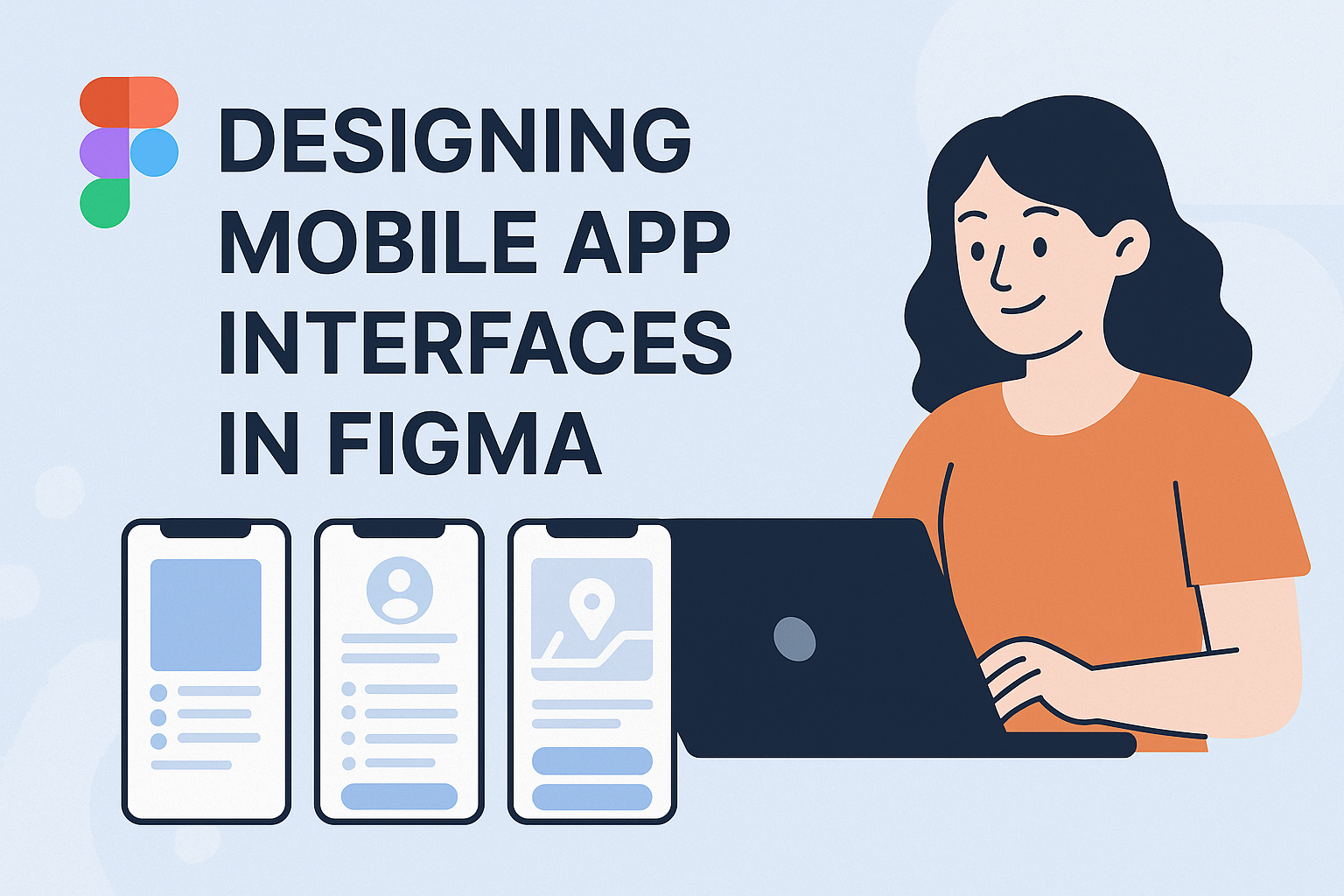
Understanding the Figma Interface
Figma is a powerful tool for designing mobile app interfaces, featuring a user-friendly layout and intuitive controls. Grasping the basics of its tools and panels is essential for setting up projects with ease.
The Basics of Figma’s Tools and Panels
Figma’s interface consists of several essential components. On the left, the Layers Panel organizes all the elements within a project. It’s crucial for keeping track of different parts and making quick edits. The top menu bar provides access to common actions like undo, redo, and zoom, which help in navigating and adjusting designs efficiently.
In the center, the Canvas is where the design work happens. Users can add frames, shapes, and text, using the Toolbar at the top to select the appropriate tool. Familiarity with the Properties Panel on the right is also vital. This panel allows for detailed adjustments to elements, such as changing colors, sizes, and shadow settings.
Setting Up Your First Project
Starting a new project in Figma is straightforward. Begin by clicking on the “New File” button on the dashboard. This opens a blank canvas where the design process begins. Users can choose from various templates, which provide a base layout for specific types of projects.
It’s important to decide on screen sizes and orientations first. For mobile apps, select a baseline iPhone or Android frame. Then, implement a grid system to maintain design consistency. Grids can be customized in the Properties Panel by setting columns, gutters, and margins. This step keeps design elements aligned and organized throughout the project.
Design Principles for Mobile Apps
Designing mobile apps involves paying close attention to several essential elements. These include the thoughtful use of color and fonts, creating intuitive interfaces, and ensuring the app works well on different devices. Understanding these principles can lead to highly functional and appealing apps.
Color Theory and Typography
Color and text are pivotal in designing mobile apps. Colors evoke emotions and can guide users through the app. Designers often use a limited color palette to maintain consistency and avoid overwhelming users. Contrast is important to ensure text and buttons stand out clearly.
Typography affects readability and user engagement. It’s essential to choose fonts that are clear and match the app’s style. Consistency in font sizes and styles is crucial for a professional look. Pairing fonts wisely, like using bold for headings and a simple font for body text, can further enhance readability.
User Interface (UI) and User Experience (UX) Fundamentals
A well-designed user interface (UI) is intuitive, allowing users to navigate easily. Key elements include clear icons, simple navigation bars, and understandable text labels. UI design should aim for simplicity to prevent user overwhelm.
User experience (UX) focuses on the user’s overall journey and interaction. Ensuring an app is user-friendly means reducing the number of steps needed to complete tasks. Incorporating feedback, such as animations or sound cues, can enhance the user experience and make interactions more engaging and understandable.
Responsive and Adaptive Design
Responsive and adaptive design ensures that an app looks good on any device, whether it’s a smartphone, tablet, or desktop computer. Responsive design focuses on creating a single layout that adapts to various screen sizes using flexible grids and images.
Adaptive design involves crafting different versions of the app interface to fit specific devices. This approach can provide a tailored experience by adjusting the layout based on device capabilities. Both methods share the goal of maintaining usability and aesthetic appeal across platforms. This adaptability is essential for providing users with a seamless experience, regardless of their device.
Creating a Design System
Creating a design system in Figma involves more than assembling elements; it’s about crafting an environment where every component aligns seamlessly. Important aspects include defining color palettes and fonts, utilizing grids and spacing, and building a robust component library.
Defining Color Palettes and Fonts
Color palettes and fonts are the backbone of any design system. A consistent color scheme ensures that the app’s visual identity remains unified across different screens. Designers can choose colors that evoke specific emotions or align with brand guidelines.
Fonts play a significant role in readability and style. Selecting a set of fonts that complement each other is crucial. It’s helpful to use styles in Figma, where designers can manage fonts easily across the design. You may explore resources like Figma’s Simple Design System, which incorporates practical fonts and color examples.
Utilizing Grids and Spacing
Grids and spacing create structure in a design, making it visually appealing and easy to navigate. Figma’s grid tools allow designers to maintain consistent alignment and distribution of elements. These features ensure that designs are not only aesthetically pleasing but also functional on various devices.
By using grids effectively, designers can place components in a balanced manner. Consistent spacing between elements prevents clutter and guides the user’s eye smoothly through the app. A few clicks in Figma can create and adjust grids, ensuring adaptability to screen size changes.
Building a Component Library
A component library serves as a catalogue of reusable elements, speeding up the design process. Components can range from simple buttons to complex navigation bars, ensuring consistency throughout the app.
In Figma, components simplify modifications across the design. When a component is updated, all instances in the design adjust automatically, saving effort. Figma’s ability to create such a library aids in maintaining uniformity across multiple projects. Designers often look to best practices like those described in Design systems 102 for building a cohesive system.
Developing Layouts and Navigation
Designing effective layouts and smooth navigation is crucial for user satisfaction in mobile app interfaces. These features ensure a cohesive and engaging user experience, guiding users seamlessly through the app.
Wireframing Techniques
Wireframing is a vital step in creating mobile app layouts. It helps designers sketch out the basic structure and layout of screens before adding detailed design elements. Using tools like grids and rulers in Figma, designers can keep their wireframes organized and proportionate.
Wireframes should focus on the placement of key elements such as buttons, menus, and images. This step allows designers to plan the user journey and decide on the hierarchy of information. It’s a straightforward process that prioritizes simplicity to ensure users can easily navigate through the app.
Collaborative tools in Figma allow teams to share wireframes and gather feedback in real time. This feature promotes iteration and improvement, ensuring the best possible layout before moving on to the design phase.
Prototyping Interactions and Transitions
Prototyping brings app designs to life by adding interactions and transitions. In Figma, designers can create interactive prototypes to visualize how users will engage with the app. This stage involves setting up gestures like taps, swipes, and drags to guide user actions.
Smooth transitions between screens enhance usability. Designers focus on how each interaction leads to another screen or action to create a flow that feels natural. Tools in Figma make it easy to test interactions and ensure that navigation is intuitive.
It’s important for prototypes to mimic the final product closely. This helps in identifying any usability issues early, allowing designers to make necessary adjustments before the app goes live. Regular testing of prototypes can refine the user experience, making navigation effortless and enjoyable.
The Art of Iconography and Illustration
Creating visually appealing mobile app interfaces requires attention to the smallest details, including icons and illustrations. These elements should be clear, functional, and aesthetically pleasing to enhance user experience.
Designing Custom Icons
Custom icons play an important role in app design. When designing icons, clarity is key. Icons should be simple and easily recognizable to convey their purpose quickly. A guide to iconography design suggests keeping icon names clear and straightforward, like naming a lightbulb icon “lightbulb” instead of something complicated.
Using design tools like Figma or Sketch, designers can create icons that match the app’s style. It is essential to maintain consistency in size, color, and style across all icons to create a cohesive look. Custom icons can enhance app-specific functionality, ensuring that unique features are both noticeable and intuitive.
Incorporating Vector Graphics
Vector graphics are ideal for mobile app illustrations due to their scalability and quality. They remain clear and sharp, regardless of size adjustments, making them perfect for various screen sizes. Designers can access a wide range of editable illustrations in design software like Figma.
Using vector graphics also allows for easy customization. Designers can modify colors and details to fit the app’s visual theme. This flexibility enhances the app’s design, ensuring that illustrations not only support functionality but also add to the app’s aesthetic appeal. By incorporating these graphics, apps benefit from visuals that are both functional and attractive.
Incorporating Imagery and Multimedia
Incorporating images and multimedia can significantly enhance a mobile app’s user experience. Effective use of visuals helps convey information quickly and engage users with the app’s content.
Working with Images and Video
Using images and videos in an app can create an engaging user interface. Designers should choose high-quality visuals that align with the app’s purpose and brand identity. They should also consider how visuals appear on different screen sizes and orientations.
Integration of videos can provide interactive elements. Short clips can illustrate features or demonstrate usage. Careful attention to file size is crucial. Large files can slow down the app and frustrate users. Strategies like using compressed formats, such as JPEG for photos and MP4 for videos, can maintain quality while reducing size.
Image Optimization and Scalability
Optimizing images ensures they load quickly and display correctly across devices. Designers can use tools to compress images and maintain their clarity. Striking a balance between quality and performance is key. Designers should also consider vector images for scalability, as they adjust without losing quality.
Scalability is vital for consistent app appearance across various screen resolutions. Using adaptive image scaling techniques helps. For instance, graphic elements may change in size while maintaining proportions. This ensures that visuals remain clear and functional on all devices. Skilled designers will maintain the app’s aesthetic appeal while optimizing images appropriately.
Collaboration and Feedback Integration
Designing mobile app interfaces is more efficient and effective with strong collaboration and clear feedback. Figma’s features enhance teamwork and allow designers and stakeholders to exchange ideas easily.
Real-Time Collaboration Features in Figma
Figma offers powerful tools for real-time collaboration. Its cloud-based platform allows team members to work on the same design file simultaneously. This feature works across different locations, making it perfect for remote teams. Users can see each other’s cursors and edits live, reducing misunderstandings and improving productivity.
The platform includes a commenting feature that lets users leave notes directly on the design. This ensures that feedback is both clear and location-specific. Editing permissions can be adjusted to include or restrict certain users, maintaining control over the project. These tools help keep the team aligned and on track.
Collecting and Applying Feedback
Collecting feedback in Figma is straightforward. The comment tool lets users attach detailed feedback directly to specific design elements. This prevents confusion and helps designers understand exactly what needs to be improved. Stakeholders can offer suggestions and critiques, which can be easily tracked and managed.
Version history is another useful feature. It allows designers to review past changes and revert to previous versions if necessary. This ensures that feedback is integrated smoothly without losing any valuable work. By fostering an environment where feedback is easy to give and receive, Figma promotes continuous improvement and a productive workflow.
From Figma to Development
Transitioning from design to development requires careful attention to detail to ensure effective implementation. Designers can streamline this process by exporting assets properly and maintaining design consistency across the app.
Exporting Assets for Developers
Exporting assets from Figma is an essential step in the design to development handoff. Designers should ensure that all necessary assets are prepared in the correct formats and resolutions. Figma allows assets to be exported in various formats such as PNG, SVG, and PDF. Using vector files like SVG can be advantageous for maintaining quality across different screen sizes.
Organizing files in Figma into clear, labeled folders helps developers quickly locate what they need. Providing assets at multiple resolutions ensures compatibility with different devices. Including detailed specifications, like dimensions and spacing, also aids developers in recreating designs accurately.
Ensuring Design Consistency
Consistency in design is crucial for a seamless user experience. Figma’s design systems and component libraries can help achieve this. Designers can create reusable components that maintain the same look and behavior across different screens of the app.
By using shared styles for colors and typography, designers ensure that the app looks cohesive. This also makes updates more efficient, as changes made to a component or style automatically reflect wherever they are used. Design tokens, which are standardized variables defining design system elements, can be helpful for developers to implement designs consistently.
Testing and Iteration
Testing and iteration are key steps in designing mobile app interfaces. They help refine the user experience and ensure the app meets user needs effectively.
Conducting Usability Testing
Usability testing is essential in identifying how users interact with the app. It involves observing real users as they navigate through the interface. Tests should focus on key tasks that users are expected to perform. This helps designers see where there might be confusion or difficulty.
Using tools like heatmaps or session recordings can provide additional insights into user behavior. Feedback from users is important to reveal pain points. It is also helpful to conduct these tests in different stages of development. This saves time and resources, allowing designers to adjust quickly based on real-world data.
Iterating Based on Test Results
Iteration involves making changes based on feedback from usability tests. Once problem areas are identified, designers can prioritize which issues to address. This often begins with tackling the most critical problems first. Regular updates and small tweaks can lead to significant improvements in user experience.
Creating a list of actionable steps from test insights is useful. Designers should focus on enhancing clarity and usability. Implementing changes should be followed by another round of testing to evaluate their effectiveness. This cycle of test, iterate, and retest helps polish the app’s design.
Keeping Up with Trends and Updates
In the world of mobile app design, trends change quickly. Keeping designs fresh and updated is crucial to staying relevant. Designers should regularly explore resources like the Figma Community mobile apps section to find free templates and inspiration. These resources help designers stay ahead by providing access to a variety of design solutions.
Regularly reviewing current UI principles can be beneficial as well. For example, using the principle of proximity helps in creating intuitive interfaces by grouping similar elements together. This is explained in more detail in the UI design principles page. Integrating these principles helps maintain a modern and clean look.
Plugins in Figma are another great tool for staying updated. They extend Figma’s functionality by enhancing tasks such as accessibility checks and image optimization. These plugins are detailed further on GeeksforGeeks. They save time and large amounts of effort during the design process.
Lastly, observing successful apps like Airbnb or Spotify can provide insights into effective design strategies. Their focus on user experience can inspire new ways to keep interfaces engaging and user-friendly. According to Savvycom Software, these companies succeed by creating interfaces that boost user retention and brand loyalty.