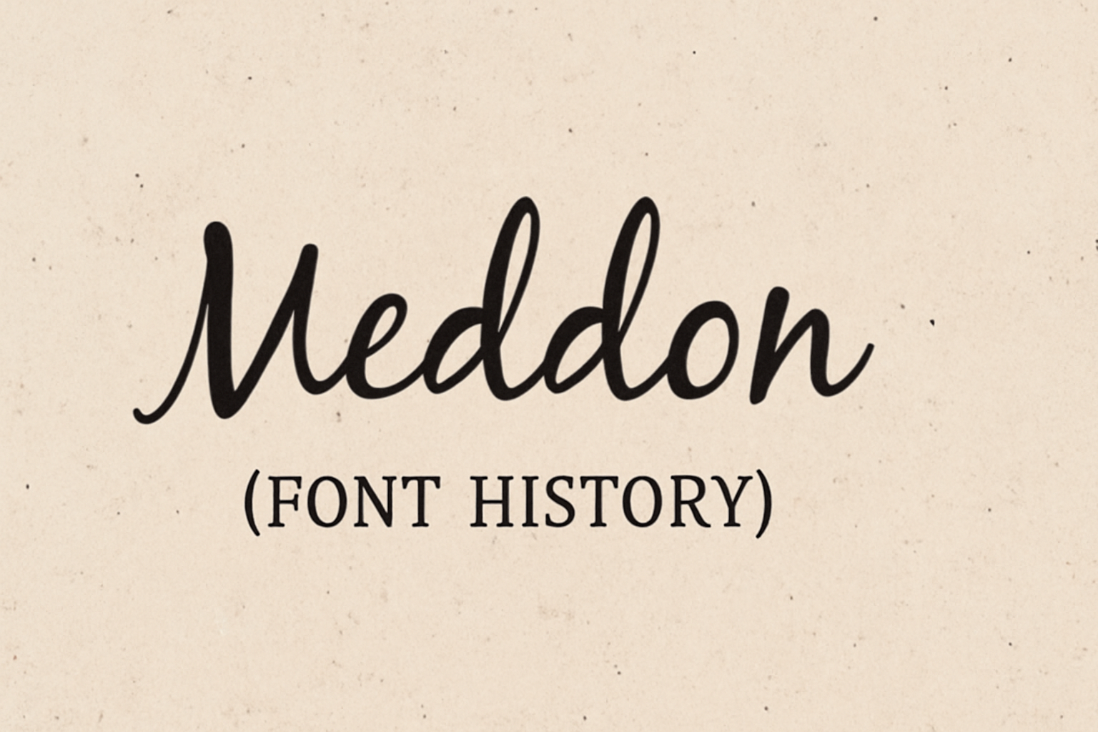
Meddon is a font that captures the charm of handwritten script from an Eighteenth century legal document. Its style brings a personal, casual feel, often reminding readers of handwritten letters or journals. Designed by Vernon Adams, Meddon offers elegance in digital typography.
This handwriting font has made quite an impact since it was first created. It combines historical flair with modern usage, making it versatile for various creative projects. Meddon’s continued popularity shows its timeless appeal, drawing in designers who appreciate its unique character.
Updates and new versions of Meddon are being developed to include many alternate characters and swashes. These updates aim to enhance compatibility with new web browsers that support OpenType font shaping. If you’re looking for a font that merges classic style with contemporary design needs, Meddon might just be the perfect fit.
Origins of Meddon
Meddon is a typeface with a rich background. It draws from the aesthetics of medieval writing while being crafted by a modern type designer. This blend gives it a unique charm that bridges historical styles with contemporary design.
Medieval Manuscripts Inspiration
The design of Meddon takes a lot from medieval manuscripts. These ancient documents, often handwritten, were known for their detailed and flowing letterforms. Scribes focused on creating text that was both beautiful and functional. The curves and flourishes of these old scripts were essential in shaping what Meddon would become. This historical influence gives Meddon its distinct and elegant look, reminiscent of a time when writing was an art form practiced by skilled hands.
Creation by Vernon Adams
Vernon Adams brought Meddon to life. Known for his work on digital fonts, he transformed the elegance of handwritten scripts into this digital typeface. Adams had a knack for capturing the essence of traditional styles while adapting them for modern use. Meddon is a handwriting font created from an eighteenth-century legal document, showcasing his ability to translate historical documents into digital formats. His dedication to preserving the originality of old manuscripts while making them accessible today gives Meddon its compelling appeal.
Design Characteristics
Meddon is a unique handwriting font inspired by an old legal document. Its distinct style is marked by irregular letterforms and varying stroke widths. This font’s design combines historical charm with modern use, making it a distinctive choice for creative projects.
Handwritten Qualities
Meddon captures the essence of eighteenth-century handwritten scripts. Designed from an old legal document, it preserves the flow and elegance typical of that era. The font carries a natural handwritten feel with varying strokes, making it suitable for projects wanting a personal touch. Its handwritten quality might draw attention in creative projects like invitations or greeting cards where a human element can enhance the messaging.
Unique Glyph Design
Meddon features artistic glyph designs that stand out. Each letter has its own unique flair, contributing to the overall distinctive look. Designers have expanded the font to include alternate characters and swashes, adding to its versatility. This makes it easier to incorporate Meddon into different platforms that support Opentype font shaping. Swashes and flourishes can give digital projects a classic, elegant feel.
Readability and Usage
Although charming, Meddon’s readability can vary depending on how it’s used. The irregular letterforms and stroke widths can affect legibility, especially in smaller text sizes or dense text blocks. Its spacing between characters and x-height might present challenges in these settings. This font works best for headlines or short text where its unique style can shine. Designers should consider accessibility when working with Meddon, ensuring it’s easy to read for all users.
Evolution of Meddon
Meddon has undergone changes since its initial creation, reflecting shifts in design technology and user preferences. This section covers its first introduction and ongoing refinements.
Initial Releases
Meddon began as a handwriting font derived from an 18th-century legal document. Its design stayed true to the original script, which helped showcase its unique charm and historical appeal. At first, the font had limited character options, fitting the needs of simpler text designs.
Its irregular letterforms and varied stroke widths gave it an old-world charm but made it challenging to use in digital environments. The x-height and character spacing were adjusted mainly for decorative and limited text use, which established its niche appeal among users looking for authenticity.
Updates and Refinements
With advances in web browsers and font technology, Meddon underwent significant updates. A new version included alternate characters and swashes, improving its versatility. These changes were a response to the need for better compatibility and visual appeal in digital settings.
Efforts were made to enhance its readability without losing its distinct look. Designers worked on OpenType font shaping to include features that better support character variations. This helped to address previous concerns about legibility in smaller sizes and dense text environments, making it more user-friendly for various applications.
Cultural Impact
Meddon, a handwriting font, has found its place in different areas, from media to branding. People often look for fonts that bring a sense of tradition or a personal touch.
Use in Modern Media
In modern media, Meddon is recognized for its unique, handwritten style. This font often appears in movie titles or posters, giving them an authentic and classic feel. TV shows also use it in opening credits, where a personal touch is needed. The font’s link to historical documents adds a layer of authenticity.
Meddon’s use is not limited to just films or shows. It also finds its place in social media graphics. Creators and influencers use it to add character to posts and stories. Its handwritten style stands out in the digital world of uniform fonts.
Popularity in Branding
Brands often choose Meddon to evoke warmth and tradition. This font is popular for products that want to appear artisanal or handmade, like organic foods or crafted goods. The historical touch makes it ideal for brands that want to look both authentic and timeless.
Meddon works well on packaging, business cards, and logos. Its distinctive style helps brands create a memorable image. Those who select Meddon seek to communicate trust and personality to their audience. Companies looking for a vintage touch often choose Meddon for both print and online materials.
Technical Specifications
Meddon is a handwriting font with distinct characteristics and specific requirements for optimal use. Users can explore different formats and licensing options to apply the font in various projects.
Font Formats and Files
Meddon is designed in multiple file formats to cater to different needs. Commonly, it is available in TrueType (TTF) and OpenType (OTF) formats. These formats ensure compatibility with a wide range of applications and systems. The OpenType version supports advanced typography features that may include alternate characters and swashes, which enhance its functionality for creative designs.
The font can be easily downloaded and installed on most systems. When integrating Meddon into web projects, using a tool like Google Fonts can streamline the process. This accessibility makes it a versatile choice for designers seeking a handwritten style.
Licensing and Distribution
Meddon is available under an open-source license, which permits both personal and commercial use. This flexible licensing arrangement allows users to incorporate the font into diverse projects without licensing concerns. Websites such as Bunny Fonts provide access to download the font freely.
Licensed distributors like Fonts Ninja offer purchase options for more extensive features or additional formats. These options ensure users can find solutions tailored to their particular needs, whether requiring additional font weights or specific licensing details for wide-ranging use.
How to Use Meddon
Meddon is a versatile handwriting font that adds a personal touch to creative projects. It pairs well with certain modern fonts and works best in artistic settings.
Pairing with Other Fonts
When using Meddon, pairing it with a complementary font enhances its appeal. Roboto is a popular choice because of its clean and modern look. This contrast with the playful style of Meddon creates a visually striking balance.
Combining these fonts can highlight headers and artistic elements while keeping body text readable. It’s crucial to ensure that the accompanying font is simple yet aesthetically fitting. Matching Meddon with too many elaborate fonts might overwhelm the design, so careful selection is key.
Best Practices for Designers
Designers should use Meddon in projects where a handwritten style fits naturally. Its historical charm makes it ideal for wedding invitations, vintage-themed posters, and artistic branding materials.
To make the most of Meddon’s aesthetic, designers should focus on projects that benefit from a touch of individuality. The font can add personality and draw attention, but it’s important to maintain legibility. Creators should avoid using it in large blocks of text since its decorative nature shines best in headers and accents.