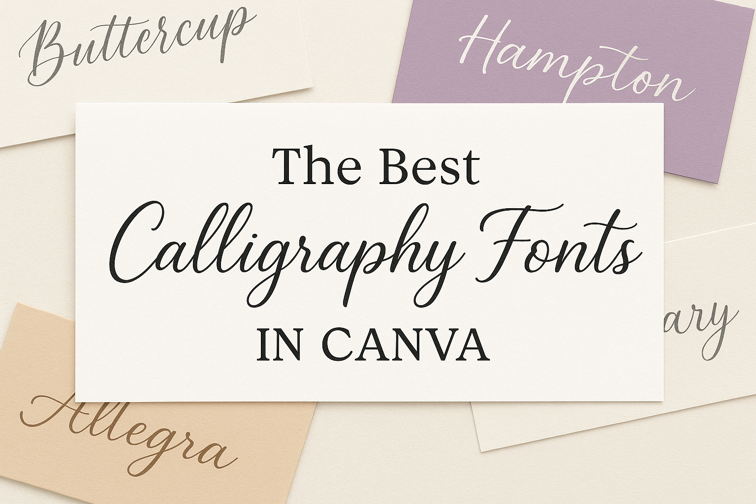
Calligraphy fonts add a touch of elegance and creativity to any design project. Whether it’s for invitations, branding, or personal projects, Canva offers a variety of free calligraphy fonts to bring your ideas to life. Choosing the right font can transform simple text into an eye-catching masterpiece.
In the world of design, the style and flow of a font can create a lasting impression. Fonts like Lucida Calligraphy and Lavonia Classy bring a sense of tradition and sophistication to the table, perfect for certificates or luxury branding. For those looking to add a modern twist to their designs, Angella White and Yellowtail offer stylish and contemporary options on Canva’s platform.
Great calligraphy fonts can elevate your project’s style and impact. With the many options available, Canva makes it easy to find the perfect match for any kind of design work. The availability of these fonts can inspire creativity and help designers create unique and memorable visuals.
The Charm of Calligraphy in Design
Calligraphy adds a unique elegance and personality to design projects. Through its artistic nature and historical roots, it influences aesthetics, enhances branding, and conveys emotions through beautifully crafted letters.
Defining Calligraphy
Calligraphy is the art of beautiful handwriting, where style and form matter most. It involves creating visually appealing characters using specific tools like brushes or pens. These tools help produce varying line thicknesses, which are characteristic of this art form. Calligraphy’s emphasis on curves and flourishes sets it apart from ordinary handwriting.
In design, calligraphy can express nuances such as elegance or flair, fitting a project’s theme or aesthetic. Whether for invitations, logos, or signage, calligraphy offers a way to communicate artistic intent through text.
History and Evolution
Calligraphy has its roots in ancient civilizations like China and Egypt. It evolved alongside writing systems, particularly Arabic, Latin, and East Asian scripts, each with distinct styles. The tradition carried through the ages, influencing modern typography and digital fonts.
Over time, tools and techniques have changed, progressing from traditional quills to modern pens and digital tools. Despite technological advancements, calligraphy maintains its craftsmanship essence, providing a timeless appeal in various media.
Impact on Aesthetics and Branding
In design, calligraphy fonts create a sophisticated and classic look. Brands often use these fonts for luxury products, defining elegance and exclusivity. Calligraphy conveys a sense of refinement that can elevate a brand’s presence.
For personal projects, calligraphy establishes a unique style, making invitations or cards stand out. In digital media, calligraphy fonts enhance visual storytelling, leaving a lasting impression due to their artistic detail. Therefore, calligraphy plays an essential role in both personal and professional design environments.
Navigating Canva’s Font Library
When exploring Canva’s font library, users can find a wide range of stylish calligraphy fonts perfect for any design project. It’s essential to know how to access these fonts and understand the differences between Canva Pro and free font options.
Accessing Font Options
Accessing fonts in Canva is straightforward. Users begin by opening a design and clicking on the text tool. This action opens the font library, where they can browse through various categories. Searching for specific styles or names can help narrow down the choices.
Another helpful feature is the font pairing suggestions, which show how different fonts complement each other in a design. This is especially useful for creating balanced and professional-looking projects.
In addition, users can filter fonts by popularity, recently added, or alphabetical order. This makes finding the right calligraphy font easier, speeding up the design process.
Canva Pro vs Free Fonts
The difference between Canva Pro and free fonts can affect the design experience. Free users have access to a good selection of calligraphy fonts but might encounter some limitations. Some premium fonts are marked with a crown icon, indicating they are available only to Canva Pro subscribers.
Subscribing to Canva Pro unlocks a broader selection of exclusive fonts. This provides more options for those seeking unique or high-end styles. Canva Pro also allows users to upload custom fonts, adding another layer of personalization.
While free fonts are great for simple designs, investing in Canva Pro can be beneficial for those who frequently need advanced features. This makes it easier for designers to find the perfect font for any project.
Top Calligraphy Fonts in Canva
Canva offers an array of calligraphy fonts perfect for any design need. From elegant scripts to modern styles and traditional classics, there are options to suit various preferences.
Elegant Script Fonts
Script fonts bring a stylish touch to designs. Great Vibes, with its elegant lines, is a favorite for wedding invitations and stylish greetings. It flows beautifully and adds a classy look to any project.
Bellaboo Script is another wonderful choice. It offers a personalized feel, which is great for unique invitations or cards. Its curves and flourishes make it stand out without overwhelming the design. Angella White is also popular for logos, offering a sophisticated air with thin strokes. Each of these fonts can transform a simple design into something special and memorable.
Modern Calligraphy Choices
Modern calligraphy fonts blend traditional elegance with contemporary flair. Lavina features vintage vibes and graceful loops, ideal for those looking to add a touch of nostalgia. This makes it perfect for romantic designs or greeting cards that require charm.
Lucida Calligraphy brings a tone of prestige. It’s often used for certificates or upscale branding, offering class and refinement. Great Vibes captures contemporary designs with thin, flowing lines, suitable for any event that demands elegance mixed with modernity. These styles are versatile, fitting both playful and professional designs.
Traditional Calligraphy Styles
Traditional calligraphy fonts continue to inspire with their classical aesthetics. Lavonia Classy offers elegance and exclusivity, perfect for high-end fashion or luxury cosmetics. Its traditional prestige stands out, capturing attention without overpowering.
Lucida Calligraphy holds a solid reputation, known for its versatility in formal settings. It’s frequently used in upscale branding, providing a strong sense of tradition. Fonts like these ensure designs hold onto their timeless beauty, exuding familiarity and warmth in a modern world. Such classic fonts never go out of style, maintaining relevance across different design contexts.
How to Choose the Right Calligraphy Font
Choosing the right calligraphy font can greatly enhance the design of your project. The best font depends on the project type and how well it pairs with other fonts and elements in your design.
Considering the Project Type
The type of project is key when selecting a calligraphy font. For instance, Lucida Calligraphy works well for certificates and upscale branding, giving them a touch of prestige. On the other hand, fonts like Lavonia Classy are perfect for luxury fashion or cosmetics, adding an exclusive feel.
Event invitations typically call for elegant and sophisticated styles. Chicano fonts, which draw from traditional styles, are great for tattoo designs and add a bold look that’s still artistic. By matching the font to the project, you ensure consistency and appeal.
Look into the purpose and tone of the project to decide if it demands a formal, modern, or casual vibe. This will help narrow down the font choices to what best suits the project’s needs and aesthetics.
Font Pairing Tips
Combining calligraphy fonts with others requires harmony. Start by matching fonts that share similar characteristics, such as thickness or letter shapes. This helps create a cohesive look.
Contrast can also enhance designs. Pairing a flowing script with a simple sans-serif font can make the calligraphy stand out. Be cautious with combining too many script fonts, as this might clutter the design.
Think about readability. Calligraphy fonts with intricate details may look beautiful but can be hard to read in small sizes. Use these fonts for headings or short phrases, while simpler fonts can handle larger blocks of text. This balance ensures both visual interest and functionality.
Using Calligraphy Fonts Effectively
Calligraphy fonts can bring elegance and style to any design. Knowing how to customize them, balance their weights and sizes, and apply color theory can elevate a project.
Customization Tricks
Customizing calligraphy fonts is key to creating unique designs. Users can start by adjusting the letter spacing, also known as kerning, to ensure the text is visually pleasing. Increased spacing adds a touch of modernity, while tighter spacing feels more traditional.
Another effective trick is using layering. Designers might overlay transparent layers of the same text, perhaps with different opacities or colors, to create depth. This technique adds interest and can draw attention to important parts of the design.
Additionally, experimenting with gradient fills can make text pop. A single color across all letters might work in some cases, but gradients give fonts more texture and dynamism. Remember to keep the overall design goal in mind when customizing.
Balancing Font Weights and Sizes
Balancing weights and sizes is crucial for harmonious design. When choosing multiple calligraphy fonts, it’s important to mix different styles thoughtfully. For example, pair a bold, heavy script with a lighter, more delicate font to create contrast.
Size also plays an essential role. Larger fonts can be used for headings or to emphasize key messages. Smaller fonts might serve as subtitles or additional info. Designers should ensure there’s a clear hierarchy, so readers understand the importance of each section at a glance.
One helpful approach is creating a visual balance with sizing. If a new font seems to disrupt the layout, try adjusting its size first. Consistent alignment and spacing will also help maintain balance and readability.
Color Theory and Calligraphy Fonts
Color heavily influences how calligraphy fonts are perceived. Using the right colors can enhance the message of the design. Consider the emotional impact of colors. For instance, blue often feels calming, while red brings energy.
Contrast is key in color theory. Dark fonts on a light background, or vice versa, ensure text is readable. Designers should also test their color choices in grayscale, as this helps guarantee good contrast.
Complementary colors further enhance calligraphy. Paired colors can provide balance and make text stand out. For designers, understanding color interaction is vital for creating appealing and effective layouts.
Incorporating Calligraphy in Various Designs
Calligraphy fonts on Canva can add elegance and personal flair to many design projects. They are perfect for creating unique invitations, enhancing brand logos, and making eye-catching social media graphics.
Invitations and Announcements
Using calligraphy for invitations and announcements creates a lasting impression. This style adds a touch of sophistication and is often used in wedding invitations and formal events.
Elegant fonts like Great Vibes or Daydream complement delicate designs with their graceful letterforms. Traditional events might benefit from Vivaldi’s timeless appeal.
Combining calligraphy fonts with simple backgrounds keeps invitations readable and ensures the text remains the focal point. Use space wisely and consider the balance between text and design elements to maintain overall harmony.
Logos and Branding
Incorporating calligraphy into logos and branding gives a unique and personalized feel. Logos with calligraphy can help a brand stand out and convey elegance or creativity, depending on the style chosen.
For traditional brands, a font like Vivaldi may exude class, while a modern font like Ahsing could bring a contemporary twist. It is essential to ensure that the calligraphy font aligns with the brand’s identity and message.
Calligraphy in logos must retain legibility across various media and be versatile enough to work on business cards and digital platforms alike.
Social Media Graphics
Calligraphy in social media graphics helps capture attention and brings a creative edge. Elegant fonts can be used in quotes, announcements, or promotional posts to enhance visual appeal.
In these graphics, balancing ornate fonts with minimalistic elements is key to ensure readability on small screens. Fonts like Great Vibes can add sophistication without overwhelming the design.
When choosing calligraphy for social media, it’s important to consider consistency with other branding elements. This ensures that posts not only look good individually but also create a cohesive brand image across platforms.
Best Practices for Calligraphy on Digital Platforms
Using calligraphy digitally involves unique strategies to ensure that the fonts are effective and attractive. Focus is placed on making it readable on screens and understanding how digital and print contexts differ.
Readability on Screens
When using calligraphy on screens, readability is crucial. Choose fonts with clear letter shapes, so text is legible even at small sizes. Avoid overly intricate styles, as they may blur on low-resolution screens or when scaled down.
Colors also affect readability. High-contrast combinations, like dark fonts on light backgrounds, enhance clarity. It helps users with varying screen brightness.
Spacing plays a key role, too. Ensure enough space between letters and lines to avoid a crowded look. This adjustment helps in maintaining legibility on different devices such as tablets, phones, or computers.
Web vs. Print Considerations
Calligraphy on the web and in print serves different needs. Online, fonts should load quickly. Consider using web-friendly formats like WOFF or WOFF2, which download efficiently and maintain quality.
The use of fonts also varies. While print allows for full-color designs, web design often requires simpler schemes due to monitor display limitations. This means sometimes sacrificing detail for faster load times and better user experience.
Another consideration is scalability. On websites, fonts might need to resize responsively. Ensuring that calligraphy remains crisp and legible at various sizes is crucial for maintaining aesthetic appeal and functionality across platforms.