Selecting the right font can transform a movie poster into a captivating piece of art that captures the essence of a film. Cinematic fonts often carry the weight of a film’s theme and genre, serving as a visual cue that sets the mood for the audience even before they watch the first scene. With a vast array of options available in Canva, designers have the power to choose fonts that not only complement the visual aesthetics of their project but also enhance the overall storytelling experience.
Canva’s collection includes a range of fonts suitable for dramatic and impactful movie posters. Each font brings its own personality, from elegant and classic to modern and edgy, ensuring creatives can find exactly what they need for their design project. Fonts like Nexa Rust offer a textured quality that can add a rustic feel, while clean, geometric sans-serifs like Nexa provide excellent legibility for a sleek, contemporary look.
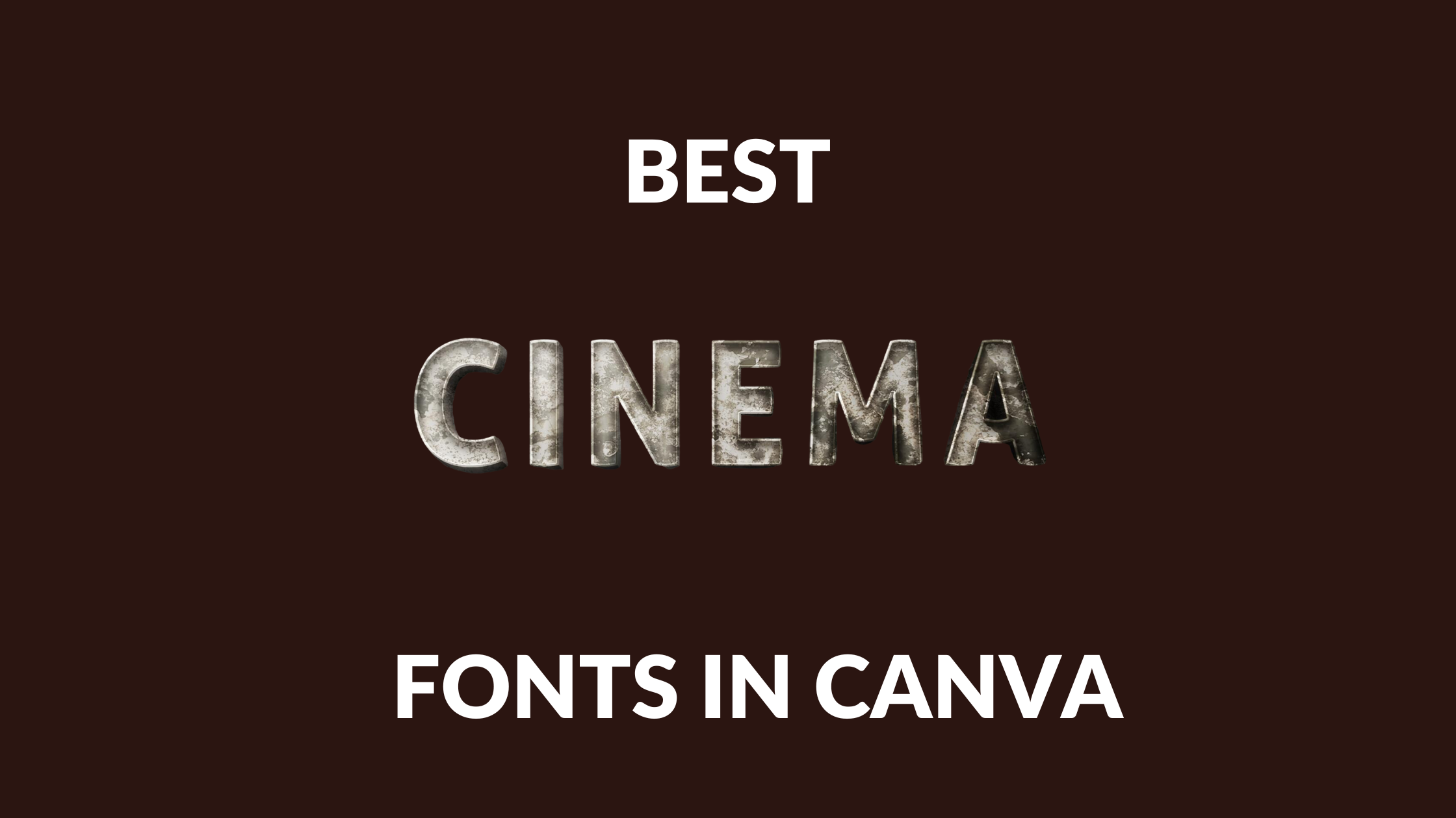
Understanding Cinematic Fonts
Cinematic fonts have a profound impact on the atmosphere and branding of films. They are crucial in setting the tone for the viewer and creating an immersive experience.
Defining Cinematic Typography
Cinematic typography refers to the stylized fonts and text designs used in film-related materials, such as movie posters and trailers. These fonts are designed to evoke the same emotions and themes that the film intends to convey. For example, a sci-fi movie might use a sleek, futuristic typeface like Andoria Sci-Fi Font, while a film with an 80s theme might opt for a retro font such as Last Dance.
Importance in Film and Design
In film and design, the font selection plays a vital role in grabbing attention and communicating the genre. Bold and dramatic typefaces can enhance the visual storytelling of a movie poster, making the difference between a forgettable design and a memorable one. Within platforms such as Canva, designers have access to an array of cinematic fonts, like Gagalin for a retro comic feel or Lato Bold for a clean, modern aesthetic, which allows for consistent branding across a film’s marketing materials.
Top Cinematic Fonts in Canva
Selecting the right font is crucial for creating an impactful movie poster or title sequence. Canva offers a diverse range of fonts that cater to different cinematic themes, from bold and dramatic to elegant and clean.
Bold Impact Fonts
For titles that need to make a statement, a bold impact font is essential. These fonts are ideal for creating an impression of strength and action.
- Amazoone – A bold hand-drawn brush font that delivers a strong visual punch.
- Merchant Ledger – With robust lines, this font gives a commanding presence on any poster.
Classic Serif Fonts
Serif fonts bring a traditional and sophisticated feel to cinematic designs. They are often used for period pieces or films that require an air of elegance.
- Ruttan – An elegant serif font that offers a refined look for any classic-themed design.
- Desmon – A modern typeface with serifs that provide a sense of formality and gravitas.
Modern Sans Serif Fonts
Clean, simple, and versatile, modern sans serif fonts give a contemporary feel and are readable at various sizes.
- Nice – A minimalist sans-serif font that’s both modern and extremely legible.
- Kilimanjaro Sans – Offers a sleek and futuristic style suitable for sci-fi and modern themes.
Handwritten and Script Fonts
For a personal touch or to convey emotion, handwritten and script fonts can add a unique element to cinematic projects.
- Last Dance – A retro 80s movie-inspired script that adds a touch of nostalgia.
- Sunset Script – A beautiful handwritten font perfect for intimate and emotive storytelling.
How to Choose the Right Font
Choosing the right font is a critical part of creating a visually compelling movie poster in Canva. The font selected not only needs to reflect the essence of the film but also ensure clarity and impact at a glance.
Considering the Film Genre
Each film genre conveys a different atmosphere, and fonts have the power to mirror this. For instance, a thriller might benefit from sharp, angular typefaces such as “Ossem Rust” which exude tension. On the other hand, a romantic comedy might lean towards warm and whimsical fonts like “Waterlily” to capture its light-hearted spirit.
Matching Fonts with Mood
The mood of the movie should resonate through its font choice. An epic space adventure could utilize robust fonts with clean lines and futuristic styling to embody its cutting-edge nature. Alternatively, a period drama might call for elegant serif fonts that reflect the historical context of the film with a touch of sophistication.
Legibility and Readability
Regardless of the font’s style, it is imperative that it remains legible and readable. This involves considering factors such as font size, weight, and color contrast against the poster background. Viewers should be able to decipher all text from various distances and angles without misinterpreting the information conveyed. Using fonts with clear distinctions between letters, like “Cooper Hewitt”, enhances overall legibility.
Applying Fonts in Canva
When designing in Canva, one has access to a variety of fonts suited for cinematic purposes. The selection and application of these fonts can significantly enhance the visual appeal of movie posters and related designs.
Navigating Canva’s Font Library
Canva’s font library is user-friendly, allowing designers to easily browse through a myriad of font choices. Users can filter fonts by categories such as serif, sans-serif, and display, making it simple to find a font that fits their project’s mood and style. The search function also helps in quickly locating specific fonts or types.
Customizing Fonts for Your Project
Once a font is selected, customization is key to making it fit the design. Users can adjust font size, color, letter spacing, and line height. It’s advisable to use contrasting font colors against the background for readability. Also, one can apply effects like bold or italic to add emphasis where needed.
Pairing Fonts Effectively
Effective font pairing in Canva creates a coherent look that can bring cinematic designs to life. Canva suggests combinations that harmonize well, but a good rule of thumb is to combine a serif font with a sans-serif to balance readability and aesthetics. For instance, a strong, bold font for the title can be paired with a more subdued font for taglines or descriptions, ensuring the main message stands out.
Creative Tips for Cinematic Typography
When crafting a movie poster or video title in Canva, selecting the right cinematic font ensures that a project conveys the intended atmosphere and emotion. A well-chosen font can create a strong first impression and set the mood before the audience views the content.
Incorporating Visual Hierarchy
Visual hierarchy in typography dictates the order in which the audience perceives the information. To achieve this, one can vary the size, weight, and spacing of text. The title should generally be the largest element, with supporting details like taglines or credits appearing smaller. Bold choices for the main titles paired with more understated options for subtitles can guide the viewer’s attention effectively.
Using Color to Enhance Impact
Color can deeply influence the emotional response to typography. For a dramatic effect, one might pair a dark background with a bright font color such as white or yellow to ensure the text stands out. Alternatively, using muted tones can evoke nostalgia or a sense of the past, appropriate for period films. It is important to ensure there is enough contrast between the text and the background.
Animating Text for Engagement
Animated text can capture interest and add a layer of sophistication. Canva provides tools to animate text with various effects like fade, pan, or rise, which can be used sparingly to add movement. For instance, having the title slowly zoom in can draw the viewer’s eye and create anticipation. The key is to avoid overuse — subtle animation often works best to engage viewers without overwhelming them.