Choosing the right sans serif font for design projects in Canva is essential for giving them a clean and contemporary feel. These types of fonts are incredibly versatile, making them a go-to choice for a variety of design work, from professional presentations to engaging social media graphics. They lack the small projecting features called “serifs” at the end of strokes, which gives them a sleek, modern look.
Canva offers an array of free sans serif fonts, each with unique traits suited to different design needs. From the soft and rounded Alerta Stencil to the condensed and geometric Squada One, designers have the flexibility to select fonts that complement their brand’s voice and style. These fonts are not only high quality but also offer the adaptability required to design with consistency and flair.
With the platform’s extensive font library, finding the perfect sans serif typeface can be a daunting task. However, this selection is curated to enhance the aesthetic appeal of any project, whether for business branding, personal endeavors, or creative experiments. The availability of such a variety of sans serif fonts ensures that there’s something to match every designer’s vision.
Understanding Sans Serif Fonts
Sans serif fonts are characterized by the absence of the small projecting features called “serifs” at the end of strokes. They present a cleaner and more modern appearance. Designers often favor these fonts for their readability and versatility.
When choosing sans serif fonts, one should consider the context and mood they aim to convey. For instance, geometric sans serifs, like Squada One, have a more modern and clean style, making them ideal for contemporary designs. On the other hand, humanist sans serifs exhibit more warmth and are often more readable, which suits body text well.
In Canva, users have access to a variety of sans serif fonts. They can experiment with options such as the robust and neutral Helvetica, or explore something with a unique character, such as Alerta Stencil, which adds a playful touch to designs. Canva’s library includes sans serif fonts suited for both headings and body text, enabling users to create coherent and attractive designs.
Top Canva Sans Serif Fonts for Professional Designs
Choosing the right sans serif font is crucial for creating clean and legible professional designs. They select fonts based on their client’s brand voice, aesthetics, and readability across various media.
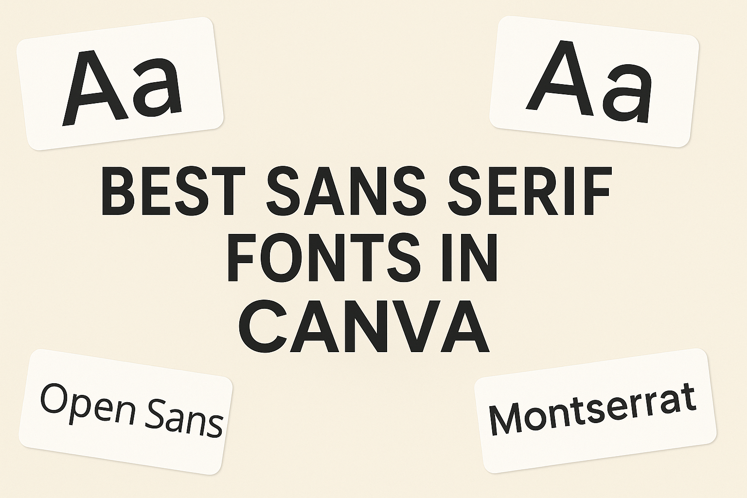
Montserrat
Montserrat offers a modern, geometric style ideal for designers who want to give their work a sleek, contemporary feel. It stands out for its versatility, making it suitable for everything from headers to body text.
Lato
Lato is known for its warm and welcoming appearance, providing a humanist touch to design projects. Designers commonly use it for both web and print to achieve a balance between professionalism and friendliness.
Open Sans
Open Sans is widely recognized for its legibility and clean design. Its characters are optimized for both digital and print environments, ensuring clarity and an accessible reading experience across all formats.
Popular Sans Serif Fonts for Branding
Selecting the right font is critical for establishing a brand’s identity. Among the plethora of choices, certain sans serif fonts have become particularly synonymous with professional and modern branding.
Futura
Futura is known for its geometric structure and efficiency in design. It conveys a sense of modernity and forward-thinking, making it a go-to choice for brands looking to project a clean, progressive image.
Helvetica Neue
Helvetica Neue is an update to the classic Helvetica font. Its clean, crisp lines offer excellent readability, which has lead to its immense popularity in corporate branding. Users appreciate its versatility across various applications.
Roboto
Roboto offers a balanced and approachable feel, combining geometric forms with friendly curves. This font is designed for clarity on both digital and print platforms, ensuring that a brand’s message is effectively communicated.
Sans Serif Fonts for Web Content
Selecting the right sans serif font for web content is crucial. It enhances readability, ensures accessibility, and maintains user engagement. Below are some recommended sans serif fonts available in Canva that are perfect for web-based text.
Source Sans Pro
Adobe’s Source Sans Pro is often celebrated for its versatility and readability. It’s designed for user interfaces, making it a strong choice for web content where clarity is key.
PT Sans
PT Sans is a popular font for web use, thanks to its open shapes and legible characters. It’s suitable for both text and headings, offering a professional look to websites.
Ubuntu
With its distinctive curves and easy readability, Ubuntu font is not only a reflection of the operating system’s philosophy but also a versatile choice for web content. Designed for clarity on desktop and mobile screens, it maintains its legibility across various digital platforms.
Unique Sans Serif Fonts in Canva
Canva offers an array of unique sans serif fonts that cater to various design needs. The following subsections discuss three distinctive sans serif typefaces available in Canva that stand out for their character and usability.
Raleway
Raleway is a sophisticated typeface with a touch of elegance due to its clean lines and modern design. It is highly versatile, making it suitable for both titles and body text in a variety of creative projects.
Asap
Asap, which stands for ‘As soon as possible’, is designed for clarity and efficiency. With a practical and straightforward appearance, it conveys information cleanly, making it ideal for designs that require quick readability.
Varela Round
Varela Round is a friendly and warm sans serif font that features soft curves and a rounded structure. This font’s approachable aesthetic makes it perfect for projects that aim to have a gentle and inviting feel.
Canva Pro Exclusive Fonts
Canva Pro users have access to an extensive library of premium fonts, enhancing their designs with unique typography. Each font has distinctive characteristics that offer various design applications.
Proxima Nova
Proxima Nova combines modern proportions with a geometric appearance, making it universally functional for design work. Its range of styles and weights allows for versatile usage in both digital and print media.
Gotham
Gotham is a widely appreciated font for its clean, assertive lines that convey strength without being imposing. This sans serif is popular for its clarity and professional look, suitable for a broad array of designs.
Avenir Next
Avenir Next is a polished font that portrays a sense of forward-thinking elegance. It’s an excellent choice for users who want to give their work a sleek, contemporary feel while maintaining excellent readability.
Best Practices for Sans Serif Fonts Usage
When selecting sans serif fonts in Canva for various projects, designers should prioritize legibility and branding consistency. Sans serif fonts are known for their clean lines which contributes to the overall readability, especially in digital formats. They should use these fonts to convey a modern and minimalistic feel to their designs.
A common best practice involves the pairing of fonts. Designers are encouraged to combine a sans serif font with a contrasting type, such as serif, to create a visual hierarchy. For example, bold sans serif fonts work well for headings, while a lighter serif can complement as body text.
To ensure a harmonious design, consistency in font weight and styling across the project is crucial. This means maintaining the same font styles for similar elements across a layout. Here is a basic guideline for consistent font usage:
- Headings: Bold or Semi-Bold
- Subheadings: Regular or Light
- Body Copy: Light or Regular
Designers should also utilize Canva’s tools, such as grid and layout templates, to help align their text for a cleaner appearance. They must be mindful of their audience and the platform of their design to optimize font size and spacing for the best user experience.
In sum, the efficient use of sans serif fonts in Canva involves great readability, appropriate pairings, consistency, and careful consideration of the audience’s needs. These practices help enhance the message being conveyed without overwhelming the reader.
Font Pairing Strategies
When choosing sans serif fonts in Canva for various design projects, consider the visual hierarchy. The combination of a bold, attention-grabbing font for headings paired with a more subdued, clean font for body text can be effective. This strategy ensures that the main messages stand out while the supporting text remains easily readable.
Contrast in Font Weight is also a key strategy. Designers often pair a heavy weight font for headlines with a light or regular weight font for body text. For example:
- Headings: Tenor Sans (Bold)
- Body Text: Lato Light (Regular)
Creating balance through Style Consistency ensures that the paired fonts share a few stylistic features. If the heading font is geometric, one might select a body font with subtle geometric influences to maintain a cohesive design.
Font Pairing Examples:
| Heading Font | Body Font | Use Case |
|---|---|---|
| Shrikhand | Ternor Sans | Modern Websites |
| Cooper Hewitt | Open Sans | Galleries, Editorials |
| Playfair Display | Source Sans Pro | Editorial Design |
| Montserrat | Roboto | Corporate Branding, Web Design |
These pairings help to create a polished, professional look in one’s designs. They balance readability with aesthetic appeal, ensuring that design communicates effectively.
Licensing and Use in Commercial Projects
When selecting fonts from Canva for commercial use, one must ensure they are compliant with the licensing agreements. Canva’s license allows users to use the fonts for free in commercial projects, but the specific terms may vary. That’s why it’s crucial to review each font’s license before integrating it into a commercial design.
For instance, some fonts under Creative Common licenses may require attribution, while others might not. Users should be attentive to the license details for fonts like Fanzine Regular or Impact Label, which are free but may have specific limitations.
To streamline the process, Canva often bundles the fonts with a general license that suits most commercial needs. Here’s a brief breakdown of things to consider:
- Check individual font licenses: Even within Canva, fonts may have different licensors, and each may have its own set of rules.
- Be aware of Commercial Use definitions: Understand that ‘commercial use’ can vary, and fonts used in marketing or products for sale might be regarded differently.
- Update on policies: Canva’s licensing policies may change, so always check for the most current information prior to using a font commercially.