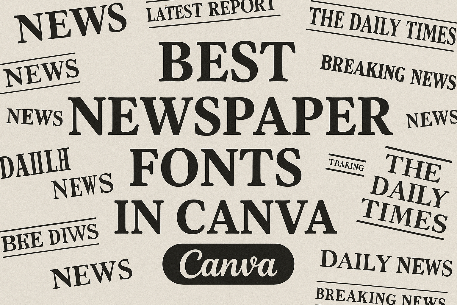
Choosing the right font can make all the difference in capturing the reader’s attention.
In the world of newspaper design, using classic and effective fonts sets the tone for each article.
Canva provides a variety of options that mimic traditional newspaper styles while adding a modern twist.
One of the top options is The Seasons, a serif font known for its elegant and inviting look. It offers high contrast and soft terminals, making it ideal for feature stories.
Another popular choice is Engravers’ Old English, which evokes a Gothic, historical feel perfect for formal news sections.
For those aiming for a more straightforward and classic appearance, Times New Roman remains a staple.
Each of these fonts provides unique qualities that can elevate a newspaper’s design, and with Canva, they are easily accessible and simple to implement.
To explore these fonts and more, check out 21 Newspaper Canva Fonts on Goofy Designer.
The Importance of Typography in Newspapers
Typography in newspapers plays a critical role in how stories are received and understood by readers. It affects both the readability of the text and the way it’s perceived visually, shaping a reader’s engagement with the content.
Impact of Font Choices on Readability
Font choices directly influence how easy it is to read a newspaper. A clear and legible font can make a big difference.
Typefaces like Times New Roman are popular for newspapers due to their classic and readable design.
Fonts with good spacing and size help the eyes move comfortably across lines of text.
Bold headings and italicized subtitles can enhance understanding by breaking up the content into manageable chunks. Using lists or bullet points also assists in making information digestible.
Readable fonts lessen eye strain, allowing readers to focus on the content without distraction.
Influencing Reader Perception Through Fonts
Fonts do more than make text readable; they also set the tone for the article.
Serif fonts often convey a sense of tradition and reliability, which is why they are commonly used in news publications. For example, UnifrakturMaguntia gives a vintage feel, which can enhance stories with historical backgrounds.
Conversely, sans-serif fonts like Arial often feel modern and clean, suitable for digital formats.
Different fonts can evoke emotions or establish an expectation about the content. By carefully choosing fonts, newspapers can subtly influence how a reader perceives the information presented, guiding their interpretation in nuanced ways.
Classic Newspaper Fonts in Canva
Classic newspaper fonts are essential for capturing the timeless look of traditional journalism. Canva offers a variety of these fonts, each with unique styles suited for different design needs.
From serif fonts, which are known for their elegance and readability, to sans-serif fonts that provide a clean look, there’s something for everyone.
Timeless Serif Fonts
Serif fonts are known for their small lines attached to the ends of letters, giving them a classic and formal appearance.
In Canva, options like Times New Roman are popular due to their long-standing use in newspapers. This font is celebrated for its professional and authoritative feel, making it ideal for both headlines and body text.
Another great option is Engravers Old English. This font reflects a more historical vibe, perfect for sections that require a touch of tradition or prestige. Its decorative style adds a distinguished touch, making it suitable for brand names or special sections.
These serif fonts provide a sense of history and reliability in any newspaper design.
Reliable Sans-Serif Options
Sans-serif fonts are recognized for their straightforward design, lacking the small lines found in serif fonts. This makes them easy to read and modern-looking.
Solway is a favorite in Canva’s collection. It combines clarity with style, making it apt for headlines and text that need to stand out but still be clear.
Other options include Arial and Helvetica, known for their simplicity and efficiency. These fonts work well for body text, where readability is key. They offer a clean and uncluttered appearance, ensuring the content is easy to digest.
Sans-serif fonts serve as versatile options for modern newspaper layouts.
Elegant Script Styles
Script fonts bring an elegant, cursive touch to newspaper designs. They are often used for special sections or titles that require a chic touch.
Canva has options like The Seasons, which captures a stylish yet readable aesthetic. It’s perfect for creating an inviting and warm feel in headlines or special articles.
While not typically used for body text due to their decorative nature, script fonts like Bookmania can be used for accents or quotes. They provide a sense of personality and warmth.
These elegant fonts add a touch of sophistication, offering a contrast to the more traditional serif and sans-serif options.
Modern Alternatives for a Contemporary Look
Choosing the right font is crucial for modern designs. Modern alternatives to traditional fonts offer fresh styles that appeal to contemporary tastes. These fonts can add a unique flair to any project, blending elegance, simplicity, and boldness.
Innovative Serif Selections
Modern serif fonts blend classic charm with innovative designs. They often retain the traditional serif elements but feature updated details.
One example is The Seasons, a font known for its elegant style and high contrast. This makes it suitable for both print and digital media.
Fonts like Rakesly by Typodermic Fonts Inc. are another option. They have a condensed design, offering a neat and versatile appearance, perfect for headlines where space might be limited.
These fonts can elevate your design, giving a touch of sophistication while maintaining readability.
Stylish Sans-Serif Variations
Sans-serif fonts are known for their clean lines and modern edge. They don’t have the small projecting features at the ends of strokes, giving them a sleek appearance.
A grand choice in this category is Agrandir Grand, valued for its bold and striking presence. This font’s geometric forms make it perfect for contemporary projects, offering clarity and style.
For those looking for variety, these fonts come in multiple weights and italics, adding flexibility to designs.
Dynamic Display Fonts
Display fonts are designed to grab attention. They stand out with unique shapes and weights, ideal for eye-catching titles. Their creative twists give a digital project a modern and artistic feel.
Among popular choices is Rakesly, which has influences from 19th-century typesetting styles. It brings a historical touch to modern design, standing out in a crowded layout.
Such fonts are best used sparingly but can be very effective when applied strategically.
Integrating these fonts into designs can help communicate a clear, modern message while adding a unique visual impact.
Font Pairings for Newspaper Layouts
When creating newspaper layouts, choosing the right font pairings is crucial for readability and aesthetics.
Serif and sans-serif combinations offer a balance of tradition and modernity, while balancing font weights and styles ensures clarity and emphasis across sections.
Serif and Sans-Serif Combinations
Combining serif and sans-serif fonts can enhance the readability and visual interest of newspaper layouts.
Serif fonts, known for their traditional and formal look, work well for headlines and main articles. They create a sense of history and authority. Popular serif options include Times New Roman and Georgia.
In contrast, sans-serif fonts like Arial and Helvetica provide a clean and modern appearance. They are typically used for subheadings or sidebars.
This combination helps readers easily distinguish between different sections and types of content. By changing the font style between sections, the layout becomes more dynamic and engaging.
When choosing font sizes, using larger serif fonts for headlines and slightly smaller sans-serif fonts for subtitles maintains clarity and hierarchy.
Balancing Font Weights and Styles
Adjusting font weights and styles is key in newspaper design.
Newspapers often use bold weights for headlines to grab attention. This makes important stories stand out.
In contrast, regular or italic weights are perfect for body text and captions, providing an easy-to-read experience without visual clutter.
It’s important to ensure contrast between different weights. For example, using a bold serif for headlines while choosing a regular sans-serif for body text maintains distinction between sections. This contrast guides readers through the content.
Consistency in style also matters. Stick to one or two font families across the newspaper to keep the layout organized.
Mixing too many weights or styles can confuse readers and disrupt the flow of information. Balancing styles throughout the publication makes it visually appealing and easy to navigate.
Optimizing Font Sizes and Spacing for Clarity
When designing with newspaper fonts in Canva, getting the font size and spacing just right is important for readability and visual appeal.
Font Sizes:
- Headlines: Headlines are best when they stand out. A font size between 24-36 points is often ideal.
- Subheadings: For subheadings, a size of 18-24 points helps maintain hierarchy.
- Body Text: For the main content, 11-14 points is standard.
Line Spacing:
Proper line spacing, or leading, makes text easier on the eyes. A good rule of thumb is to set line spacing between 120% and 145% of the font size.
For example, if the font size is 12 points, line spacing should be around 14.4 to 17.4 points.
Letter Spacing:
Letter spacing, or tracking, can affect the overall feel of text.
Increasing tracking slightly for headlines can make them more airy and easy to read, while tighter tracking might suit denser text for impactful messages.
Example Table:
| Text Element | Font Size | Line Spacing | Letter Spacing |
|---|---|---|---|
| Headlines | 24-36 pt | 28-52 pt | +2% |
| Subheadings | 18-24 pt | 21.6-34.8 pt | 0% |
| Body Text | 11-14 pt | 13.2-20.3 pt | 0% |
Using the right combinations enhances clarity and coherence, making content easier to digest. Play around with these settings to find the perfect fit for any design project.
Understanding Licensing and Usage Rights
When using Canva for designing, it’s important to know about licensing and usage rights. This helps ensure that your designs are used appropriately and legally.
Canva offers two types of content: Free and Pro. Free content is accessible to everyone at no cost, while Pro content requires a subscription.
Each type comes with its own licensing terms.
Free Account:
- Personal Use: Many free fonts and elements are available for personal projects.
- Commercial Use: Some free content can be used commercially, but restrictions may apply.
Pro Account:
- Access to a wider range of content with more flexible commercial use options.
- Always check specific licensing terms for each element used.
For detailed information on Canva’s licensing, refer to their Licensing Explained page. This guide provides clarity on what the licenses allow and restrictions that might apply.
Designers should review Canva’s Content License Agreement to stay informed about the latest terms.
It’s essential to ensure compliance with rules to avoid any legal issues.