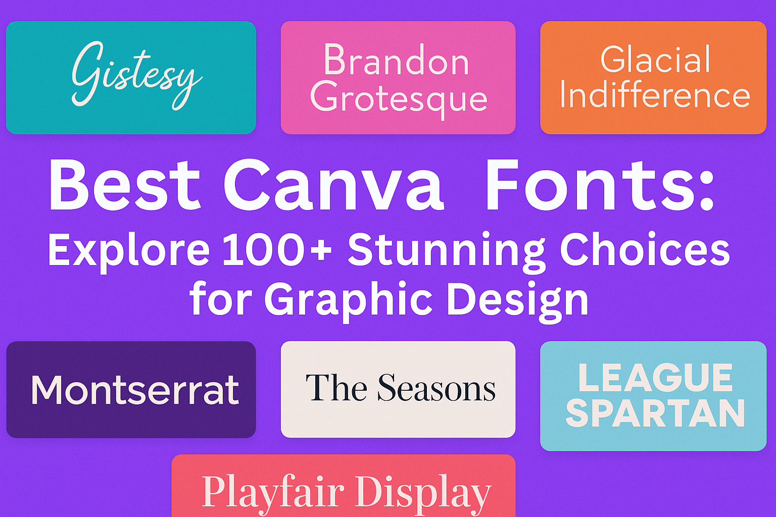
Canva has revolutionized the world of design, providing a vast array of fonts to meet every need. With a multitude of options at your fingertips, choosing the right font can make or break a design.
The key is finding fonts that not only look good but also communicate clearly.
Whether you’re designing a sleek tech brochure or crafting a vintage-themed poster, the right typography can enhance your message.
Fonts like Pecita offer a bold, modern look ideal for tech-related designs, while Oregano adds a whimsical touch perfect for playful projects.
Exploring these stunning Canva fonts will inspire creativity and transform your designs. Dive into the world of Canva fonts, and discover which ones can elevate your next project.
What Makes a Font Great for Graphic Design?
A great font can transform a design. It’s important to choose one that matches the project’s purpose.
For professional reports, a clean, simple font often works best. For festive invitations, a fun or decorative font might be more suitable.
Readability is key. If a font is hard to read, it loses its impact. Fonts like sans-serif are generally easier on the eyes, especially when there’s a lot of text involved.
Another aspect is versatility. Good fonts fit a variety of design settings. Whether it’s a digital or a print project, a versatile font can adapt and still look great. This includes being scalable without losing clarity.
Font pairings can elevate design quality. Pairing fonts with different styles creates contrast and visual interest. This helps in emphasizing certain parts of the design.
Consider the emotional impact. Fonts carry their own style and mood. A bold, heavy font might convey strength or urgency, while a script font might express elegance or creativity. Matching the font to the desired emotion enhances the message.
Available resources like Canva’s font library offer a wide range of choices, making it easy to experiment. Trying different fonts can lead to discovering what best suits the design needs.
Navigating Canva’s Font Library
Canva offers a variety of fonts that users can explore to enhance their designs. Users can navigate the font library by understanding font categories and utilizing filtering and searching techniques effectively.
Understanding Font Categories
In Canva’s library, fonts are organized into different categories. These categories help users find the perfect font for any project.
Serif fonts are classic and often used for print. They are great for conveying a traditional or elegant feel.
Sans-serif fonts are modern and clean, ideal for digital designs and tech brands.
For a playful or unique vibe, script and decorative fonts add personality and flair.
Canva also features display fonts, which draw attention with their bold and artistic looks. They work well for headlines or logos. Knowing these categories helps users pick the right font style that matches their design’s tone.
Filtering and Searching Techniques
Finding the right font quickly in Canva is easy with filtering and search tools.
Users can type specific keywords into the search bar to locate fonts by name or style. Try searching for terms like “modern” or “handwritten” to narrow down choices.
Canva allows filtering fonts by features such as thickness, italic, or bold. This helps users refine their choices according to project needs.
Browsing recently used or favorited fonts also speeds up the process. Users can create a shortlist of preferred fonts for easy access in future designs, making their workflow seamless and efficient.
Top Canva Fonts for Various Design Needs
Choosing the right font is crucial for capturing the essence of a design. Various styles can help convey messages effectively, from bold fonts for headlines to elegant scripts for invitations.
Bold and Impactful Headlines
For designs that need to grab attention, bold fonts are the go-to choice. Options like League Gothic and Anton make headlines stand out. These fonts are perfect for posters, banners, and ads. They convey urgency and importance, making them ideal for sales announcements or event promotions.
Combining bold fonts with contrasting colors can enhance visibility, especially on digital platforms. It’s essential to pair bold fonts with simpler text for balance. This approach ensures that the message is clear and compelling without overwhelming the viewer.
Elegant and Sophisticated Scripts
Script fonts bring a touch of elegance to any design. Fonts like Great Vibes and Dancing Script add a stylish feel suitable for invitations, cards, and boutique brand logos. These fonts emulate hand-drawn calligraphy, offering a personal touch to projects.
Using script fonts in logos or headings can set a sophisticated tone. They work best when paired with simple background designs to avoid a cluttered look. Scripts are not ideal for large blocks of text, but they shine in smaller, decorative elements that add creativity to a layout.
Clean and Readable Sans Serifs
Sans serif fonts are known for their modern and clean look. Options like Montserrat and Lato provide easy readability, making them suitable for web content and professional documents. These fonts create a friendly and approachable vibe without being overly casual.
Their versatility allows them to fit a variety of design needs. Sans serifs are excellent for body text in brochures and websites because they maintain clarity even at smaller sizes. Pairing them with more decorative fonts can help create a hierarchy within the design.
Traditional and Authoritative Serifs
Serif fonts have small lines at the ends of characters, which give them a classic and formal appearance. Fonts like Times New Roman and Merriweather are perfect for projects requiring an air of tradition and authority, such as academic publications or editorial layouts.
These fonts enhance readability in printed materials, especially when dealing with large blocks of text. They are often viewed as more formal and trustworthy, making them a favorite for newspapers and book publishing. Using serif fonts can add credibility and elegance to business reports and scholarly work.
Fun and Quirky Display Fonts
Display fonts are meant for decorative use and add character to designs. Fonts like Pacifico and Chewy infuse creativity and fun into a project, making them ideal for children’s materials, party invitations, and playful brand logos.
These fonts can stand alone as art elements within designs. However, their strong personality means they should be used sparingly to prevent them from overpowering the message. Display fonts are best used in headings or special callouts that need to capture the viewer’s attention instantly.
Pairing Fonts in Canva
Finding the right font pairings in Canva can enhance your design by creating a balanced look and feel. It’s important to combine fonts that complement each other while avoiding common pairing mistakes that can clutter your design.
Complementary Font Combinations
Complementary font combinations help create visual interest and harmony. When choosing fonts in Canva, mixing a serif with a sans-serif can be effective. For example, pairing a bold, decorative header with a clean, sans-serif body text is a classic choice. This contrast makes headlines stand out while keeping body text readable.
Designers often use font weight and style for contrast. A bold header works well with light body text, ensuring each element holds its own. Some popular pairs seen on onefoxyblogger.com include classic serif fonts like Times New Roman with modern sans-serif fonts like Arial.
Experimenting with different combinations while maintaining readability and balance can make a design more appealing. Canva’s extensive font library makes it easy to try various styles.
Avoiding Common Pairing Pitfalls
When pairing fonts, it’s important to avoid common pitfalls. A frequent mistake is using too many intricate fonts, which can make the design busy and hard to read. Sticking to two or three fonts usually works best. This approach maintains clarity and cohesion.
Another pitfall is choosing fonts that are too similar. This can make the text look uneven and lacks visual contrast, making it hard to differentiate between text elements. According to 33rdsquare.com, variety in style, weight, and size enhances readability.
Keeping the design’s purpose in mind is crucial. The font should reflect the message and tone of the design. Canva users should ensure their font choices align with the project’s goal, whether it’s formal, casual, or fun.
Customizing Fonts in Canva
Customizing fonts in Canva allows designers to create unique and visually appealing designs. By adjusting size, color, contrast, and adding layers with effects, users can enhance their text to better fit their creative projects.
Adjusting Size and Spacing
Adjusting the size of text in Canva can make a big difference in the overall look of a design. Using different font sizes can help create a hierarchy, making important text stand out. Users can change the font size by selecting the text and choosing a new size from the toolbar.
Spacing between letters, words, and lines can also impact readability. Canva allows for the adjustment of kerning (space between letters) and leading (space between lines). These adjustments help achieve the desired look and feel of the text. It is important to experiment with these settings to find the right balance.
Color and Contrast
Color choice is key when customizing fonts in Canva. Designers can select colors that complement their design theme or brand identity. Canva provides a color palette tool, making it easy to match colors across different elements.
Contrast is crucial for enhancing readability. High-contrast text against its background ensures the message is clear and easy to read. Canva users can experiment with different color combinations to see what works best for their design. Bright colors or shades that pop are often used for emphasis or to draw attention to specific parts of the text.
Layering With Effects
Adding effects to text in Canva can transform a simple design into something eye-catching. Canva offers various effects like shadows, outlines, and glows. These effects can be layered to create depth and emphasis.
By adjusting the intensity, angle, or size of an effect, users can customize the appearance of text to suit their design needs. It’s important to use effects sparingly, as too many can make text hard to read or look cluttered. Experimenting with different combinations can help find the right balance and enhance the overall design.
Utilizing Fonts for Brand Consistency
When working on branding, it’s important to choose fonts that match the identity of the brand.
Fonts should reflect the style and personality of the company. Bold and modern fonts can give a fresh look, while classic fonts may convey sophistication.
To keep things cohesive, many brands use specific fonts for different purposes.
Consider consistently using one font for headings, another for subheadings, and a third for body text. This strategy ensures that every piece of content looks uniform.
Here is a simple example:
| Purpose | Font Name |
|---|---|
| Headings | Montserrat |
| Subheadings | Lato |
| Body Text | Open Sans |
Consistency is key. It helps build recognition and trust.
Brands often set these fonts in their Brand Kits. This makes it easy to apply the same fonts across all projects.
Learn more about setting up brand fonts in the Canva Brand Kit.
Another tip is to pair fonts wisely. Some fonts naturally complement each other.
There are guides, like the Canva Font Pairing Guide, to help find matches that work well together. This is a great way to ensure that designs are visually appealing.
Finally, it’s important to keep in mind that only specific users like owners or designers can set up or change brand fonts in tools like Canva.
This control helps maintain the consistency of your brand visuals.
Canva Pro Fonts vs Free Fonts
Canva offers a wide range of fonts for both free and Pro users.
While free fonts provide a solid foundation for design, Pro fonts add extra advantages with unique styles and enhanced creative possibilities.
Exclusive Pro Font Advantages
Canva Pro users have access to a larger selection of fonts. This includes exclusive fonts not available to free users.
These Pro fonts often showcase unique styles, which can help make any project stand out. For designers, this means more options to match the font style with the project’s theme or mood effectively.
Additionally, Pro users benefit from regular updates that bring in trendy and modern fonts. This ensures their projects stay up-to-date with current design trends.
Having a diverse library of fonts allows Pro users to create more personalized and tailored designs, appealing to varied audiences or clients.
In short, the key advantage of Pro fonts is variety and access to exclusive styles that can elevate the overall design quality.
Maximizing Free Font Potential
Free Canva fonts are plentiful and can meet the needs of many basic design projects.
With over hundreds of fonts available, free users are equipped with a variety of styles suitable for different purposes, such as headings, body text, or decorative elements.
By experimenting with various free fonts, designers can find creative ways to pair different styles.
For instance, pairing a bold font like Pecita with a simpler one can enhance visual contrast. Moreover, free users can maximize font usage by exploring different sizes, colors, and text spacing to increase impact without additional cost.
Thus, by creatively using these parameters, free fonts can still achieve effective and visually appealing results.
Licensing and Legal Considerations for Canva Fonts
When using Canva fonts for design projects, it’s important to know the rules about licenses and copyrights. Not all fonts on Canva are copyright-free.
Designers should always verify the licensing information before using a font in their commercial work.
Canva offers two types of licenses: Free and Pro. Each license has its own set of rules.
Free users should be cautious, as some fonts and elements might have restrictions even within free content.
For Pro users, it’s crucial to ensure any Pro content is used according to Canva’s conditions.
For instance, some Pro fonts require watermarking in specific scenarios, especially when used in marketing or promotional materials.
Designers need to remember that while creating designs using Canva’s fonts and tools is permitted, selling the fonts themselves as standalone assets is not allowed.
This rule helps protect the original creators’ work and respects the licensing agreements.
For more detailed information on licensing, the Canva website provides an extensive guide on licensing rights.
Understanding these guidelines helps avoid legal complications while taking advantage of Canva’s diverse font library.
Keeping up-to-date with Canva’s terms ensures designers create confidently and legally.
Tips for Staying Updated With New Canva Fonts
Follow Canva’s Blog
Canva frequently posts updates about new features and fonts on its blog. By keeping an eye on their posts, users can discover the latest additions and trends in the Canva font library.
Subscribe to Newsletters
Signing up for newsletters from Canva-related sites like Design Pixie can provide insights into new fonts. These newsletters often contain exclusive tips and font updates.
Join Canva Communities
Participating in online communities such as Canva’s forums or related social media groups can be helpful. Community members often share news about new font releases, allowing users to stay informed and inspired.
Explore Regularly
Regularly exploring Canva’s font library can keep users updated. With categories like free and premium, checking different sections might reveal recent additions.
Engage With Tutorials and Blogs
There are numerous blogs and tutorials like those on 33rd Square that discuss font pairings and updates. Following these resources can offer great tips and showcase how others use new fonts.
Enable Notifications
Allowing notifications on the Canva app or website can alert users to updates. This feature ensures that no new font goes unnoticed, providing a direct way to keep up with changes.