Choosing the right font can make a big difference in creating engaging and attractive designs.
For those with a love for the sea or nautical themes, Canva offers a wide array of fonts that capture this vibe perfectly.
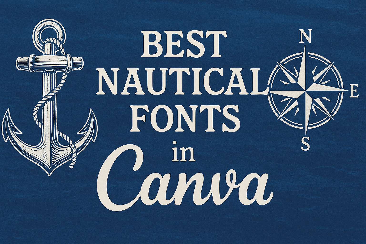
Some of the best nautical fonts in Canva are Sailors and EFCO Brookshire, which include elements mimicking waves and sea elements to evoke a coastal feel.
These fonts can bring uniqueness and charm to any project, whether it’s a logo, flyer, or branding material.
EFCO Brookshire, for example, provides stylish flair and curves reminiscent of ocean waves. Such features make it a go-to choice for anyone aiming to add an elegant maritime touch to their work.
Sailors, with its bold lines and nautical elements, is another favorite among designers for its ability to reflect the spirit of the sea.
Incorporating these fonts into your design can help set a seaside tone and ensure your project stands out.
Whether you’re working on a seaside event’s branding or simply looking to add some maritime inspiration to your designs, these fonts from Canva are worth considering. Dive into these options and elevate your creative projects with a nautical flair.
What Are Nautical Fonts?
Nautical fonts are a special category of typography inspired by the sea and maritime themes. They feature elements like curves, bold strokes, and decorations that remind one of ocean waves or ropes.
History of Nautical Typography
The roots of nautical typography trace back to maritime communication systems. Sailors and navigators needed clear and distinct fonts for ship names, navigational charts, and harbor signs.
During the 19th century, as sea travel became more common, these fonts gained popularity in trade and commerce. Designers often chose styles mimicking the curves of waves or the rugged strength of ropes and sails.
This historic connection to maritime activities has kept nautical fonts in use today, available in both digital and print media. They often bring a touch of the nostalgic or adventurous spirit of the sea, making them perfect for themed designs and branding that focus on the sea or adventure.
Defining Characteristics of Nautical Fonts
Nautical fonts often feature specific design elements that evoke maritime imagery.
Bold strokes and rounded edges mimic the motion of waves or the sturdy design of ship parts.
These fonts might also include decorative elements like anchors, ropes, or sails. Such features work well in creating a sense of depth and motion.
Another common feature is the use of curved lines that suggest fluidity, much like ocean currents. The fonts might be more stylized, providing a vintage or rustic look. They are both visually appealing and functional, making them ideal for logos, signs, and other designs relating to sea themes.
Why Use Nautical Fonts in Designs?
Nautical fonts are a great way to capture the essence of the sea, adventure, and tradition in design projects. They can evoke a sense of maritime history and adventure while bringing a classic or vintage feel.
Enhancing Maritime-Themed Projects
When designing anything related to the sea, whether it’s a restaurant menu or a travel brochure, nautical fonts can set the mood instantly.
They help designers create visuals that feel like they belong on a ship or at a seaside resort.
Fonts like EFCO Brookshire, known for its flamboyant curves, mimic the ocean’s fluidity and add elegance and charm. These fonts work best on headers and titles, drawing the viewer’s eyes immediately.
Including maritime symbols such as anchors, ropes, and waves in the font design can strengthen this theme. These elements give a visual cue about the content’s connection to the ocean or nautical lifestyle. Such details make designs look cohesive and well-thought-out, instantly grabbing attention.
Creating a Sense of Adventure
Nautical fonts can inspire a feeling of adventure, tapping into imagery of sailing the high seas and discovering new lands. This is perfect for travel ads, book covers, or any brand emphasizing exploration.
For instance, a font like Sonorous, known for its textured look, suggests weathered, timeworn stories waiting to be told. This imagery sparks curiosity and excitement.
In marketing materials, using these fonts can help brands convey the idea of embarking on journeys.
This not only highlights the adventurous nature of the products or services but also makes them compelling to the audience. These fonts, with their bold and dynamic designs, are sure to leave a memorable impression.
Invoking Nostalgia and Tradition
Fonts inspired by the sea can transport viewers back to classic maritime eras. They can evoke nostalgia for times when sailors navigated using stars and maps.
This is especially effective for brands that want to show a deep connection to history or tradition. Fonts like IM Fell English SC, known for their traditional serifs, give a historical touch to designs, reminding viewers of vintage posters or age-old books.
For projects aimed at invoking tradition, nautical fonts highlight craftsmanship and timelessness. This makes them a fantastic choice for celebrating heritage or aligning with well-established brands. Using these fonts in design projects fosters a warm sense of connection and familiarity among audiences, bridging past and present.
Popular Nautical Fonts in Canva
Canva offers a variety of nautical fonts that cater to different design needs. Some of these fonts are free to use, while others might require a premium subscription. Let’s explore both options.
Top Free Nautical Fonts in Canva
Canva provides several free nautical fonts that are perfect for creating sea-inspired designs.
Sailors is a popular choice, with its nautical elements such as rounded corners and bold strokes. This font is ideal for projects that need to evoke the feel of waves and sea life.
IM Fell English SC is another great option available for free. It offers a classic and elegant look, making it suitable for designs with a historical or traditional theme. This font can add a touch of sophistication to your work without any cost.
Using these free fonts, designers can achieve a rich nautical aesthetic without investing in premium options. Whether for personal projects or commercial use, these fonts provide style and versatility.
Premium Nautical Fonts Worth the Investment
For designers looking to invest in high-quality fonts, Canva’s premium options offer unique styles and features.
EFCO Brookshire stands out with its stylish cursive design, which mimics the fluidity of the ocean. It’s perfect for creative projects that aim to capture the elegance of the sea.
Another premium choice is the Sonorous Font, known for its textured and worn look. Designed by Jordan Wilson, this font is great for projects that need a realistic maritime appearance. It works well in logos, branding, and other creative endeavors.
Investing in premium fonts like these can enhance your designs, making them more professional and eye-catching. These fonts offer unique features that can set your projects apart from the rest.
How to Access Nautical Fonts in Canva
Finding the right nautical fonts in Canva can be a fun and creative process. By exploring Canva’s font library and using the search function wisely, users can easily discover fonts that capture the essence of the sea.
Navigating Canva’s Font Library
Canva’s font library is packed with a variety of options.
To access nautical fonts, users should first open a design project and click on the Text tab on the left sidebar.
From here, they can browse through categories and view a range of styles, such as bold fonts that mimic maritime symbols.
Looking through curated collections in Canva can reveal unique fonts like Sailors with its wave-like curves and Boardley, a decorative script that mimics calligraphy.
Experimenting with these styles can help users find the perfect fit for their sea-themed designs.
Checking out new additions or popular fonts in the library often leads to some hidden gems. Trying different fonts and comparing their appeal can enhance the overall design experience.
Utilizing the Search Function Effectively
The search function in Canva is a powerful tool for finding specific nautical fonts.
In the search bar within the font section, users can type keywords such as “nautical,” “sailor,” or “ocean” to get more targeted results like EFCO Brookshire.
Using precise terms helps narrow down choices quickly and efficiently.
Being specific with keywords ensures that users are not overwhelmed by unrelated options. This approach makes it easier to pinpoint fonts that have the ideal characteristics, like curves or anchor-like shapes.
Trying different variations of keywords can also provide new font discoveries. This method encourages creativity and helps capture the desired nautical theme effortlessly.
Pairing Nautical Fonts with Visuals
When creating nautical-themed designs, pairing the right fonts with visuals is key. Using fonts like Sailors or Boardley can enhance the oceanic feel when combined with themed graphics. Choosing complementary colors and imagery will bring the maritime atmosphere to life.
Best Practices for Font Pairing
Pairing nautical fonts requires balance.
Fonts like Sailors or EFCO Brookshire can make titles pop, thanks to their bold, wave-like curves. Meanwhile, simpler fonts should be used for body text to ensure readability.
Using contrasting weights helps create a visual hierarchy. For example, pairing a bold title font with a light and clean body font draws attention to the most important message.
Consistency is crucial. Keeping the font styles and weights uniform throughout the design helps maintain a cohesive look. This not only makes reading easier but also strengthens the design’s overall theme.
Complementing Fonts with Nautical Imagery
Adding nautical visuals, such as anchors or waves, can tie together the theme in a design. Consider using elements like ships or compasses that sync with nautical fonts from this guide.
Utilizing colors that reflect the sea can amplify the mood. Shades of blue, sandy tones, and seafoam green can enhance the visual impact. These colors help in highlighting both the text and imagery.
Selecting graphics that match the font’s style ensures the design feels seamless. This creates a cohesive appearance where every element of the design works together.
Incorporating Fonts into Different Design Formats
Nautical fonts are versatile and can enhance various design formats. They add a unique charm to social media posts, invitations, and branding materials for maritime businesses. Below are practical ways to integrate nautical fonts effectively.
Design Tips for Social Media Posts
Social media is all about capturing attention quickly.
Nautical fonts like Marty Two can add a fun and retro feel to posts. Using bold fonts ensures that the message stands out against busy images.
Consider combining nautical fonts with ocean-themed graphics or backgrounds. Subtle use of shadow effects, as seen in Vast Shadow, can make text more impactful. Pair these fonts with contrasting colors to ensure readability.
Keep the text minimal. When using decorative fonts, less is more. This approach maintains clarity and avoids overwhelming the viewer.
Creating Invitations and Flyers with Nautical Themes
Invitations and flyers can benefit greatly from whimsical and elegant nautical fonts like EFCO Brookshire. This font delivers a sense of movement akin to ocean waves, adding elegance to designs.
Use these fonts for headings or key details. Make sure to balance decorative text with simple body fonts for easy reading. Color palettes should reflect nautical elements—think blues, greens, and sandy browns.
Incorporate water motifs or maritime symbols like anchors to enhance the theme. Canva provides many such icons or backgrounds to complement font choices, creating cohesive and eye-catching designs.
Branding Elements for Maritime Businesses
For maritime businesses, consistent branding is vital. Nautical fonts help develop a strong identity. Whether it’s for a logo or promotional materials, the right font choice can convey the essence of the sea.
Choose fonts that resonate with the brand’s message, whether sleek for a luxury feel or bold for adventure. Fonts like Marty Two create impact and recognition in logos.
Consistency across all platforms is crucial. Use the same fonts for business cards, signage, and online materials to create a unified look. Canva’s tools allow easy integration of brand elements into various formats. Design templates help maintain uniformity in branding efforts.
Tips for Customizing Nautical Fonts
Customizing nautical fonts in Canva can transform a simple design into an eye-catching project. Two important factors to consider are adjusting the font color and size for better readability and using text effects to enhance the visual impact of the fonts.
Adjusting Font Color and Size for Readability
Choosing the right color and size for your nautical fonts can greatly improve how easily they can be read.
Contrast is key. For background with light colors, opt for darker fonts. This contrast prevents text from blending into the background, ensuring clarity.
Font size also matters. Large fonts are more readable from a distance, which is essential for posters or banners.
Smaller fonts are better for detailed prints. Keep in mind that unique fonts like cursive need to be larger to remain legible.
Testing the readability by looking at your design from a distance or on different screen sizes is helpful.
Using Text Effects to Enhance Visual Impact
Text effects can give your nautical fonts a distinctive flair.
Shadows add depth, making the text pop off the page or screen. These can be subtle or bold depending on the style you are aiming for.
Consider using outlines or strokes to emphasize the text. This works especially well if the font is decorated with nautical elements, like anchors or waves.
Gradients allow fonts to have colors that shift from one to another, mimicking the sea’s natural colors. This gives the text a fresh look, perfect for seaside-themed designs.
Customizing these effects can help the text match the theme and mood of your project.
Best Practices for Typography in Design
In design, effective typography goes beyond choosing appealing fonts. It’s about how these fonts interact and enhance the message.
Balance and consistency are key in creating visually engaging designs.
Balancing Typefaces within a Layout
Balancing typefaces involves using complementary fonts that work well together.
A combination of serif and sans-serif fonts can create a visually appealing contrast. For instance, pairing a bold serif like Garamond with a clean sans-serif like Helvetica can highlight heading and body text efficiently.
Hierarchy is crucial, too. Use different font sizes and weights to draw attention where it’s needed, such as making headings bigger and bolder than body text.
It’s essential to ensure readability by not overloading the design with too many fonts.
A simple guideline is to stick to two or three fonts at most. This keeps the design cohesive and prevents a clashing, cluttered look.
Adjust spacing between letters and lines, known as kerning and leading, to ensure clarity and improve the reader’s experience.
Maintaining Consistency in Design Elements
Consistency in typography helps in building a strong visual identity.
Using the same set of fonts across different platforms and materials aids recognition.
Establish a style guide that dictates font choices, sizes, and weights to maintain uniformity.
This approach should extend to other design elements such as color and alignment.
Ensuring alignment in text blocks improves readability. Meanwhile, using consistent colors that match the typography further strengthens the design’s visual appeal.
Templates can be handy for maintaining consistency.
They provide a ready-to-use format that ensures all text adheres to the predefined style rules, making it easier to create cohesive designs time and again.