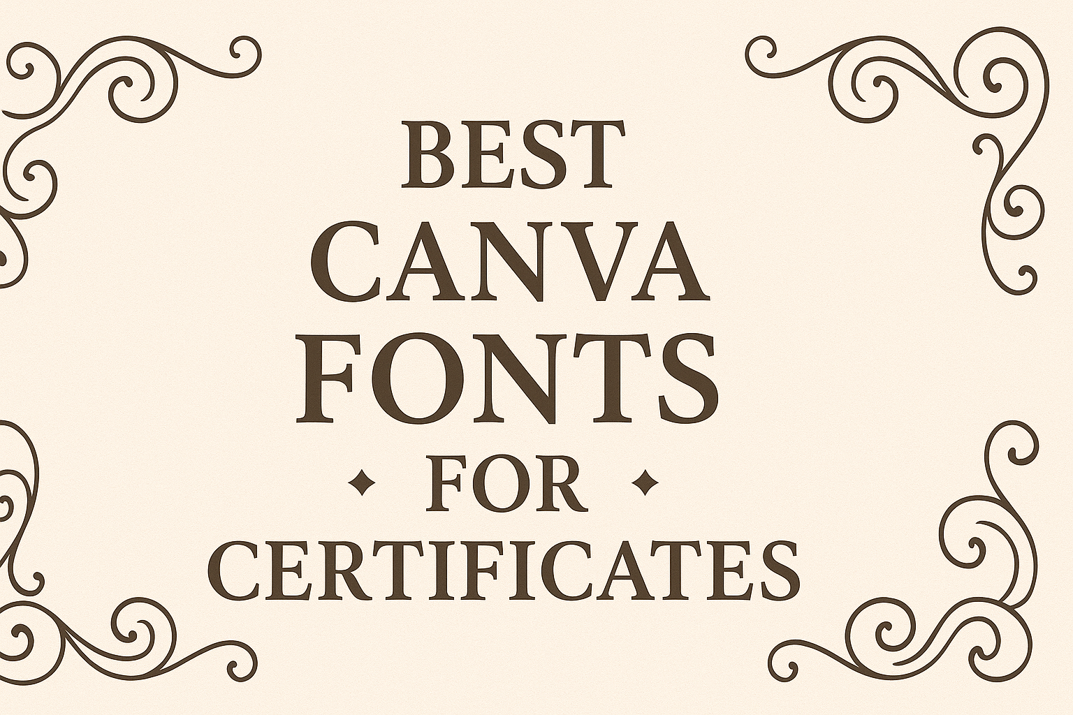
Choosing the right font for a certificate can make all the difference in how prestigious and professional it looks.
When creating certificates, it’s important to pick a font that not only appears elegant but also conveys a sense of achievement.
Some of the best Canva fonts for certificates combine style and readability, ensuring the document looks both impressive and formal.
For those looking to design eye-catching certificates, fonts like William Duke, Deluce, and Veinline bring distinct styles that suit different occasions.
William Duke is perfect for formal events like graduations, adding a classic touch. Meanwhile, Deluce can be ideal for more luxurious settings, offering a sophisticated flair. Lastly, Veinline provides a modern twist, demonstrating versatility for various certificate designs.
Understanding the varying tones each font can set allows creators to better match their certificates with their intended purpose.
By exploring the best Canva fonts, designers can craft certificates that not only stand out visually but also reflect the accomplishments they celebrate.
Dive into these font choices to enhance your next certificate project.
Understanding Certificate Design
Certificate design combines visual elements that convey importance and achievement.
Typography plays a crucial role, influencing how certificates are perceived. It connects the design to the purpose, while also affecting emotions through font choices.
Importance of Typography
Typography is central in shaping the look and feel of a certificate. It sets the tone and ensures that the certificate feels appropriate for the event.
Fonts like Giaza and Cinzel are popular for their unique styles; Giaza brings a modern touch with its geometric design, while Cinzel offers a classic, formal feel.
A well-chosen font not only makes the text legible but also complements other design elements.
Fonts must be paired wisely; a primary display font can be balanced with a simpler secondary font to guide the viewer through the certificate. This harmonious blend keeps the design elegant and makes sure the recipient feels honored.
Font Psychology in Certificates
Fonts can evoke specific emotional responses, affecting how a certificate is received.
Serif fonts often convey tradition and professionalism, making them suitable for academic or corporate certificates. For example, William Duke brings a sense of formality, which is ideal for occasions like graduations.
On the other hand, fonts with modern characteristics, like Veinline, can add a contemporary flair, making them suitable for creative fields.
Choosing fonts with care ensures the certificate reflects the intended message and emotion. This consideration makes a significant difference in presenting achievements effectively.
Choosing the Right Font for Your Certificate
Selecting the right font is crucial for making a certificate look polished and professional.
When picking fonts, it’s important to consider readability and how fonts pair together to achieve a harmonious look. This ensures the certificate is both attractive and easy to read.
Readability and Legibility
A certificate should be easy to read at first glance.
Fonts like Times New Roman, Arial, and Helvetica offer clarity and are popular due to their clean lines and timeless style. These fonts ensure that the text is easily distinguishable from a distance, making them ideal for certificates presented at events.
High contrast between letters, adequate spacing, and simple design enhance readability.
It’s best to use serif or sans-serif fonts since they maintain clarity, even in small print. Avoid overly decorative fonts as they can be distracting and hard to read, especially when used in lengthy sections of text.
Prioritizing readability ensures that the certificate communicates its message effectively.
Font Pairing Essentials
Combining multiple fonts can add interest to a certificate design, but it’s important to avoid chaos.
A balanced design typically uses 2-3 complementary fonts. One font can be used for the title, another for the body, and a third for small details, like footnotes. This strategy maintains a neat layout.
When pairing fonts, look for similarities such as weight or height to ensure cohesion. For example, a bold title font pairs well with a more understated serif for the body.
Using contrasting styles, like a modern font with a classic one, can also enhance the design’s appeal.
Choosing fonts with purpose will make the certificate visually engaging while remaining organized.
Top Canva Font Recommendations
Exploring the right fonts can elevate your certificate designs. Whether you’re aiming for a classic touch or a modern twist, choosing the right font is key. Below are recommendations for serif and sans serif fonts that stand out.
Serif Fonts for a Classic Look
Serif fonts are ideal for certificates because they convey elegance and tradition. Playfair Display is a popular choice. It has a refined appearance with high contrast between its thick and thin strokes, making it perfect for adding sophistication to your certificates.
Another great option is Times New Roman, a timeless classic that offers a formal and respectable look. These fonts are excellent for traditional designs where readability and a classic aesthetic are important.
Georgia is also worth considering. Known for its readability, it provides a touch of elegance while ensuring the text remains the focal point. This font’s balance between old-style charm and modern needs makes it versatile for various certificate types.
Sans Serif Fonts for Modern Appeal
Sans serif fonts present a clean and modern style. Montserrat stands out with its geometric simplicity, making it perfect for certificates that need a contemporary look. It’s widely used for its versatility and clear lines.
Arial is another excellent choice. Known for its clarity and straightforward design, it works well when simplicity and professionalism are desired without the frills of serifs.
For those looking to add a bit of personality, Raleway offers both elegance and a unique style. With its bold and thin options, it adapts well to different design needs, providing a sleek and modern look to any certificate.
Use these fonts to align with current trends while maintaining readability.
Decorative Fonts for Accents and Emphasis
Using decorative fonts for accents in certificates can add a special touch. Elegant script fonts bring a classic feel, while bold typefaces ensure key text stands out effectively.
Elegant Script Fonts
Elegant script fonts are perfect for adding a touch of sophistication to certificates. They often mimic handwriting styles, which can evoke a sense of tradition and class.
Great Vibes and Dancing Script are popular choices among designers for their fluid lines and subtle elegance. These fonts are especially useful for highlighting names or titles, adding an air of elegance without overwhelming other elements on the certificate.
Elegant scripts are ideal for award titles or recipient names. Their unique style brings a personal feel, making any document seem more prestigious.
Because of their detailed design, it’s best to use them at a larger size for maximum readability. It’s also wise to limit their use to key texts, ensuring clarity remains throughout the certificate.
Bold Typefaces for Headings
Bold typefaces are great for making headings pop. They command attention and can highlight essential sections of a certificate effectively.
Oswald and League Spartan are commonly used for this purpose, offering clean and robust lines that easily draw eyes to titles and headings. These fonts ensure that the most important parts of a certificate are not missed.
When choosing a bold typeface for headings, it’s crucial to balance it with other text elements to maintain readability.
Such fonts should be used for headings and subheadings, where their weight can be fully appreciated. They pair well with simpler body text fonts, maintaining a clean and professional appearance across the certificate.
Font Combinations for Certificates
Choosing the right font combinations can greatly enhance the look of a certificate. Using contrasting fonts can create a dynamic and eye-catching design, while harmonious pairings offer a balanced and professional appearance.
Contrasting Fonts for Dynamic Layouts
Combining different font styles adds energy to a certificate. A bold serif font paired with a clean sans-serif creates a visually interesting contrast.
For example, using Playfair Display with a modern sans-serif like Montserrat can make headings stand out.
Another option is blending traditional and modern fonts. A classic script paired with a contemporary sans-serif like Open Sans provides a dynamic contrast. This approach is ideal for keeping the recipient’s name prominent without overshadowing the details.
To maintain readability, ensure that the contrasts are not too drastic. Keeping color and size in mind is crucial when using contrasting fonts.
Harmonious Font Pairings
For a more unified look, harmonious font pairings are effective. Using fonts that share similar characteristics fosters a sense of cohesion.
For instance, pairing two elegant serif fonts like William Duke with Playfair Display can create a sophisticated and cohesive design.
Similarly, combining two simple sans-serifs like Arial and Helvetica can provide a modern, polished feel. The key here is to choose fonts with similar weights and proportions.
The harmony in these combinations ensures that the certificate looks balanced. This is particularly useful when the design requires a professional appearance, ensuring that no single element dominates the layout.
Using Custom Fonts in Canva
Using custom fonts in Canva allows designers to personalize their projects, giving a unique touch to each design. While Canva has a wide selection of fonts, uploading your own fonts offers even greater creative freedom.
It’s essential to understand how to upload these fonts properly and consider licensing implications.
Uploading Own Fonts to Canva
Canva Pro users enjoy the ability to upload their own fonts, expanding their design potential significantly.
To start, users should navigate to the Brand Kit section of Canva. Here, they will find an option to upload fonts.
It’s as simple as selecting the font file from the computer and confirming the upload.
Supported font upload formats include .TTF, .OTF, and .WOFF. Once uploaded, the new font becomes part of the user’s library and can be used in any future projects.
Ensuring the font file is compatible with Canva and correctly formatted is crucial for a seamless experience. This allows designers to maintain consistency across all design work while leveraging their preferred typography styles.
Licensing Considerations for Fonts
When using custom fonts in Canva, understanding font licensing is vital to avoid potential legal issues.
Many fonts require specific licenses, especially for commercial use.
Users should verify the licensing information upon obtaining a font. This typically involves confirming whether the font is free for both personal and commercial use or if purchasing a license is necessary.
For team projects, it’s important that everyone on the team has the correct licenses for any shared fonts.
Misusing fonts without proper licensing can lead to fines or other legal complications. Taking the time to review and adhere to licensing agreements ensures a smooth design process, free from unforeseen challenges.
Formatting Text for Clarity
Formatting text for clarity is about making sure your message is easy to read and understand. This involves choosing the right text alignment and spacing, as well as creating a clear hierarchy and scale within the text.
Alignment and Spacing
Text alignment plays a crucial role in readability.
Aligning text to the left is often the default and works well for most situations because it follows the natural reading pattern for many people. Center alignment can be useful for headings or when you have short lines of text, but it’s harder to read in paragraphs.
Spacing is just as important.
Adequate line spacing makes text easier to read and lessens eye strain. Too little spacing can make the text appear cramped, while too much can disrupt the flow. Adding enough space between paragraphs helps to separate ideas and makes the overall text layout clearer.
Hierarchy and Scale
Creating a visual hierarchy helps readers focus on the most important parts of the text first.
Size, weight, and style of fonts can indicate hierarchy. For instance, headings can be bold and larger than the body text, guiding the reader through the content naturally.
Scale is another key aspect.
Using different font sizes helps to emphasize important points. It’s effective to have a clear distinction between headers, subheaders, and body text. Consistency in using styles for different levels of information ensures that the text structure is logical and easy to follow.
Fonts and Branding
Fonts play a crucial role in branding. They can convey the personality of a brand and make it stand out.
Choosing the right font helps communicate the brand’s values and connects with the target audience effectively.
When it comes to branding, some fonts exude professionalism, while others have a more casual feel.
For instance, serif fonts like Cinzel give a classic look, perfect for traditional brands.
On the other hand, sans-serif fonts like League Gothic provide a modern and clean appearance. This style is often used by tech and minimalist brands aiming for a sleek image.
Script fonts are ideal for brands looking to inject elegance and sophistication. Fonts like Oregano can add a touch of playfulness to the design, fitting for creative industries.
For those targeting a youthful and edgy market, fonts like Drunken Hour can make a bold statement. This choice helps the brand to appear trendy and fresh.
Here’s a quick list of font types and their uses:
- Serif: Classic and trustworthy
- Sans-serif: Modern and clean
- Script: Elegant and sophisticated
- Display: Bold and attention-grabbing
The choice of font can greatly influence how a brand is perceived. Selecting the right typeface is essential in creating a memorable brand identity.
Finally, Canva offers a wide selection of fonts, making it easy to find the perfect match for any brand’s needs.
Resources and Tools
In exploring fonts for certificates, Canva offers a wealth of options. Users benefit from both its own extensive font library and additional fonts from third-party resources. This allows for flexibility and variety in design.
Canva Font Library
Canva’s font library is extensive, featuring both free and premium fonts.
Accessible through the platform, these fonts range from classic serif styles to modern sans-serif designs. Whether users are creating formal certificates or casual designs, the right font is just a search away.
Fonts like William Duke and Deluce are popular choices for certificates, known for their elegance and readability. Canva even allows users to explore these options through a simple search tool and style categorizations.
This makes it straightforward for users to find the ideal font for any occasion. For those with a Canva Pro subscription, even more fonts become available, enhancing customization options.
Third-Party Font Resources
Beyond Canva’s own library, third-party font resources expand design possibilities.
Websites like 33rd Square offer insights into free fonts that pair well together, aiding in cohesive design.
Designers can download these fonts and integrate them into their Canva projects.
This flexibility ensures users are not limited to the fonts within Canva itself.
Web resources also provide guidance on integrating new fonts into Canva.
This process involves uploading the selected fonts into the platform and applying them directly to designs.
These additional tools empower users to achieve distinctive looks tailored to their needs.