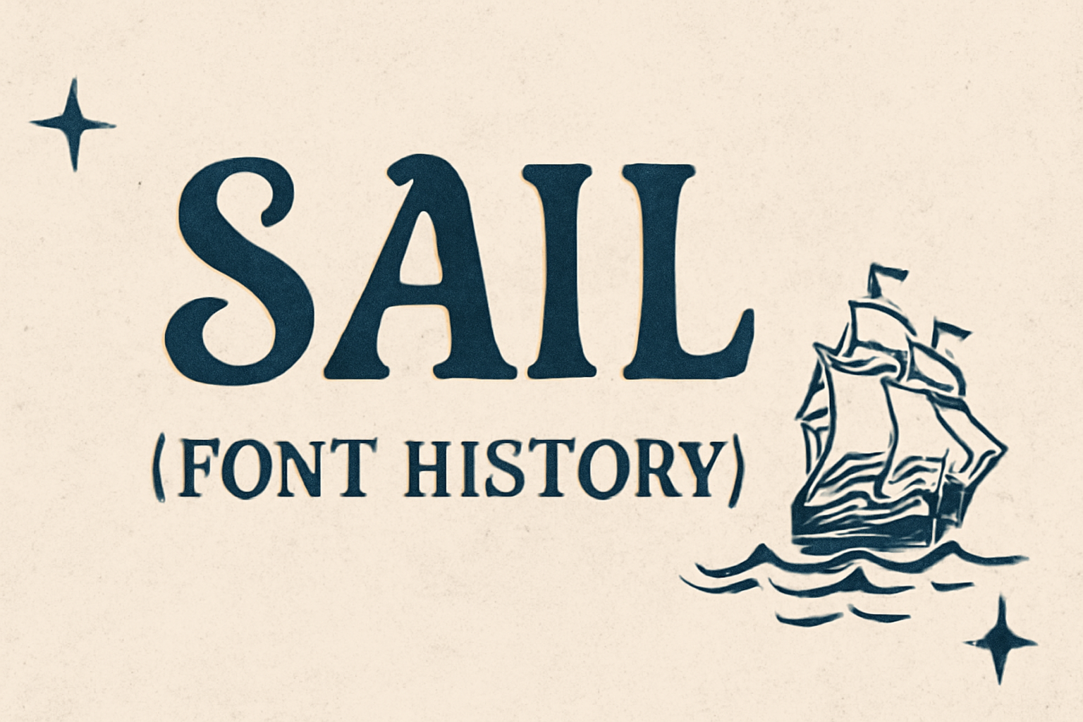
The Sail font brings a touch of elegance and lightness to design projects. Created by Miguel Hernandez, it’s known for its Didot script style, making it perfect for headlines and displays. This font stands out with its windy uppercase letters, ideal for capturing attention in headlines and posters.
Sail’s design offers both style and versatility, giving users a fresh way to enhance their projects. Sail is especially popular for its clean lowercase letters, which suit longer texts and paragraphs. This makes it a flexible choice for both digital and print media.
With its unique swashes and modern flair, Sail has become a favorite among those seeking a nautical or elegant aesthetic in their designs. It combines practicality and beauty, offering a special touch for any creative work.
Origins of ‘Sail’ Font
The ‘Sail’ font, featuring a Didot script style, reflects a mix of elegance and movement. Created for specific uses like posters and headlines, its design was carefully crafted by a talented designer.
Designer and Foundry
Miguel Hernandez is the designer behind the ‘Sail’ font. His work gives the font its unique aesthetic appeal. Hernandez’s designs are known for their careful attention to detail and distinct style elements. His collaboration with FontForge ensured that ‘Sail’ met high standards for quality and usability, making it a reliable choice for designers seeking a modern yet classic look. This partnership helped Hernandez’s vision come to life, offering a font with graceful curves and sophisticated detailing.
Inspiration and Concept
The ‘Sail’ font takes inspiration from the Didot script style. This influence is evident in its sleek lines and flowing movement, which make it suitable for large text applications. Its design captures the feeling of fresh air and movement across each character. The uppercase letters, in particular, have a windy quality, adding visual interest. This makes the font perfect for displays and web navigation, enhancing both readability and aesthetic appeal. The thoughtful concept behind ‘Sail’ reflects the balance between artistic expression and practical use in typography.
Design Characteristics
The Sail font combines a sense of movement and elegance. It has features that make it suitable for display purposes, and its style and unique details set it apart.
Typeface Style
Sail is a Didot script typeface. This style means it has a refined and elegant appearance. Miguel Hernandez, the designer, created it to shine in headlines and large displays.
Its script style brings a sense of fluidity and grace. The uppercase letters resemble the flow of wind, which is why it’s great for texts that need to stand out. This makes it perfect for posters and titles where a touch of flair is needed.
Unique Glyphs and Ligatures
Sail’s unique glyphs add a distinctive touch to any text. The characters look as if they are in motion, giving them a lively feel. This movement aspect makes the font dynamic.
Ligatures in Sail are crafted to seamlessly connect letters, enhancing the flow of the text. These connections make it easier to read, especially in decorative uses. The style is ideal for any situation where an artistic touch is desired, whether in print or digital formats.
Technical Details
The Sail font offers unique features that make it suitable for various design projects. Understanding its file formats and compatibility, as well as font metrics and kerning, ensures effective use in different applications and environments.
File Formats and Compatibility
Sail is available in several standard file formats, including OTF (OpenType Font) and TTF (TrueType Font). These formats ensure that the font can be used across various platforms such as Windows, macOS, and Linux.
Compatibility with design software like Adobe Illustrator and CorelDRAW makes it versatile for both professional and personal projects. Being an open-source typeface, Sail can be freely used and modified, making it a favorite for many designers looking for flexibility in their font choices.
Sail’s compatibility with web fonts also extends its use to online projects. It can be easily integrated with CSS for web design, thanks to platforms such as Google Fonts. This allows seamless loading on websites, enhancing visual appeal without slowing down page performance.
Font Metrics and Kerning
Font metrics are crucial in understanding Sail’s dimensions. The height and width of its characters ensure readability while maintaining its elegant style. Sail features slightly larger uppercase letters, giving an ornate and eye-catching appearance.
Kerning—adjusting the space between characters—is vital for maintaining the font’s fluidity. In Sail, careful kerning ensures that each letter flows smoothly into the next. This is especially important in script typefaces, where connections between letters impact the overall design.
Tools like FontForge can be used to adjust metrics and kerning, allowing designers to tailor Sail’s features to their specific needs. This adaptability makes Sail a popular choice among those who seek a personalized touch in their typography work.
Usage and Applications
The Sail font is a Didot script with distinct characteristics, making it a popular choice for branding, display texts, and web navigation. It’s known for its elegant swashes and clean lines that enhance readability in different contexts.
Popularity in Branding
Sail’s elegance and fresh appearance make it a favorite in branding. Companies often use its windy uppercase letters to create logos that stand out. The font’s clean lowercase helps maintain readability in various formats, from business cards to print ads. Its versatile style fits well with design trends, allowing brands to update their image without losing identity. Its ability to convey both modernity and elegance makes it a compelling choice for businesses looking to make a strong impression.
Common Pairings
Sail often pairs with other fonts to create contrasting designs. Designers like to combine Sail with simple sans-serif fonts for a balanced look. The mix of Sail’s decorative style and a plain font enhances readability while adding flair. In web design, this combination helps guide the viewer’s eye across headings and body text. Pairing it with minimalist fonts draws attention to headlines without overwhelming the layout. These combinations make it easy to maintain a clean, professional appearance across different platforms. Using Sail with compatible fonts allows for creative yet cohesive design solutions.
Reception and Critiques
The Sail font has gathered both praise and criticism from various users. It is admired for its eye-catching design but has challenges in readability for longer texts.
Design Community Feedback
In the design community, Sail is appreciated for its distinctive style. Many designers find it ideal for adding a touch of elegance to their projects. Due to its decorative nature, it is often highlighted in discussions about font choices for digital displays. These displays can include short text passages and captions, where Sail’s unique curves make the text stand out.
Some designers warn against using Sail in lengthy text passages. Its intricate details can become overwhelming and hard to read when used in large blocks of text. Adjusting font size and spacing may help, but thoughtful use is essential.
Notable Usage and Case Studies
Sail has been used effectively in several branding and design projects. It is frequently chosen for logos, invitations, and marketing materials where a bold and stylish aesthetic is desired. Its performance in short text passages allows it to shine in such scenarios.
Some notable case studies show Sail being used in digital platforms, where its captivating style helps draw attention. These examples illustrate how choosing the right context and project type can highlight Sail’s strengths, making it memorable and impactful.
Evolution of ‘Sail’ Font
The ‘Sail’ font has undergone a fascinating transformation from its original design to a well-loved choice for display and poster use. Key developments in its updates and the expansion of its family have contributed significantly to its popularity.
Updates and Version History
The ‘Sail’ font, initially crafted by Miguel Hernandez, has seen various updates that enhanced its design and adaptability. The font started with a Didot script that exuded elegance and movement. Designers made subtle changes over time to keep it fresh and versatile, focusing on enhancing its glyphs to make them more appealing for headlines and digital displays.
Some updates involved optimizing the font for better readability across different digital platforms. These changes helped in maintaining its popularity for web navigation and larger paragraphs. The efforts to keep it current demonstrate a commitment to balancing traditional beauty with modern requirements.
Expansion of the Font Family
As the font gained popularity, the ‘Sail’ font family expanded to include new styles and variations. The aim was to offer more options for designers needing diverse typographic choices. This expansion involved creating bold and italic versions, which enriched its usage in different design contexts.
The font’s distinctive characteristics suggest that the windy quality of the uppercase letters offers unique aesthetics. This expansion allowed the ‘Sail’ font to be used not just in posters but also in branding and editorial projects. With swash options and clean lowercase letters, it suited a variety of creative needs, broadening its appeal to graphic artists and web designers alike.