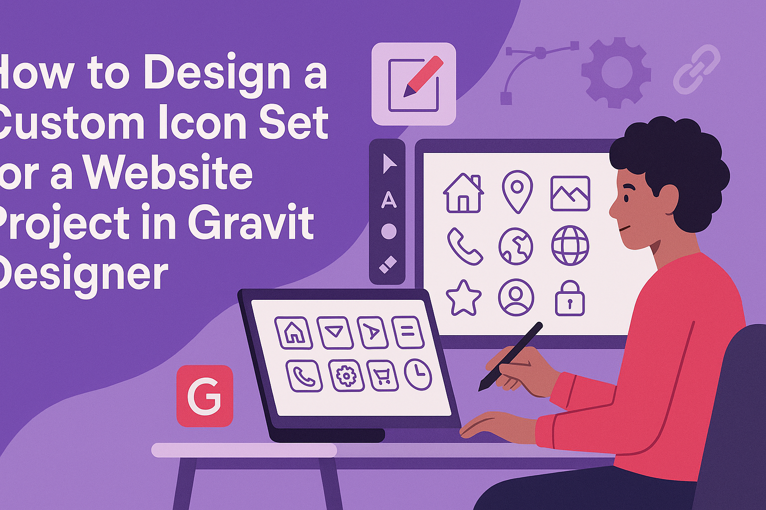
Creating a custom icon set for a website project can elevate its visual appeal and enhance user experience. By using Gravit Designer, anyone can easily craft unique icons that reflect their brand’s identity and style. This powerful tool offers intuitive features that simplify the design process, allowing designers to focus on creativity.
With a 45-degree grid and various design tools at their fingertips, users can systematically create cohesive icons that work well together.
Whether designing for a personal blog or a professional website, the ability to integrate personalized graphics is invaluable. Custom icons not only differentiate a project but also provide a polished look that resonates with users.
This guide will take readers step-by-step through creating their own icon set in Gravit Designer. They will learn essential tips and tricks that make the design process efficient and enjoyable. By the end, designers will have the confidence to produce stunning icons tailored specifically to their projects.
Getting Started with Gravit Designer
To begin designing icons in Gravit Designer, one must first understand the software interface and set up the canvas properly. Knowing the essential tools available will make the design process smoother and more efficient.
Understanding the Interface
When opening Gravit Designer, the first thing seen is the workspace. This includes the toolbar on the left, the properties panel on the right, and the canvas in the middle.
- The toolbar has tools for selecting, drawing shapes, and text.
- The properties panel displays options to adjust color, size, and effects.
Familiarizing oneself with these areas allows for quick navigation and efficient design.
Once comfortable with the interface, creating icons can become a streamlined process.
Setting Up Your Canvas
Setting the canvas correctly is crucial for a successful design. Users can create a new document by selecting the Create button.
- Choose the dimensions based on the intended icon size.
- It helps to start with a grid. This grid aids in keeping the icons aligned.
Selecting the grid can be done from the View menu.
Adjusting the zoom level also helps in working with finer details.
This setup ensures the icons look polished and professional.
Essential Tools for Icon Design
Gravit Designer comes with various tools ideal for icon creation. Here are some key tools to be aware of:
- Shape Tools: Useful for creating basic shapes like circles and rectangles.
- Pen Tool: Allows for custom shapes and paths.
- Text Tool: Great for adding labels or annotations.
Utilizing these tools effectively helps in bringing ideas to life. Mastering their functions can greatly enhance the icon design process.
The more comfortable one feels with these tools, the easier it is to experiment and innovate.
Designing the Icon Set
Creating a custom icon set is a fun and rewarding process. It’s essential to focus on key elements like style, consistency, and detail to ensure the icons look great together.
Choosing a Style and Palette
Selecting the right style and color palette is crucial. Designers often begin by researching different styles, such as flat, line, or glyph icons. Each style has its unique feel and can affect how users perceive the website.
Once a style is chosen, picking a color palette comes next. Colors should complement the website’s branding and enhance usability.
Using tools like Adobe Color can help create palettes that work well together. Aim for a balance between bold colors for emphasis and softer tones for consistency.
Creating Consistent Shapes and Sizes
Consistency is key in icon design. When creating icons, designers should establish a grid system. A common starting size is 24×24 pixels, which works for most platforms. This grid helps maintain uniformity across the icon set.
Using similar shapes and proportions for all icons strengthens the overall aesthetic.
Designers can use vector tools to easily resize and adjust shapes without losing quality. The goal here is to ensure all icons look like they belong to the same family.
Adding Details and Effects
Once the basic shapes are set, it’s time to add details. Simple elements like shadows, highlights, or outlines can make icons pop. However, less is often more; too many details can clutter the design.
To enhance usability, designers should ensure that icons remain recognizable at different sizes. Testing icons at various resolutions helps keep them clear and functional.
Utilizing subtle effects can add depth and interest without overwhelming the design. This balanced approach creates engaging and user-friendly icons.
Optimizing Icons for Web
To create effective icons for a website, it is crucial to ensure they are scalable and exported in the right formats. These steps help maintain quality while improving load times and user experience.
Ensuring Scalability
When designing icons, scalability is vital. Icons should look good at different sizes, from small buttons to large banners.
Designers often use vector graphics software like Gravit Designer, which allows icons to be resized without losing quality.
To achieve scalability, keep designs simple and use clear shapes. Avoid excessive detail, which can blur when resized. Testing icons at various dimensions can help identify potential issues early.
Using a grid system also aids in maintaining proportionality across different icon sizes. This approach ensures a consistent visual appearance, enhancing the overall aesthetic of the website.
Exporting Icons in Web-Ready Formats
Exporting icons in appropriate formats is essential for web use. SVG (Scalable Vector Graphics) is a popular choice because it allows icons to scale without losing quality. SVG files are lightweight and support interactivity and animation.
Another option is PNG (Portable Network Graphics), suitable for raster images. PNGs offer high quality but can result in larger file sizes.
Designers should choose PNG when detailed imagery is necessary.
It is also beneficial to optimize the file size. Reducing file sizes without sacrificing quality improves website loading times. Tools like SVGO can assist in this optimization process. By ensuring icons are web-ready, designers can create a smoother user experience.
Implementing Icons on the Website
Adding custom icons to a website can enhance its visual appeal and user experience. This section covers how to effectively integrate icons using HTML and CSS, as well as comparing the use of icon fonts and SVGs.
Integrating with HTML and CSS
Integrating icons into a website primarily involves using HTML and CSS.
First, designer needs to upload the icon files to a suitable location on the server. This makes them accessible for use in the code.
Next, they can implement the icons using an <img> tag for individual images. Alternatively, they can use CSS for background images, which allows for styling flexibility. For example:
<div class="icon-home"></div>
In CSS, it might look like this:
.icon-home {
  background-image: url('home-icon.svg');
  width: 24px;
  height: 24px;
}
This method keeps the HTML clean and allows for easy adjustments in the CSS as needed.
Icon Fonts vs SVGs
When choosing between icon fonts and SVGs, both options offer unique advantages.
Icon fonts are widely supported and allow for easy scaling with CSS. They can be styled using color and size in a straightforward way.
On the other hand, SVGs provide greater detail and flexibility. They are resolution-independent and can include complex shapes and colors. Additionally, SVGs can be manipulated directly in the DOM, making animations easier.
Designers must consider project needs.
If quick and simple icons are required, icon fonts may be ideal. For projects requiring detailed and unique designs, SVGs are the better choice.