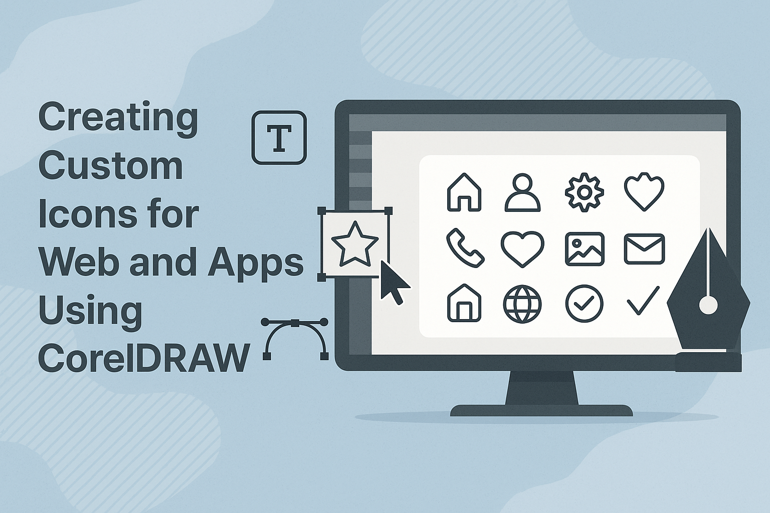
Creating custom icons for web and apps using CorelDRAW is a straightforward and rewarding process. CorelDRAW offers a range of tools that make designing icons easy, even for beginners. From basic shapes to polished designs, users can create icons that perfectly fit their digital projects.
Icons play a crucial role in user interface design, serving as visual cues that guide users. A well-crafted icon can enhance the look and functionality of a website or app, making it more user-friendly. With CorelDRAW, designers can explore a variety of features to ensure their icons catch the eye and function well across different platforms.
For those interested in diving into icon creation, understanding the features of CorelDRAW is key. The software provides flexibility and precision, allowing designers to experiment with their ideas and refine their creations. By mastering the art of icon design, users can ensure their projects stand out in today’s digital landscape.
Getting Started with CorelDRAW
CorelDRAW is a versatile tool for designing custom icons. Key skills include understanding the workspace, setting up documents, and mastering vector basics. This introduction helps users create striking and functional icons efficiently.
Understanding the CorelDRAW Workspace
The CorelDRAW workspace is designed to be intuitive. It features a menu at the top, a toolbox on the left, and a docker on the right. The toolbox contains drawing tools like rectangles, ellipses, and freehand drawing lines.
The Properties bar at the top changes based on the selected tool, offering relevant options. For example, selecting a rectangle shape provides options for corner styling or border width.
Users can customize the workspace to fit their preferences. Dockers can be minimized or moved, and toolbars can be adjusted. Understanding this setup helps users work comfortably and quickly.
Setting Up Your Document
Before starting, users need to set up their document correctly. First, choose a canvas size. Icons usually need to be quite small, often no more than 512×512 pixels. This ensures compatibility across different platforms.
Select an appropriate color mode. RGB is best for web graphics, while CMYK suits print needs. Another vital step is to set guidelines. These help maintain consistency and alignment in designs.
Finally, save the document template. This step streamlines future projects, ensuring a consistent starting point. Users can dive right into design without technical delays.
Vector Graphics Basics
Understanding vector graphics is crucial for using CorelDRAW effectively. Unlike raster images that rely on pixels, vectors use mathematical formulas to define shapes. This allows for scalability without losing quality.
CorelDRAW offers tools like the Bezier tool to create precise curves. Users can adjust nodes and paths to refine shapes as needed. This feature ensures sharp and clean lines at any size.
Additionally, layers organize complex designs. Each element can be on a separate layer, making it easy to edit specific parts without affecting others. Mastery of vectors and layers helps create professional icons swiftly and efficiently.
Design Principles for Icons
Creating effective icons is crucial to enhancing user experience in web and app design. Key principles include keeping designs simple yet clear, ensuring scalability across different sizes and devices, using appropriate color contrasts, and maintaining visual consistency throughout a project. These principles help communicate information effectively while making the interface pleasant and easy to navigate.
Simplicity and Clarity
Simplicity is at the heart of a good icon design. Users should instantly understand an icon’s meaning without confusion. Keeping designs straightforward ensures that icons communicate quickly and effectively. Avoid complex details that can muddle the icon’s message.
Icons should focus on a single key idea. For example, a trash bin icon should clearly represent deletion or discarding. Details should be minimal to maintain clarity and readability.
Simplified shapes and symbols are recommended to make icons easily recognizable. Icons are often small in size, so using clean and bold outlines can enhance their visual appeal. This approach helps users identify the icons at a glance, improving overall user interaction.
Scalability Considerations
Icons need to be scalable without losing quality. They should look good on various devices and screen sizes, from small mobile displays to larger desktop monitors. Using vector graphics can achieve this because they maintain quality regardless of resizing.
Consider designing icons in different sizes to ensure they remain clear and identifiable at all resolutions. Important details should be tested by scaling the icon up and down.
Check icons for clarity at smaller sizes. Some details might need to be adjusted or removed to ensure that the icon remains clear and functional when scaled down.
Color and Contrast
Using the right color and contrast helps make an icon stand out and be easily identifiable. Choose colors that align with your brand and complement the application’s overall design.
Ensure good contrast between the icon and its background. This contrast is vital in making sure the icon is noticeable and readable. High contrast can improve visibility, especially for users with visual impairments.
Color choices should be consistent across all icons in a set to create a cohesive look. This uniformity helps users intuitively understand what the icons signify. Consider testing your icons in both light and dark background settings to guarantee proper visibility.
Visual Consistency
Consistency in visual elements like style, size, and color is crucial for creating a cohesive design. Icons should share a similar aesthetic, whether it’s a flat design, 3D style, or something else.
Ensure that icons feel part of a family by using similar shapes, line widths, and proportions. This unity enhances the intuitive use of the interface, as users become familiar with the pattern and style.
When designing a set, consider the 7 Principles of Icon Design. Consistency helps establish a user-friendly experience by providing a predictable and reliable interface, encouraging smooth navigation through the web or app.
Creating Icon Shapes
Designing icons in CorelDRAW involves mastering the use of basic shapes, freehand drawing techniques, and transforming and editing shapes. Each method allows designers to craft unique, visually appealing icons.
Using Basic Shapes
CorelDRAW provides tools for creating simple geometric shapes like circles, squares, and triangles. These shapes serve as the foundation of icon design.
Designers can start by selecting the Rectangle or Ellipse tool to create these shapes. Once the basic shape is formed, it can be adjusted using the Shape tool. This allows for resizing, repositioning, and further modification.
Another useful feature is the Polygon tool, which helps in creating multi-sided shapes. This tool is ideal for more complex icon designs that require precision.
Freehand Drawing Techniques
Freehand drawing in CorelDRAW adds a personal touch to icon designs. This technique lets designers sketch custom shapes that don’t fit typical geometric patterns.
The Freehand tool is a primary feature for this approach. By adjusting settings, such as smoothing, they can control the line quality. This is especially helpful for creating curved or irregular shapes with ease.
Importantly, using a graphic tablet can enhance the freehand experience. It offers better control and precision, making it easier to convey artistic ideas.
Transforming and Editing Shapes
After creating initial shapes, transforming and editing them refines the icon’s design. CorelDRAW offers a range of transformation tools like Rotate, Scale, Skew, and Mirror.
These options help in modifying shapes to achieve the desired look. For example, rotating shapes adds dynamic angles, while scaling adjusts size without losing proportion.
Editing shapes involves using nodes and control handles, allowing fine-tuning. This process is crucial for ensuring all elements of the icon align perfectly and maintain consistency.
Working with Color and Styles
Color and styles add personality and consistency to custom icons. This section discusses selecting the right palette, applying fills, and utilizing style sets to ensure your icons stand out visually.
Selecting a Color Palette
Choosing a color palette is crucial for making attractive icons. CorelDRAW provides tools to create and manage your palette easily. Users can select from pre-made options or create a custom palette. It’s important to consider the theme of the app or website when picking colors. Consistent colors help maintain a unified look.
Experimenting with shades and hues can also personalize the design. Using color harmonies, like complementary or analogous schemes, can elevate the design. This method ensures a balanced appearance that appeals to viewers.
Applying Fills and Outlines
Applying fills and outlines defines the structure of icons. CorelDRAW offers a variety of fill options including solid colors, gradients, and patterns. Users can choose the desired effect by simply selecting the icon and navigating the fill tool options. Outlines emphasize the edges, and you can modify their thickness or color.
For icons, less is often more. Simple fills and outlines can make icons clearer at small sizes. Adjusting opacity levels can also add interesting depth or focus to certain parts of the icon, making them more visually appealing.
Using Style Sets
Style sets ensure that all icons remain consistent across an application or website. CorelDRAW enables users to save and manage style sets. This includes text styles, shapes, colors, and more. By applying a style set, designers can maintain a uniform appearance for all their icons, enhancing visual coherence.
This feature is particularly useful for managing large projects, where maintaining consistency manually can be challenging. Modifying a style set allows for quick updates across the board, saving time and ensuring a cohesive design throughout. Experimenting with different style combinations can lead to unique designs without losing uniformity.
Adding Details and Effects
In CorelDRAW, enhancing icons with thoughtful details and effects can significantly improve their visual appeal. This involves working with transparency, shadows, text elements, gradients, and textures to bring depth and interest to icon designs.
Using Transparency and Shadows
Transparency can help create subtle layers in an icon design. By adjusting the transparency of certain elements, designers can add depth and complexity. Shadow effects are another way to make icons stand out.
Applying shadow effects helps in creating a 3D look, making the icon appear lifted from the surface. CorelDRAW offers tools to easily adjust shadow properties like blur, distance, and direction. This is particularly useful for achieving realistic shadow effects that enhance overall design quality.
Incorporating Text Elements
Text elements can convey important information quickly and effectively within an icon. Adding text to an icon requires careful consideration of font style and size, ensuring it remains legible even at smaller sizes. CorelDRAW offers a range of fonts and customization options like bold or italic styles to make text stand out.
When placing text, it’s crucial to maintain balance in the design. The text should complement other elements without overwhelming them. Experimenting with text placement and effects can lead to a cohesive and impactful icon design.
Applying Gradients and Textures
Gradients and textures are powerful tools for adding richness to icon designs. Using gradients, designers can create smooth transitions between colors, enhancing the visual interest of an icon. CorelDRAW provides a variety of gradient options, allowing customization of colors and angles to suit the design needs.
Textures can also add a tactile feel to icons. By incorporating textures, designers can create visually engaging icons that appear more realistic. Experimenting with different textures in CorelDRAW helps in exploring various visual effects. This results in unique and effective icon designs that can capture attention.
Exporting Icons for Web and Apps
Exporting icons efficiently for web and app use involves choosing the right file formats, considering device compatibility, and utilizing software tools correctly. Ensuring icons are optimized helps in maintaining performance and visual appeal across different platforms.
Understanding File Formats
Selecting the right file format is crucial when exporting icons. SVG (Scalable Vector Graphics) is a preferred format for web use due to its scalability and lightweight nature. Icons exported in SVG retain quality across various screen sizes.
On the other hand, PNG formats are ideal for raster images, offering transparency which is beneficial for layering icons over backgrounds. JPEG is less favorable due to the lack of transparency.
Optimizing for Different Devices
When exporting icons, it’s vital to consider different device resolutions. Creating multiple resolutions like 1x, 2x, and 3x ensures icons appear sharp on any screen. This includes modern devices with high-resolution displays.
One technique is to use CSS sprites to combine multiple icons into one file. This reduces HTTP requests and speeds up loading times.
Proper optimization enhances the user experience across phones, tablets, and desktops.
Exporting with CorelDRAW
CorelDRAW provides various tools for exporting icons efficiently. After designing, navigate to the export options, selecting the desired file format such as SVG or PNG. The export settings allow adjustments in resolution and quality.
To export for web use, CorelDRAW also supports direct optimizations. Adjust the compression level for formats like PNG to balance quality and file size.
Using CorelDRAW’s features ensures the icons are ready for smooth integration into web and app projects.
Best Practices for Icon Accessibility
Creating accessible icons ensures that web and app interfaces are user-friendly for everyone. Focus on clear visual design, provide text alternatives, and test icons thoroughly.
Accessibility Considerations
When designing icons, it is essential to make them clear and understandable for users with different abilities. Using text labels alongside icons helps convey their purpose to screen readers. For instance, a magnifying glass icon, which signifies search, should include a text label like “search button.”
Contrast ratios also play a vital role in making icons visible. Make sure the icons stand out against the background to aid users with limited vision. Adjusting the size and color of icons can further enhance visibility.
Testing for Usability
Once the icons are designed, it’s crucial to test them with real users. Such testing helps identify any accessibility issues that may have been overlooked. Collecting feedback from users with disabilities can vastly improve design outcomes.
Utilizing various tools and methods can enhance the testing process. Screen readers and contrast checkers can play a key role in identifying problems with text alternatives and color visibility.
Collaborating with accessibility experts can provide additional insights that enhance the icons’ accessibility. Making necessary adjustments based on these evaluations helps achieve a more inclusive web or app design.