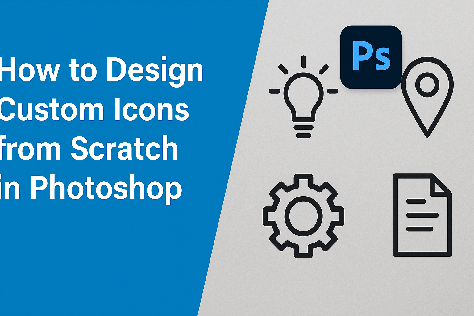
Creating custom icons in Photoshop can seem like a daunting task, but with the right guidance, anyone can master it. Icons play an essential role in modern design, enhancing user interfaces and bringing digital concepts to life. With a few tools and some creativity, designers can craft unique icons that reflect their personal style and improve the overall aesthetic of their projects.
In this blog post, readers will explore the basics of icon design and learn how to utilize Photoshop’s powerful features. They’ll discover step-by-step techniques for making selections, using paths, and applying effects to create stunning visuals. Designing from scratch offers the freedom to experiment and develop icons that truly stand out.
Whether you’re a beginner or looking to refine your skills, this guide offers valuable insights and practical advice. Explore how using familiar tools like the Magic Wand and Path Panel can simplify the process and make icon creation an enjoyable endeavor.
Understanding Icon Design
Designing icons is a crucial part of creating user interfaces. Icons serve various roles, from guiding users to enhancing the aesthetic of digital products. It’s important to know the functions and types of icons, as these will help designers craft visuals that communicate effectively.
The Role of Icons in User Interface
Icons act as visual shortcuts in user interfaces. They help users navigate applications and websites efficiently. Because they are often used to represent actions like saving, deleting, or sharing, they improve user experience by reducing the amount of text displayed.
Besides functionality, icons contribute to the branding and aesthetic of an interface. They can set the tone and personality of a product, making it memorable to users. Consistent and well-designed icons create a cohesive look.
Different Types of Icons and Their Uses
Icons can be categorized based on their purpose. Functional icons include those like the trash bin for deleting or the envelope for email. Decorative icons are used to enhance the visual appeal without specific user functions in mind.
Social media platforms often use social icons to link to profiles or sharing options. Meanwhile, informational icons provide users with additional data, such as the battery or Wi-Fi indicators.
Each type serves a distinct purpose, and understanding these categories helps in designing effective icons. By selecting the right type for the task, designers can ensure clarity and accessibility for users.
Setting Up Your Workspace
Designing custom icons requires an efficient workspace in Photoshop. It’s important to configure preferences, create the right document, and organize layers properly for a smooth workflow.
Configuring Photoshop Preferences
The first step is setting up Photoshop preferences to match the needs of icon design. Adjusting the performance settings ensures that Photoshop runs smoothly. Users should allocate enough memory to Photoshop under Preferences > Performance. This adjustment can help in handling large files without lag.
Color settings are also crucial. Icons need consistent colors, so using the sRGB IEC61966-2.1 color profile is recommended for web use. To make this change, navigate to Edit > Color Settings. This keeps colors vibrant and accurate across different devices.
Additionally, setting the Units & Rulers to pixels will aid in precision. This can be adjusted by going to Preferences > Units & Rulers.
Creating a New Document
Creating the right document size is essential for icon design. Start by opening Photoshop and going to File > New. A common size for icons is 512×512 pixels, but this can vary depending on the intended use.
It’s vital to set the resolution to at least 72 DPI for web icons. For icons intended for print, a higher resolution like 300 DPI might be more suitable.
The color mode should be set to RGB for digital icons. Make sure to include a transparent background if planning to create icons with no background color. This will provide flexibility in design.
Organizing Layers and Groups
Organizing layers and groups keeps the workspace tidy and efficient. Always use separate layers for different elements of the icon. This makes adjustments easier without affecting the entire icon.
Grouping related layers is another helpful practice. For example, if an icon includes multiple elements, like a shape and text, these can be grouped using Layer > Group Layers.
Naming layers and groups clearly can save time. Instead of using default names, rename them according to their function, such as “Background” or “Text Layer.” This makes it quicker to find and edit elements later.
Design Foundations
Creating custom icons in Photoshop requires a strong grasp of foundational design principles. This includes selecting a suitable icon style, utilizing color theory effectively, and achieving proper composition and sizing.
Choosing Your Icon Style
Deciding on an icon style is essential. Styles range from flat and minimalist to detailed and realistic. The choice depends on the purpose of the icon and the platform it will be used on. For example, mobile apps may benefit from a clean, simple design, while game icons might thrive on intricate detail.
Key Considerations:
- Purpose: What is the icon representing?
- Audience: Who will use it?
- Medium: How will it be displayed (digital, print)?
Understanding these factors helps in aligning the style with the intended message and function.
Understanding Color Theory and Palettes
Color plays a crucial role in icon design. It impacts the mood and usability of the icon. Using color theory helps designers choose a palette that conveys the right emotions and ensures accessibility.
Basic Principles:
- Contrast: Make sure elements are distinguishable.
- Harmony: Colors should complement each other.
- Accessibility: Ensure icons are legible for all users.
Applying these principles involves selecting colors that enhance the icon’s readability and appeal. Tools like Adobe’s color wheel can assist in finding the perfect combination.
Basics of Composition and Sizing
Effective icon composition ensures clarity and aesthetics. Icons must be well-balanced and appropriately sized for their context, maintaining functionality across different devices.
Composition Tips:
- Balance: Even distribution of visual weight.
- Alignment: Keep elements neatly arranged.
- Proportion: Consistent sizing relative to other UI elements.
For sizing, icons should typically be clear at smaller resolutions and scalable for larger formats. Using consistent sizing helps maintain a cohesive design throughout the application or website.
Crafting Your Icon
Designing custom icons involves translating ideas into visual elements, starting with initial sketches, then forming solid shapes, and finally adding textures for depth. Each step builds the icon, creating a unique graphic piece.
Sketching Initial Concepts
Sketching is the starting point for icon design. It helps translate ideas into a visual format. Designers should begin by jotting down basic concept sketches using pencil and paper or a digital tool. This phase is all about exploring different ideas and forms, focusing on the overall shape and style of the icon.
Creating several iterations during this stage helps refine the concept. Simple sketches allow designers to consider how each element interacts in the final design. Trying out different compositions and styles can lead to a clearer vision of the final icon. A sketch doesn’t need to be perfect, but it should clearly capture the main idea.
Creating Basic Shapes
Once a concept is sketched, it’s time to create basic shapes in Photoshop. Start by setting up the canvas with the correct dimensions. Use tools like the Rectangle Tool or Ellipse Tool to create shapes that form the icon’s foundation. It’s crucial to ensure these shapes are clean and precise, as they form the icon’s framework.
Aligning the shapes and using grids aids in maintaining symmetry and proportion. Using simple geometric forms can help create a clear and easily recognizable icon. Consider using the Path Tool to refine and adjust curves for smoother lines. Creating an icon in Photoshop allows for experimentation with colors and layers to build complexity.
Adding Detail and Texture
After the basic shapes are arranged, adding detail and texture brings the icon to life. Details can include highlights, shadows, and small embellishments that enhance the icon’s realism or stylization. Photoshop’s blending modes and layer styles offer various textures to add depth.
Textures can be applied using brushes or patterns, giving the icon a tactile feel. Balancing detail without overcomplicating ensures the icon remains clear at smaller sizes. This stage is essential for making the icon distinctive and visually engaging.
Working with Layers and Paths
In Photoshop, layers and paths are essential for creating precise and flexible icons. They allow designers to build complex images by stacking elements and defining exact shapes.
Using the Pen Tool
The Pen Tool is fundamental for designing icons with paths. It lets users draw straight or curved lines, known as paths. To start, they simply click to create anchor points, which connect to form paths. Holding down the mouse while clicking allows for curves, offering more fluid shapes. Users can toggle between smooth and sharp points by holding the Alt/Option key.
Practice and patience are key. Beginners should experiment with the tool to understand how different clicks create diverse shapes. This tool is powerful, and mastering it opens endless possibilities for custom icon design.
Manipulating Anchor Points
Anchor points are crucial for path manipulation in icon design. By adjusting these points, users can refine paths for desired shapes. When using the Pen Tool, clicking on an existing path allows users to add or remove anchor points. Dragging these points reshapes the path, making curves sharper or smoother.
Photoshop provides handles for anchor points that control curve direction and steepness. Users can click and drag these handles while holding Alt/Option to modify curves without altering other parts of the path. It’s a balance of control and precision, allowing users to shape their icons precisely.
Layer Styles and Effects
Layers make editing non-destructive and flexible. By using Layer Styles, designers can add effects like shadows, glows, or strokes to enhance their icons. These effects are applied live and can be tweaked at any time, offering visual depth without permanently altering the layer.
Photoshop offers several styles like drop shadow, bevel and emboss, and inner glow, which can be accessed by double-clicking the layer. This additional styling capability ensures each icon stands out and looks polished. Adjusting these styles allows designers to give icons a unique touch while preserving editing ease.
Coloring and Shading Techniques
Creating custom icons requires attention to detail, especially when it comes to coloring and shading. The way colors are applied affects the icon’s look. Using gradients and shading can add depth and realism.
Applying Solid Colors
Solid colors are the foundation of any icon design. They set the tone and mood of the icon, making them essential. When using solid colors, it’s important to choose hues that resonate with the design’s purpose. Bold and vivid colors can make an icon stand out, while softer tones can provide a more subtle feel.
Colors can be applied using the paint bucket tool or by selecting areas with the magic wand and filling them. Consistency in color choice across different icons in a set is crucial as it helps in maintaining uniformity. It’s best to stick with a limited color palette to avoid overwhelming your design.
Using Gradients for Depth
Gradients add depth and dimension to icons, making them more visually interesting. They can create a sense of light and shadow, leading to a more realistic appearance. Photoshop offers different types of gradients such as linear and radial. These can be easily applied through blending options.
When applying gradients, it’s important to think about the light source. The direction and type of gradient should mimic how light would naturally fall on the object. Smooth transitions between colors will make the icon appear more polished. Experimenting with opacity and blending modes can also yield some creative effects.
Shading for Realism
Shading is what brings an icon to life, giving it a 3D effect. It involves adding darker tones to areas where light naturally wouldn’t reach. Tools like the burn tool can help create shadows, and the dodge tool can be used to lighten areas. This contrast helps in making certain parts of the icon pop.
Attention to detail is key when shading. Observing real objects and how light interacts with them can provide valuable insights. Applying soft feathered brushes can help achieve smooth transitions, creating more convincing shadows. Adjusting the layer opacity and using clipping masks can refine these effects even further, making the icon appear more realistic.
Refining Edges and Details
Refining the edges of your icon helps it look polished. Adjust the icon’s curves and lines to make them smooth using tools like the Pen Tool and Smooth Tool. These adjustments will help eliminate any jagged edges that may have appeared during earlier steps.
Zoom in closely to review small details. Make sure colors and shadows are balanced and consistent. Layers come in handy—adjust opacity and blending to achieve depth.
Review the overall shape and make sure it conveys the intended idea. This step ensures the icon looks professional and visually appealing.
Testing Icon Clarity at Different Sizes
Icons need to be clear at various sizes, from small app buttons to larger widgets. Test the icon at different resolutions to ensure clarity. Typically, icons are checked at sizes like 16×16 pixels or 32×32 pixels. This practice reveals issues like loss of detail or unclear lines.
Use a grid to ensure the icon maintains its proportions when resized. This way, the icon can fit into any design without becoming distorted or overcrowded. Make necessary adjustments to ensure the icon is legible and recognizable even when reduced to smaller dimensions.
Exporting Your Icons
Exporting icons from Photoshop involves selecting the correct file format and ensuring they are optimized for different platforms. Paying attention to these details helps maintain the quality and functionality of the icons.
Choosing the Right File Format
Choosing the appropriate file format is crucial when exporting icons. PNG is popular due to its lossless compression and support for transparency, making it ideal for web use and user interfaces. In contrast, SVG is valuable for vector-based icons because it scales well without losing quality.
For desktop applications on Windows, ICO files are often used because they can contain multiple sizes within a single file. Creating an ICO file in Photoshop involves selecting this format during export. Each format has its uses, so consider your project’s needs before deciding.
Optimizing for Various Platforms
Different platforms may have unique requirements for icons. Desktop platforms typically require higher resolution images. For instance, Windows uses 256×256 pixel icons, while creating a .ICO file in Photoshop ensures compatibility by selecting the right settings during export.
On the web, efficiency is important, so keeping file sizes small speeds up page load times. Using a grid can help in aligning pixels and creating uniformity across icon sets. For mobile platforms, multiple sizes might be necessary to fit various screen densities effectively. Always check platform guidelines to provide the best user experience.