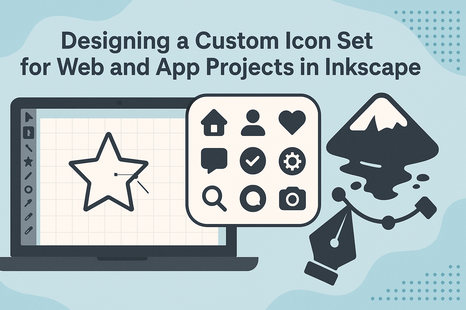
Creating a custom icon set can greatly enhance the visual appeal of web and app projects. Inkscape is a powerful tool that allows designers to create unique and engaging icons tailored to specific needs. With its user-friendly interface and a variety of features, Inkscape simplifies the process of transforming ideas into digital graphics.
Designers can follow steps to create distinct icons that reflect the style and functionality of their projects. Using tools like the Pen Tool or Shape Tool, even beginners can experiment with designs and export them in SVG format for scalability. Tutorials, such as those found on platforms like YouTube, provide step-by-step guidance.
Aside from visual benefits, custom icons help in enhancing user experience and reinforcing brand identity. Whether it’s a website or an application, icons play a crucial role in how users interact with the product. By exploring resources like the Lucide Icon Design Guide and GeeksforGeeks, designers can elevate their projects with distinctive and functional icon sets.
Understanding Inkscape Basics
Inkscape is a powerful tool for creating vector graphics, ideal for both beginners and experienced designers. By mastering its interface, setting up a workspace, understanding vector graphics, and effectively using layers, users can create stunning custom icons for their web and app projects.
Interface Overview
Inkscape’s interface is user-friendly yet filled with many tools and features. The main window includes toolbars, the canvas, a color palette, and a status bar.
On the left, there is a toolbox for drawing shapes, lines, and text. Above the canvas, users find control bars with options for each tool. The canvas is the workspace area where designs come to life. The status bar at the bottom provides useful tips and object details.
Navigation tools, such as panning and zooming, help users focus on different parts of their project. Customizing these interface components can streamline the design process.
Setting Up a Workspace
Setting up an efficient workspace in Inkscape can greatly enhance productivity. Users can start by adjusting canvas properties like dimensions and units according to project needs.
Docking essential panels, such as layers and fill and stroke, ensures they are easily accessible. Users often choose a grid or guides to assist with alignment.
Preferences allow adjustments to tool settings, color profiles, and keyboard shortcuts. Arranging these elements in a logical and accessible way reduces the time spent on basic tasks, allowing more focus on creativity.
Vector Graphics Fundamentals
Vector graphics are based on mathematical equations, which makes them scalable without losing quality. In Inkscape, objects are created using paths defined by nodes and lines.
Using the Bezier tool, users can draw and manipulate paths. Path operations, such as union, difference, and intersection, allow for complex shapes. Understanding fill and stroke is essential, as it determines the look of an object.
Color gradients and patterns can be applied to enhance icons. Mastering these fundamentals is crucial for flexible and high-quality icon design.
Working with Layers
Layers in Inkscape help organize different elements of a project. By using multiple layers, users can separate components like backgrounds, foregrounds, and details.
Layers can be locked, hidden, or reordered to control visibility and editing permissions. Grouping objects within a layer promotes easier manipulation.
Naming layers clearly is important for organization. Layers make it easier to work on complicated designs and maintain the flexibility to change individual parts without affecting the rest.
Planning Your Icon Set
Designing a cohesive icon set requires careful planning. By defining the scope, selecting a style, ensuring consistency, and considering how the icons will be used, the designer can create graphics that meet user needs and enhance the application.
Defining the Scope
To begin, it’s crucial to define the scope of the icon set. This involves deciding how many icons are needed and what functions they will serve. A designer needs to consider the specific tasks and features that the icons should represent.
They should create a list of all potential icons and prioritize them based on importance and use. This helps in determining which icons are essential and should be focused on first, and which can be added later.
Additionally, contemplating the range of devices and platforms these icons will be used on is important. Whether they’re used on a website or within an app, understanding the scope allows for more targeted and effective design work.
Choosing a Style and Palette
Choosing a style and color palette for the icon set is another key decision. Icons should reflect the overall aesthetic of the application or website. A consistent style ensures a uniform look that aligns with the brand’s identity.
Whether opting for flat design, skeuomorphic, or minimalist styles, the choice should resonate with the intended audience. Color choices should be clear and evoke the right emotions.
For example, bright colors can convey energy, while muted tones might suggest calmness. The palette should also be accessible, considering users with color vision deficiencies.
Consistency and Scalability
Consistency is critical in icon design. This means maintaining uniform line weights, alignment, and sizing. Establishing a grid system can help achieve this. Using a consistent pixel grid, such as a 1px grid, ensures that icons are visually aligned and balanced.
Scalability is also vital. Icons should be designed to scale up or down without losing clarity or meaning. This requires creating icons as vectors, which allows them to be resized easily for different devices and resolutions.
Usage Context Considerations
Considering where and how the icons will be used can impact their design significantly. Understanding the UI guidelines for different platforms helps create icons that are not only visually appealing but also functional.
Icons used in apps might need to look different from those used on websites due to differences in interaction patterns and screen sizes. Thinking about how users will interact with the icons helps in choosing appropriate shapes and sizes.
Remembering the user’s context ensures the icons are effective and improve the user interface experience.
Design Principles for Icons
Designing a custom icon set requires attention to several key principles to ensure they are effective and visually appealing. These principles include clarity, simplicity, alignment, and adaptation for various sizes.
Clarity and Simplicity
Icons should communicate their message quickly. Simplicity helps achieve this by reducing visual noise. Each icon should represent its function or idea clearly, avoiding any unnecessary details that may confuse users. A straightforward design helps users understand what the icon represents at a glance, which is crucial for intuitive user interfaces.
Using familiar shapes and symbols also contributes to clarity. When users recognize an icon, they can understand its function without hesitation. Having a consistent theme across all icons reinforces this understanding, creating a cohesive visual language.
Grids and Alignment
Using grids ensures that icons are balanced and aligned. Designers often start with a 24×24 pixel grid, which helps maintain proportion and symmetry. Grids guide the placement of elements within an icon, making sure everything fits neatly and consistently.
Alignment is crucial for visual harmony. Properly aligned icons appear organized and professional. Misaligned icons can disrupt the visual flow, causing user confusion. By adhering to icon grids, designers ensure a set of icons look unified and aesthetically pleasing.
Iconography Best Practices
Creating icons involves following best practices to enhance their effectiveness. Icons should be scalable, meaning they look good at any size. This often means starting with a simple design and adding detail as needed for larger versions.
Consistency across an icon set is vital. This means maintaining similar styles, shapes, and line weights. Consistency helps build brand identity and ensures users can navigate the interface smoothly. The use of personality and branding elements can also make the icon set unique.
Test for Different Sizes
Testing icons at different sizes is essential to ensure readability. Icons need to work equally well on small mobile screens and large desktop displays. A common approach is to begin with a small base size, such as 16×16 pixels, then add details as icons increase in size, as illustrated in many design guides.
Testing involves checking clarity and legibility in all intended display resolutions. If an icon becomes unclear at smaller sizes, it may need simplification. Proper testing helps avoid any inconsistencies that might arise when icons are used across multiple platforms.
Creating Icons in Inkscape
Designing icons with Inkscape can transform visuals for web and app projects. By mixing simple shapes with advanced features, users can build striking icons. The effective use of colors and effects enhances icons even more. Ensuring the icons are optimized keeps performance smooth.
Starting with Basic Shapes
Inkscape offers tools to create basic shapes like squares, circles, and triangles. Users can start by selecting the shape tool. These shapes form the building blocks of many icons.
Users can then adjust size and position by dragging corners or typing values for precision. Aligning and distributing these elements help maintain symmetry. The Snap feature ensures shapes join perfectly at edges, which is crucial for a clean design.
Advanced Techniques
For intricate designs, Inkscape provides advanced tools such as the Bezier Curve. This tool allows users to create custom paths by plotting points.
Using path operations like Union and Difference joins or cuts shapes to form distinct icon designs. The Node Tool is also useful for manually fine-tuning these paths. Patterns and textures can be added by importing files, providing an extra layer of detail.
Applying Color and Effects
Color enhances icon appeal significantly. Inkscape’s Fill and Stroke menu lets users choose solid colors or gradients. Gradients create depth, making icons more dynamic and appealing.
Filters like Blur and Drop Shadow add effects for further emphasis, giving icons a finished look. Using layers helps manage complex designs by separating elements and their colors, ensuring changes won’t disrupt the entire icon.
Optimizing for Performance
To keep website or app performance high, icons must be optimized. Inkscape enables users to resize their icons using the Export option. For web use, exporting icons as SVG format is ideal due to scalability and small file size.
Compression tools reduce file size without quality loss, essential for faster load times. Removing unused elements or simplifying complex paths further improves efficiency.
Exporting and Integration
Exporting icons correctly and integrating them into web and app projects is crucial. The choice of file formats impacts compatibility, and the process of exporting from Inkscape ensures quality across platforms.
File Formats and Compatibility
Choosing the right file format is important for ensuring that icons work properly on different platforms. SVG files are commonly used because they are vector-based and scale without losing quality.
PNG is another popular format, widely supported and perfect for use in apps needing specific sizes. It’s important to check the compatibility of these formats with the target platform to avoid integration issues later on.
Exporting Icons from Inkscape
Inkscape offers a straightforward process for exporting icons. First, design the icon at the required size. Use the “File” > “Export PNG Image” option to export.
Choose your desired resolution and size in the dialog box. For higher quality, select a higher dpi option. Ensuring all layers are visible and properly aligned ensures consistency in the exported images.
Integrating with Web and App Projects
After exporting, icons need to be integrated into projects. For web use, incorporating icons via CSS or using them in HTML is common. In CSS, utilize classes to maintain responsiveness and styling control.
In app development, formats like ICO or PNG, especially for Android and iOS, can be directly used. Carefully manage file naming and paths to avoid any errors during app development and deployment.
Maintaining Your Icon Set
Keeping an icon set useful and relevant is important. This means controlling different versions, updating designs, and expanding the collection to suit various needs.
Version Control
Using version control is a smart way to track changes in icon sets. Platforms like Git can help designers manage revisions, revert to earlier versions, and collaborate effectively. This is especially helpful when working with teams. Each update should be documented with clear notes, making it easier to understand the reasons behind any changes.
Consistent file naming is also crucial. It helps identify and retrieve specific icons quickly. Including the version number within the file name can simplify the process of locating the right version. Keep this in mind to prevent confusion and maintain order.
Updating Icons
Icons need updates to stay visually appealing and functional. Trends in design change, and updates ensure icons are current and visually compatible with modern interfaces. A regular review process can help identify which icons need tweaks or complete redesigns. Feedback from users or team members is also valuable.
When updating, focus on maintaining consistency with existing design elements. This means using the same style and proportions. Tools like Inkscape offer features for adjusting details without compromising the design’s core look. An organized update routine can keep the project seamless and efficient.
Extending Your Icon Set
Expanding an icon set may be necessary as new project requirements arise. This involves creating new icons that fit within the established style and grid system. Maintaining uniformity across new designs is critical to ensure a cohesive look throughout the set.
Designers should use a consistent grid size and color palette to preserve harmony. Consider user needs and project scope when extending the set. Prioritizing icons that enhance usability or meet specific demands will make the set more functional. Aligning new icons with existing ones not only builds consistency but also enriches the overall design language.