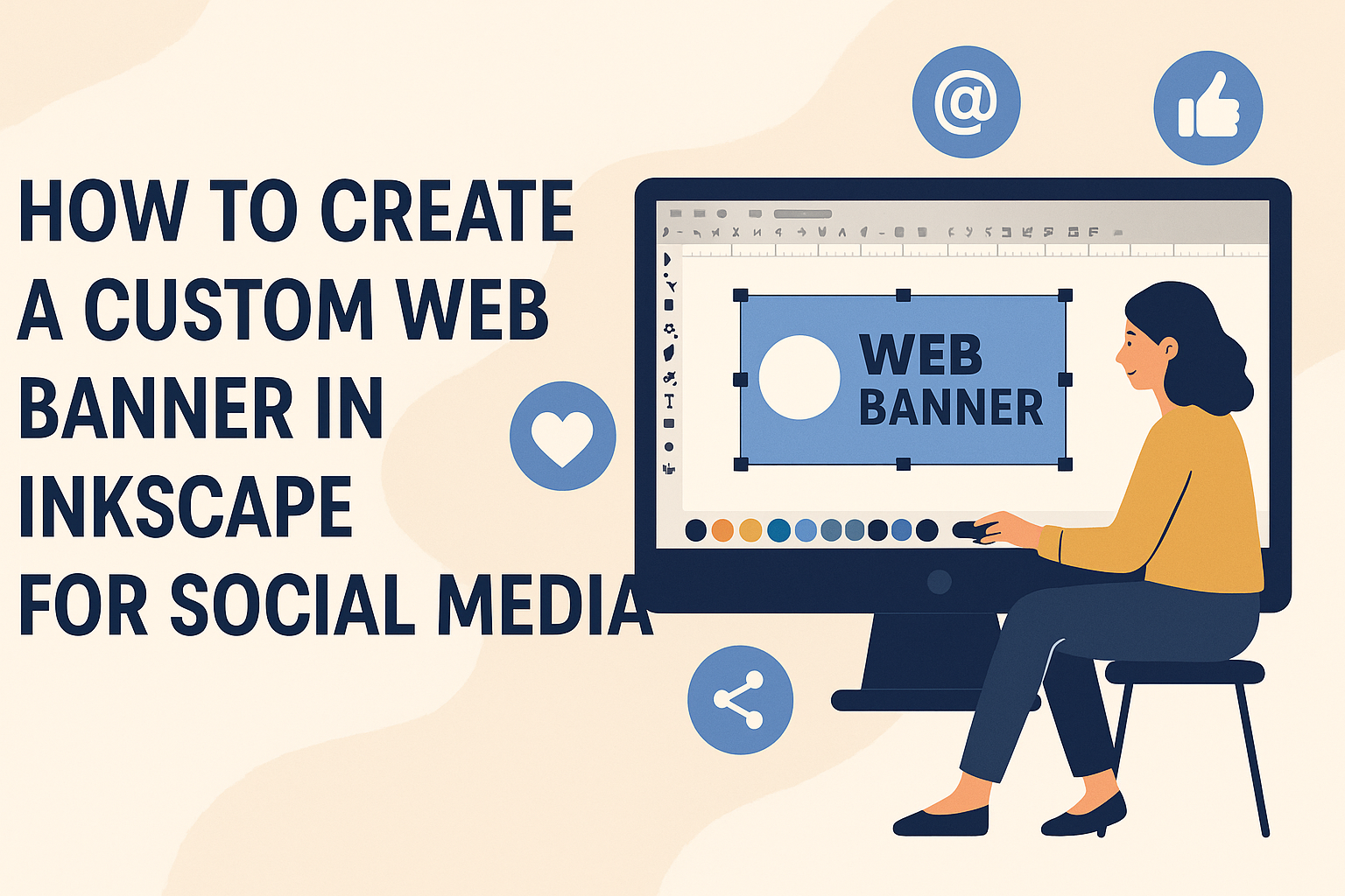
Creating a custom web banner in Inkscape for social media combines creativity with practical design. With Inkscape, users have access to a powerful tool that lets them mix shapes, colors, and text to produce eye-catching banners. To make a custom web banner in Inkscape, start by opening the software, select the dimensions for your banner, and use the drawing tools to craft a design that speaks to your brand’s style.
Inkscape is not just another graphic design tool; it’s free and packed with features to help designers at any skill level. Whether it’s a Facebook post or a Twitter header, Inkscape allows for easy integration of different elements to craft engaging visuals. For users looking to explore these features further, the video tutorial offers a step-by-step guide to making effective custom banners.
Designers can leverage free templates available for Inkscape to streamline the process and enhance creativity. These templates offer a head start, especially for beginners, making it easier to tweak designs to meet specific social media needs. Customize these templates by altering colors, fonts, and images to create unique banners that capture attention. To get started with free templates, visit Inkscape templates.
Getting Started with Inkscape
Before diving into creating a custom web banner, it’s important to get set up with Inkscape properly. This includes installing the software, becoming familiar with its interface, and configuring your document for design.
Installing Inkscape
Inkscape is a free vector graphics editor available for Windows, macOS, and Linux. To get started, visit the Inkscape website and download the appropriate version for your operating system. Follow the instructions provided by the installer.
For Windows, after downloading the .exe file, run it to start the setup. On macOS, the .dmg file needs to be opened and the Inkscape icon dragged into the Applications folder. Linux users can use package managers like APT or pacman for a smooth installation.
Once installed, open Inkscape to ensure that everything functions correctly. If any issues arise, the Inkscape forums offer a great place for troubleshooting and support. They provide solutions for installation problems and general guidance.
Understanding the Inkscape Interface
The Inkscape interface can look complex at first, but it becomes manageable once you know where things are. Along the top, the menu bar gives access to various tools and settings. The toolbar on the left contains drawing tools like paths, shapes, and the text tool.
Below the toolbar, you’ll find the control bar which changes depending on the tool selected. The right side features a dock where you can open dialogs for things like layers and objects. At the bottom, the color palette helps in selecting colors for your design work.
Spend a few minutes exploring the toolbar and familiarize yourself with options such as the Bezier tool. This will be valuable as you create complex shapes for your banners. Practicing switching between tools can make the design process smoother.
Setting Up Your Document
Preparing your document correctly is a crucial step. Start by selecting ‘File’ in the menu and then ‘Document Properties.’ Here, you can set the size and units for your project. For web banners, dimensions vary depending on platform, but a common size is 1024×300 pixels.
Choose ‘Pixels’ under the ‘Units’ dropdown to ensure precision needed for web graphics. Adjust the ‘Page Size’ by entering custom width and height. You can also set guidelines and grids which help align objects perfectly.
Creating a new layer through ‘Layer’ > ‘Add Layer’ helps manage complex designs by separating elements. Organizing layers effectively can make revising and editing parts of the banner easier later.
Design Principles for Web Banners
Creating an effective web banner involves careful attention to color schemes, font design, and branding elements. These elements work together to create a visually appealing and memorable banner.
Choosing a Color Scheme
A good color scheme is vital for making web banners stand out. It helps convey the message and mood of the banner. Designers often use colors that match the brand’s identity. For example, if a brand has a logo with blue and yellow, those colors should be part of the banner.
Color can also highlight important parts of the banner, like a call to action. Contrasting colors can make text and buttons pop. This catches the viewer’s eye and encourages them to interact with the banner.
Using color psychology, such as red for excitement or green for calmness, can enhance the message being delivered. Tools like Adobe Color can help find complementary or analogous colors for design.
Selecting Fonts Design
The choice of fonts can greatly affect the banner’s readability and appeal. Simple, clean fonts are often recommended because they are easy to read even at small sizes. Avoid using more than two font styles to keep the design cohesive.
The font should match the brand’s tone. For instance, a playful brand might use a casual font, while a corporate brand might choose something more formal. Font weight and size can emphasize specific words, making the message clear and engaging.
Using bold or italics can highlight key phrases without overcomplicating the design. It’s important to test how different fonts look across various devices to ensure consistency and legibility.
Incorporating Branding Elements
Incorporating branding elements is essential for making the banner recognizable and consistent with the company’s identity. This includes logos, mascots, or signature elements that represent the brand. They should be placed in a way that doesn’t overshadow the main message.
Logos can be positioned in the corner or near a call to action, keeping them visible but not intrusive. Using brand-related imagery helps maintain a consistent look across different platforms. These elements also make the banner more memorable to viewers.
It’s important to keep the balance between branding and content. Too much branding might distract from the banner message, whereas too little might not resonate with the audience.
Creating Your Banner
Creating a custom web banner in Inkscape involves using various tools and techniques. This process includes drawing shapes, adding text, inserting images, and applying special effects to make the banner stand out.
Drawing Shapes and Lines
Inkscape offers a variety of tools for drawing shapes and lines. Users can start with basic shapes like rectangles, circles, or triangles. These shapes form the foundation of the banner design.
To add more creativity, users might want to utilize the Bezier tool. This tool allows for the drawing of custom shapes and curves. Adjusting handles on these shapes can refine their appearance, ensuring the design looks polished.
Using layers can also help manage different elements of the design easily. By keeping shapes on separate layers, they can be adjusted or edited without affecting other parts of the banner.
Adding Text and Typography
Inkscape makes it easy to add text to banners. The Text tool allows users to create text boxes and type directly onto the design.
Adjusting font styles and sizes is essential for making the banner visually appealing. Users can choose from a variety of fonts available in Inkscape or install new ones. Choosing the right font can set the tone for the message the banner conveys.
Aligning and positioning text correctly is also crucial. It ensures that the message is clear and readable. Using guides and grids can help in aligning text consistently throughout the design.
Inserting Images and Icons
Inserting images and icons into a banner design can add visual interest. Inkscape allows users to import images by dragging and dropping them into the canvas.
Images can be resized and positioned as needed. By holding down the Ctrl key while resizing, users can maintain the image’s aspect ratio, preventing distortion.
Adding icons can be done by using existing clip arts or creating custom ones with the shape tools. Icons can highlight certain features or messages in the banner, making it more engaging.
Applying Filters and Effects
Filters and effects can give a banner a unique look. Inkscape offers a range of filters like blurs, shadows, and glows. These can add depth and interest to the design.
Applying a drop shadow can make text or shapes pop out from the background. This is done by selecting the object and choosing a shadow filter from the filters menu.
Experimenting with different effects can lead to interesting results. However, it’s important to keep them subtle, so they enhance rather than overwhelm the overall design.
Finalizing the Banner
When finishing a web banner in Inkscape, arranging elements perfectly, keeping the design consistent, and exporting it correctly are crucial steps. By ensuring these aspects are accurately addressed, the banner will be visually appealing and fit well on different social media platforms.
Arranging and Aligning Elements
Arranging the elements is key to a polished design. First, make sure text and images are aligned using Inkscape’s alignment tools. These tools allow elements to be centered or balanced within the banner. This step helps create a tidy and organized look.
Consider using grids and guides to assist in placement. They help ensure that no element appears out of place. Proper spacing between elements is also crucial. It keeps the design clean and easy to read.
For an added touch of professionalism, use grouping. Group related elements, such as text and icons, so they move together when repositioned. This ensures that, when changes are made, the design stays cohesive.
Ensuring Consistency
Consistency in design helps in brand recognition. It’s important to follow a set color palette and a limited range of fonts. This keeps the design visually connected and aligned with the brand’s identity.
Look over the banner to ensure all fonts are easy to read. This is especially important for social media, where text may become smaller on mobile devices. Additionally, make sure that the images and other graphic elements match in style, so nothing feels out of place.
Lastly, double-check that the banner adheres to any brand guidelines. This might include specific colors or logos that need to be included. Consistent branding will reinforce messages and engage the audience more effectively.
Exporting Your Design
Exporting correctly is as important as creating the design itself. Inkscape allows users to export in various formats, including PNG for web use. This format maintains quality while ensuring the file is not too large for online upload.
Before exporting, set the correct dimensions for where the banner will be displayed. Different social media platforms have specific size requirements. Make sure the banner fits those guidelines to avoid unwanted cropping or resizing.
Finally, check that the resolution is suitable for display purposes. For social media, a resolution of 72 DPI generally works well. Following these steps ensures that the banner looks sharp and professional once uploaded.
Best Practices for Social Media Banners
Creating effective social media banners involves understanding platform requirements and ensuring that the visuals are eye-catching yet efficient in terms of file size and format. By considering these factors, one can make a stronger impact on their audience.
Adapting to Different Platforms
Each social media platform has its own specifications for banner sizes. Using the wrong dimensions can lead to poor display of the banner. For instance, Facebook often requires different dimensions than Twitter or Instagram. It’s crucial to check each platform’s current requirements.
Design consistency is another key point. Although dimensions differ, maintaining a uniform style helps reinforce brand identity. This might include using the same color scheme, font, or logo across all banners. Regularly updating banners to reflect seasonal events or promotions also keeps content fresh and engaging.
Optimizing File Sizes and Formats
File size affects how quickly a banner loads. Large files can slow down loading times, which may deter viewers. Compressing images without losing quality is important. Tools like TinyPNG can help reduce file size while maintaining clarity.
Choosing the right file format is also critical. JPEG is generally suitable for banners with many colors, while PNG works for images with transparent backgrounds. Avoid using GIF for banner images as they can be much larger and slower to load. Checking the file optimization guidelines for each platform can ensure faster loading speeds.