In the world of web and mobile design, creating consistent and visually appealing layouts is crucial. Designers often turn to Figma’s grid and layout system for help. Figma allows designers to align objects and maintain structure using various grid types like uniform, column, and row grids.
These grids help to build a sense of hierarchy and balance in the design, which can enhance user experience. By mastering Figma’s grid system, designers can adapt layouts to different devices and screen sizes, offering a seamless experience to users.
For those eager to improve their design skills, learning to use Figma’s layout tools can be a game-changer. The platform provides a range of features that make it easier to apply and adjust grids. This is essential for any designer looking to make professional and responsive web and mobile interfaces.
Getting Started with Figma
Figma is a popular tool for designing web and mobile interfaces due to its versatile features. This section will cover the basics, including navigating the interface, setting up projects, and using fundamental tools like frames, shapes, and layers.
Overview of Figma’s Interface
Figma’s interface is intuitive and user-friendly. At the top, you’ll find a toolbar with options for creating shapes, adding text, and more. The main workspace is where your designs come to life. On the left, the Layers Panel shows all the elements in your project, making it easy to organize and edit them. The Properties Panel on the right allows you to tweak styles, layouts, and properties of selected elements. Getting familiar with these panels helps users work efficiently.
Setting Up Your First Project
To start a new project in Figma, open the application and click on the New File button. You’ll be prompted to name your project and select a canvas size, such as for web or mobile. Use the Preset Sizes for common devices if unsure. Once the file is created, explore options like layout grids to set up guides for your design. These tools are crucial when creating designs that are structured and visually appealing.
Figma Basics: Frames, Shapes, and Layers
Frames act as containers for your design elements. They can represent devices—such as a smartphone—or sections of a webpage. Start by choosing a frame size from the Frame Tool menu. Next, add shapes and text to bring your design to life. Each element you add creates a new layer automatically. Layers can be rearranged and renamed in the Layers Panel to keep your project organized. Understanding these basics is key for creating complex designs with ease.
By mastering frames, shapes, and layers, designers can develop both simple and complex layouts. Whether you’re designing a mobile app or a website, having a good grip on these fundamentals is essential.
Understanding the Grid System in Figma
Figma’s grid system is a vital tool for designers aiming to create harmonious and organized layouts. It offers flexibility in choosing different grid types to cater to diverse design needs and ensures design consistency.
The Role of Grids in Design
Grids play a crucial role in design by providing a structured framework for arranging visual elements. They help in maintaining alignment and consistency across different parts of a design. By using grids, designers can create a balanced composition and ensure that all elements have a defined place within the layout. This is especially important for creating clear visual hierarchy and structure. Grids also make adapting a design to various screen sizes and resolutions easier, enhancing the responsiveness of web and mobile designs. Incorporating grids into designs helps improve usability and readability, which are key factors in user experience.
Types of Grids Available
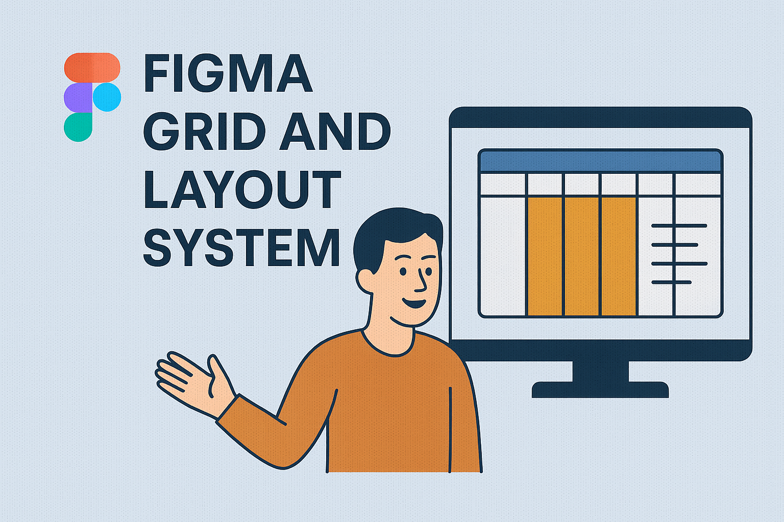
Figma offers several types of grids to suit different design needs. Some common options include modular grids, which divide the layout into uniform units and are great for responsive design. Column grids help in organizing content into vertical sections, making navigation intuitive.
Row grids, on the other hand, offer a way to create alignment across horizontal planes. This is particularly useful for designs that require even spacing. Figma also allows for creating custom grids. This flexibility ensures designers can adapt the grid system to fit specific project requirements, enhancing creativity while maintaining structure and order. Selecting the right grid type depends on the project goals and the specific challenges of the design task at hand.
Working with Columns and Gutters
Columns and gutters are vital components in creating organized and well-structured designs in Figma. Columns help to align content consistently, while gutters provide spacing between columns to enhance readability and design balance.
Defining Columns in Figma
Creating columns in Figma involves selecting a frame where the columns will be applied. Users can choose the type and number of columns that fit their design needs. Each column type, like multi-column or modular, impacts how content is arranged on the page. Designers have control over the column width to ensure the layout supports various screen sizes and design contexts. For more detailed instructions on setting up columns, check out this article about implementing grids and layouts in Figma.
Columns are especially useful for maintaining clear visual hierarchies. By adjusting the width and spacing of columns, creators can ensure content is not only visually appealing but also easy to navigate. This approach supports a seamless user experience across different devices.
Adjusting Gutter Width for Responsiveness
Gutters are the spaces between columns, and adjusting their width is crucial for responsive design. In Figma, users can modify gutter widths to accommodate different screen sizes, ensuring the layout looks great on both web and mobile platforms. Responsive gutters adapt to various display dimensions, allowing for a consistent flow of information.
By tweaking gutter sizes, designers can manage how tightly content is packed together, which affects readability and aesthetics. Wider gutters can make a design feel more open, while narrower gutters maximize content space. Understanding how to effectively use gutters will enhance a design’s adaptability and visual harmony. For insights on setting up responsive grids, explore this responsive grid system tutorial.
Layout Grids in Action
Layout grids are essential in Figma for organizing content consistently. They help designers align elements, create harmonious layouts, and ensure responsiveness across devices.
Applying Layout Grids to Frames
To start using layout grids, designers must first select a frame. Grids in Figma can only be applied to frames, which act like the canvas for designs. By clicking on the frame, users can access the layout grid options in the right sidebar. From there, they can choose different grid types like columns, rows, or grids.
Designers can customize the number, width, and color of columns to suit their project’s needs. For mobile designs, using a simple column grid helps in maintaining consistency across screen sizes. This setup ensures that content aligns correctly when viewed on various devices, providing a seamless user experience.
Managing and Editing Grids
Once a grid is applied, designers might need to adjust it to fit their design changes. Figma allows easy modification of grids by selecting the frame and accessing the layout grid settings. Here, they can alter grid properties like the number of columns, gutter size, and margins to better suit the content layout.
Designers often experiment with these settings to achieve their desired look and function. Managing grids efficiently is crucial for responsive design, as it allows the layout to adapt to different screens. Adjusting these parameters can create a balance between design aesthetics and functionality, ensuring a flexible and accessible design process.
Designing for Web and Mobile
Designing for web and mobile involves creating interfaces that work well on a wide range of devices and screen sizes. Important techniques include responsive design and choosing whether to focus on mobile or desktop first.
Responsive Design Techniques
Responsive design ensures that web content adjusts smoothly across devices. One common technique is using flexible grid systems, which can be adjusted based on the screen size. Using CSS media queries allows for specific styles at different breakpoints, optimizing layout and design. Scaling images and text properly ensures they look good on high-resolution displays, such as those found on mobile devices. Utilizing tools like Figma’s grid features helps maintain consistency and precision, allowing designers to create adaptable and visually appealing designs for both web and mobile.
Mobile-first vs Desktop-first Approaches
Choosing between a mobile-first or desktop-first approach can impact design decisions. A mobile-first strategy prioritizes designing for smaller screens initially and then scaling up. This often leads to simpler, faster-loading pages perfect for mobile users. On the other hand, a desktop-first approach involves designing for larger screens and scaling down, which can sometimes result in a richer feature set for web users. Evaluating the target audience and device usage can help decide which approach is best. Tools like Figma make it easier to adapt designs to either strategy by offering flexible frameworks and layouts.
Advanced Grid Techniques
Figma offers tools that let designers create detailed and responsive layouts. Mastering advanced grid techniques can elevate web and mobile designs. This section explores nested grids and using constraints with grids to enhance flexibility and precision.
Nested Grids for Complex Layouts
Nested grids are invaluable for complex designs. Using them, designers can create layers of organization within a single frame. This is helpful for projects that need various content sections.
Nested grids allow for diverse and flexible layouts. Designers can control spacing and alignment more precisely, leading to a cleaner design. By organizing elements hierarchically, they create visually appealing and coherent designs.
This technique is beneficial in responsive design. Designers can easily adjust nested grid layouts for various screen sizes. Learn more about advanced grid layouts in Figma on the Poespas Blog. This approach simplifies complex projects and enhances creativity, making it essential for detailed design work.
Using Constraints with Grids
Constraints help maintain consistency while adapting to different screen sizes and orientations. In Figma, constraints allow elements within grids to respond to changes in the frame size.
When combined with grids, constraints offer a powerful tool for responsive design. Designers can fix elements to different parts of the frame. This helps ensure that elements remain aligned and proportional as screens resize.
For example, designers can anchor elements to the top, bottom, or sides of a grid. This ensures the layout remains orderly and logical, even when dimensions change. This strategy is crucial in mobile design to cater to varying device sizes seamlessly. For more about using constraints with grids in Figma, see Figma’s best practices.
Best Practices for Grid Usage
Grids in design provide structure and help maintain balance in layouts. They ensure consistency and efficiency. While following grid lines is essential, knowing when to break them can allow for creative flexibility. Understanding these aspects can help designers create more effective and appealing designs.
Consistency and Alignment
Maintaining consistency and alignment is crucial when using grids. Designers should ensure that elements line up properly to create a cohesive look. Consistent spacing between elements, such as text and images, helps users navigate the design easily.
Proper alignment improves readability and visual appeal. For example, using a layout grid with columns ensures that text and images are evenly spaced. This avoids clutter and makes the design more organized.
Designers should choose a grid system that matches the project’s needs. Whether using a modular grid for complex layouts or a column grid for simpler designs, selecting the right type plays an important role. The goal is to create a harmonious and intuitive experience for users.
When to Break the Grid
Sometimes, breaking the grid can enhance design creativity. Designers may shift elements slightly to draw attention or create emphasis. This technique can make certain features stand out, such as a call-to-action button.
However, breaking the grid should be done with caution. It should enhance the design without causing confusion. Elements that break the grid should still appear intentional and integrated into the overall layout.
Knowing when to break the grid comes with experience and practice. It can add uniqueness and dynamism to a project, but it’s crucial not to disrupt the design’s purpose or user flow. In some cases, breaking the grid can make a design more memorable and engaging.
Collaboration and Sharing Grid Systems
Figma’s grid systems make working together and sharing designs with others much easier. These are essential for ensuring everyone is on the same page when designing or developing a project. This section will explore how to share grids with your team and effectively export layouts for development handoff.
Sharing Grids with Your Team
Figma allows designers to easily share grid systems with team members. By creating a shared library, everyone on the team can access and use the same set of grids. This ensures consistency across different projects.
Designers can set permissions in Figma to control who can view or edit grids. This is helpful for maintaining the integrity of design systems. Team members can comment directly on grids, making collaboration smoother.
When designers update a grid in the shared library, these changes are automatically synced across all users. This feature saves time and prevents errors caused by outdated grids. To organize grids, teams can label and categorize them according to their project needs, ensuring easy navigation.
Exporting Layouts for Development Handoff
Exporting Figma layouts for developers is crucial for a seamless handoff. Designers can export layouts in formats like PNG, SVG, or PDF, which are easy for developers to use. These formats ensure that the design specifications are clear and accessible.
Developers appreciate annotated grids. Designers can add notes directly within Figma to clarify specifics, ensuring everyone understands spacing, alignment, and other important details. Figma also supports exporting CSS code snippets for web projects, which can be a great help to developers.
Providing a detailed style guide, along with the exported grids, ensures that developers recreate the intended design accurately. Linking grids when exporting makes it easier for developers to navigate complex layouts, keeping the development process as streamlined as possible.