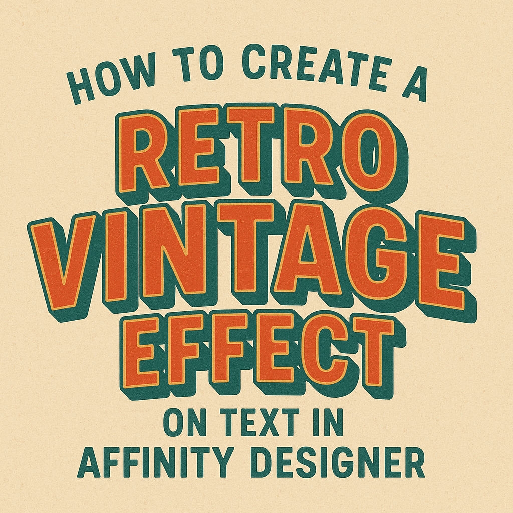
Creating a retro vintage effect on text in Affinity Designer can add a charming touch to any design project.
The best way to achieve this effect is by using various layer styles and color techniques that evoke nostalgia. This process allows designers to transform simple text into eye-catching graphics that stand out.
Whether someone is designing a poster, a logo, or a social media graphic, mastering this technique makes their work more appealing.
By exploring steps that include choosing the right font and applying creative effects, they can bring the past to life in their designs. This article offers simple, actionable tips for anyone looking to elevate their Affinity Designer skills.
Setting up Your Affinity Designer Workspace
Creating an effective workspace is crucial for designing. Proper document settings and familiarity with the interface can greatly enhance the design experience while working on retro vintage effects.
Choosing the Right Document Settings
When starting a new project in Affinity Designer, selecting the right document settings is key.
This involves choosing the correct dimensions for your artwork. Designers often prefer dimensions like 1920 x 1080 pixels for digital designs or A4 for print.
Be sure to select the proper DPI (dots per inch). A setting of 300 DPI is ideal for print, while 72 DPI is sufficient for web use.
Furthermore, consider the color format. Choose RGB for digital designs and CMYK for print. This choice ensures that colors appear as intended in the final product.
Navigating the Affinity Designer Interface
Familiarizing oneself with the Affinity Designer interface is essential.
The main tools are organized in a sidebar on the left, while the top menu offers options for file management and editing functions.
Using the toolbar, designers can quickly access essential tools like the rectangle tool and text tool.
In addition, the context toolbar changes based on the selected tool, providing relevant options.
It’s also helpful to customize the workspace.
Designers can rearrange panels and use the View menu to access workspace presets. This customization can streamline the design process and improve efficiency.
Creating the Base Text for the Retro Effect
Creating the perfect base text is essential for achieving a stunning retro vintage effect. The right font and adjustments make a significant difference in how the final design looks. Below are two key aspects to focus on.
Selecting the Perfect Font
Choosing the right font can set the tone for the entire design. For a retro effect, look for fonts that have a vintage flair. Popular choices include serif fonts or bold script styles that evoke nostalgia.
Consider these tips:
- Research Font Styles: Vintage designs often use fonts from the 70s or 80s. Look for free or commercial fonts that fit this style.
- Use Text Resources: Websites like TextStudio offer special vintage-style font generators for added options.
- Test Different Options: Experiment with various fonts to see how they come together visually in the design.
Adjusting Text Size and Kerning
Once a font is selected, adjusting the text size and kerning is crucial.
The text size determines its visibility, while kerning affects the space between letters.
Here’s how to make adjustments:
- Set a Readable Size: Ensure the font size is appropriate for the design. A larger size helps make a bold statement.
- Adjust Kerning Carefully: Change the spacing between letters for better balance. Too tight or too loose can detract from the vintage effect.
By paying attention to font selection, size, and kerning, designers can create a solid base for their retro text effect.
Applying the Vintage Effects
Creating a retro vintage effect on text involves several techniques that enhance the overall look. These methodical steps help achieve a vintage feel by adding depth, texture, and color to the design.
Adding Textures and Grains
Textures and grains can significantly enrich the vintage look. They create an aged appearance, making the text stand out.
Start by selecting a texture image, like vintage paper or grunge patterns.
- Import the texture into Affinity Designer.
- Place it above the text layer in the Layers panel.
- Change the blend mode of the texture to Soft Light or Multiply for best results.
Next, adjust the opacity until it complements the text without overwhelming it. This layering adds character and depth to the overall design.
Using Layer Effects and Blend Modes
Layer effects offer an easy way to enhance text without complex adjustments. Shadows, glows, and other effects can add dimension.
- Select the text layer and go to the Effects panel.
- Apply a Drop Shadow for depth. Adjust the parameters like blur and distance to suit the style.
- Experiment with Outer Glow or Inner Shadow to create emphasis.
Blend modes provide another layer of creativity. They control how colors interact across layers, helping achieve a unique look. Test modes like Overlay or Multiply to see what works best for your project.
Incorporating Color Palettes and Gradients
Choosing the right colors is crucial in achieving a vintage vibe. Soft, muted tones typically work best.
Curate a color palette that reflects the era you want to capture. Pastel colors, for instance, work beautifully for a retro feel.
To add a gradient, select the text and go to the Gradient Tool.
- Choose two or more colors from your palette.
- Apply the gradient to the text, adjusting the angle for desired effects.
This technique not only adds a modern touch but also enhances the retro aesthetics.
Final Touches and Exporting Your Design
As the design comes together, refining the edges and saving in the right format are key steps. Attention to detail and proper export settings ensure the final product looks professional and is ready for use on different platforms.
Refining Edges and Details
In Affinity Designer, refining edges can significantly enhance the overall look.
Using the Outline Tool can help creators adjust the thickness of text edges. This step ensures the font stands out while maintaining a clean appearance.
Next, it’s useful to zoom in and check for any pixel issues or imperfections.
Adjust the curves and straight edges using the Node Tool for a smoother finish. Applying a slight drop shadow can add depth, making the text pop against the background.
Lastly, consider adjusting the opacity of layers to achieve a more vintage feel. Fading the edges slightly can mimic natural wear over time.
Saving and Exporting for Multiple Platforms
Once the design is fine-tuned, it’s important to save it correctly.
Affinity Designer allows users to export files in various formats such as PNG, JPG, and SVG. Each format serves different purposes.
To export, navigate to the File menu and select Export.
Choose the desired format based on how the design will be used. For web use, PNG or JPG works best. SVG is ideal for scaling without losing quality.
When saving, creators should also consider the resolution.
A 300 DPI setting is recommended for print, while 72 DPI suffices for digital displays.
Lastly, make sure to name and organize files logically for easy access later.