Creating a retro text effect in Inkscape can bring a touch of nostalgia to any design project. Whether you’re working on a poster or a branding project, vintage designs with retro text styles are always eye-catching. Using Inkscape to make these effects is both fun and accessible, even for beginners.
Retro text effects often involve bold colors and layered designs that were popular in past decades. In Inkscape, elements like the masking feature can add depth and an aged look to your work. If you’ve ever wondered how to recreate a classic sunset style or stacked vintage lettering, Inkscape provides the perfect tools to achieve this.
Since Inkscape is free and open-source, it’s a great choice for designers looking to experiment with styles without the cost. Learning how to use this software to create retro text effects can expand your creativity, allowing you to mix modern artwork with timeless charm. Dive into the world of vintage design and discover all the possibilities waiting in Inkscape.
Getting Started with Inkscape
Starting with Inkscape involves a simple download and installation process. After setup, familiarizing oneself with the interface is crucial.
Downloading and Installing Inkscape
To begin using Inkscape, one needs to download it from the official Inkscape website. It’s available for Windows, macOS, and Linux. On the website, hover over the Download menu and select your operating system.
After downloading, run the installer. For Windows, follow the installation wizard prompts. On macOS, drag the Inkscape icon into the Applications folder. For Linux users, the package manager usually has Inkscape, but users can also compile from source if needed.
Once installed, launch Inkscape to ensure everything runs smoothly. If there are any issues, checking the FAQ or support forums can be helpful.
Familiarizing Yourself with the Interface
Understanding Inkscape’s interface can enhance design efficiency. When you first open Inkscape, the canvas takes up most of the screen. Tools are on the left, and menus are at the top. Familiar tools include the Selector for choosing objects and the Bezier tool for drawing curves.
The main toolbar has options like zoom and undo. Details about a selected tool appear in a bar above the drawing area. On the right, panels like layers and properties can be opened for more control.
Exploring these components by hovering over them for tooltips or experimenting with different functionalities can speed up the learning process. Practicing with simple designs can also help new users get comfortable with the software.
Understanding Vintage Design Elements
Vintage design elements bring a sense of nostalgia and timeless style. By understanding these elements, designers can effectively create retro text effects that capture the essence of past eras.
Key Characteristics of Retro Text
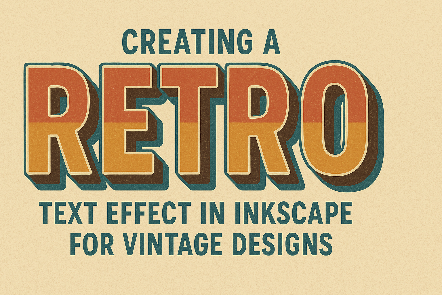
Retro text often includes features that evoke a sense of nostalgia. One such characteristic is bold typography, which uses thick lines and large, striking fonts to draw attention. These fonts often have curved edges or geometric shapes, reminiscent of mid-20th century styles.
Textures can also enhance retro text. Utilizing distressed or aged effects gives the text an old-time feel. Techniques like halftone patterns or grainy overlays can help achieve this.
Layering and shadows are important, too. They add depth and make the text stand out. By using different layers, designers can create a 3D effect without complex tools.
Choosing the Right Color Palette
Selecting the right color palette is essential for a vintage look. Often, these palettes include muted or desaturated colors, which mirror the limitations of printing technology from earlier times.
Warm shades like mustard yellow, burnt orange, and olive green are typical and convey a sense of warmth and familiarity. Pastels, such as soft pinks and blues, can also invoke a retro feel.
Pairing these colors with neutral tones helps balance the design. Cream, beige, and off-white can be used as background colors or for highlighting text elements.
Using these carefully chosen colors brings an authentic vintage appearance to any design. It’s all about creating harmony between the tones to evoke the right atmosphere.
Creating Your Text
In this section, readers will learn how to add text to their Inkscape canvas and choose a fitting retro font style. These are essential steps for anyone looking to create eye-catching vintage designs.
Adding Text to Your Canvas
To begin, open Inkscape and start a new project. Use the Text Tool, which looks like an “A” icon, to click on the canvas where you want to place your text.
Simply type the words you need for your design. Adjust the size by clicking and dragging the corners of the text box. The text can also be rotated to suit the layout of your design. Remember that placement is important to ensure your text is easily readable and appealing.
Experiment with different alignments, such as centered or left-aligned, to see what works best. Consistent spacing between lines also helps achieve a professional look. The positioning of your text should enhance the final design, ensuring balance and harmony on the canvas.
Choosing a Retro Font Style
Selecting a retro font sets the tone for your vintage design. Inkscape lets you experiment with various fonts to find the right match. In the Text Menu, go to the font selection dropdown to browse through available choices.
Fonts like League Gothic or Zabatana bring a classic feel to your text. They are popular for their bold and distinct appearance. Consider the style and theme of your project when choosing fonts.
A bold font may fit a poster design, while a fancy script suits elegant invitations. Try different fonts to see their impact on your text’s readability and style. Adjust the text’s color and effects, like shading or highlighting, to enhance its retro feel. This combination makes your text a standout feature of your design.
Applying Effect Techniques
Creating a retro text effect in Inkscape involves some interesting techniques. This section explains how to use path effects and 3D elements to add depth and character to your designs.
Using Path Effects
To add a retro touch, start by transforming the text outline. With Inkscape, apply path effects to create curvature or distortions that give a vintage feel. First, convert the text to paths by selecting Path > Object to Path. This allows the use of various path effects.
Choose a path effect like “Bend” or “Envelope Deformation” to shape the text. These effects let you bend and adjust paths, giving them a unique style.
Another useful tool is the “Bezier Envelope” effect. This gives more control over the text’s shape, letting designers stretch and skew text into interesting patterns. By experimenting with different options, the final design can look dynamic and expressive.
Creating a 3D Look
To achieve a 3D appearance, begin by duplicating the original text. Move the duplicate slightly to simulate depth. Then, blend the two copies using the interpolating tool by selecting Extensions > Generate from Path > Interpolate.
This tool allows for smooth transitions and layered depth, creating a shadow or multi-layered effect. By adjusting the gradient and shadow direction, designers can enhance the three-dimensional look further.
Adding highlights and shadows amplifies the design. Use the “Fill and Stroke” options to add a shadow effect that matches the retro style. This contrasts with the light source, giving the text more realism. Combining these elements results in a strikingly vintage design full of visual interest.
Adding Textures and Patterns
Textures and patterns can enhance retro text effects in Inkscape, giving designs a unique, vintage feel. These elements can add depth and interest, transforming simple text into a standout graphic.
Incorporating Grunge Textures
Grunge textures give a rugged, aged appearance to text, adding character and a touch of historical flair. To apply them in Inkscape, one can use the masking feature to overlay a grunge image onto text.
First, import a texture image and position it over the text. Next, select both the text and the texture, and use the Object > Mask > Set option. Adjust the transparency and blend settings to achieve the desired effect.
This technique helps in creating a worn, timeless look that is popular in vintage designs.
Using Pattern Overlays
Pattern overlays introduce repetitive visual interest to text, enhancing its appeal. In Inkscape, create or import a pattern file, such as stripes or polka dots.
Afterward, convert the text to a path using Path > Object to Path. This step is crucial for ensuring patterns conform to the text shape. Position the pattern over the text, select both, and choose Object > Clip > Set to apply the pattern.
By customizing the colors and size of these patterns, designers can achieve different retro styles. Experimenting with overlays helps to unlock creative possibilities, adding vibrant nuances to any retro-themed project.
Finalizing and Exporting Your Design
To complete your retro text effect in Inkscape, focus on perfecting the details and ensuring your file is ready to use. This includes making final adjustments to your design and choosing the right file format for export to maximize quality and compatibility.
Adjusting Final Details
After completing your retro text effect, double-check all elements for consistency. Ensure that colors and shadows are applied correctly and that text alignment is uniform across the design.
Zoom in to inspect lines and edges for any unintended overlaps or gaps. Consider testing various background colors to see how the text stands out. This can highlight any necessary adjustments in contrast or saturation.
If your design includes multiple text layers, verify the layering order so no essential parts are obscured. A clear structure can enhance the overall retro appearance of your design.
Tip: Use Inkscape’s align and distribute features to make sure all elements are perfectly positioned. This helps in achieving a polished and professional look.
Exporting to Various File Formats
Exporting your final design in the correct format is crucial. For web usage, consider saving it as a PNG file, which preserves quality with a transparent background if needed. If your design is meant for print, opt for a high-resolution PDF or SVG file, offering scalable graphics without loss of quality.
If you need multiple formats, adjust the export settings for each. In Inkscape, use File > Export to select desired formats and resolutions. Remember to name your files descriptively to easily identify them later. This ensures you have versatile files ready for different applications, whether digital or print.
Checklist:
- PNG for web
- PDF or SVG for print