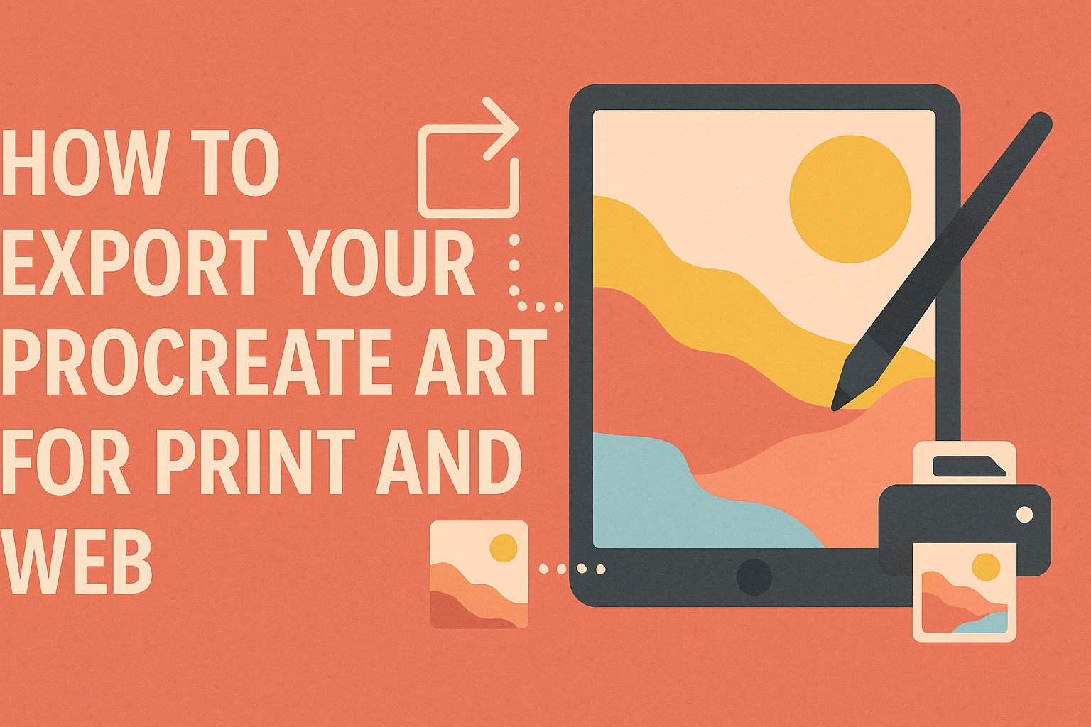
Creating digital art on Procreate opens a world of possibilities, but sharing that art with others involves knowing how to export it correctly. To ensure your artwork looks perfect on both print and web, it is essential to export with the right settings. This includes choosing the right color format, resolution, and export options.
Procreate offers an easy-to-navigate system for exporting art. The software supports various file formats, making it versatile for different purposes. For instance, exporting in CMYK is crucial for print, while RGB is more suitable for web display.
Learning these steps not only enhances the quality of your work but also elevates the experience for anyone who views it. This blog post will guide you through the process, making exporting from Procreate both simple and effective. Readers can look forward to mastering techniques that bring their digital creations to life in any format they choose.
Understanding Digital Art Basics
In digital art, knowing the difference between raster and vector graphics, understanding resolution, and picking the right color mode are essential skills. These basics are key when preparing artwork for print or web use.
Pixels vs. Vectors
Digital art often involves working with pixels and vectors. Pixels are tiny blocks that make up a digital image. They are used in raster graphics, which include images created in Procreate. These images have fixed resolutions. When you zoom in, they can become pixelated or blurry.
Vectors, on the other hand, use mathematical formulas to create shapes. They can be resized without losing quality, making them ideal for logos and illustrations that require scaling. Understanding when to use pixels or vectors is vital for creating clear, high-quality art across various platforms. Each has its strengths, depending on the project’s needs.
Resolution and DPI
Resolution refers to the number of pixels in a digital image. It’s crucial for determining the quality of print art. The term DPI stands for “dots per inch” and describes how many dots of ink are placed in a printed inch. Procreate artists often aim for a DPI of at least 300 for high-quality prints.
Using a lower DPI might make the print look pixelated or blurry. This is why it’s important to set your canvas size correctly in Procreate before starting your artwork. Keep an eye on the pixel dimensions to ensure your artwork looks great both on screen and in print.
Color Modes: RGB vs. CMYK
Color modes are essential when converting digital art for different uses. RGB stands for red, green, and blue. It is used mainly for digital screens like computers and phones because these devices emit light.
In contrast, CMYK (cyan, magenta, yellow, and key/black) is used for printing. Printers mix these four inks to produce various colors on paper. Converting from RGB to CMYK is a critical step for digital artists to ensure their colors print accurately. Failing to do so can lead to inaccurate colors and poor-quality prints.
Setting Up Your Canvas in Procreate
Getting your canvas settings right in Procreate is essential before diving into your art project. Choosing the correct size and setting an appropriate DPI are critical for achieving high-quality prints.
Choosing the Right Canvas Size
Selecting the right canvas size is important for both print and web. In Procreate, users can create a custom canvas by tapping the plus sign in the gallery. It’s important to define the dimensions that fit the project’s needs. Standard paper sizes like A4 (210 x 297 mm) or letter size (8.5 x 11 inches) are good for printed art.
For digital projects, think about the medium where the art will appear. A social media post, for instance, might require a square format or a specific resolution. It’s smart to start larger to maintain quality if resizing becomes necessary later.
Setting the DPI for Prints
DPI, or dots per inch, is key to ensuring your artworks print clearly and sharply. Procreate allows users to set the DPI when creating a canvas. For optimal print quality, it’s recommended to set the DPI to at least 300. This ensures crisp and professional-looking prints without pixelation.
To check or change the DPI, open the canvas information by tapping the wrench icon and selecting Canvas. If the DPI is lower than 300, resizing the canvas can adjust it. Keeping an eye on DPI from the start helps avoid quality issues later on.
Creating Your Masterpiece
When crafting art in Procreate, understanding layers, color palettes, and brush techniques is crucial. Each element plays a vital role in bringing a piece to life, ensuring it translates well both on-screen and in print.
Layers and Their Importance
Layers in Procreate are like transparent sheets stacked on top of each other. They allow artists to work on different parts of their artwork without affecting other areas. Layers can be used to separate backgrounds, foregrounds, and details. This helps in making adjustments easily, like changing colors or fixing mistakes without disrupting the entire piece.
By organizing layers, artists can keep their workflow efficient. For instance, grouping layers or naming them appropriately can save time. Using layer blend modes also adds unique effects, enhancing the final look of the artwork.
Utilizing Color Palettes
A well-chosen color palette makes a big difference in how art is perceived. Procreate offers customizable color swatches, allowing artists to create and save palettes tailored for specific projects. This tool helps maintain color consistency throughout the piece.
Experimenting with different colors and understanding color theory can bring depth to the artwork. Artists often use warm colors to evoke emotion or cool colors for a calming effect. By exploring various combinations, they can communicate their message more effectively.
Effective Use of Brushes
Procreate provides a wide array of brushes, each serving a different purpose. Some brushes offer textures that mimic real-life materials like charcoal or watercolors. Understanding the right brush for each element in the artwork is key. Fine brushes work well for details, while broader brushes can quickly fill larger areas.
Customizing brushes can lead to unique results. Artists can tweak settings like opacity and flow to achieve the desired effect. Through practice, they can discover which brushes best suit their style, making their artwork distinctive and personal.
Preparing for Export
Before exporting artwork from Procreate, it’s crucial to ensure the layers are well-organized, and any final adjustments are completed. This step improves the quality of the final output, whether for print or digital platforms.
Flattening and Merging Layers
In Procreate, dealing with multiple layers can be cumbersome, especially when preparing for print. To streamline the process, artists often flatten or merge layers. Flattening layers reduces the file size by combining all visible layers into a single layer. This is helpful when the artwork no longer needs separate layer adjustments.
Merging layers is similar but gives more flexibility by combining specific layers while keeping others separate. To merge, simply pinch two layers together in the layers panel. Be careful, as this action is irreversible. Choose to keep editable layers when exporting for digital formats to provide more flexibility in the future.
Adjusting Final Details
Adjusting details like size, resolution, and color settings is essential before exporting. Checking the resolution ensures that the artwork meets print requirements. A resolution of at least 300 DPI is recommended for high-quality prints, while lower DPI settings are suitable for web use.
Color settings also matter. Switching from the default RGB profile to CMYK can help prevent color discrepancies when printing. This adjustment provides more accurate color representation on paper. Lastly, inspecting the artwork for any remaining errors or inconsistencies is a good practice, ensuring the final piece looks exactly as intended before exporting. This step prevents any surprises after printing or posting online.
Exporting for Print
Exporting artwork from Procreate for print involves choosing the right file format, ensuring the resolution and dimensions meet print standards, and applying sharpening techniques to enhance print quality.
Selecting the Correct File Format
When exporting for print, choosing the right file format is crucial. TIFF and PDF are often recommended as they retain high quality and can handle large file sizes.
TIFF files are favored for their ability to maintain image quality without loss, making them ideal for professional printing. They support layered images and have the flexibility to be compressed if needed.
PDFs are useful for documents with both text and images. They are a great choice when sending artwork to clients or printers as they ensure that the layout remains consistent across devices.
When selecting a file format, consider the requirements of the print service you’ll be using. Some printers might have specific preferences, so checking with them beforehand can save time.
Checking Resolution and Dimensions
Resolution directly affects print quality. For sharp prints, a resolution of 300 DPI (dots per inch) is generally standard. This ensures that images have enough detail when printed.
To set the right dimensions, navigate to the “Canvas Information” in Procreate. Adjust the width and height to match the size you’d like to print. It’s important to maintain a high pixel count to avoid pixelation in the final product.
Create custom canvas sizes in Procreate if the default options don’t suit your needs. Keeping the canvas size proportional to the print size helps maintain clarity and accuracy.
Sharpening for Print
Sharpening enhances the detail of your artwork. It’s a key step after adjusting the file format and resolution. In Procreate, you can use the Adjustment tools to fine-tune the sharpness.
Beware of over-sharpening, as it can lead to unwanted artifacts. A subtle touch often works best. Test different levels on screen to see how they appear.
Consider performing a test print of a small section. This can provide a real-world preview of how sharpening affects the finished product. Adjust based on these results to achieve the best balance.
Exporting for Web
To ensure that Procreate art looks great online, it’s essential to focus on reducing file size while maintaining quality. Selecting the right image format and applying metadata also play significant roles in the export process.
Reducing File Size without Losing Quality
Reducing file size is key to fast web loading times. One way to achieve this is by adjusting the resolution. A resolution of 72 DPI is typically effective for web images. Procreate allows artists to export their work at a reduced size, keeping files efficient for web use. Compression tools, like TinyPNG, can further shrink file size without noticeable quality loss. These tools optimize images by trimming unnecessary data, ensuring quick loading times and great visual quality.
Choosing Web-Friendly Formats
Choosing the right format is essential for maintaining quality online. JPEG and PNG are popular web-friendly formats. JPEGs are useful for complex images with many colors, while PNGs support transparency and are great for logos or icons. When exporting from Procreate, artists can select these formats in the Share menu. More information on format choices can be found in the Procreate Handbook.
Understanding and Applying Metadata
Adding metadata helps with image organization and searchability. Metadata includes essential information such as the artist’s name, creation date, and keywords related to the artwork. In Procreate, this data can be integrated into the file during the export process. Ensuring that metadata is accurate benefits artists by enhancing their online presence and search results. Platforms like websites and social media use this information to improve visibility, making it easier for audiences to discover the artwork.
Sharing Your Artwork Online
Sharing artwork online is an exciting way to reach a wider audience and showcase your creativity. It’s important to consider the best practices for social media and safeguard your work with watermarks.
Best Practices for Social Media
Social media is a powerful tool for artists to connect with audiences. Artists should choose platforms that fit their style, like Instagram for visuals or Pinterest for inspiration.
Posting regularly keeps followers engaged. Consistency builds an audience and encourages interaction. Using relevant hashtags increases visibility so more users notice the artwork.
Engagement is key. Artists should respond to comments and interact with other creators. This interaction builds community and could lead to collaborations. Quality over quantity is vital. High-quality images attract attention and reflect the artist’s professionalism.
Protecting Your Work with Watermarks
Protecting artwork online is crucial. Adding a watermark is one effective method. A watermark is a faint logo or signature added to digital art. It helps prevent unauthorized use while still allowing viewers to enjoy the art.
The watermark should be subtle enough not to distract but visible to discourage theft. Artists can place it in a corner or over part of the image. They should use design software like Procreate or Photoshop to apply watermarks easily.
For further protection, metadata can be included in digital files. This hidden information stores details like the creator’s name and copyright. Creating a balance between protection and visibility keeps the artwork safe and appealing online.