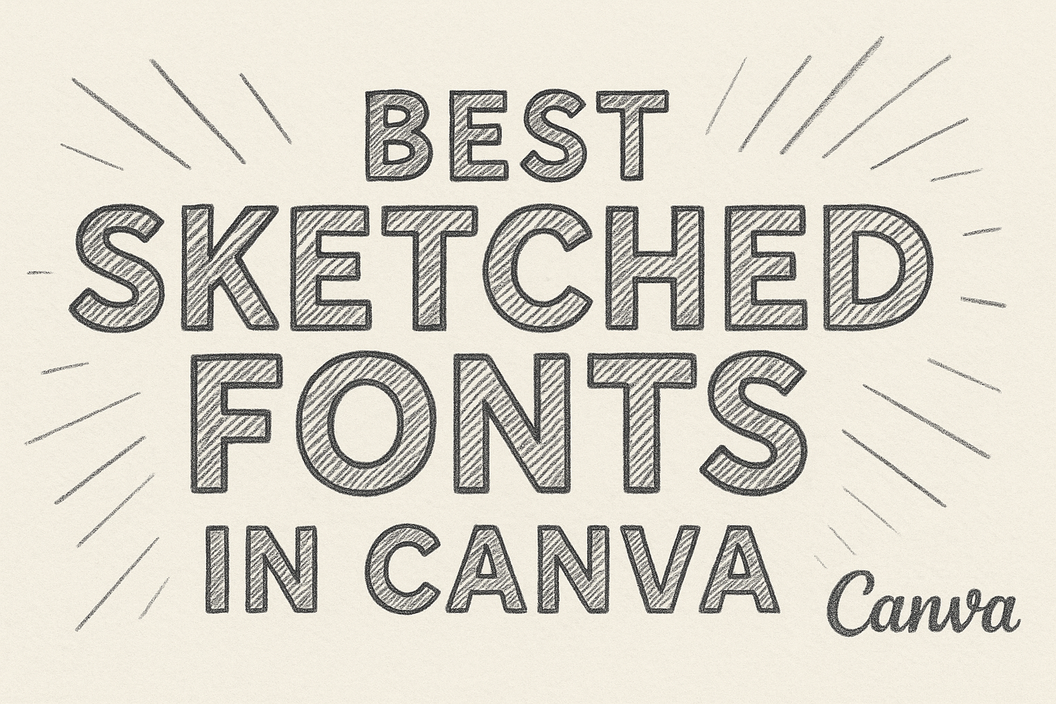
Sketched fonts bring a casual, hand-drawn style that makes designs feel more personal and creative. They often look like quick pencil or pen drawings, giving text a playful and artistic touch. The best sketched fonts in Canva help projects stand out by adding character and a handcrafted feel.
These fonts work well in titles, headers, or short phrases where personality matters more than formality. They can shift the tone of a design from polished to relaxed, making them perfect for invitations, posters, or social media graphics. With options ranging from elegant scripts to rough chalk styles, there’s a sketched font for almost any project.
What Are Sketched Fonts in Canva?
Sketched fonts in Canva bring a hand-drawn look to digital designs. They stand out because of their irregular lines, textured strokes, and casual style that mimic writing or drawing done by hand. These details make them useful for projects that need a personal or creative touch.
Defining Sketched Fonts
Sketched fonts are typefaces that imitate the look of hand-drawn letters. They often appear rough, imperfect, or textured, as if made with pencil, chalk, or ink. This makes them different from clean, computer-generated fonts.
In Canva, sketched fonts are available in many forms, from playful doodle styles to more detailed calligraphic sketches. Examples include Cabin Sketch and Londrina Sketch, which both highlight a casual, handmade feel.
Designers value these fonts because they add warmth and personality. Unlike standard fonts, each letter can feel slightly unique, which makes text look less mechanical and more natural.
How Sketched Fonts Differ from Other Styles
Compared to serif or sans-serif fonts, sketched fonts are less structured. Serif fonts use small strokes at the ends of letters for readability, while sans-serif fonts keep lines clean and simple. Sketched fonts, however, rely on irregular strokes and uneven textures.
They also differ from script fonts. While script fonts often focus on elegance and flow, sketched fonts emphasize creativity and informality. Some may overlap with script styles, like Authenia, which combines sketch-like qualities with calligraphy.
Another key difference is readability. Sketched fonts work best in short text, such as titles or headers, because their irregular lines can be harder to read in long paragraphs. This makes them more of a display font than a body font.
Why Use Sketched Fonts in Your Designs
Designers use sketched fonts to create a relaxed, approachable mood. They fit well in projects like posters, greeting cards, menus, or social media graphics where personality matters more than formality.
In Canva, these fonts help make designs feel custom rather than generic. A font like Sprite Graffiti adds an urban, edgy look, while Dingos Stamp Outline gives a rustic, handmade feel.
Using sketched fonts also helps establish tone. For example, a playful sketch font can make a children’s book cover feel fun, while a detailed calligraphic sketch can add elegance to an invitation. Choosing the right style depends on the message the design needs to send.
For a closer look at font options, check out this guide to the best sketched fonts in Canva.
Top Sketched Fonts Available in Canva
Canva’s font library includes many hand-drawn and sketched styles that balance personality with readability. Some options lean toward playful and casual, while others bring a more refined or artistic feel that works well in creative projects.
Josefin Sans
Josefin Sans is a clean, geometric typeface that works well when paired with sketch-style elements. While it is not overly decorative, its slightly vintage look makes it a strong choice for headings or minimalist layouts. Designers often use it to create a balance between modern simplicity and handcrafted details.
The font’s tall x-height and thin strokes give it a light, airy feel. This makes it effective for posters, branding, and social media graphics where clarity is important.
When combined with bolder sketched fonts, Josefin Sans acts as a grounding element. It provides structure to designs that might otherwise appear too busy or uneven.
Meow Script
Meow Script stands out for its flowing, handwritten quality. It mimics casual pen strokes, giving text a friendly and approachable tone. This makes it especially useful for invitations, greeting cards, or personal projects where warmth matters.
The letters connect smoothly, yet the strokes remain slightly irregular. This detail helps it feel authentic and less mechanical than many other script fonts.
Designers often pair Meow Script with simple sans-serif fonts to prevent the design from feeling cluttered. Its playful curves make it a good fit for short phrases, headers, or creative branding.
Drunken Hour
Drunken Hour is a bold, sketch-inspired display font with uneven letterforms. It has a rough, hand-drawn style that adds energy and character to any design. Because of its strong personality, it works best in titles, posters, or event graphics.
The irregular strokes give it a casual, almost rebellious edge. This makes it well-suited for projects that need to feel lively or unconventional.
Since it can be hard to read in long passages, designers usually apply Drunken Hour sparingly. Pairing it with a clean font like Josefin Sans creates contrast that keeps the overall design readable and balanced.
Best Sketched Script Fonts
Sketched script fonts combine the elegance of cursive writing with the casual, hand-drawn look of sketching. They work well in projects that need both personality and style, especially when designers want text that feels warm, creative, and approachable.
Feeling Passionate
Fonts that capture a feeling passionate style often use flowing strokes and soft curves. They resemble handwritten calligraphy but with a more relaxed, imperfect touch. This makes them suitable for invitations, quotes, or personal branding where emotion plays a key role.
Examples of passionate script fonts in Canva include:
- Authenia – elegant, calligraphic strokes that feel refined.
- Ralyne – graceful curves that add sophistication.
- Majesty – bold flourishes that stand out in decorative layouts.
These fonts are best used in short text, such as titles or headers, since longer passages can be harder to read. Designers often pair them with simple sans serif fonts to balance readability. Using them sparingly keeps the design polished while still conveying energy and charm.
Script Fonts for Handwritten Effects
Handwritten script fonts focus less on elegance and more on casual, sketch-like qualities. They mimic natural handwriting with irregular lines and uneven spacing, giving a personal and approachable tone. This style works well for creative projects, greeting cards, or social media graphics.
Popular handwritten script options include:
- Londrina Sketch – playful and informal, perfect for lighthearted designs.
- Cabin Sketch – doodle-like letters that feel casual and fun.
- Kompot Display Outline – rough, hand-drawn outlines that add texture.
These fonts shine in projects that want authenticity over perfection. They bring a friendly, human touch to designs, making them effective for informal materials like café menus, event posters, or children’s book titles. For more examples, see this guide on the best sketched fonts in Canva.
Chalk and Hand-Drawn Sketched Fonts
Chalk fonts in Canva bring a hand-crafted look that works well for classrooms, menus, or casual posters. They often mimic real chalk strokes, making text look playful, rustic, or handwritten depending on the style chosen.
Six Hands Chalk
Six Hands Chalk is one of the most popular chalk fonts available in Canva. It is free to use and has a natural, handwritten texture that feels like it was drawn directly on a blackboard. Designers often choose it for projects that need a friendly and approachable tone.
This font works especially well for menu boards, children’s materials, and DIY projects. Its rounded strokes and slightly uneven lines make it feel warm and personal. Unlike more polished fonts, Six Hands Chalk adds character without sacrificing readability.
A quick comparison shows why it stands out:
| Font Name | Style | Best Use Cases | Availability |
|---|---|---|---|
| Six Hands Chalk | Handwritten, Chalk | Menus, Posters, Education | Free in Canva |
Users who want a simple but effective chalk look often start with this font before exploring others. It balances clarity with charm, making it a reliable choice.
Chalk Fonts for Blackboard Effects
Fonts designed for blackboard effects go beyond just looking hand-drawn. They recreate the smudgy, textured strokes of real chalk. Options like Cabin Sketch, Berton, and Londrina Sketch provide different levels of roughness and irregularity, which helps mimic authentic chalk writing.
These fonts are often used in school presentations, restaurant signs, casual invitations, and social media posts. For example, Londrina Sketch has wavy lines and uneven thickness that give it a handmade feel, while Berton offers a retro chalkboard look that pairs well with vintage designs.
According to a list of chalk fonts in Canva, many of these styles are free, making them accessible for quick projects. They allow designers to add personality without needing custom artwork.
When used on dark backgrounds, chalk fonts create strong contrast and improve readability. This makes them especially effective for designs that need to grab attention while keeping a casual, welcoming tone.
Display and Serif Sketched Fonts
Display fonts often stand out with bold or decorative details, while serif fonts bring a classic and structured feel. When combined with a sketched style, both can create designs that look creative yet still readable.
Playfair Display
Playfair Display is a serif typeface that works well for titles and large text. It has high contrast between thick and thin strokes, which gives it a refined look. When paired with a sketched effect, the sharp serifs balance the hand-drawn texture.
Designers often choose Playfair Display for invitations, branding, or editorial layouts. The font’s elegance makes it suitable for projects that need a formal yet approachable tone. Its readability at larger sizes also makes it a strong choice for headlines.
Compared to playful doodle fonts, Playfair Display keeps a professional edge. This balance allows it to fit into both creative projects and more traditional designs. Readers can explore more about display fonts in Canva to see how Playfair Display compares to other options.
Serif Fonts with Sketched Appeal
Serif fonts with a sketched look combine structure with a handcrafted touch. The small strokes at the ends of letters give them a grounded style, while the rough or uneven lines add personality. This makes them ideal for posters, menus, or handmade product labels.
Some serif fonts lean toward a vintage style, while others feel more playful. The mix of formal letterforms and sketch-like detailing creates a versatile design tool. These fonts often work best in short phrases or headers, since the texture can affect readability in long text.
Designers can explore options highlighted in collections of sketched fonts in Canva to find styles that fit their project.
Tips for Using Sketched Fonts Effectively
Sketched fonts can add personality and style to designs, but they work best when balanced with clarity and purpose.
Pairing Sketched Fonts with Other Styles
Sketched fonts often look best when paired with clean, simple typefaces. A bold sans serif or a minimal serif can balance the irregular lines of a hand-drawn font. This keeps the design from feeling cluttered while letting the sketched style stand out.
In Canva’s font library, users can easily test combinations by layering headers, subheaders, and body text. For example:
| Sketched Font | Good Pairing | Use Case |
|---|---|---|
| Cabin Sketch | Open Sans | Posters, casual invites |
| Londrina Sketch | Lato | Social media graphics |
| Authenia | Playfair Display | Wedding stationery |
Pairing works best when roles are clear. The sketched font should highlight titles or key phrases, while the supporting font keeps the main text easy to read.
Best Practices for Readability
Because sketched fonts often have uneven strokes and textures, they can be hard to read in long blocks of text. Designers should use them mainly for short phrases, titles, or headers. Large paragraphs in these fonts can strain the eyes and reduce impact.
To improve readability, spacing matters. Increasing letter spacing (tracking) and line height can make the text feel more open. Canva allows these adjustments directly in the editor, which helps when working with fonts that have irregular shapes.
Color contrast is also important. Light sketched fonts on pale backgrounds may disappear. Instead, pairing them with strong contrast—like dark text on light backgrounds—keeps the design clear.
Creative Typography Ideas
Sketched fonts can do more than just decorate headers. They can add a handmade look to menus, event posters, or classroom materials. When used sparingly, they bring a personal touch that feels approachable and fun.
Designers in Canva can combine sketched fonts with graphic elements like doodles, frames, or textured backgrounds. This adds depth without overwhelming the layout. For example, Sprite Graffiti works well with bold shapes, while Dingos Stamp Outline pairs with rustic textures.
Experimenting with layering effects, such as shadow or outline, can also create standout typography.