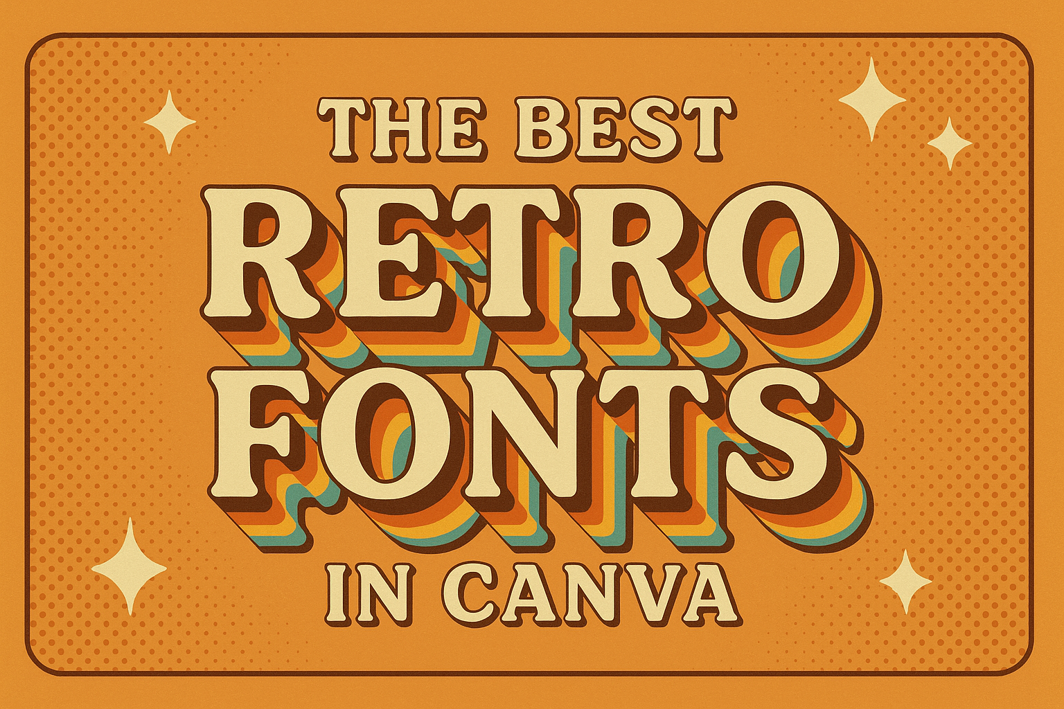
Retro fonts have made a big comeback in the design world, blending nostalgia with modern style. If you’re looking to add a touch of vintage flair to your work, Canva offers a wide range of options. From bold and lively styles to sleek, minimalist designs, Canva has retro fonts that fit every need.
With choices capturing the essence of the 70s disco era or the funky charm of the late 60s, Canva’s options work well for a variety of projects. This makes them perfect for anyone wanting to stand out with a unique, stylish look. Some of these fonts, like Bright Retro and Candice, exude nostalgic vibes and are a hit among designers today.
Whether you’re designing a logo, poster, or any other creative project, the right font can make a big difference. Explore these fonts not just for their style but also for how they can transform your design. They are as versatile as they are eye-catching.
The Charm of Retro Design
Retro design stands out with its nostalgic appeal and creates a unique experience through its visual elements. This style reconnects people with past trends and styles, bringing a sense of familiarity and warmth.
Defining Retro Aesthetic
The retro aesthetic is characterized by its vibrant colors, bold patterns, and vintage influences. This style often incorporates elements from the 1950s to the 1980s, including geometric shapes and playful motifs. Retro design features nostalgic elements like polka dots and checkerboards.
These designs are not just visually appealing but also evoke emotions connected to past decades. People are drawn to the sense of familiarity and history that retro designs bring to modern media. The charm of this style lies in its ability to transport viewers to an era of simplicity and vibrant creativity.
Impact of Vintage Typography
Typography plays a crucial role in retro design by capturing historical styles and adding character. Retro fonts like Harlow scream vintage feel, using bold and elegant letterforms. Others like Yesteryear bring a touch of nostalgia with their smooth and classic lines.
These fonts often mimic hand-lettered scripts and traditional serif styles. They reinforce the overall vintage aesthetic and evoke memories of past decades. By using typography that has depth and historical context, designers can create designs that feel authentic and timeless. This connection enhances the visual appeal of any creative project.
Navigating Through Canva’s Font Library
Canva offers a robust collection of fonts, making it easy to find the perfect style for any project. Users can access a vast range of retro and modern typefaces by familiarizing themselves with Canva’s tools and categories.
Starting with Canva
Getting started with Canva is straightforward. Users first need to create an account or log in. Once logged in, they can open a new design project. The interface is user-friendly, with tools and options displayed on the left side.
To begin adding text, select the “Text” tool. It offers quick choices like headings, subheadings, or body text. Clicking any of these options reveals the text panel, where fonts can be customized. Exploration of the font library begins here.
Canva’s font panel is organized with a search bar at the top. Users can type specific font names or styles, helping them find options like bold, italic, or script. Simple navigation and search features become essential when dealing with thousands of font choices.
Exploring Font Categories
In Canva, fonts are grouped into categories to simplify the selection process. These categories, such as retro fonts, help users find styles that match their design theme. Browsing through categories, users can click on any font to see a preview in their text box.
Using filters is an effective way to narrow down choices. Popular filters include serif, sans-serif, and decorative. For retro design enthusiasts, options like Harlow or Candice provide vintage vibes with their distinctive styles. Assigning favorites to frequently used fonts makes them easily accessible for future projects.
Top Retro Fonts in Canva
Canva offers a wide range of retro fonts that suit various design styles. Among these options, users can find bold and lively fonts from the ’70s, elegant script fonts reminiscent of past decades, and pixelated styles ideal for gaming themes.
Bold and Groovy Selections
Bold fonts in Canva bring back the dynamic feel of the ’70s with their unique style. Fonts like Bright Retro are known for their playful curves, capturing the essence of the disco era. This typeface is perfect for projects needing a splash of personality.
Another standout is Candice, which exudes groovy vibes with its thick, rounded letters. It’s reminiscent of the funky designs from the late ’60s. This font is ideal for creating eye-catching posters or banners.
These bold selections are excellent for projects looking to harness the energy and spirit of retro design. They work well for anything from social media graphics to event invitations.
Classic Script Fonts
Classic script fonts on Canva offer a touch of elegance and nostalgia. They evoke the charm of handwritten letters from decades past. These fonts are perfect for sophisticated designs that need a personal touch.
Script styles like Great Vibes or Pacifico add elegance to invitations or greeting cards. Their intricate details and flowing lines make them stand out in any project.
These fonts work well when paired with simple backgrounds, letting their beauty shine. Users love them for creating vintage-inspired logos or branding materials that demand a classic appeal.
Pixel and Arcade Styles
Pixel and arcade fonts transport users right back to the golden age of video gaming. These styles mimic the blocky, pixelated text from early computer screens and game consoles.
Fonts like Press Start 2P and Arcade Classic are favorites among designers aiming for a retro gaming aesthetic. They are great for projects that need a nostalgic tech vibe.
These styles are a hit for flyers, game-themed invitations, and nostalgic merchandise. The pixel art design gives a nod to retro gaming while adding a unique flair to modern designs.
How to Pair Retro Fonts
Pairing retro fonts in Canva can be a fun way to give your designs a unique style. It’s all about finding the right balance and creating a clear hierarchy to make your text stand out.
Combining Fonts Effectively
Combining fonts takes creativity and attention to detail. It’s important to choose fonts that complement each other. For instance, if one font is bold and eye-catching like Bright Retro, pair it with a simpler font to keep the text readable. A thick, funky font can work well with a thin, elegant typeface, ensuring both fonts have their moment to shine.
Using contrasting styles can also help create visual interest. For example, mix a retro script font with a clean sans-serif font. This not only draws attention but also highlights different parts of your content. Avoid using fonts that are too similar, as this can make the design appear muddled.
Experimenting with size and weight is another way to make fonts work together. Increasing the size of the more decorative font can be effective for headlines, while a smaller, simpler font can be great for body text.
Balance and Hierarchy
Balance and hierarchy play a vital role in organizing text visually. Hierarchy is about making sure the most important information stands out first. This can be achieved by using larger or bolder fonts for headings and smaller ones for subheadings or body text.
Balance refers to distributing different text elements evenly across the design. Aligning text properly and using equal spacing can help achieve this. The choice of color also affects balance. Using contrasting colors can attract attention to the right places in your text.
Alignment and spacing are other key aspects of achieving balance. Ensure that text doesn’t seem too crowded or overly spaced out. Consistent line heights and margins will help maintain a clean look, making your design appealing and easy to read.
Designing with Retro Fonts
Retro fonts can evoke nostalgia and convey a specific era or theme in a design. They work best when paired with the right colors and layouts to enhance their visual impact.
Creating a Mood with Typography
Choosing the right typesetting can quickly set the tone for a project. Retro fonts often have distinct features like playful curves or bold, geometric shapes. Examples such as Harlow and ITC Bottleneck showcase these characteristics with a vintage flair.
These fonts are ideal for projects aiming to create a sense of nostalgia or historical charm. By thoughtfully selecting a font that matches the desired mood, designers can make their projects more relatable and engaging. The right font choice can transport viewers to a different time and place.
Color Palettes and Retro Fonts
Color plays a crucial role in enhancing retro fonts. Pairing these fonts with suitable color palettes can heighten their nostalgic appeal. Bright colors like oranges, yellows, and greens can make fonts pop, evoking the ’70s disco era. Softer pastels can lend a 1960s vibe, creating a happy, relaxed feel.
Consistency in color usage can help solidify the theme and make the design more cohesive. Colors should complement the font style and the messages they convey. This ensures the overall aesthetic remains true to the intended retro theme.
Layouts and Composition
A good layout is essential for making retro fonts shine. Arranging text and images effectively enhances readability and maintains viewers’ interest. Retro fonts often have intricate designs that need enough space to stand out without overwhelming other elements.
Designers should consider balance and alignment in their compositions. Using grids can help maintain order, allowing the retro fonts to be the focal point without causing visual chaos. Careful placement of elements using hierarchy ensures the message remains clear and the design feels unified.
Tips for Maximizing Font Impact
Using retro fonts in Canva can elevate any design project. It’s important to think about both contrast and readability, as well as how to scale and customize fonts to fit different design needs.
Contrast and Readability
Choosing the right contrast helps make text stand out. Retro fonts often come with unique styles, but it’s vital to pair them with background colors that enhance their visibility. For instance, bold fonts pop against light backgrounds, while lighter fonts look strikingly elegant on darker surfaces. It’s a good idea to use color wheels or tools to find complementary shades.
Readability should always be prioritized. While decorative fonts look stylish, they can be hard to read if overused. By limiting elaborate fonts to headings or short phrases, the text remains engaging and accessible. Mixing retro fonts with simple ones creates balance and maintains readability across larger bodies of text.
Scaling and Customization
Scaling fonts correctly ensures the text is neither too small nor too overwhelming. When working with retro fonts, it’s crucial to adjust the size depending on the medium. Posters and flyers may benefit from larger fonts, while digital designs might need smaller sizes.
Customization offers creative freedom to match a design’s theme. Canva allows users to easily tweak fonts by adjusting their weight, slant, and style. This flexibility means retro fonts can be personalized to suit various projects, from fun and quirky to sleek and modern. Experimenting with font alignment, like centering or justifying text, provides additional ways to highlight the essential elements of any design.
Inspiring Examples of Retro Typography in Design
Retro typography brings a unique charm and nostalgia to design projects. From creating a strong brand identity to enhancing marketing visuals, these styles captivate audiences by mixing old and new elements.
Branding and Identity
Retro typography plays a powerful role in branding and identity. Many brands use vintage-inspired fonts to evoke nostalgia and establish a timeless identity. The Mad Dogs project illustrates how retro fonts mixed with plaid patterns can create a unique punkish twist. Brands aiming to remind consumers of their heritage often use retro typefaces to connect emotionally with their audience. For instance, the use of script fonts can suggest tradition and reliability, while bold, block-style fonts can hint at innovation and durability.
These elements often convey a sense of history, allowing brands to stand out in a competitive market. They mix creativity and nostalgia, establishing a visual style that resonates with their target audience.
Marketing and Advertising
In marketing and advertising, retro typography is often used to grab attention and create memorable campaigns. This approach can add a nostalgic touch that captures the audience’s imagination. The vintage Sprite advert shows how a monochrome palette, custom type, and quirky illustrations combine for effective advertising.
Using these elements helps brands tell their story visually, often evoking emotions associated with happier, simpler times. This can make marketing campaigns feel relatable and trustworthy. Whether it’s a billboard or a social media post, retro fonts can transform a simple message into a captivating story.
Digital and Print Media
Retro typography is also a staple in digital and print media. Publications often use vintage fonts to set a mood or theme for their content. In digital media, retro fonts can bring a refreshing aesthetic that stands out among modern design trends. For example, the ITC Bottleneck font has a bold and elegant vibe that suits both print and digital formats.
In print, newspapers and magazines incorporate these fonts for section headings or article titles to draw readers in. Retro typography adds visual interest and enhances readability, making content more engaging. Designers use this style to mix old-school charm with innovative layouts, creating work that is both stylish and timeless.