Yatra One is more than just a font; it is a tribute to the culture and vitality of Mumbai’s bustling streets. Inspired by the hand-painted signage of the Mumbai local railway, it captures the essence of India’s diverse graphic style. Designed for both Devanagari and Latin scripts, Yatra One brings a piece of Mumbai’s artistic flair to digital typography.
The font’s unique design includes angular cuts and open knots, showcasing the idiosyncratic handwriting style that is common in India. The creator, Catherine Leigh Schmidt, worked to ensure that the font embodies both traditional calligraphy and modern digital aesthetics. Its heavy weight and high-contrast display make it stand out, perfect for both artistic and practical uses.
Yatra One was released by the Indian Type Foundry and has since gained popularity for its distinctive look and cultural significance. By combining delicate brush-painted details with the needs of contemporary design, Yatra One serves as a bridge between the old and the new, making it a perfect choice for anyone looking to add some cultural depth to their projects.
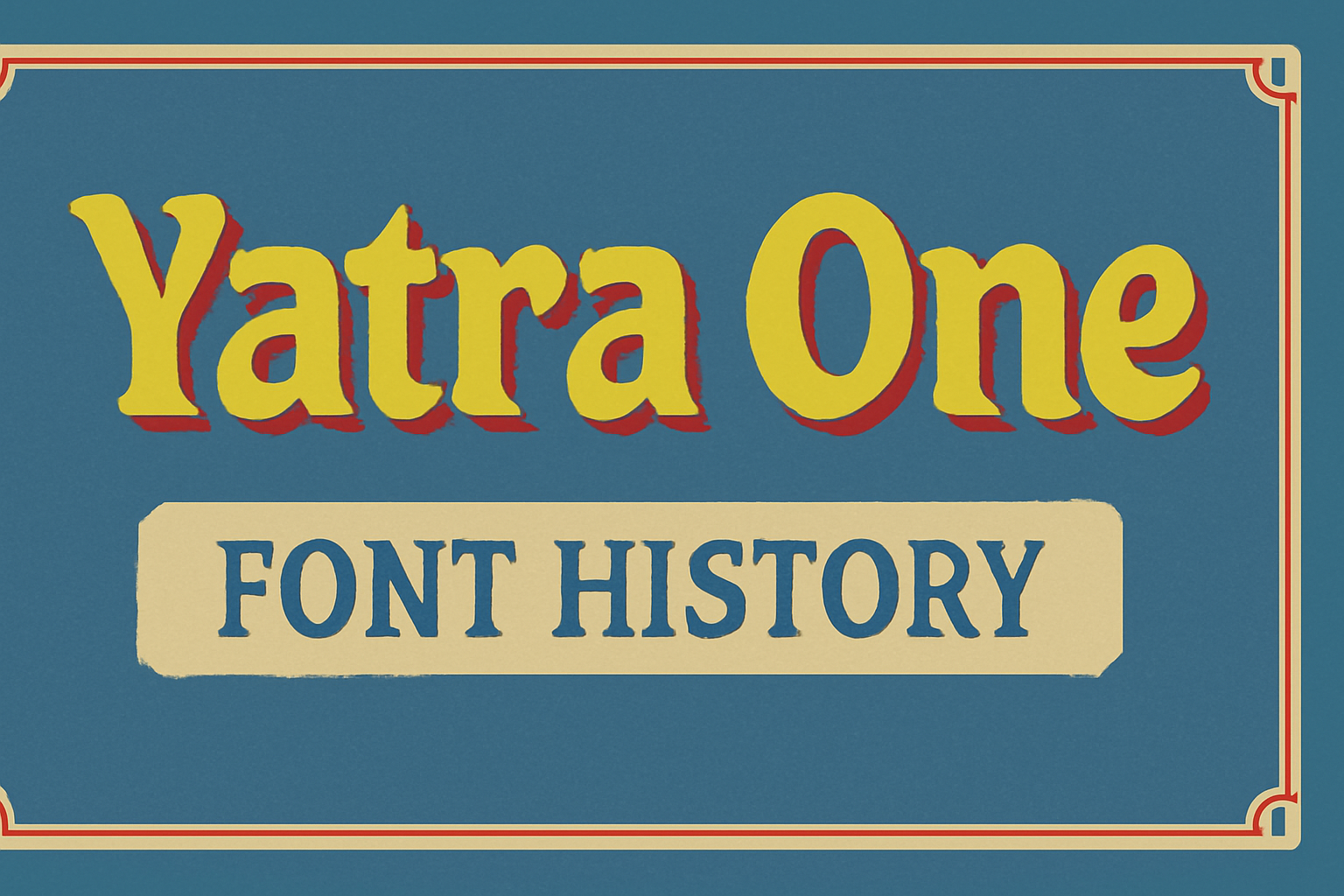
Origins of Yatra One
Yatra One is a distinctive font featuring both Devanagari and Latin scripts. It’s inspired by Mumbai’s vibrant railway signage, showcasing unique design elements that reflect the city’s artistic culture and history.
Inception and Designers
The Yatra One font was created with a focus on the lively essence of Mumbai’s street art and railway signs. The design team aimed to capture the beauty and vibrancy of these hand-painted signs. This was achieved by incorporating features like high contrast and angular cuts in the font design.
A notable aspect is how the Latin script adopts a Devanagari brush angle, merging two writing styles into one harmonious look. Such attention to detail highlights the dedication and creativity behind the font’s creation. This blend serves a wide audience by making the font accessible in multiple languages.
Cultural Significance
The cultural roots of Yatra One lie in Mumbai’s bustling railway system, where colorful signage guides millions of commuters daily. These signs are not just practical; they are a vivid expression of the city’s spirit and creativity.
In these designs, angular cuts and open knots serve as reminders of the hand-painted artistry that defines Mumbai’s visual landscape. By using these elements, Yatra One preserves a part of Mumbai’s heritage. The font allows designers to bring a piece of this lively culture to various projects. Its use in different mediums celebrates the city’s aesthetic while remaining functional for bilingual communication.
Font Characteristics
Yatra One has a unique style that blends traditional and modern elements. It draws inspiration from hand-painted signs, making it both aesthetic and functional.
Typography Features
Yatra One features a heavy weight and high contrast design. Inspired by the traditional hand-painted signs found in Mumbai, it incorporates angular cuts that give it a distinct appearance. The font skillfully combines Devanagari and Latin scripts while maintaining a brush-painted style.
A defining element is its open knots, which add a charmingly rustic vibe. The Latin characters have adopted a Devanagari brush angle, making them harmonious with the Devanagari script. This attention to detail ensures that the font remains consistent in its visual impact.
Legibility and Readability
The font is known for its readability across various sizes, which makes it versatile for different applications. Despite the high contrast and unique design, it maintains clarity in both small and large text settings. Yatra One’s design allows users to experience the font’s personality without sacrificing legibility.
This makes it suitable for cultural and festive contexts where a traditional yet contemporary look is desired. Designers often appreciate how well it performs in both print and digital formats, balancing aesthetic appeal with functional usability. The combination of such features ensures Yatra One’s effectiveness in various uses.
Usage and Applications
Yatra One is a versatile typeface that beautifully balances traditional and modern designs. It is ideal for use in both printed and digital formats, offering unique applications in branding and user interface design.
Print versus Digital Media
Yatra One excels in both print and digital media. In print, its high-contrast style and distinctive look make it perfect for posters, headlines, and book covers. The font’s bold and clear forms grab attention, making it stand out on physical media.
In digital media, Yatra One’s readability is a key advantage. Its well-defined characters make it ideal for web design and online publications. The font retains its clarity on screens, ensuring that content is easily digestible whether viewed on a computer or a mobile device. Its adaptability makes it a favorite in digital platforms.
Branding and Marketing
For branding and marketing, Yatra One offers a unique aesthetic that can help brands differentiate themselves. Its roots in hand-painted signage from Mumbai give it an authentic and culturally rich feel, making it perfect for brands looking to emphasize their Indian heritage or cultural touch.
The font’s eye-catching design elements are perfect for logos, packaging, and advertising materials. Companies looking to create a memorable visual identity can utilize Yatra One to portray boldness and cultural depth. The font can convey a message of creativity and innovation, appealing to companies that want a dynamic and modern look.
User Interface Design
Yatra One is ideally suited for user interface design, providing a mix of style and functionality. Its clean and distinct style aids in ensuring user interfaces are intuitive and easy to navigate. The font’s characteristics make it suitable for apps and websites targeting audiences familiar with the Devanagari script.
The font’s adaptability ensures it can be used across various devices without losing clarity or style. Its ability to integrate modern design elements with traditional flair allows UI designers to create engaging and user-friendly experiences, making interactions feel both fresh and familiar.
Technical Aspects
Yatra One is appreciated for its unique design, but understanding its technical details is vital for maximizing its use. This section will focus on the font’s compatibility with various systems and how it is distributed to users.
File Formats and Compatibility
Yatra One is available in several common file formats, making it versatile for various design applications. The most frequently used formats include TTF (TrueType Font) and OTF (OpenType Font). Both these formats allow seamless integration with design software like Adobe Illustrator and Photoshop.
Compatibility is a crucial aspect when choosing a font. Yatra One works well on both Windows and Mac operating systems. Its ability to maintain its structure across different platforms ensures designers can rely on it without worrying about formatting issues. Web developers also appreciate its availability through Google Fonts, as it helps with easy integration into websites.
Licensing and Distribution
The distribution model for Yatra One is quite user-friendly. This font is licensed under an open-source model, allowing designers and developers to use it for free in both personal and commercial projects. This liberal licensing approach encourages widespread adoption and experimentation.
Yatra One is distributed through several major online platforms like Google Fonts and GitHub. These platforms make it easy to download and update the font as necessary. With sources that provide regular updates, users can ensure they are working with the most recent version, thereby keeping their design elements up-to-date and functional.
Evolution and Updates
Yatra One is a unique typeface that captures the traditional essence of Indian script while adapting to modern design needs. Over time, it has undergone various changes to enhance its usability and style.
Historical Updates
The Yatra One font, inspired by the hand-painted signs of Mumbai’s local railway, was originally designed to emphasize the Devanagari script’s artistic style. The Indian Type Foundry released it, incorporating traditional calligraphic styles alongside digital advancements. Its heavy weight and high contrast were distinctive features, aimed at preserving the artistic essence of brush-painted signage. Over the years, the font has gained popularity for its unique angular cuts and open knots, making it suitable for both print and digital media. This adaptation has helped it maintain relevance in contemporary design projects.
Current Version
The current version of Yatra One continues to integrate both Latin and Devanagari scripts. The design adopts a Devanagari brush angle, making it versatile for various uses. It remains a free-to-use font under the SIL Open Font License, allowing individuals to modify and distribute it. Users can utilize it in diverse projects, from website creation to print media. This modern iteration balances traditional elements with sleek digital aesthetics, making it accessible and appealing to a global audience. Its ability to stay relevant while retaining its cultural roots marks its significance in the evolving world of typography.
Reception and Impact
Yatra One has made significant waves in the design community, gaining appreciation for its unique style. It has also been adopted by various users who value its blend of tradition and modernity.
Design Community
The design community has warmly embraced Yatra One. Its distinctive style has been praised for maintaining the spirit of hand-painted signage, reminiscent of the Mumbai local railway. Designers admire its combination of high contrast and unique angles. This typeface offers both artistic flair and versatility, making it a popular choice for creative projects.
Many designers use Yatra One for its ability to connect traditional calligraphy with modern digital design. This fusion of styles appeals to those who enjoy incorporating cultural elements into their work. The font is viewed as a bridge between old and new, which excites many in the design world.
User Adoption
Yatra One has been widely adopted for both personal and commercial use. It is appreciated by users looking for a font that combines the Devanagari and Latin script. Its free availability under the SIL Open Font License encourages widespread use, allowing creators more freedom in their projects.
Users find Yatra One particularly useful in projects that require a bold, eye-catching display font. Its ability to stand out while preserving readability has made it a favorite for posters, advertisements, and digital content. Many see it as an opportunity to add a unique touch to their visual communications.
Comparative Analysis
Yatra One stands out as a distinct typeface that draws inspiration from traditional signage while offering a contemporary twist. Examining its similarities and unique features helps in appreciating its design and usage across different contexts.
Similar Fonts
Yatra One shares visual characteristics with several other typefaces inspired by traditional calligraphy and hand-painted signs. Fonts like Baloo and Mukta similarly incorporate the Devanagari script along with Latin elements. These fonts focus on maintaining the essence of handwritten styles with a modern flair.
Another comparable font is Atma. It balances a playful style with readability, much like Yatra One’s approach. While these fonts may differ in weight and tone, they all embrace cultural and traditional cues in their designs, making them popular choices for diverse projects.
Distinctive Qualities
Yatra One’s distinctive features set it apart from other fonts. Its most notable aspect is the integration of Devanagari influence into its Latin script, resulting in angular cuts and open knots. This design choice mirrors the brush-painted signage characteristic of Mumbai’s local railway system, offering a nod to its roots with a high-contrast display.
Created by Catherine Leigh Schmidt for the Indian Type Foundry, Yatra One emphasizes high contrast and heavy weight, making it ideal for display purposes rather than body text. Its striking appearance often catches the eye, making it a preferred choice for brands and projects looking to reflect cultural authenticity.