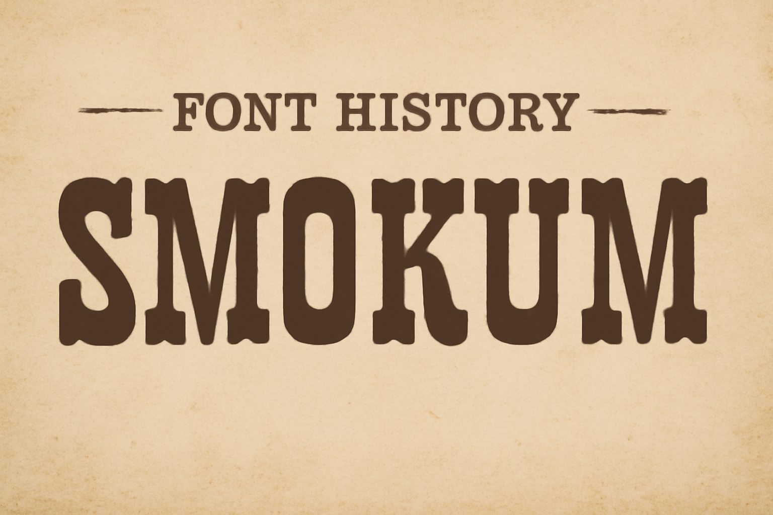
Smokum is not just a font; it’s a piece of Western-inspired charm brought to life. Created by Astigmatic, this slab-serif font exudes a playful swagger, reminiscent of the Old West. It’s perfect for headlines and playful graphics, adding a hint of adventure and nostalgia to any design.
Smokum performs best in medium to large sizes, allowing its unique contrast of thick and thin strokes to shine. Ideal for projects needing a touch of country flair, it maintains legibility while delivering a distinctive look. Its design conveys a relaxed yet bold character.
For designers seeking to add a bit of rustic charm to their work, Smokum is a versatile choice. Whether used for digital or print, it brings a unique personality to the table. Opportunities abound to explore its potential, making it a go-to for those who appreciate style with a touch of whimsy. To explore this font further, check out more about Smokum on Google Fonts.
Origins of Smokum
Smokum is a unique font characterized by bold and chunky letterforms. It combines a playful feel with vintage design, drawing inspiration from Western aesthetics. Two key aspects in its creation are the design process and the influences that shaped its distinct look.
Designer and Design Process
Smokum was designed by Astigmatic (AOETI), a foundry known for its creative typefaces. The designer aimed to create a font that evokes nostalgia while remaining functional for modern use. The design process involved balancing thick and thin lines, which makes Smokum suitable for medium to large display use. This process ensured the font would stand out in headlines and other prominent text applications, making it ideal for catching attention.
Attention to detail was crucial, as the designer wanted to capture the essence of Western wood type designs. The result is a font that feels both familiar and fresh, perfect for adding a touch of the Old West to modern projects.
Inspiration and Influences
Smokum draws heavily from the Western aesthetic, reminiscent of vintage posters and advertisements. It was inspired by woodblock printing techniques, where letters were carved on woodblocks and then printed using a letterpress. This influence is evident in Smokum’s bold and decorative style, which exudes charm rooted in Old West imagery.
Images of dusty trails, cowboys, and classic Western movies played a big role in shaping its design. The font’s structure and flair capture the adventurous and rugged spirit of the era, making it popular in themed events and spaces such as restaurants looking to create an authentic Western ambiance.
Typography Fundamentals of Smokum
Smokum is an eye-catching western-inspired font that features bold slab-serif characteristics. It brings a rustic flair with playful elements, making it ideal for headlines and display purposes.
Typeface Characteristics
Smokum’s design originates from the old western wood type styles. Its bold, slab-serif structure gives it a strong presence, making it perfect for headlines. The font carries a unique combination of thick and thin strokes, which adds to its distinctiveness.
The contrast in stroke width provides a playful yet authoritative aesthetic. Its design is not only influenced by western themes but also adds a modern twist that makes it versatile for different graphic needs. Smokum works well in both digital and print media, ensuring it stands out in various applications.
Letterform Anatomy
The letterforms of Smokum are characterized by their solid slab-serif endpoints. These serifs are square and robust, adding to the font’s sturdy appearance. The stem of each letter is exaggerated in width, while the thins offer a lively contrast.
This structure helps in maintaining readability at larger sizes even when used for digital media. Smokum’s playful letterforms incorporate curves in some characters, adding a touch of whimsy, which enhances its western flair. Its overall anatomy makes it suitable for creative uses like posters, T-shirts, and signage.
Usage and Applications
Smokum is a unique font known for its bold, western-inspired design. It thrives in areas where it’s important to capture attention, such as branding and media.
Popular Brands Using Smokum
Smokum’s distinctive look makes it a favorite among brands that want to evoke a sense of the Wild West or rustic charm. Companies in the food and beverage industry, especially those with themes related to barbecue or country living, often choose Smokum for their logos and packaging. Additionally, restaurants aiming for a western or rustic feel incorporate Smokum in their signage and menus because of its bold slab-serif style. A few popular clothing brands with a vintage or cowboy vibe also favor this font to align with their brand aesthetic.
Print and Digital Media
Smokum is frequently used in both print and digital media to create striking headlines and display text. Its high readability makes it ideal for short text in advertisements, posters, and flyers. Magazines focusing on themes like travel or lifestyle sometimes use Smokum for titles or section headers to add flair. In digital media, Smokum works well for websites that need a touch of playfulness or ruggedness. It’s especially effective in larger sizes, such as headers or buttons, because it remains clear and easy to read while catching the viewer’s eye. This is why many designers choose Smokum for high-impact graphical elements online.
Technical Details
Smokum is a distinct slab-serif typeface with unique attributes that make it suitable for certain applications. It’s helpful to understand its file formats and licensing information to make the most of this font.
File Formats and Compatibility
Smokum comes in several file formats that make it versatile for different uses. Commonly, it is available as TrueType (.ttf) and OpenType (.otf) formats. These formats ensure compatibility with most design software and word processors. OpenType offers advanced typographic features like ligatures and alternate characters.
For web usage, Smokum supports Web Open Font Format (.woff and .woff2), enabling faster loading times and better performance on modern browsers. This makes Smokum a solid choice for web designers aiming to add a western flair to their site. Compatibility ensures that whether it’s print or digital, Smokum maintains its distinctive look across platforms.
Licensing and Permissions
Smokum is often provided under open-source licenses like the GNU General Public License or SIL Open Font License. This means it can typically be used in both personal and commercial projects without charge. These licenses allow users to modify the font while requiring that any derivatives remain free.
However, depending on the distributor, there might be variations in licensing terms. It’s important to check the specific permissions on platforms like Google Fonts or Font Squirrel where Smokum is available. Ensuring the correct licensing ensures legal use in different types of projects. Always consult the specific terms provided by the vendor to avoid any legal issues.
Visual Style and Appeal
Smokum is a striking font with a Western charm. Its bold, slab-serif style makes it stand out. The playful character and heavy serifs remind people of wagons and cowboys. This decorative font often feels like a classic from old Western movies or wanted posters.
The thick and thin contrasts in Smokum add to its distinct visual appeal. These features make it great for headlines and display uses. The font’s playful swagger also gives it a relaxed, country-like flair. This style suits restaurant signage and themed events well.
However, this font might not be the best for long reading passages. Its decorative nature can cause visual fatigue over time. For shorter texts, like captions or quick digital displays, it performs much better. Smokum really shines when used in medium to large sizes on the web.
Pairing Smokum with a simpler typeface can enhance readability. For instance, combining it with Roboto creates a balanced look. Roboto’s clean and professional style complements Smokum’s bold design. This makes the text easier to read while keeping that unique Western vibe.
Reception and Critiques
Smokum has found a niche among designers who appreciate its bold and playful style. It’s particularly popular for projects needing a western or vintage look. The font’s unique characteristics make it a choice for those wanting to evoke memories of the Old West and cowboy themes.
The font’s thick and thin contrasts can be challenging for small sizes. It’s best used for medium to large headlines, where its details shine the most. Although it fits specific themes well, some designers may find it too stylized for broader applications.
Feedback from users highlights its effectiveness in creating eye-catching designs. Projects like restaurant signage and themed posters benefit from its standout presence. Smokum remains a font that captures attention while bringing a bit of flair to any design.
Critics note its limited use in minimalist designs. Yet, for those aiming for a distinctive statement, the font serves purposefully. Its charm makes it a favorite in specialized fields while sparking discussions about its versatility.
The font is available under the SIL Open Font License, allowing use in both personal and commercial projects without restriction. This accessibility has helped it grow a dedicated following among creative professionals.
Updates and Variations
Smokum has seen changes in its design since its inception. Its evolution reflects changing design needs and trends. Related typefaces share some stylistic elements, creating a varied family of fonts.
Evolution over Time
Smokum began as a western-inspired slab-serif font, designed to capture the rustic charm of the Old West. Initially, it was mainly used for headlines and displays with its playful style and contrast between thick and thin strokes. Over time, designers have adjusted its features to adapt to digital displays, supporting its use on web platforms at medium to large sizes. Enhancements in its readability and appeal have made it more versatile for different modern design applications.
Related Typefaces
Smokum belongs to a broader category of western-style slab serif fonts. These typefaces all share the distinctive thick and thin strokes while exuding a rustic feel. Similar fonts include Playbill and Rockwell, which also draw inspiration from the frontier aesthetic. Each has its unique twist, like different serif shapes or stroke contrasts, setting them apart from one another. For those creating projects that require a touch of the wild west, browsing related typefaces can provide a complementary mix of styles.
Preservation and Legacy
Smokum is more than just a western-inspired font; it is a nod to the past. Because of its unique style, Smokum harks back to the days of cowboys and dusty trails. Its playful swagger makes it perfect for adding a touch of history to modern designs.
The Smokum font is particularly popular for creating eye-catching headlines. Used widely in themed restaurants and film titles, Smokum brings a slice of the Old West to life with each letter. Design enthusiasts appreciate how it creates an inviting display, keeping the spirit of that era alive.
The charm of the Smokum font lies in its adaptability. Designers are encouraged to use, modify, and share it freely due to its licensing under the SIL Open Font License. This openness ensures that Smokum continues to thrive and inspire creativity in both personal and commercial projects. You can learn more about its licensing at the FontForge guide.
Preserving the legacy of the Smokum font involves keeping its Old West essence while allowing for new interpretations. As designers continue to explore its potential, Smokum remains a timeless bridge between tradition and creativity, preserving its legacy for future generations.