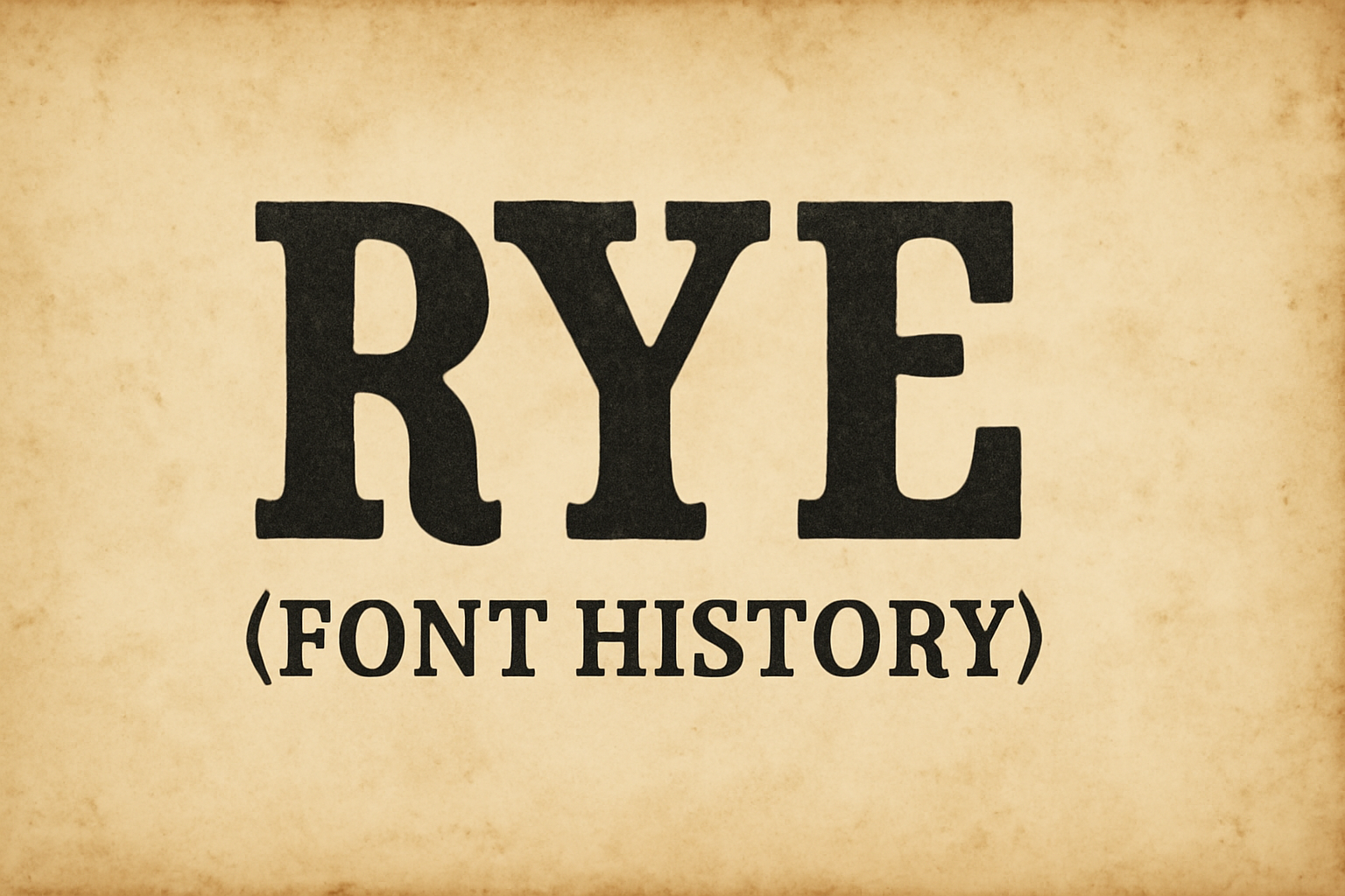
Rye is a font that captures the charm of the American West, drawing inspiration from vintage posters crafted with wood type. Its bold and eye-catching design makes Rye perfect for headlines and advertising. Created specifically for web use, it offers a modern twist on a classic aesthetic.
The distinctive features of Rye make it popular among designers who aim to evoke a sense of history or craftsmanship in their projects. Despite its decorative style, the font maintains excellent readability, which is an essential quality in design work. This unique combination of style and function is part of what makes Rye so appealing.
Nicole Fally, the designer behind Rye, successfully melds past influences with contemporary needs. The font is available for free on platforms like Font Squirrel and Google Fonts, making it accessible to a wide range of users. With its medium contrast and ability to stand out in medium to large sizes, Rye continues to be a go-to choice for creative projects.
Origins of Rye Font
Rye Font emerged from a blend of robust design principles and historical inspirations. It captures the essence of traditional wood type with a modern twist, making it ideal for bold headlines and advertisements.
Design Philosophy
Rye Font embraces a medium contrast in its design, which means it features a notable difference between thick and thin strokes. This gives the font a dynamic and eye-catching appearance. It focuses on being clear and strong, suitable for web use and large displays. Created specifically for online applications, Rye Font balances legibility and stylish design, making it a favorite in the digital space. Attention to shapes and spacing ensures that the font remains readable even at larger sizes.
Inspirations and Influences
This typeface draws heavy inspiration from the American West, as well as traditional posters using wood type. The designer Nicole Fally looked at old western signage to create something that feels rustic yet contemporary. By studying the imperfections of historic prints, slight irregularities were infused into Rye Font’s letterforms, giving it character. This nod to history, fused with modern design elements, gives Rye a distinctive presence. Nicole wanted to connect history with digital technology, resulting in a typeface that stands out both online and in print.
Rye Font Characteristics
Rye font is known for its bold presence and unique charm. It features a robust design, making it popular for headers and advertisements. Below, the key aspects of Rye’s design are broken down to highlight what makes it stand out.
Visual Style
Rye boasts a bold and condensed look. Its design is inspired by traditional wood type posters from the American West. This gives it a distinctive and assertive appearance that catches the eye. The medium contrast design enhances its striking effect, making it ideal for larger displays. Typically, Rye is used in medium to large sizes, which complements its robust style perfectly. The bold strokes are a defining feature, helping to grab attention in both print and digital formats.
Distinctive Features
Several characteristics set Rye apart in the typography world. Its bold letterforms have heavy strokes and slight irregularities, echoing the imperfections of hand-crafted lettering. This adds a touch of characteristic personality and charm. One significant aspect is its attention-getting shapes, which are especially useful in advertising materials. Rye’s design purposely mimics traditional imperfections, giving each letter a unique feel. This makes it ideal for projects that require a blend of tradition and statement-making design.
Legibility and Readability
Rye is designed to be clear and easy to read, particularly when used at larger sizes. Its bold style works well for headlines, where it can make a strong impact without sacrificing clarity. Although the font has a distinctive look, it maintains readability, ensuring that the text remains accessible. Because it was made specifically for web use, it supports digital readability, featuring clean, well-defined lines. This ensures that even at smaller sizes, Rye remains legible on various devices and screen resolutions.
Typography Fundamentals
Typography is the art of arranging type to make written language legible and visually appealing. It involves understanding the differences between typefaces and fonts, along with the detailed parts that make up a font like Rye.
Typeface vs. Font
In typography, the terms typeface and font are often used interchangeably but they have different meanings. A typeface refers to the overall design of characters. It includes various styles like bold, italic, and regular. Meanwhile, a font is a specific style and size of a typeface, such as Arial Bold in 12-point.
Think of a typeface as a family and fonts as the individual members. In digital design, these terms have become blurred, but understanding their difference is crucial. For instance, Rye is a typeface characterized by its strong, condensed letterforms and includes different fonts like regular, bold, or italic.
Anatomy of Rye Font
Rye font is known for its bold appearance and design inspired by wood type posters from the American West. The font’s anatomy includes distinctive features like heavy strokes and slight irregularities that make it feel traditional yet unique.
Key elements of Rye’s design are its condensed letterforms and high contrasting strokes, which contribute to its strong presence. These characteristics make Rye suitable for headlines or prominent text in designs where boldness is necessary. Its design helps capture attention and evoke a sense of nostalgia with its slight imperfections.
Development of the Rye Typeface
Rye is known for its bold and vintage feel, drawing inspiration from the American West and woodblock printing. This typeface was created with a specific purpose and audience in mind, focusing on both visual style and technical functionality.
Design Process
Rye was crafted by Nicole Fally. Her goal was to capture a robust and industrial aesthetic reminiscent of vintage woodblock prints. This decorative typeface needed a strong presence, and she achieved this through bold and condensed letterforms.
Each character was designed to be attention-grabbing, suitable for medium to large text sizes. This makes Rye ideal for headlines and other prominent text displays. The choice of shapes and lines aimed to evoke a sense of strength and clarity.
The design is appreciated for its ability to conjure a sense of nostalgia while still being functional in modern text applications. This balance of old and new is part of what gives Rye its unique charm.
Technological Advancements
Rye was developed to seamlessly integrate with web platforms. Its design process involved ensuring that it is web-compatible, allowing it to be used with modern digital devices.
It is available through platforms like Google Fonts, making it easily accessible for designers. Rye is offered in a single weight of 400, balancing style with usability.
Technical considerations in its development included optimizing the font for performance and privacy when used online. This ensures that websites employing Rye maintain good loading speeds and font clarity across various devices.
Usage of Rye Font
Rye font stands out with its bold and assertive appearance. It often features in creative and eye-catching designs. This section will explore common uses, such as in advertisements and web design, and how it fits different brand identities.
Common Applications
Rye font’s bold and condensed letterforms make it ideal for grabbing attention. It works great in advertising because of its strong, noticeable design. Advertisements that want to convey a message quickly can benefit from its impactful style. Posters and banners frequently use Rye for this reason.
It’s also a popular choice for headlines in digital content due to its clear and strong appearance. Rye was specifically designed to excel as a web type font, making it well-suited for online platforms. Websites that need to stand out and catch the eye can leverage its unique look.
Brand Identity and Rye Font
When it comes to brand identity, Rye font helps communicate a bold and adventurous spirit. Brands looking to evoke a sense of the American West or a rustic vibe might find Rye particularly fitting. Its design can give a feeling of authenticity and tradition, which can be important for a brand’s message.
Using Rye in logos or packaging can also help distinguish a brand, as it adds character and uniqueness. Companies aiming to project strength and confidence may choose Rye for its bold shapes and heavy strokes, which offer a strong visual impact. This font adds a distinctive touch that can enhance a brand’s identity and visibility.
Licensing and Distribution
Rye is a unique font with specific guidelines under the SIL Open Font License, allowing free use and modification. This section covers its usage rights and ways to acquire it efficiently.
Usage Rights
Rye is licensed under the SIL Open Font License (OFL), granting users broad rights. It can be used in personal, commercial, or educational settings without any fees. The license allows modification, so users can adjust the font to their liking.
The license requires that any modifications shared must be distributed with the same OFL terms. This ensures that new versions of the font remain free and accessible to others, continuing the cycle of free use and sharing.
Acquisition Methods
Rye can be downloaded from various platforms, making it easily accessible to designers. Google Fonts offers a straightforward way to get the Rye font for free. This platform ensures that users can integrate Rye quickly into their projects, especially for web typography.
Platforms like FontForge provide detailed guides and options for those looking to modify Rye while adhering to licensing terms. These resources help users make informed decisions about how and where to obtain Rye legally and responsibly, ensuring the font is used correctly.
Impact on Design and Culture
The Rye font has left a mark on both design and culture, becoming a favorite for its unique style. Its decorative nature sets it apart, capturing the interest of design enthusiasts and creatives. In this section, the influence of Rye on popular culture and modern typography is explored.
Rye Font in Popular Culture
Rye’s distinctive appearance makes it a go-to choice for projects that want to evoke a sense of history or craftsmanship. Its ability to maintain readability despite its ornate features adds to its appeal. Designers often use it for period pieces or vintage-themed projects, making it a recognizable element in visuals aiming for an old-world charm. This characteristic helps it stand out in fields like graphic design and advertising.
In movies and TV shows, Rye can often be seen in title sequences or promotional materials, adding an air of authenticity and nostalgia. For instance, in projects set in earlier historical periods, Rye helps create an atmospheric and genuine aesthetic. Its influence extends to brand identities that want to communicate heritage and authenticity.
Influence on Modern Typography
Rye’s impact on modern typography is significant, blending traditional design elements with contemporary needs. It showcases how decorative fonts can still be functional and relevant in today’s fast-paced world. Its style encourages designers to experiment and push the boundaries of typical typeface design, bridging the gap between old and new.
The font has inspired a range of similar designs that emphasize intricate detailing while ensuring usability. Many modern fonts now incorporate elements reminiscent of Rye, emphasizing bold, unique styles that maintain legibility. Designers often cite Rye as an example of how historical influences can merge with modern design principles, creating fresh and exciting typographic options.