The Ribeye Marrow font combines a playful aesthetic with a nod to cartoon tattoo styles. Created to exude fun and creativity, its distinctive design makes it ideal for projects that need an element of whimsy and approachability. Known for its edgy attitude and friendly syncopation, Ribeye Marrow is perfect for children’s books, event posters, and casual brand logos.
The history of Ribeye Marrow is tied to the designer’s vision of crafting a font that appeals to both young and old through its unique charm. This typeface supports a wide range of languages, making it versatile and accessible for various audiences. With its innovative flair, Ribeye Marrow continues to stand out in diverse creative applications.
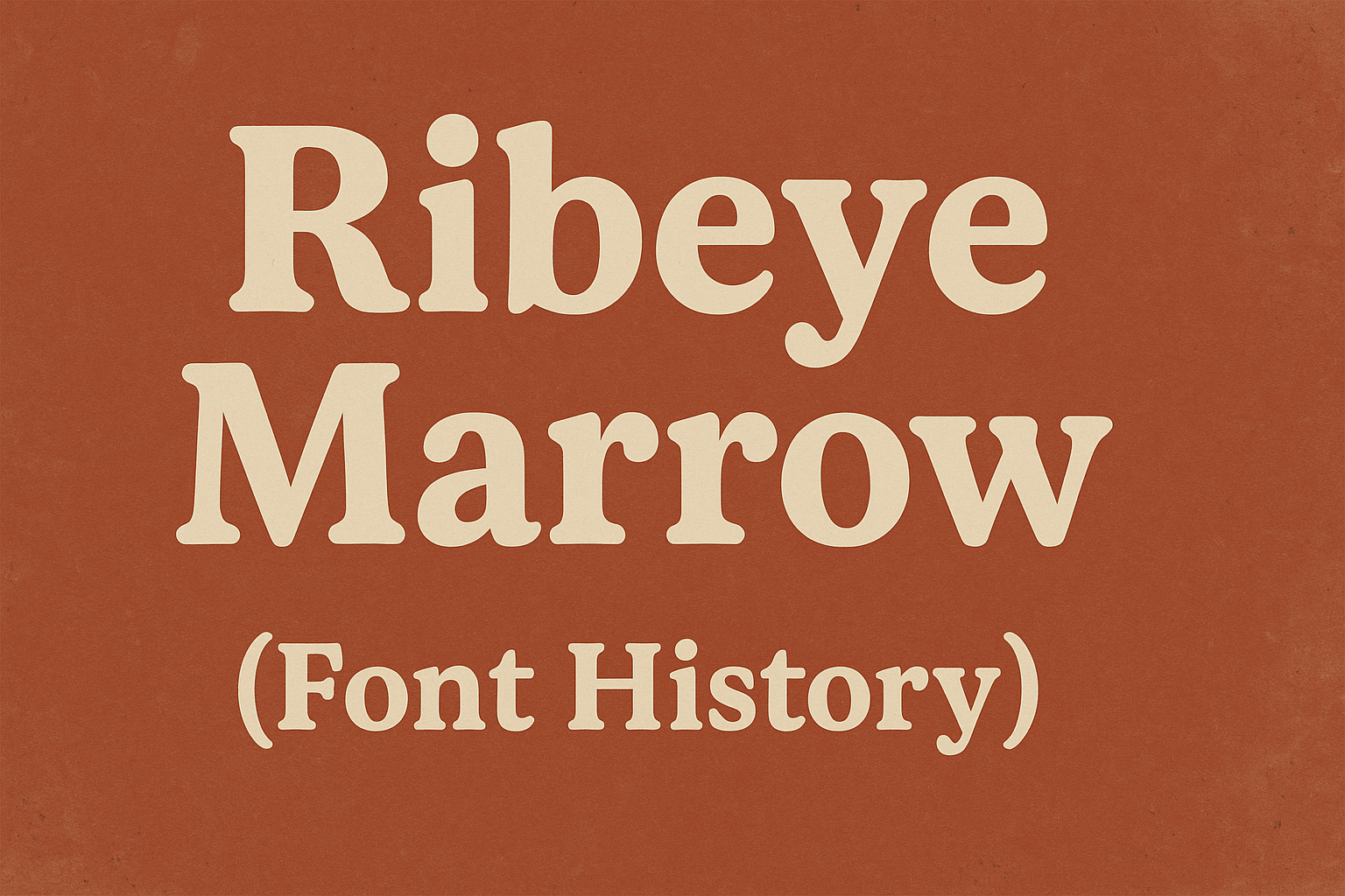
Designed by Astigmatic and Brian J. Bonislawsky, Ribeye Marrow breaks traditional weight distribution across letterforms, offering a fresh look. Its consistent legibility and engaging design have earned it popularity in graphics seeking a touch of delight and personality.
Origins of Ribeye Marrow Typeface
The Ribeye Marrow typeface is known for its fun and playful look. It combines unique design elements to stand out in different contexts. This section breaks down its origins, exploring the inspiration behind its name and the first ideas that shaped its design.
Inspiration Behind the Name
Ribeye Marrow draws its name from an unusual yet memorable source. The designer aimed to create a typeface that evoked a sense of boldness and uniqueness, much like the distinctive nature of a ribeye steak. The name also hints at the playful and playful spirit of the font, suggesting an informal and friendly vibe. This cartoon tattoo style gives it an edgy, yet casual appeal.
This name choice reflects the designer’s intent to craft a font that feels approachable and personable. The friendly syncopation and playful weight distribution across the letters further emphasize the unconventional nature behind the name. Ultimately, the name Ribeye Marrow embodies both the robustness and charm of the typeface.
Initial Design Concepts
The initial design of Ribeye Marrow focused on creating a playful and informal appearance. The designer wanted it to stand out with bold and rounded letterforms. This approach was meant to make the font easily recognizable and suitable for various creative uses. This design choice led to highly legible letterforms, pairing style with readability.
The font’s creators intended to offer something fresh and visually engaging. The unique weight distribution of the letters, along with their playful curves, were crafted to capture attention. This approach ensured the typeface remained appealing in different design projects, from advertisements to playful graphics. It reflects a balance between creativity and functionality, resulting in a distinctive character.
Font Development Process
The journey of creating a font like Ribeye Marrow involves several key steps. From initial sketches to refining digital versions and expanding the character set, each stage is vital for achieving a playful and engaging result.
Sketching and Drafting
The process begins with sketching. Designers focus on the font’s playful nature inspired by cartoon tattoo styles. They draw each letter to capture its signature quirky style.
These sketches help shape the font. With every drafted letter, the playful design begins to emerge. It’s important to get the design right at this stage. This is because it impacts later stages. Pens or digital tablets are often used to sketch out ideas.
This phase sets the foundation for the font. Detailed drafting ensures that each letter maintains a consistent style. Creativity is key, and sketches often go through multiple revisions. The goal is to ensure balance and legibility across all letterforms.
Digitalization and Refinement
Once sketches are ready, digitalization begins. Using software like FontForge, designers bring their sketches to life. This step involves converting sketches into vector graphics. Vector graphics allow designers to manipulate each letter with precision.
In this phase, the focus shifts to refinement. Adjustments are made to letter thickness and height. This ensures clarity and charm. Digital tools make it easier to experiment with different weights and styles.
Careful attention is needed to maintain the font’s edgy attitude and friendly syncopation. This ensures that the final version stands out as a highly legible, charming typeface. Digitalization helps in perfecting details that were drafted on paper.
Character Set Expansion
After refining the basic letterforms, expanding the character set is next. This means adding additional characters. Designers include numbers, punctuation, and special symbols. This makes the font versatile for different uses.
Character set expansion is crucial for broad applicability. By including a wide range of characters, Ribeye Marrow can be used in various contexts. Examples include posters, branding, or children’s books.
Each new character needs to align with the font’s original style. This ensures consistency. Designers carefully adjust each additional piece to fit seamlessly, enhancing the font’s playful identity.
Notable Features of Ribeye Marrow
Ribeye Marrow captures attention with its quirky design and high readability. Its playful style sets it apart, making it suitable for various creative applications.
Unique Glyph Design
Ribeye Marrow stands out with its cartoon tattoo style. Each letterform has a playful irregularity, giving it a hand-drawn feel. The font features distinctive large x-height, adding to its unique look. This style, combined with slightly uneven shapes, makes it memorable and engaging for designers. These characteristics allow for creative expression in various projects. The design is perfect for posters, logos, and other creative works looking for a bit of edge and personality. Its edgy yet friendly style creates a captivating visual appeal.
Legibility and Application
High legibility is another strong point of Ribeye Marrow. Despite its unique design, the font remains clear and easy to read, thanks to its large x-height. This makes it suitable for a variety of uses, including branding, headlines, and playful graphic work. Designers can make the most of the Ribeye Marrow’s regular and bold weights, which allow flexibility and creativity in design applications. Its ability to maintain clarity without sacrificing style makes it a versatile choice for both digital and print projects. Whether for websites or printed materials, it offers an opportunity to stand out while ensuring readability.
Typography and Usage
Ribeye Marrow brings a playful and unique style to various design projects. Its cartoon-like appearance works well in creative and informal settings, making it suitable for different media formats and font pairings.
Pairing with Other Fonts
Ribeye Marrow is best paired with simple and minimalist fonts. This balances its bold, playful nature with more subtle text elements. For headings, Ribeye Marrow can stand alone, but for body text, a clean sans-serif like Arial or Helvetica complements it well.
Using contrasting weights helps maintain readability. The playful character of Ribeye Marrow can shine in titles and logos, while the paired font remains clear in longer text sections.
Recommended Media Formats
Ribeye Marrow thrives in formats that highlight its fun and imaginative style. Its design is well-suited for children’s books, adding a whimsical touch to the illustrations and narratives. Posters and flyers for casual events or parties also benefit from its eye-catching look.
In digital media, Ribeye Marrow adds personality to buttons and banners on websites. In branding for casual eateries or quirky products, its design can draw attention and convey a lighthearted brand spirit.
Reception and Critiques
Ribeye Marrow has caught attention for its playful and unique style, which appeals to both casual designers and professionals. While users appreciate its distinct look, experts have pointed out both strengths and potential areas for improvement.
User Feedback and Reviews
Users often praise Ribeye Marrow for its creative design and readability. It’s frequently used in children’s books and playful branding due to its cartoonish style. The font is known for its ability to convey a fun atmosphere, making it popular for events’ flyers and casual logos.
Some users, however, note that the font’s distinctive style can limit its use in formal contexts. The playful design may not suit every project, restricting its versatility. Despite this, Ribeye Marrow remains a favorite for those seeking a unique and engaging font for specific design needs.
Industry Experts’ Opinions
Industry experts recognize Ribeye Marrow for its well-executed blend of creativity and readability. Many appreciate its edgy design, which breaks away from traditional fonts, providing a fresh option for designers.
Experts also highlight the font’s suitability for informal contexts, like children’s media or restaurant branding. Some critiques mention that while the font excels in fun designs, it’s not ideal for formal or minimalist applications. The font’s specific character might overshadow content in more serious settings, but it effectively targets its intended niche.
Technical Specifications
Ribeye Marrow is a versatile font designed to bring a playful and engaging style to various projects. It is important to understand its file formats, compatibility, licensing, and usage rights for effective use.
File Formats and Compatibility
Ribeye Marrow is available in a range of file formats that ensure compatibility with different software and systems. The most common format used is TrueType (TTF), which is widely supported by most operating systems such as Windows, macOS, and Linux. This makes it easy to install and use across various design platforms.
The font is also accessible through Google Fonts, ensuring seamless integration with web projects. This allows developers to embed the font directly into websites, ensuring a consistent look across browsers and devices. With support for 58 languages, Ribeye Marrow is a flexible option for diverse audiences.
Licensing and Usage Rights
Ribeye Marrow is licensed under the SIL Open Font License (OFL) 1.1, which allows both personal and commercial use. This open license means designers and businesses can freely use the font without needing to purchase additional rights or permissions.
Modification of the font is permitted under the same license, allowing users to adapt it to their specific needs. This makes it an attractive choice for projects like branding, where unique customization might be required. The licensing terms offer flexibility while ensuring that the font can be shared and improved by the community.
Cultural Impact and Legacy
Ribeye Marrow has gained attention for its playful style and has influenced various design trends. Its use in branding and advertising highlights its wide appeal, showing how fonts can shape visual identities.
Influence on Design Trends
Ribeye Marrow’s distinct style combines bold, cartoon-like features with a playful twist. This unique style has made it popular in creative projects like children’s books and cartoons. It stands out for breaking the usual weight distribution in letterforms, leading other designers to experiment with similar approaches.
Ribeye Marrow’s influence extends to digital media, where its friendly and edgy look is preferred for high-engagement content. Its use in vibrant and energetic designs has set a trend for lively and approachable fonts.
Presence in Branding and Advertising
Ribeye Marrow has also made its mark in branding and advertising. Its eye-catching and easy-to-read design makes it suitable for logos, posters, and event promotions. Fonts with a fun and lighthearted appeal are often used in casual dining and beverage brands, enhancing their informal yet inviting image.
Brands wanting to connect with a younger audience or convey a joyful message often choose Ribeye Marrow. This choice helps create a distinct brand personality that stands out in crowded markets. Its widespread use highlights the font’s appeal as a modern yet timeless choice for today’s designers.