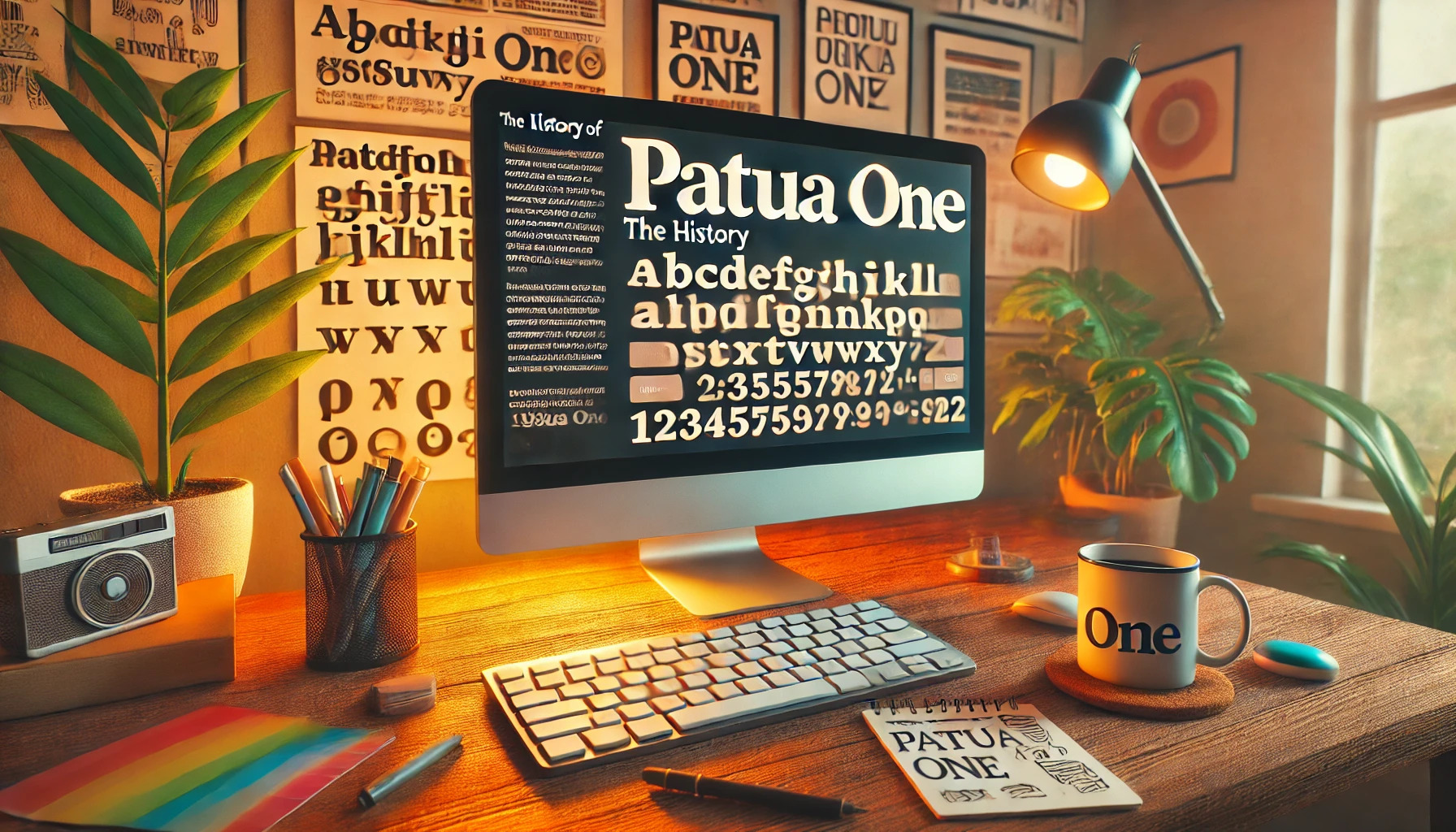
Patua One is a distinctive slab serif font with a rich history that began with its release in 2012. Inspired by early 20th-century advertising typography, it stands out with its low contrast and bold, blocky serifs. What makes Patua One unique is its ability to create visual impact even at small sizes, thanks to its strong and thickly curved serifs.
This font is part of the Google Fonts library, making it easily accessible for web use. Its open-source nature under the Open Font License (OFL) supports collaborative projects, providing designers from around the world a chance to improve and share it. The combination of historical influence and modern flexibility gives it widespread appeal.
For those interested in typography’s evolution, understanding Patua One’s inspiration and design offers a glimpse into how fonts can blend tradition with contemporary needs. Its robust structure and gentle curves make it a favorite for projects that require a mix of strength and elegance.
The Origins of Patua One
Patua One is a typeface with a rich history, traced back to its introduction as an open-source font in 2012. Its design pulls inspiration from early 20th-century advertising, creating a unique look with blocky serifs and a solid structure.
Inspiration and Design Philosophy
Patua One’s design is inspired by advertising typography from the early 1900s. The font has a strong visual impact, featuring low contrast and robust serifs. These design choices aim to bring a sense of boldness and clarity to text, even at smaller sizes. The thick, curved serifs add a touch of smoothness and grace, reflecting a style that combines function with aesthetic appeal.
Its purpose is to provide readability and visual engagement, making it suitable for online and print media. These characteristics allow it to stand out while maintaining a clear and clean appearance.
Creator Background
Patua One was created by designer Rodrigo Fuenzalida, who worked with Latinotype. His background in typography and design research played a significant role in shaping the font. Fuenzalida sought to develop a font that was not only visually striking but also easy to use in various settings.
His expertise and creative vision are evident in the way Patua One blends traditional elements with modern functionality. It aims to bridge historical typeface styles with new design trends to meet the diverse needs of today’s users. His work ensures that the font remains accessible and widely used, further contributing to its enduring popularity.
Design Characteristics
Patua One is known for its strong visual impact and unique style. It combines elements of early 20th-century advertising with modern design principles to create a distinctive slab serif font.
Typography and Style
Patua One stands out due to its robust serifs and solid structure, which provide a sense of stability and strength. Designed for small sizes, it has low contrast, making it easier to read on digital screens. This particular slab serif font brings a touch of elegance with its thick serifs that are gently curved, offering a smooth appearance. The design was influenced by old advertising typography, which is evident in its bold lines and classic features.
Letterforms and Legibility
The letterforms of Patua One are designed to be both striking and readable. Its bold and blocky serifs create a strong silhouette that enhances readability without sacrificing style. The font’s low contrast between thick and thin strokes ensures that each letter is clear and distinct, even in smaller sizes. This attention to detail in letterforms improves legibility, especially in digital platforms. The open-source nature of Patua One allows it to be continually refined and improved, maintaining its status as a reliable choice for web typography.
Usage of Patua One
Patua One is a versatile font used widely due to its distinct style and high readability. It is well-suited for both web and print, making it a favorite among designers for various projects.
Popular Applications
Patua One’s sturdy serifs and clean lines make it ideal for use in a range of projects where impactful typography is key. It is frequently employed in advertising and marketing materials to create bold, attention-grabbing headlines. Additionally, due to its readability at smaller sizes, it is often found in editorial content like magazines and blogs.
Educational materials and textbooks also benefit from Patua One’s clarity, providing a pleasant reading experience. Its inclusion in the Google Fonts library ensures accessibility, allowing web designers to easily incorporate it into their sites. This makes the font a common choice for creating clean and professional-looking online content.
Design Compatibility
Patua One’s adaptability in design stems from its low contrast and solid serifs. This font pairs well with others, enhancing visual harmony in mixed-type layouts. It’s especially effective when combined with sans-serif fonts for contrast, enhancing visual interest while ensuring text remains legible.
The font’s structure, inspired by early 20th-century typography, complements vintage themes and modern designs alike. Its ability to convey a sense of boldness and elegance without overwhelming other elements makes it versatile in various styles.
Whether used as a primary or secondary typeface, Patua One contributes to a polished and cohesive design, fitting both digital and print needs seamlessly.
Technical Details
Patua One is a slab serif font known for its robust design and ease of use across different platforms. Its technical elements are vital for anyone looking to make the most out of this font.
File Format and Integration
Patua One is available in the popular OpenType format. This format allows for broad compatibility across different devices and software. It’s ideal for web use, thanks to its integration into libraries like Google Fonts.
Users can easily incorporate Patua One into their websites by including a link to the font in their HTML. This allows for quick updates and ensures that the font is always accessible. The OpenType format also supports advanced typographic features, enabling designers to create sophisticated layouts.
Language Support
Patua One offers support for a wide range of languages, enhancing its versatility. The font includes the Latin character set, which covers most Western languages. This makes it suitable for international projects and diverse audiences.
The font’s comprehensive language support is particularly useful for multilingual websites and publications. With its clear and impactful design, Patua One ensures readability and aesthetic appeal across different languages and cultures. By supporting multiple scripts, it allows designers to maintain a consistent look and feel in their projects.
Reception and Critique
Patua One has garnered attention for its unique design and usability. The font’s slab serif style and strong visual appeal make it a popular choice. Below, designer feedback and user experiences highlight the aspects that define its reputation.
Designer Feedback
Designers appreciate Patua One for its solid structure and historical influence. Its roots in early 20th-century advertising give it a nostalgic charm. The blocky serifs and low contrast make the font versatile and appealing for various design projects.
Many designers find the thick, curved serifs particularly appealing, adding a touch of smoothness to the overall blockiness. This provides both a bold presence and a gentle aesthetic. Its open-source nature also allows creative professionals the freedom to customize and adapt the font to suit specific needs.
User Experiences
Users of Patua One value its strong visual impact, especially in small sizes. The font offers good readability, which is essential for web usage, thanks to its low contrast and strong serifs. Patua One’s ability to draw inspiration from earlier typography styles resonates well with people looking for a traditional yet modern font.
The font’s availability in the Google Fonts library makes it easily accessible, expanding its reach among web designers. Users appreciate this accessibility and often pair it with other fonts to create eye-catching designs. Its compatibility with various platforms and free download option also adds to its popularity among a wide range of users.
Evolution and Updates
Patua One is a font with an interesting journey from its inception to its current form. It’s a popular choice among designers for various projects. The font has seen some updates and changes since its debut in 2012, influenced by its roots in early 20th-century typography.
Version History
Patua One was first released in 2012. It was introduced as an open-source font and quickly became part of the Google Fonts library. This move helped the font become widely accessible, allowing designers from all over the world to use it in their work. As it gained popularity, various updates were implemented to improve its compatibility and performance across different platforms.
As technology evolved, so did Patua One’s ability to render well on both digital and print media. Over time, the font became more polished, maintaining its solid structure while adapting to new media demands. Its enduring appeal is rooted in its classic slab serif style, which has not changed drastically but has improved with modern demands.
Notable Changes
One of the most notable aspects of Patua One is its thick, curved serifs, inspired by 20th-century advertising. Changes over time focused on refining these features, improving readability without losing its impactful look.
Since its release, the main updates have centered around enhancing its performance on screens. The adjustments made the font more versatile, ensuring it stays crisp and clear across various sizes. These deliberate refinements have kept the font relevant for contemporary use, allowing it to serve both traditional and digital storytelling needs effectively.
Licensing and Distribution
Understanding the licensing and distribution of the Patua One font is important for both personal and commercial users. It covers its usage rights and how to access and use it.
Usage Rights
Patua One is available under the SIL Open Font License (OFL), which is a free and open framework. This license allows users to freely use, modify, and distribute the font.
The OFL aims to support font creation efforts in academic and linguistic communities. This means that anyone can use Patua One for both personal and commercial purposes without needing to pay for a license.
However, modifications to the font must not be sold by themselves. Users can alter the font, but if they distribute it, they must also provide the original or altered files under the same license. This keeps the spirit of collaboration and sharing that the OFL promotes.
Availability and Access
Patua One is very accessible and easy to obtain. It’s part of the popular Google Fonts library, which makes it readily available for web and design projects. This online resource allows users to download the font directly and integrate it into web designs with ease.
Another platform where Patua One can be found is 1001 Fonts. This site offers free downloads for personal and commercial use. Users can also find the font on Adobe Fonts through Adobe’s website, offering additional resources for those in creative fields using Adobe products.
All these platforms make Patua One a flexible option for creative projects, ensuring designers and developers can easily use it across various applications.