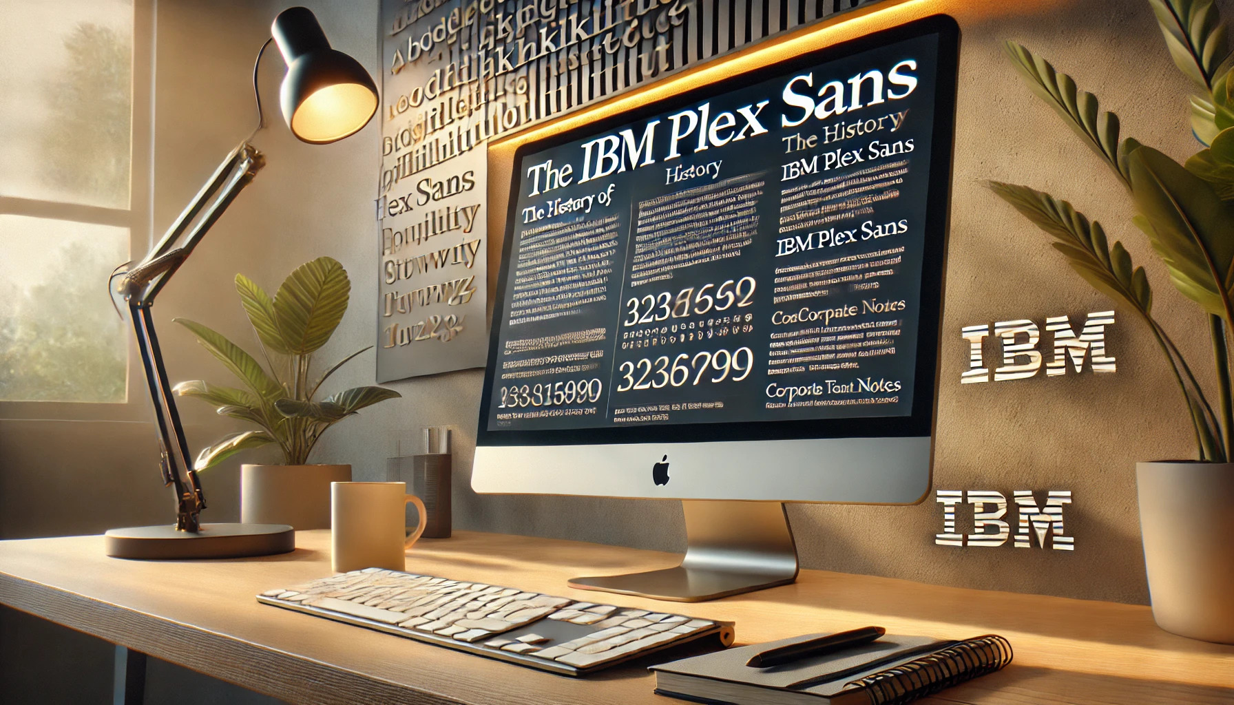
For a company as iconic as IBM, creating a typeface that reflects its values is no small task. IBM Plex Sans serves as a key part of this vision, embodying both history and modernity.
The development of IBM Plex Sans was driven by a desire to capture IBM’s unique identity. This typeface is not just versatile, but also distinctively IBM with its balance of right-angle interiors and smooth exteriors.
As an open-source project, IBM Plex Sans is accessible to everyone, allowing it to be widely used and appreciated. It’s tailored for modern user interface environments, offering a seamless experience whether in print or digital formats like on Google Fonts.
Design Philosophy
The design of IBM Plex Sans blends modern aesthetics with IBM’s long-standing brand values. This approach balances functionality and visual appeal, making the typeface both versatile and recognizable.
Commitment to Open Source
IBM Plex Sans stands out for its open-source nature. This ensures that designers and developers worldwide can use and adapt it without concerns about licensing fees or restrictions. Open-sourcing the font encourages collaboration and innovation. It reflects IBM’s dedication to community-driven projects. By allowing free access and customization, IBM aims to build a wider community around their brand assets. This openness helps in creating consistent experiences across different platforms and projects, fostering a sense of unity and collaboration.
IBM Plex Sans Features
IBM Plex Sans comes with distinct features that capture IBM’s unique identity. Its geometric structure gives it a clean and balanced look, making it ideal for both digital and print media. The font family includes various styles such as serif, mono, and sans-serif, providing flexibility for different design needs. Its modern and neutral appearance makes it suitable for a wide range of applications. Clear readability and aesthetics set IBM Plex Sans apart, ensuring it meets the demands of professional environments and creative projects alike. This attention to detail enhances its usability and ensures it meets diverse design requirements.
Impact on Brand Identity
Switching to IBM Plex Sans as the corporate typeface marked a significant shift in IBM’s brand strategy. Replacing Helvetica that had served IBM for over fifty years, this typeface creates a fresh and modern image for the brand. It helps IBM reduce dependency on external licensing, optimizing their resources. By using a font designed to reflect their design principles, IBM fosters a cohesive and unified brand identity. The typeface’s use across all brand material internationally ensures consistency and recognition. This coherent visual language strengthens brand presence and supports IBM’s communication goals effectively.
Development Journey
IBM Plex Sans is part of the IBM Plex typeface family, created to illustrate the blend of humanity and technology. The development of this font involved a clear vision, collaboration among experts, and multiple refinements.
Initial Concept and Goals
The initial idea for IBM Plex Sans began with IBM’s desire to craft a unique typeface that aligns with its brand. The aim was to capture the company’s rich history in innovation and technology. Designers wanted a typeface that was open-source and versatile. This approach not only allowed IBM to save on licensing fees but also enabled widespread use across various platforms. The typeface was meant to reflect the unification of humans and machines, a concept central to IBM’s philosophy.
Collaboration with Designers
The collaboration phase was crucial to the successful development of IBM Plex Sans. Mike Abbink, working within IBM, partnered with the design agency Bold Monday. Together, they established a collaborative and iterative environment where creative ideas could flourish. This collaboration introduced different styles like Sans, Serif, and Mono. Each style required careful consideration of IBM’s design principles and adaptability for global use. This teamwork ensured that the typeface could function well in many languages and contexts.
Iterations and Refinements
Refining IBM Plex Sans involved extensive prototyping and feedback. Each iteration aimed to improve readability, balance, and aesthetic appeal. Designers focused on achieving a consistent look and feel across different weights and styles. This process included adjusting kerning, glyph shapes, and spacing to enhance user experience in digital and print mediums.
The result was a flexible and cohesive font family that met IBM’s needs. Through numerous trial and error rounds, the team fine-tuned details until IBM Plex Sans became an integral part of IBM’s identity.
Release and Reception
IBM Plex Sans made a significant impact with its launch, demonstrating a blend of innovative design and functionality. It quickly gained traction within the design community and was adopted across various platforms.
Launch Day
IBM Plex Sans was officially launched as an open-source font, marking a big shift in IBM’s typographic strategy. Developed by Mike Abbink in collaboration with Bold Monday, the typeface was designed to embody IBM’s brand spirit. It replaced Helvetica, which had been used by IBM for over fifty years. The goal was to make IBM Plex Sans accessible and versatile for everyone, from web designers to print specialists. This launch also freed IBM from high licensing costs associated with Helvetica.
Industry Response
The response from the design and technology industries was largely positive. Experts praised the typeface for its modern look and functional versatility. IBM Plex Sans, with its variety of styles such as Sans, Serif, and Mono, catered to a wide range of design needs. Critics appreciated its balance of aesthetics and user readability. The font’s open-source nature encouraged designers to explore and use it without restriction, making it a favorite among tech companies and branding agencies alike.
Adoption Across Media
IBM Plex Sans found its way into numerous mediums, illustrating its flexibility and appeal. Designed to work well in user interfaces, it became popular for websites and apps. Print media also adopted it for its legibility and clean look. The font’s different styles allowed for creative uses in editorial design, while Plex Mono’s suitability for code made it popular among developers. IBM Plex’s adoption across these varied platforms speaks to its effectiveness and adaptability as a modern typeface.
Typographic Characteristics
IBM Plex Sans is a typeface that carries a modern and clean appearance. It strikes a balance between geometric structures and humanistic elements. It is known for its versatility and ability to support multiple languages.
Typeface Family Overview
IBM Plex Sans is part of the IBM Plex family, which includes several styles like Serif, Mono, and more. Each style keeps the core design principles while offering variations to suit different needs.
The Sans style itself is a Grotesque typeface with a focus on neutrality and friendliness. This design choice reflects its aim to connect the human and machine in a seamless, harmonious way. The typeface family is well-suited for both digital and print media, offering flexibility in various design contexts.
Its design supports multiple scripts, including Latin, Cyrillic, Devanagari, and more, ensuring global usage. This makes it suitable for diverse user interfaces and applications.
Distinctive Glyphs
IBM Plex Sans stands out with specific features in its letterforms. Right-angle interiors contrast with smooth exteriors, crafting a unique visual effect. The font’s geometric structure gives the typeface a sharp yet approachable look.
Particular letters like the “a” and “g” display distinctive features. The tail of the “a” and the ear of the “g” are designed notably, providing character to the typeface. Meanwhile, the b, d, p, and q bowls carry subtle straight segments, which contribute to the font’s balanced appearance.
This intricate balance of elements is what makes IBM Plex Sans aesthetically appealing and functional for various applications.
Usage and Applications
IBM Plex Sans is versatile, making it great for various uses. Its modern and neutral look fits both digital interfaces and traditional print.
Digital and Print Media
IBM Plex Sans is widely used in both digital and print media because of its readability. In digital spaces, the font works well for websites, apps, and user interfaces. Its clear and geometric design ensures text looks crisp on screens of all sizes. In print media, it is often seen in magazines, brochures, and corporate documents, where a clean and professional look is needed. This adaptability makes it a favorite for brands aiming for consistency across different platforms.
Guidelines and Pairings
For optimal impact, IBM Plex Sans should be used according to certain guidelines. It pairs well with other fonts from the IBM Plex family, such as Plex Serif and Plex Mono, to achieve a cohesive look. When choosing complementary fonts, the goal is to maintain balance and harmony. It’s important to consider contrast in weight and style to enhance readability. Additionally, using Plex Sans in various weights and styles, like bold or italic, can add emphasis without needing extra fonts, streamlining the design process.
Evolution Over Time
IBM Plex Sans has played a significant role in transforming IBM’s visual identity and has influenced typography beyond IBM. This section explores key developments in its history and its impact on other designs.
Updates and Variants
IBM Plex Sans is part of the IBM Plex family, which includes serif, sans serif, and monospace fonts. Since its launch, the typeface has seen updates to improve legibility and aesthetic appeal. It was designed to be versatile, accommodating different languages and scripts globally, which has made it a popular choice for many projects.
These variations allow designers to maintain consistency while adapting to various contexts. Each variant adds a unique touch, whether in professional reports or digital interfaces. The open-source nature of the font encourages constant development and adaptation, ensuring that it evolves with design trends.
Influence on Other Designs
IBM Plex Sans’s clear and modern design has inspired other typefaces seeking versatility and neutrality. Its geometric structure and adaptability have set a standard for contemporary typeface design. This has prompted other companies to rethink their visual identities, focusing on open-source and modular typefaces.
Moreover, its emphasis on a human-machine connection represents a broader trend in the design world. Many typefaces now focus on balance and harmony between digital and print media, echoing this philosophy. IBM Plex Sans’s impact is evident in its widespread use, reflecting its influence on modern typography.
Licensing and Accessibility
IBM Plex Sans offers a flexible licensing model and ensures accessibility for diverse global users. Its open-source nature allows widespread use and adaptation across different platforms and mediums.
Understanding the License
IBM Plex Sans is available under the SIL Open Font License, a common license for open-source fonts. This license permits users to use, modify, and distribute the font freely. However, any altered versions must also be distributed with the same license, ensuring that modifications remain open and accessible to the public.
Users are required to credit IBM and not use the open-source font for non-open-source projects without the appropriate permissions. This open license allows developers and companies to use IBM Plex Sans without limitations on commercial projects, provided they adhere to the licensing terms. This helps in maintaining the font’s accessibility and adaptability in various applications.
Global Accessibility
Accessibility is a crucial aspect of IBM Plex Sans. The typeface has been designed to ensure high readability across various devices, whether it’s in print, on the web, or for mobile interfaces. Its geometric structure, clean lines, and balanced look make it easy to read in different contexts and sizes.
Supporting multiple languages and character sets, IBM Plex Sans caters to a global audience, enhancing inclusivity. The font maintains clarity for diverse users, whether reading in dim light or on different digital platforms. This makes IBM Plex Sans a versatile choice for international communication and design, promoting accessibility and user-friendliness around the world.