Designing a tear-off flyer can be a fun and creative way to spread the word about an event or service. With Canva’s user-friendly platform, anyone can create an eye-catching flyer, even with minimal design skills.
To make a tear flyer in Canva, choose a template, customize it with your details, and add tear-off tabs.
Creativity comes easy with Canva’s variety of templates, which can be customized to fit any theme or color scheme.
Users can add their own images, text, and colors to make the flyer truly personal. The addition of tear-off tabs helps in creating a practical flyer that people can interact with.
By using Canva’s easy design tools, making a tear-off flyer becomes a simple task.
Canva also offers print options, so users can decide whether to print directly at home or go through Canva’s printing service for professional-quality flyers. This makes getting the final product into hands effortless.
Getting Started with Canva
Creating a tear-off flyer in Canva begins with setting up an account and navigating the dashboard.
Choosing the right template will help streamline the design process and unleash creativity.
Sign Up for Canva or Log In
To begin using Canva, users need to create an account or log in. They can sign up using an email address, Google, or Facebook account.
Creating an account is free, and signing up is a simple process.
Once signed up, they receive quick access to a variety of design tools. If they log in with an existing account, they’ll have easy access to their previous designs in the dashboard.
Canva offers both free and Pro accounts, with Pro accounts offering more features and templates. Users can choose to explore the free version first to see if it meets their needs, making it an excellent starting point for beginners.
Familiarize with the Canva Dashboard
After signing in, it’s time to explore the Canva dashboard.
The dashboard is user-friendly, providing easy access to a range of tools and features. On the left side, users find panels for templates, elements, uploads, and more. The search bar at the top allows for quick access to specific templates or designs.
Users can click on the “All Your Designs” section to see their previous work. The “Create a Design” button is prominently displayed for starting new projects.
Exploring these features will help users become more comfortable using Canva’s interface, allowing them to find and use the tools they need efficiently.
Selecting the Right Template for Flyers
Choosing the right template is crucial when creating a tear-off flyer.
Canva offers a variety of pre-made templates that can be customized with personal text and images. These templates come in different styles and layouts, perfect for those looking to create an engaging flyer.
Users can easily select a template by typing “tear-off flyer” into the search bar. Once they find a suitable template, they can start adding their own design elements.
The ease of customizing these templates makes it simple to design attractive flyers quickly, and it’s a great way for beginners to learn about design basics.
Designing Your Tear Flyer
Creating a tear flyer in Canva involves selecting an appealing layout, customizing its appearance and colors, adding text and important details, incorporating images, and designing tear-off tabs effectively. Each step is crucial to produce a visually engaging and functional flyer.
Choosing a Layout
Choosing the right layout sets the tone for the entire flyer.
Canva offers a variety of templates, which can be accessed by searching for “flyer” in its template library. When selecting a layout, consider the purpose of the flyer and its intended audience.
A layout with clean lines and clear sections works well for most purposes.
For more impact, balance text with visual elements like images and icons. Experiment with the arrangement to find one that best showcases your content without overwhelming the reader.
The goal is to keep the layout clear and professional, making sure all design elements are accessible and easy to read.
Customizing Background and Colors
The background and colors of the flyer are essential in making it stand out.
In Canva, users can easily change the background color or upload an image to use as a background.
Think about using colors that reflect the event or message of the flyer, as colors can influence mood and perception.
Try different color combinations to find the most appealing look. Canva’s color palette tool is handy for picking complementary colors.
When using images as backgrounds, ensure they don’t overpower the text or other elements. Adjust the transparency if needed to balance the visibility of all parts of the flyer.
Adding Text and Important Details
Text is a key component in conveying the flyer’s message.
In Canva, text can be added easily by using the text tool. Choose fonts that are easy to read and visually appealing.
Mix different font styles, like bold for headings and normal for details, to create contrast and hierarchy.
Include all essential information, such as event details, contact information, or a call to action.
Make sure the text size is large enough to be noticeable from a distance. Alignment is crucial too; keep text centered or aligned to one side to maintain a neat and organized look.
Incorporating Images and Icons
Incorporating images and icons can make the flyer more engaging.
Canva provides a vast library of free and premium images and icons that can be used to enhance the design.
When adding images, make sure they are high quality and relevant to the flyer’s purpose.
Use icons to visually represent information or add flair to the design. They can be particularly helpful in sections with less text, providing visual cues to the viewer.
Arrange images and icons strategically to guide the reader’s eye through the flyer content smoothly.
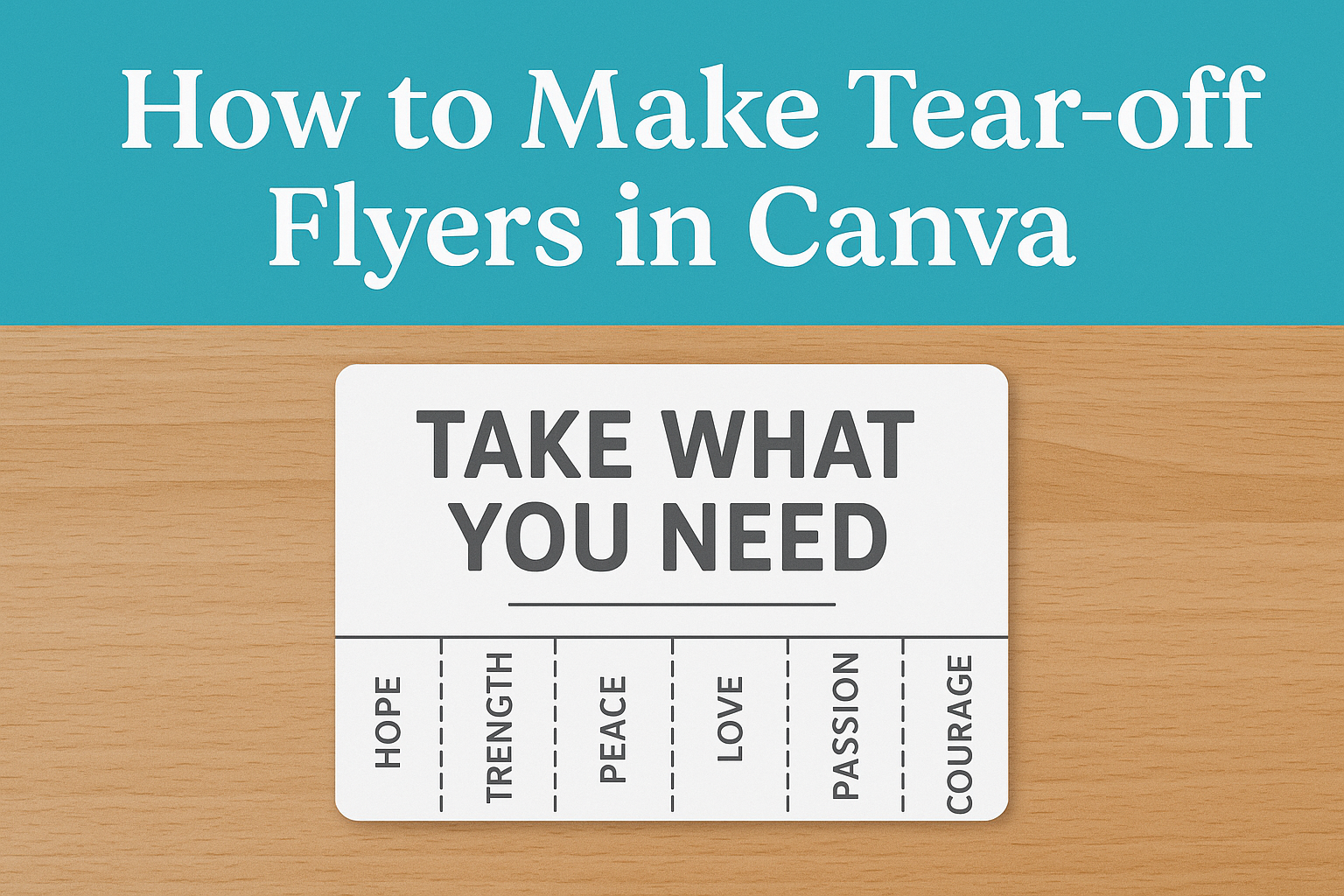
Designing Tear-Off Tabs
Tear-off tabs are functional elements of a flyer that allow people to easily take information with them.
In Canva, utilize the grid system to evenly space out tear-off tabs at the bottom of the flyer. This ensures they are evenly distributed and visually appealing.
Include essential information on the tabs, like a phone number, email, or website. Experiment with different styles and fonts to make the tabs noticeable and easy to read.
Consider adding a small visual element or icon to each tab to draw more attention and encourage people to take them. Use simple scissors icons to indicate where each tab should be torn away.
Finalizing the Flyer
Making sure your flyer is polished involves checking your design, simplifying information, and ensuring readability. These steps can help in creating a flyer that effectively communicates your message.
Reviewing Your Design
Once the flyer design is complete, it’s essential to take a step back and review it for consistency and balance.
Checking for any layout issues or misalignments is a good start. This might involve ensuring elements are evenly spaced and appropriately sized. The colors should complement each other and not clash.
Looking for any unnecessary elements or clutter can also improve the overall design. Removing these can make your flyer more attractive and focused.
Let others review your flyer too, as fresh eyes can spot issues you might have missed.
Editing for Clear and Concise Information
After reviewing the visuals, the next step is to ensure the text is clear and concise.
Avoid long sentences that might confuse the reader. Short and direct language is usually more effective.
Key information like dates, locations, or contact details should be emphasized, possibly by using bold or italic styles.
Organizing information into bullet points or numbered lists can also break down complex details. This makes it more accessible and engaging for the audience.
Always double-check for typos or grammatical errors, as they can make the flyer appear less professional.
Ensuring Readability
Readability is crucial to make sure the audience can easily understand the message.
Choosing a simple, easy-to-read font is important. Fonts that are overly decorative can be hard to read.
The font size should also be adequate; text that is too small might be missed.
The contrast between the text and background is another factor. Light text on a dark background or vice versa can enhance readability.
Providing enough white space around text blocks helps the content stand out clearly.
These practices will help in creating a clean, professional flyer that effectively conveys your important information to the intended audience.
Downloading and Printing
Creating a tear-off flyer in Canva is just the beginning. Once the design is ready, choosing the right file format and setting up print specifications are crucial steps to ensure the flyer looks professional.
Choosing the Correct File Format
When it comes to downloading your flyer, selecting the proper file format is important.
Canva offers several options like PDF, PNG, and JPEG.
For printing, a PDF format is highly recommended because it preserves the layout, fonts, and colors. Another advantage of PDF is its high resolution, ensuring the flyer prints clearly without any pixelation.
For online sharing or digital use, consider a PNG or JPEG. These formats are more suitable for web purposes and can be easily uploaded or shared on social media.
The choice of file format plays a significant role in both the quality and the versatility of the flyer.
Print Considerations and Settings
Printing a tear-off flyer requires special attention to detail.
Before printing, it’s crucial to check the bleed and trim settings. This ensures that no important information is cut off. Make sure the design extends slightly beyond the edge to allow for trimming.
The choice of paper also affects the flyer’s appearance. For a professional look, opt for a heavier, high-quality paper. This is particularly important if there are tear-off tabs, as sturdier paper helps them remain intact.
Finally, adjusting printer settings to best quality or high quality is advisable. This maximizes print clarity and color accuracy, giving your flyer a polished appearance.
Tips for Distribution
Effectively distributing tear flyers involves placing them where they will reach the right audience and ensuring all actions are legally compliant. Understanding key areas for maximum visibility and adhering to local regulations are crucial steps.
Identifying High Traffic Areas
When choosing locations to distribute tear flyers, it’s essential to focus on places with high foot traffic.
Community centers, libraries, and cafés are ideal spots. These areas often have bulletin boards where flyers can be pinned, catching the attention of passersby who might be interested.
Schools and universities are also effective locations, especially if the flyer targets students. Heavily trafficked areas like canteens or student unions work well.
It’s a good idea to rotate flyers every few weeks to keep them fresh.
Another strategic approach is handing out flyers at events. Local fairs, sports games, and concerts are perfect occasions where many people gather.
Remember to be polite and respectful when asking permission to distribute in these spaces.
Legal Considerations
Before putting up flyers, always check the local regulations regarding public postings. Some cities require permits or have specific restrictions about where materials can be placed.
He must contact the city’s local government office to get detailed rules.
In private spaces like cafés or shops, always ask the management for permission. They might have designated areas for community notices.
A clear understanding of these guidelines prevents potential fines or the removal of flyers.
Additionally, avoid placing flyers on vehicles or mailboxes without permission, as this can lead to penalties.
Ensure all actions are within the legal framework to maintain a good reputation and respect community guidelines.