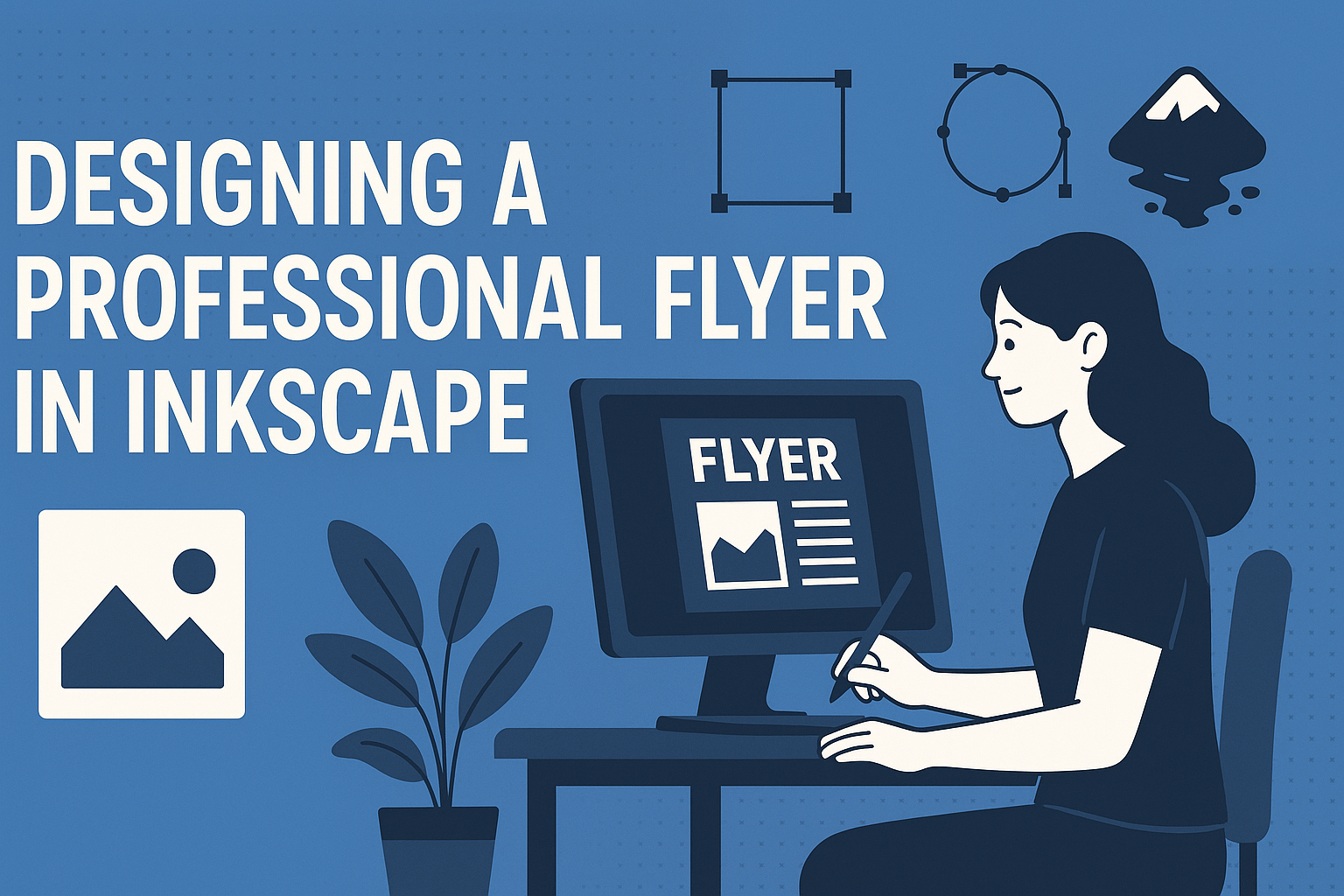
Creating a professional flyer doesn’t have to be daunting or expensive. With the right tools and a bit of creativity, anyone can craft a standout design. Inkscape, a free and open-source vector graphics editor, empowers users to make eye-catching flyers without breaking the bank.
Inkscape offers a wide array of features that make flyer design both simple and enjoyable. From color selection to font choices, the software has everything needed for beginners and professionals alike. These tools help users create visually appealing designs that capture attention.
Moreover, for those wanting to learn more, there are tutorials available online that provide step-by-step guides. These resources show how to effectively use different elements like photos and visual hierarchies, ensuring each flyer achieves its intended impact. For hands-on guidance, Kendle Carter’s video tutorial on how to create a basic flyer is a great place to start.
Getting Started with Inkscape
To create a professional flyer with Inkscape, it’s crucial to set up the software correctly. This involves installing it, learning the interface, and configuring the document’s settings for optimal design. Each step is essential for maximizing the potential of the program.
Installing Inkscape
Installing Inkscape is the first step. The software is open-source and can be downloaded from the official Inkscape website. It is compatible with Windows, macOS, and Linux. On the website, users can find the latest stable release version. Clicking on the appropriate link for the operating system will begin the download process.
Once downloaded, open the installer file and follow the on-screen instructions to complete the installation. Users usually have the option to customize the install location and additional components. After installation, open Inkscape to ensure it runs correctly. This stage prepares your computer to use Inkscape smoothly.
Familiarizing Yourself with the Interface
After installing the software, it’s beneficial to get familiar with the user interface. Inkscape has a menu bar at the top, a command bar for quick actions, and a toolbox on the left with essential drawing tools. Panels on the right provide additional settings and options.
New users should take time to explore these features. The selection tool, node tool, and pen tool are frequently used in design tasks. Having a good grasp of these tools enhances the creative process.
There are many resources available on the Inkscape Tutorials page for those who want a deeper understanding. Watching tutorials can help users become more proficient in utilizing the interface effectively.
Setting Up Your Document
Creating a new document involves setting up the canvas to fit the intended design. When a new file opens, users should adjust the size under “Document Properties” found in the “File” menu. This is important for ensuring the flyer meets the required dimensions.
Choose appropriate units, such as inches or millimeters, depending on the project needs. It is also possible to set the orientation to portrait or landscape. A grid can be activated for precise alignment of design elements.
These initial settings are essential for a successful flyer design process, ensuring that the final output looks professional and matches the desired specifications.
Design Principles
When creating a professional flyer, it’s important to consider how to use color, layout, and elements such as text and images effectively. Each of these aspects plays a crucial role in attracting attention and conveying the intended message clearly.
Understanding Color Theory
Using color effectively can make a flyer stand out. Colors can evoke different emotions and reactions. For example, warm colors like red and orange can create a sense of urgency, while cool colors like blue and green suggest calmness and trust.
A good practice is to use a color wheel to find complementary colors. These colors, located opposite each other on the wheel, create vibrant contrasts that catch the eye. Another tip is to maintain a balance, keeping the design clean and avoiding too many contrasting colors which might overwhelm the reader.
Contrast is also significant for readability. Ensure that there is enough contrast between text and background colors to make the information easy to read.
The Rule of Thirds in Flyer Design
The rule of thirds helps organize a flyer in a balanced way. Imagine dividing the flyer into a grid of nine equal parts. Important elements should be placed along these lines or at their intersections, where they draw more attention naturally.
Placing key items like headlines or images at these focal points guides the reader’s eye across the design. This helps in creating a more engaging and visually appealing flyer.
Using this rule can also assist in creating a sense of harmony and structure, making even complex designs appear simple and organized. It’s a helpful way to ensure that the flyer doesn’t feel cluttered.
Balancing Text and Imagery
Good flyer design balances text and images to create clear communication. Text should be clear and concise, delivering the main message quickly. Use a hierarchy, with headlines larger than body text, to help guide the reader through the content.
Images or graphics should complement the message. High-quality images draw attention and can convey an idea or feeling faster than text. However, it’s important not to let images overshadow the text. Maintaining balance ensures that both elements work together to communicate effectively.
Consider using bullet points to break down key points. This makes information digestible and easy to follow.
Creating Your Flyer
Designing a professional flyer in Inkscape involves selecting an appropriate template, carefully choosing fonts, incorporating images, and managing layers for intricate designs. These elements work together to ensure the flyer effectively communicates its message.
Choosing the Right Template
Starting with a good template saves time and ensures a strong foundation. Inkscape offers various free templates designed for different purposes. Users can find basic flyer templates that suit their needs by exploring resources like free design websites and Inkscape forums.
It’s important to consider the flyer’s purpose and target audience. Whether it’s for an event, sale, or promotion, each type might benefit from a different layout. A clean, simple design works best for straightforward messages, while a more creative layout could suit artistic events. Customizing the template allows users to tailor it to their specific needs, ensuring the flyer stands out.
Working with Text and Fonts
Text on a flyer should be clear and engaging. Choosing the right font is crucial for readability. Inkscape provides a wide range of fonts, but simplicity is key. Users can emphasize important information, like dates and locations, by using bold or italic styles.
Hierarchy is essential to guide the reader’s eye. Larger fonts should be used for headings, while smaller fonts can detail further information. Keeping text blocks concise helps maintain focus. To experiment with creative designs, mix fonts sparingly to avoid clutter.
Using Inkscape’s text tools, users can easily adjust text alignment and spacing. Curving text along a path or inside shapes can create interesting effects, adding flair to the flyer.
Adding Images and Graphics
Images and graphics make a flyer visually appealing. Inkscape supports importing images and offers tools for basic editing. To find suitable images, users can explore free sources or create their own illustrations within the software.
Images should be of high quality, ensuring they look good both on screen and in print. PNG or SVG formats usually work best. Proper placement of images is necessary to balance the flyer’s overall design. Centering images or aligning them with text can maintain harmony in the layout.
Graphics, like icons and shapes, can highlight key points. These elements should complement the overall theme, enhancing rather than overwhelming the design.
Layer Management for Complex Designs
Managing layers effectively is crucial for complex flyer designs. Layers allow users to separate different elements, making it easier to edit and organize content. Inkscape’s layer feature helps keep track of images, text, and shapes without affecting other parts of the design.
Creating separate layers for background, text, and images can simplify adjustments. Users can lock layers they don’t want to edit, minimizing accidental changes. Renaming layers with descriptive titles helps in quickly identifying elements during the design process.
The ordering of layers is also important. Ensuring text layers are above image layers, for instance, ensures readability. By mastering layer management, users can handle intricate designs while maintaining a clean and coherent flyer layout.
Fine-Tuning Your Design
Fine-tuning a flyer design in Inkscape can make a big difference in the final look. This process involves tweaking colors, arranging objects precisely, and using advanced features like clipping and masking to enhance the design.
Adjusting Colors and Gradients
Colors are central to a design’s impact. In Inkscape, users can adjust colors easily through the Fill and Stroke panel. This panel offers sliders and a color wheel for precise selection. Gradients add depth and interest to flat colors. By clicking the Gradient tool, they can add linear or radial effects to any shape.
Including different shades and tones can bring the flyer to life. It’s important to monitor contrast, ensuring text is readable against backgrounds. Experimenting with opacity can also yield subtle effects, making the design more visually appealing.
Aligning and Distributing Objects
Proper alignment organizes a design and improves its flow. Inkscape’s Align and Distribute tool is great for precision. Whether it’s aligning text, images, or shapes, this tool ensures everything is in the right spot. Simply select objects, then choose alignment options such as left, center, or right.
Distributing objects evenly helps maintain balance across the whole flyer. This is especially useful when dealing with multiple elements, like text boxes or icons. Even spacing ensures that each part of the design is easily noticed and harmonious.
Using Clipping and Masking Features
Clipping and masking can focus attention on specific parts of a design. Clipping uses a shape to hide portions of objects outside its boundaries. This can clean up edges or create unique compositions. Start by placing the clip shape over an object and using the Object menu to set the clip.
Masking, on the other hand, adjusts the transparency of an object, revealing only certain areas. Masks apply gradient transparency, giving a soft transition effect. This advanced technique can make visuals seem seamless and integrated. It’s perfect for highlighting important aspects without making the flyer look cluttered.
Preparing for Print and Web
Designing a flyer in Inkscape involves ensuring it looks great both when printed and when viewed on a screen. Key elements include setting the right DPI, selecting the appropriate file formats, and managing the color settings for print accuracy.
Setting Appropriate DPI Settings
DPI, or dots per inch, is crucial for print quality. For printed materials, setting the DPI to 300 is standard. This ensures images and text appear sharp and clear.
When the DPI is too low, the flyer might look blurry. High DPI can cause large file sizes, which isn’t always necessary for digital formats. For web use, a DPI of 72 is typical, as it balances quality and file size.
Inkscape allows users to set these parameters easily. Ensure the document settings reflect the intended DPI for the target use.
Choosing File Formats for Export
Selecting the right file format affects both print and online distribution. For printing, formats like PDF and TIFF are ideal. They preserve quality and support complex images and fonts.
For web use, JPEG and PNG are preferred. PNGs are great for images with transparent backgrounds. JPEGs are better for photos and detailed images because they compress well and load faster.
Inkscape supports these formats, enabling easy export. Be sure to check the format guidelines specific to the printer or web platform being used.
Ensuring Color Accuracy for Print
Color accuracy is vital for a professional flyer. CMYK is used for print, while RGB is for digital screens. Inkscape can convert between these color modes.
Print colors may look different from what is seen on a monitor. Calibrating screens and using soft proofing can help match print outputs.
Additionally, using a Pantone color guide can be useful. Always consider adjusting the colors as needed to fit the medium. Testing a sample print can save a lot of hassle before final runs.
Final Review and Adjustments
Completing a flyer design in Inkscape involves careful evaluation to ensure every element is accurate and polished. It’s crucial to verify design elements, check text accuracy, and know how to export and share your creation.
Double-Checking Design Elements
It’s important to ensure all design elements look right. Start by examining the alignment of text and images. Make sure everything is centered or aligned as intended. Check for any overlapping elements that may have been missed during the design process.
Color consistency is also vital. The colors used should match the theme and not clash with each other. Look at how the colors appear on different screens to make sure they are consistent.
Typography matters too. Verify the fonts are easy to read and appropriately sized. Check that the use of bold or italicized text effectively highlights important information. Confirm the use of space; elements should not feel cramped or too spread out.
Proofreading Text Components
Errors in text can impact the professionalism of your flyer. Double-check for spelling mistakes and grammatical errors. Reading aloud can help identify awkward phrasing or unclear language that might have been missed.
Look at any call-to-action text. Ensure it is clear and compelling. Any details like dates, addresses, or contact information should be double-checked for accuracy. Having someone else review the text can offer a fresh perspective and catch errors that were overlooked.
Finally, make sure all text is formatted uniformly. Ensure consistency in font sizes, styles, and colors across headings and paragraphs.
Exporting and Sharing Your Design
Once the design is finalized, knowing how to export it correctly is crucial. Inkscape offers various file formats for export, such as PNG, PDF, and SVG. Choose the format based on how the flyer will be used. For printing, a high-resolution PDF is often recommended.
Consider the file size, especially if you’re emailing it or uploading it to a website. Optimize the file to balance quality and size. Testing the exported file on different devices ensures it appears as intended.
If it’s for online use, make sure it is easy to download or view. If printed, ensure it meets the specifications of the printing service.