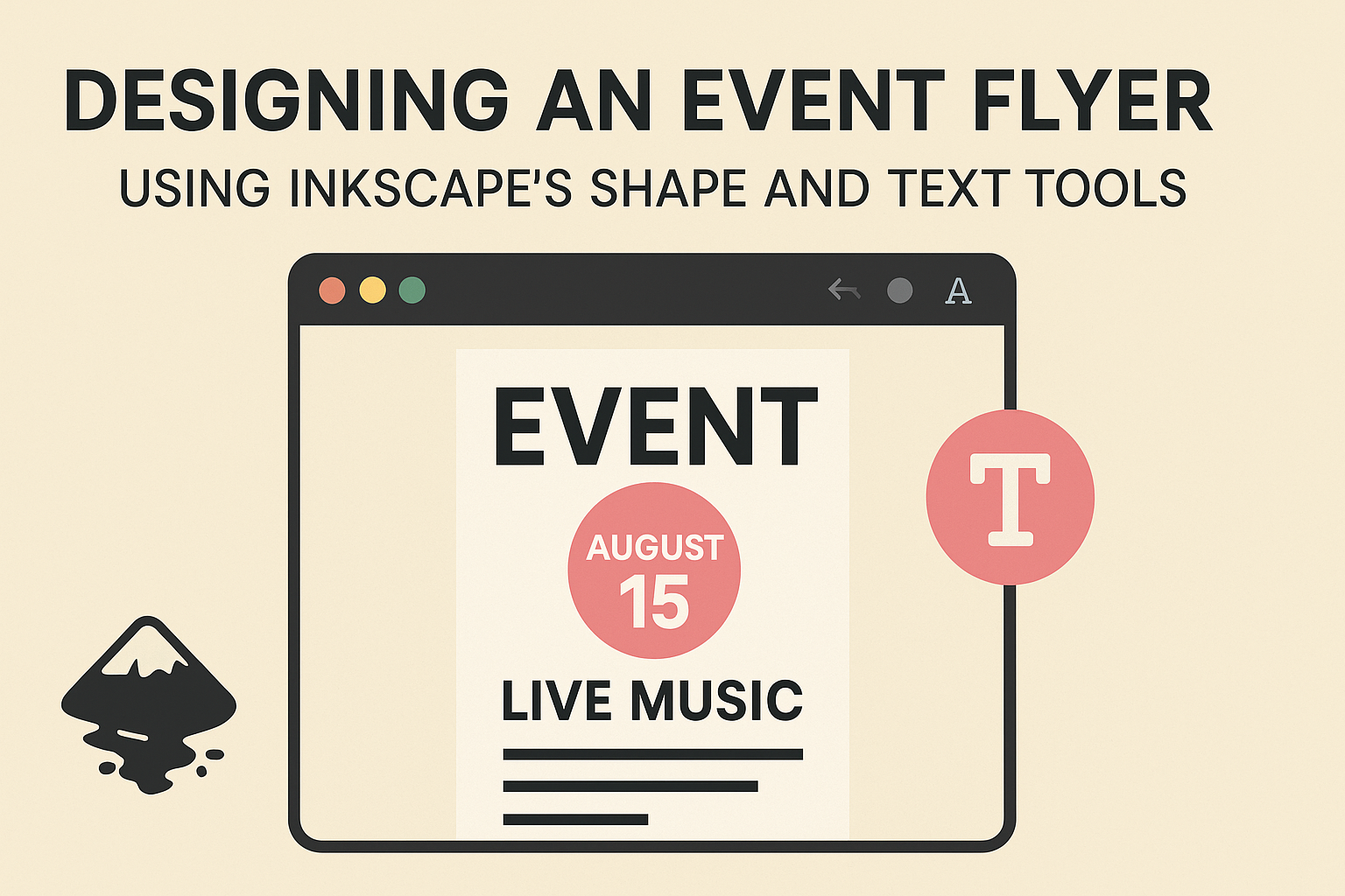
Designing an event flyer with Inkscape is both fun and accessible. Using Inkscape’s shape and text tools, anyone can create eye-catching flyers without needing expensive software. With these tools, creativity has no bounds and users can produce designs that truly stand out.
The shape tools in Inkscape are versatile and allow for creating various shapes, such as rectangles, ellipses, and stars, which provide a solid foundation for any flyer. Combining these shapes with text tools results in unique designs that capture attention. Inkscape also offers customizable options, letting users tweak shapes to fit their specific needs.
The process of creating a flyer becomes much more enjoyable with the freedom that Inkscape provides. Knowing how to effectively use these tools can transform a simple idea into a professional-looking design. This makes Inkscape a perfect choice for beginners and experienced designers alike who want to experiment and design with ease.
Getting Acquainted with Inkscape
Inkscape is a popular free tool for creating vector graphics. This section will guide you through the essential aspects of getting started, including an overview of Inkscape, understanding its user interface, and setting up your document for design work.
Overview of Inkscape
Inkscape is a robust, open-source vector graphics editor favored by designers around the world. It allows users to create and edit vector images such as illustrations, diagrams, and logos. Available for different operating systems, Inkscape supports various file formats, making it convenient for different design needs.
One of the strengths of Inkscape is its range of drawing tools, including shape, pencil, and calligraphy tools. These help create detailed designs. Furthermore, users can apply filters and effects to enhance their artwork.
Inkscape’s customization options, such as extensions and add-ons, improve functionality, catering to both beginners and advanced users. Its active user community provides ongoing support through tutorials and forums, which are beneficial for learning new techniques and troubleshooting issues.
User Interface Basics
The Inkscape user interface is designed to be intuitive, with a layout that makes tools easy to find and use. Along the left side, the toolbox offers quick access to drawing and editing tools like pencils, shapes, and gradients. The top bar provides options for file operations, while the status bar below gives information about the current tool or selection.
Key interface elements include the canvas, where users create and view designs, and the layers panel, which helps manage complex projects. Users can customize the layout by docking and undocking panels or adjusting the toolbars to fit their workflow.
Understanding the user interface allows designers to work more efficiently. Recognizing keyboard shortcuts for common actions like copy, paste, and undo can significantly speed up the design process.
Setting Up Your Document
Setting up a document correctly is vital for any design project in Inkscape. Start by selecting File > New to open a blank canvas. From there, adjust the document properties by navigating to File > Document Properties. Here, designers can set dimensions, units, and orientation according to the project’s requirements.
Choosing the right page size, such as A4 or Letter, depends on the intended print size for the flyer. Setting guidelines and grid preferences help in aligning objects accurately and maintaining symmetry across the design.
Color management and setting up default styles can also be adjusted in this phase, ensuring consistency throughout the design process. Proper document setup streamlines the workflow and prepares the canvas for successful design execution.
Working with Shapes
Inkscape offers a wide range of tools to help users create and manipulate shapes effectively. Understanding these features is crucial for designing polished event flyers.
Creating Basic Shapes
To start designing with Inkscape, the first step is creating simple shapes. Users can access the shape tools from the toolbox, including rectangles, ellipses, stars, and polygons. By selecting one of these tools, they can click and drag on the canvas to draw the desired shape.
Each of these shapes comes with individual settings. Clicking on the shape while holding the Control key ensures that proportions remain consistent, such as creating a perfect circle with the ellipse tool. It’s handy for maintaining balance and neatness in flyer designs.
Shape Transformation and Manipulation
Once shapes are created, they might need some adjustments. Using the Selection Tool, users can easily resize, rotate, and skew shapes. By clicking and dragging the corner handles, the size can be changed. Holding the Shift key during this process scales the shape from its center.
Rotation is done by clicking the shape twice, using the curved arrows that appear around it. For precise transformations, users might use numeric input in the settings panel. This control allows designers to make detailed adjustments essential for aligning elements properly on event flyers.
Using Paths to Create Complex Shapes
Creating complex designs often requires more than basic shapes. Inkscape provides the Path Tool, which is powerful for these tasks. Users can convert standard shapes into paths, allowing them to edit individual nodes and segments.
For example, using the Division Feature helps slice shapes into new forms, enhancing creativity. Converting simple rectangles or circles into unique, artistic designs is possible with paths. This capability expands the horizons of event flyer design by combining and altering shapes in innovative ways.
Using Text Tools
Inkscape’s text tools offer a wide range of features for adding and styling text on event flyers. Users can input text, adjust fonts, and apply styling effects to create visually appealing designs.
Adding and Editing Text
To begin with text in Inkscape, users should select the Text tool from the toolbar. Clicking on the canvas allows them to create a text box where they can type directly. It’s straightforward to reposition the text box by clicking and dragging it with the mouse.
Editing text is just as simple. Once the text object is selected, the user can change its content and reformat using options like size, alignment, and line spacing. The text can be adjusted easily to fit the desired layout.
Typography Basics
Typography is an essential element in flyer design. Inkscape allows users to choose from various fonts installed on their computer. Selecting a suitable font is vital for conveying the right message and tone. Users should consider readability, especially when using decorative fonts.
The font size can be adjusted for emphasis, while spacing options like kerning (space between letters) and line height are available for fine-tuning. Applying these settings helps in achieving a balanced and aesthetic composition that guides the viewer’s eye across the flyer.
Text Styling and Effects
Inkscape provides several options to enhance text with styling and effects. Users can modify the text color using the color palette or input specific color codes. These color choices can help in matching the overall theme of the event flyer.
Additional effects like shadows or highlights add depth and attract attention. Users can apply these through object and path menus. For instance, converting text to path offers more flexibility for intricate designs like making text flow into a shape. These tools enable creative freedom while maintaining the clarity necessary for an effective event flyer.
Design Principles for Event Flyers
When designing an event flyer, it’s important to focus on composition, color, and balance. These elements help create an engaging and effective flyer that grabs attention and conveys information clearly.
Composition and Layout
In flyer design, composition is key. A clean layout guides the reader’s eye naturally through the content. Use grids to organize elements and maintain a consistent structure. Aligning text and images provides order and readability.
Make use of negative space to prevent overcrowding. This space helps important elements stand out. Placing the most critical information, like the event name and date, at eye level or in the center draws immediate attention. Each section must have a purpose, ensuring that every element adds value to the flyer.
Color Theory and Usage
Color choices significantly impact the flyer’s appeal. Warm colors like red and orange can create excitement, while cool colors like blue and green evoke calmness. Using contrasting colors can highlight key information and improve readability.
Limit the color palette to two or three main colors. This prevents visual chaos and maintains focus on the message. Use the psychology of color to match the event’s theme or mood. For instance, green tones work well for eco-themed events.
Balancing Visual Weight
Balancing visual weight is about distributing elements to achieve harmony. Heavy elements, like bold fonts or large images, draw attention first. Balance these with lighter elements to avoid overwhelming the viewer.
Hierarchical design helps direct attention to the most critical information first. Varying the size and weight of text and graphics creates a hierarchy. This helps ensure that titles and important details are noticed before less crucial information.
Consider the flyer’s overall symmetry. Symmetrical designs can appear formal, while asymmetrical layouts may feel dynamic and interesting. Adjusting element placement helps achieve balance and ensures the flyer remains inviting and effective.
Incorporating Graphics and Logos
Integrating graphics and logos into an event flyer can enhance its visual appeal and make it more memorable. Properly inserting images and effectively tracing bitmaps will ensure that visuals maintain high quality and fit the flyer’s design perfectly.
Inserting Images
Inkscape makes it easy to incorporate images into your flyer design. Start by importing your desired image using the “Import” function. It’s located under the “File” menu. This lets users choose and place images anywhere on the flyer canvas.
Once inserted, resizing the image is often necessary. Grabbing a corner handle while holding the “Ctrl” key maintains the aspect ratio. This ensures that the image doesn’t look stretched or skewed.
For positioning, moving images to different layers can be helpful. Arrange them either above or below text for a cleaner layout. Using the “Object” menu to manipulate images makes it easy to match the overall design intent.
Tracing Bitmaps
A bitmap tracing function within Inkscape is extremely handy for flyer design. This converts raster images (like JPEG or PNG) into editable vector graphics, which maintain quality when resized.
First, select the image and navigate to “Path” > “Trace Bitmap.” A dialog box will appear offering different tracing options. Brightness, color, and edge detection can be adjusted based on the image complexity.
It’s important to preview the traced image to make sure it aligns with the original. Sometimes tweaking the parameters helps achieve a better outcome. After tracing, the vector image can be further edited just like any other path or shape in Inkscape.
Finalizing the Flyer Design
The final steps in flyer design include managing layers, aligning elements, and preparing for print. These tasks give a polished look and ensure the flyer is ready for any setting.
Layer Management
Using layers in Inkscape helps organize different parts of your flyer. Layers allow the designer to separate elements like text, images, and backgrounds. This separation makes adjustments easier.
Adding a new layer is a simple task. Go to Layer > Add Layer and name it appropriately based on its purpose like “Text” or “Images.” The layer panel shows all layers, where you can lock, hide, or rearrange them. This makes editing simple and helps ensure nothing important gets accidentally moved or altered.
Organizing elements on different layers ensures each part stays in place, preventing mishaps during design. Proper layer management also makes future edits quicker by keeping everything tidy and accessible.
Alignment and Distribution
Aligning and distributing elements makes the flyer look professional. Inkscape’s alignment tools are vital for this. They help center text and ensure images are evenly spaced.
The Align and Distribute tool in Inkscape offers options to align objects vertically or horizontally. It can be accessed via Object > Align and Distribute. This tool sets objects relative to each other or the page.
Consistent spacing is crucial to a clean appearance. Use the distribute function to keep elements evenly spaced. This helps guide the viewer’s eye smoothly across the flyer. By using these tools, designers can create a balanced and visually appealing layout.
Pre-Press and Exporting
Once the design looks perfect on screen, it’s important to prepare it for printing. Inkscape allows designers to check their work before exporting.
Ensure that the settings match the printer’s requirements. This includes checking the color mode and resolution. Convert any text to paths by selecting it and choosing Path > Object to Path. This avoids font problems during printing.
Exporting the final design is the last step. Go to File > Export to save the flyer as a PDF or other formats suitable for printing. Make sure to include bleed settings if needed. Proper exporting ensures the flyer looks as intended when printed.