Creating an infographic that grabs attention is essential in today’s visually driven world. Using Visme, anyone can design stunning infographics, regardless of their design experience. Visme provides hundreds of templates and design elements that make it easy to create visuals that stand out.
Visme’s user-friendly platform offers tools to transform data into engaging stories. They simplify the process with a step-by-step approach to designing infographics. By signing up for a free account, users can start designing right away.
For those wanting an edge, animated infographics can make information even more captivating. With Visme, creating these dynamic visuals is as easy as a few clicks. Check out this guide on creating animated infographics for more ideas on making your infographics pop.
Understanding Infographics
Infographics are powerful tools for communicating complex information in an engaging way. They combine visuals and text to simplify data, making it easier for audiences to grasp important details quickly.
What Is an Infographic?
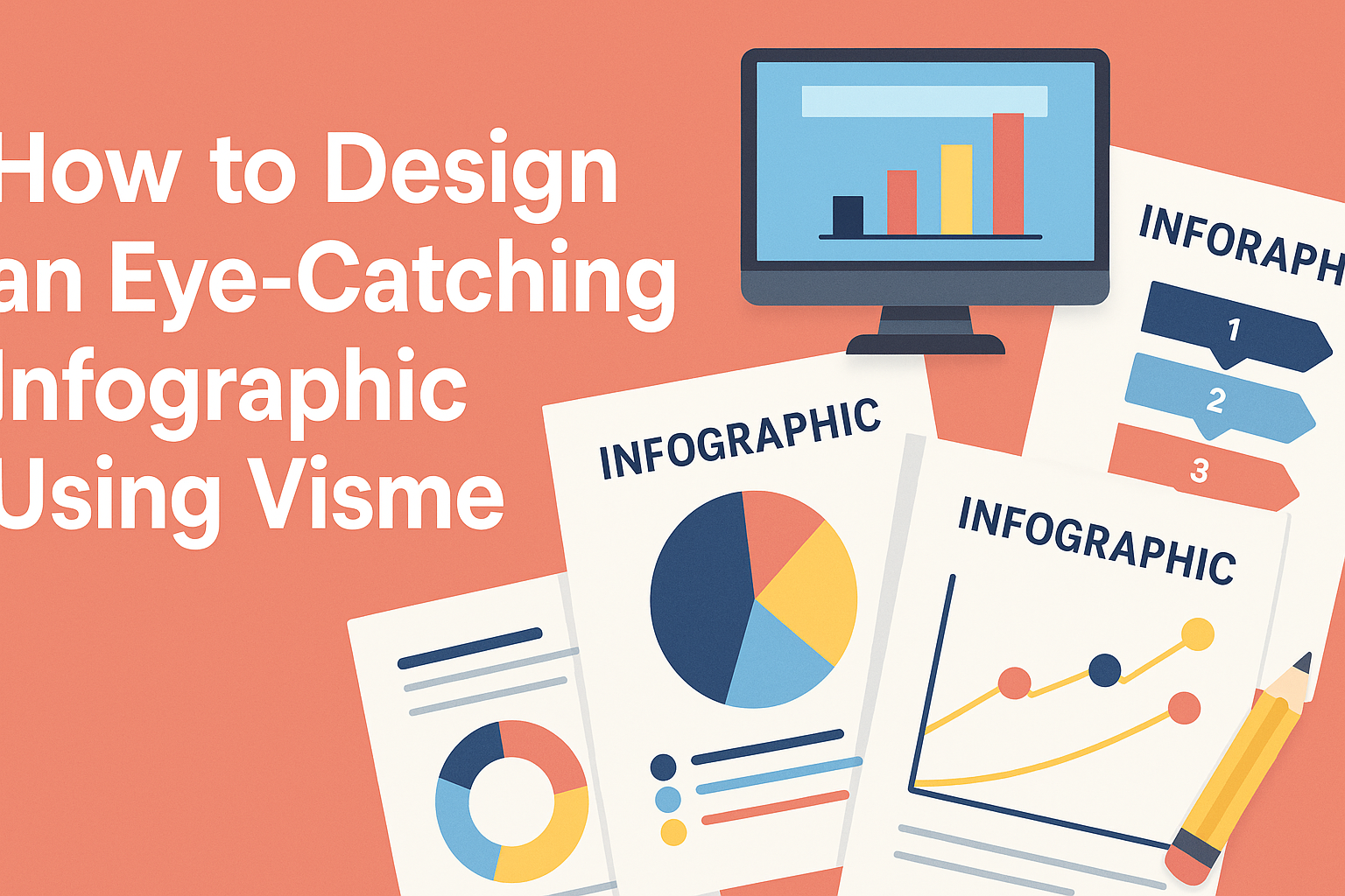
An infographic is a visual representation of information or data. It uses images, charts, and minimal text to present complex information clearly and quickly. Infographics are designed to make data understandable at a glance and can cover topics like statistics, instructions, or processes.
By transforming detailed data into eye-catching visuals, infographics make it easier to communicate information effectively. They are widely used in marketing, education, and journalism to engage audiences and enhance understanding.
Benefits of Using Infographics
Infographics offer several benefits that make them popular. First, they catch the audience’s attention with visually appealing design, ensuring key information stands out. This is particularly useful in today’s fast-paced digital world, where visual content grabs attention more effectively than text alone.
They also improve information retention. Visuals are processed faster by the brain compared to text, which means people are more likely to remember the information presented in an infographic.
Finally, infographics are shareable across various platforms, such as social media and websites. Their visual nature encourages sharing, helping to spread the message further and reach a wider audience. This makes them a valuable tool for marketers and educators alike.
Finding Your Focus
To design an effective infographic using Visme, it’s important to concentrate on what you want to achieve. This involves selecting the right topic, understanding who will view your work, and having a clear aim for what the infographic will deliver. Making conscious decisions in these areas will guide the design process smoothly.
Choosing the Right Topic
Picking the best topic is a crucial step. It’s vital to select something engaging and relevant. Start by brainstorming subjects that matter to the target audience. Check for current trends or hot topics in the industry.
Additionally, think about the purpose of the infographic. Is it to inform, compare, or entertain? Having a clear intention helps to narrow down the options and pick a subject that aligns with the intended message.
Knowing Your Audience
Understanding the audience is key to creating content that resonates. Consider the demographics, preferences, and interests of the viewers. Ask questions like, “What problems do they face?” or “What information are they seeking?”
Tailoring the infographic to meet these needs ensures higher engagement. It’s also helpful to use language and visuals that suit the audience’s level of expertise. By catering to their preferences, designers can craft infographics that truly connect with the audience.
Setting Your Goals
Establishing clear goals provides direction. Before starting the design, identify what you hope to accomplish. This could be educating viewers, increasing brand awareness, or persuading them to take action.
Having set goals helps measure the success of the infographic. Consider what metrics will be used, such as shares, likes, or new followers. Being goal-oriented not only improves the design process but also enhances the effectiveness of the final product. Aligning the infographic’s content and style with these objectives is crucial for impactful communication.
Working With Visme
Visme is a powerful tool for creating infographics. It’s designed to be user-friendly, making it easy for beginners and experienced designers alike to create stunning visuals. Key features include an intuitive interface, a variety of templates, and a rich library of assets.
Introduction to Visme
Visme is an online design tool focused on infographics, presentations, and more. It offers a straightforward platform where users can craft unique designs without needing advanced technical skills. Signing up is simple and free, requiring just an email, name, and password. Once registered, users gain access to a vast array of design possibilities.
A standout feature is its versatility, supporting both static and animated graphics. Whether creating a simple chart or a complex presentation, Visme provides tools that cater to all needs. Additionally, users appreciate the community resources available, including tutorials and forums, which enhance the design experience.
Navigating the Interface
Visme’s interface is both intuitive and efficient. Upon logging in, users are greeted by a dashboard that neatly organizes projects. The sidebar offers quick access to various features like templates, graphics, and projects in progress.
The editor itself is user-friendly, with drag-and-drop capabilities that simplify adding text, images, and more. Each tool is clearly labeled, ensuring that users can quickly find what they need. This ease of navigation minimizes the time spent searching for features and maximizes the time spent creating.
Selecting a Template
Choosing the right template is crucial in the design process. Visme provides a wide selection, catering to various themes and industries. These templates come pre-designed with professional layouts, giving users a solid starting point.
Users can filter templates based on categories or popularity, ensuring they find the perfect match for their project. Once a template is chosen, it can be easily customized by editing text, changing colors, or adding new elements. This flexibility allows the creation of unique, on-brand visuals with minimal effort.
Utilizing Visme Assets
Visme offers an extensive library of assets to enhance any design. From icons and images to charts and diagrams, these assets help convey information effectively. Users can browse through categories to quickly find the visual elements that suit their needs.
Integrating assets into a design is seamless. Simply drag and drop items into the workspace, then resize or adjust as needed. The availability of high-quality visuals makes it easy to craft engaging graphics that capture attention. Additionally, Visme’s assets are regularly updated, ensuring access to fresh and trendy content.
Design Principles
Designing an infographic involves key principles that help in creating a clarity and visual appeal. These principles include choosing an appropriate layout, the effective use of color, selecting readable fonts, and applying visual hierarchy to guide the viewer’s eye.
Layout and Composition
A well-organized layout is crucial for any infographic. It ensures that information is easy to understand. Using grids can help arrange content consistently. Grids divide the design space into equal parts, providing structure.
White space, or negative space, is also important. It prevents the infographic from appearing cluttered. Including margins around text and images allows elements to breathe.
Balance is key in composition. Content should be evenly distributed to avoid the design feeling lopsided. Symmetry creates a formal and orderly look, while asymmetry adds interest and energy. Experiment with both to find what suits the theme.
Color Theory
Color plays a significant role in influencing mood and focus in infographics. Choosing the right color scheme enhances readability and draws attention to key information. It’s effective to use a limited palette of about three to five colors.
Contrast boosts readability. Using contrasting colors for text and background ensures that content stands out. For example, dark text on a light background is easier to read.
Harmony is also important. Colors should complement each other. For a unified look, consider using analogous colors, which are next to each other on the color wheel. This creates a cohesive and pleasant design.
Typography
Typography in infographics should be clear and legible. It’s vital to choose fonts that are easy to read. Avoid using too many different fonts as this can cause confusion. Generally, limiting to two or three fonts is effective.
Font size matters. Titles and headings should be larger to stand out. Keep body text smaller but legible. A hierarchy in font size helps guide the reader through the information.
Creating emphasis with bold or italic text can highlight important points. It draws attention without overwhelming the reader. Ensure there is enough contrast between text color and background to maintain readability.
Using Visual Hierarchy
Visual hierarchy helps in directing the viewer’s eyes to the most important parts first. It uses design elements like size, color, and position to show the sequence of information.
Size is an important tool here. Larger elements naturally catch the eye before smaller ones. Using larger fonts for headings establishes a clear hierarchy.
Position also guides attention. Place the most critical information at the top or center. These are natural starting points for viewers. Images strategically placed can break up text and maintain engagement.
Visual cues like arrows or lines can guide the flow systematically. These draw paths to follow, making it easier for viewers to navigate through different sections.
Creating Content
Designing an infographic with Visme involves writing engaging text, using accurate data, and adding eye-catching visuals. Each part plays a significant role in making the infographic both informative and visually appealing.
Writing Engaging Copy
Writing clear and engaging text is crucial for grabbing the reader’s attention. Aim for short, punchy sentences that convey the main idea quickly. Use active voice and vivid language to make the content lively.
Break up text into bullet points or short paragraphs. This structure makes it easier for readers to digest the information. Bold important points to highlight key information. Ensure the text is relevant to the infographic’s main theme to maintain focus and coherence.
Incorporating Data
Including accurate data enhances the infographic’s credibility. Use statistics that are up-to-date and relevant to your topic. Present data in a way that is easy to understand, using charts or graphs. Visme offers tools to create visual representations of data that can simplify complex information.
Label charts clearly and keep them concise to avoid overwhelming the reader. Consider what data is most important and focus on those points to keep the infographic effective.
Adding Graphics and Icons
Graphics and icons make an infographic more visually appealing. They help break up text and highlight key ideas. In Visme, there are a wide range of icons and graphics to choose from. Use visuals to illustrate your points and make the content engaging.
Balance visuals with text so that neither overshadows the other. Maintain consistent styling across graphics to ensure a unified look. Carefully chosen visuals effectively support the infographic’s message, making it memorable to the audience.
Making It Interactive
When designing an infographic using Visme, making it interactive can greatly enhance user engagement. Key methods include adding animations, embedding media, and using hyperlinks to create a dynamic experience.
Adding Animations
Animations can make an infographic more engaging by bringing visuals to life. In Visme, users can create animated infographics by choosing elements like charts or icons and applying animation effects. Options such as fade in, bounce, or zoom make the content visually appealing.
Animations can be timed to activate on scroll, click, or hover, adding an interactive layer. This method helps in directing the viewer’s attention to crucial information and improving content retention.
Embedding Media
Another method to enhance interactivity is by embedding media. Visme allows users to integrate videos and audio within their infographics. This feature can provide additional context to the visuals, making the infographic more informative.
By embedding media, users can explain complex data through a video or add audio descriptions to data points. To add media, creators can drag and drop video or audio files into their design. This provides a richer, more engaging experience for the audience.
Using Hyperlinks
Hyperlinks are essential for directing viewers to more detailed information. In Visme, creators can link sections of their infographic to external resources. This feature is useful for citing sources or providing supplemental content.
To add a hyperlink, users select an object and choose the “Actions” menu. They can then link the object to a URL or another section of the infographic. This method adds depth to the design, enabling viewers to explore related content at their convenience.
Optimizing for Your Audience
When designing an infographic with Visme, it’s crucial to tailor it for your audience. Consider aspects like accessibility, mobile responsiveness, and the strategies for sharing and distribution. These elements ensure that your infographic is not only visually appealing but also effective in reaching and engaging your target audience.
Ensuring Accessibility
Accessibility is key when it comes to reaching a broader audience. It is important to use simple and clear language. Avoid overly complex jargon and phrases that might confuse readers. Color contrast is also essential for those with visual impairments. Make sure texts stand out against the background and are easy to read.
Adding alternative text to images allows those using screen readers to understand your content better. You should make sure this text is descriptive enough to provide meaningful context. Utilize bulleted lists and headings to create a structured layout. This makes it easier for readers to navigate through the information.
Use fonts that are large and clear enough to be easily read on various devices. By focusing on these accessibility features, infographics can be made inclusive to all users.
Mobile Responsiveness
With increasing mobile usage, making infographics responsive is a necessity. Infographics should be designed to be equally engaging and legible on smaller screens. Break your design into smaller sections that are vertically stacked. This ensures that users can scroll through easily on mobile devices.
Images and text should automatically adjust to fit different screen sizes. This can be achieved by using scalable vector graphics which maintain resolution on various screens. Ensure that buttons and interactive elements are large enough to be tapped without difficulty.
Testing the infographic on different devices can highlight any issues before they reach the audience. Keeping these mobile responsiveness tips in mind ensures that your infographic is effective across all platforms.
Sharing and Distribution
To maximize reach, sharing and distributing your infographic effectively is crucial. Utilize social media platforms tailored to your audience’s preferences. Each platform has its own best practices for content sharing. Make sure to adapt your content according to the platform requirements.
Include share buttons directly on your infographic. This encourages easy distribution by those who find the content valuable. Adding a call-to-action can also prompt users to engage further or visit a linked website. Collaboration with influencers or industry leaders can help in reaching more people who are interested in your topic.
Keep track of sharing performance through analytics. This way, you can adjust your strategies based on what works best for your audience.
Analyzing Performance
After creating an infographic with Visme, it’s essential to assess its effectiveness. This involves monitoring key metrics, collecting feedback, and improving the design based on insights. Each aspect plays a crucial role in enhancing the impact of your infographic.
Metrics to Monitor
Identifying the right metrics is crucial for evaluating the performance of an infographic. Key Performance Indicators (KPIs) like engagement rate, shares, and time spent on the page can offer valuable insights. For instance, a high engagement rate indicates that viewers find the content appealing.
Tracking these metrics over time helps assess which elements within the infographic resonate with the audience. Another important metric is conversion rate, especially if the infographic contains a call-to-action like subscribing to a newsletter or visiting a website. A good conversion rate suggests the infographic effectively guides users to take desired actions.
Google Analytics and similar tools can be useful here. They provide detailed reports on user interactions, helping pinpoint areas that need improvement. It’s important to regularly review these metrics to ensure the infographic continues to achieve its goals.
Gathering Feedback
Feedback offers direct insights into how an infographic is perceived by its audience. Encouraging viewers to share their opinions can provide a deeper understanding of their experience. Social media platforms are excellent venues for this, where people often express their thoughts freely.
Creating a short survey is another effective way to gather structured feedback. Include questions about the design aspects, such as clarity, color scheme, and how memorable the information is. This can reveal unexpected insights not visible through metrics alone.
Engaging with your audience through comments and direct messages also offers qualitative feedback that can be impactful. Listening to criticism, whether about design or content, is key to crafting infographics that better meet audience expectations.
Iterating on Design
Once feedback and metrics are collected, using this information to refine the infographic is essential. Iteration involves making thoughtful changes to improve both aesthetics and effectiveness. Start with any glaring issues highlighted by audience feedback or low engagement metrics.
Adjust design elements like color schemes, font size, and graphics to enhance visual appeal. Consider changing the layout if users report confusion or if analytics show a high exit rate at a particular section. Tools like Visme enable easy editing and updating of infographics.
A/B testing can also be beneficial in this phase. By testing different versions of the infographic, it’s possible to see which variations perform better. This ongoing process ensures the infographic remains engaging and relevant to its audience.