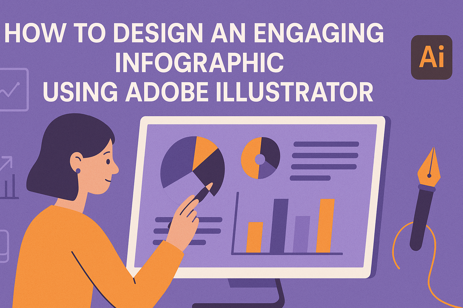
Creating an eye-catching infographic is an excellent way to present data in a way that’s both attractive and simple to understand. Adobe Illustrator stands out as a top tool for designing these visuals, offering features that help transform raw data into engaging graphics. With the right techniques, anyone can use Adobe Illustrator to craft infographics that captivate their audience.
An effective infographic combines appealing visuals with clear information, allowing viewers to grasp complex data quickly. Adobe Illustrator’s tools for shapes, colors, and text make it perfect for crafting these visuals. Additionally, it supports features like live data links to ensure the infographic stays updated and accurate.
By exploring techniques to design infographics, users can enhance their ability to communicate visually. Some useful skills include using the Bar Graph Tool and maintaining live connections between data and graphics. With practice, creating informative and dynamic infographics becomes a smooth process using Adobe Illustrator.
Understanding Infographics
An infographic merges visuals with information to communicate data or ideas clearly. They engage the viewer by breaking down complex information into easy-to-follow images and text. This section explores what infographics are, why they’re so important, and the different types available to creators.
What is an Infographic?
An infographic is a visual representation of information or data. The aim is to simplify complex details into a format that’s easy to understand and visually appealing. Infographics often include images, charts, and minimal text to quickly convey a message. They help make statistics or processes understandable at a glance, combining creativity and factual detail.
Visual elements like color and layout are crucial. These elements not only attract attention but also aid in comprehension. Well-designed infographics provide a snapshot of information, making them ideal for presentations, promotional materials, and online content.
The Importance of Infographics
Infographics play a key role in communication, especially in an age where attention spans are short. They help capture and maintain interest, making them an effective tool for educators, marketers, and businesses.
They are especially useful for social media, as users scroll quickly through content. A well-designed infographic can stand out and deliver a message in just a few seconds. They also facilitate learning by offering a visual summary of complex topics, making information accessible to diverse audiences.
Types of Infographics
Infographics come in various forms, each serving a different purpose. Statistical infographics use charts and graphs to present numbers and data. They are excellent for reports or research findings. Timeline infographics highlight chronological events, making them perfect for historical data or project milestones.
Informational infographics break down a subject into digestible parts using icons and illustrations. These suit topics that require step-by-step explanations. There are also comparative infographics, which contrast two or more ideas or products. These distinctions help decide which type best suits the information being shared.
Getting Started with Adobe Illustrator
Adobe Illustrator offers powerful features to create stunning infographics. To start, learn how to navigate its interface, set up your documents, and utilize essential tools. These foundations will make designing engaging infographics smoother.
Navigating the Interface
The Adobe Illustrator interface can seem complex at first, but it is organized to make your workflow efficient. The main workspace includes menus, panels, and a toolbar. The toolbar on the left provides access to basic drawing tools like shapes and lines.
On the right, panels let users adjust properties such as color and layers. Users can customize the workspace to fit personal preferences through the Window menu, enabling or disabling panels as needed. It’s helpful to explore the interface elements to understand how they interact. With frequent use, users will become more comfortable, making the process quicker and more intuitive.
Setting Up Your Document
Before creating an infographic, setting up a well-organized document is crucial. Begin by selecting File > New to open the new document window. Here, choose the size that fits your project needs, such as A4 or custom dimensions.
Adobe Illustrator lets users select from various preset options, including web and print. Users can also customize settings for color mode and resolution. It’s also important to set margins for clear presentation. After setting these options, create a layout. Start by sketching a wireframe, placing text boxes, shapes, and images in the desired locations. This planning helps streamline the design process and prevents mistakes later on.
Essential Tools and Functions
Adobe Illustrator provides several essential tools crucial for crafting infographics. The Selection Tool is useful for moving elements and adjusting their size. Shape tools help create basic elements like rectangles and circles, which serve as the building blocks of any graphic.
Text tools are vital for adding labels and information. Align and distribute options ensure elements are spaced evenly. Other important features include the Pathfinder to combine shapes and the Layers Panel to organize content. Utilizing shortcuts boosts efficiency, making the design process faster. Familiarizing with these tools allows users to bring their infographic ideas to life effectively.
Design Principles for Infographics
Designing infographics involves organizing information effectively and making it visually appealing. Key principles include hierarchy and layout, selecting the right color palette, and choosing appropriate typography.
Hierarchy and Layout
Hierarchy and layout are crucial for guiding the viewer’s eye. A well-structured layout ensures that the most important information stands out. Start by organizing data in a way that tells a story. Use headings, subheadings, and bullet points to create clear sections.
Adobe Illustrator offers tools like grids and guides to help with alignment. This ensures elements are evenly spaced and harmonious. Visual flow can be enhanced by arranging elements from top to bottom or left to right. This natural reading pattern makes the infographic easy to follow.
Visual weight, like using bold fonts or large images, helps emphasize key points. Consistent alignment is crucial, as it keeps the layout clean and tidy. Prioritizing information ensures that the message is clear and engaging for the audience.
Color Theory and Palette Selection
Color is a powerful tool in infographics. It can draw attention, evoke emotions, and create harmony. Understanding color theory helps in choosing the right combinations. Complementary colors create contrast and highlight important data, while analogous colors provide a more harmonious look.
Adobe Illustrator has a color guide feature that suggests palettes. Using these tools can help maintain balance and harmony. It’s essential to consider the psychological effects of colors, as they can influence how information is perceived.
Limit the number of colors to keep the design cohesive. A palette of three to five colors is usually effective. Maintain consistency by using the same colors throughout similar elements or sections. This creates a unified look and enhances readability.
Typography in Infographics
Typography is key in infographics, as it impacts readability and mood. The choice of font should match the tone of the information. Serif fonts convey formality, while sans-serif fonts are more modern and clean.
Adobe Illustrator provides a wide range of font options. It’s important to limit the number of fonts used, typically two or three. Mixing too many fonts can make the infographic look cluttered.
Font size also matters. Larger sizes should be reserved for headings, while body text should be smaller but still legible. Attention to spacing, such as line height and letter spacing, is important for clarity. Properly chosen typography ensures the infographic is easy to read and visually pleasing.
Creating the Content
Designing an engaging infographic begins with solid content creation. Key steps involve gathering accurate information, structuring a narrative, and visualizing data with charts and graphs. These steps ensure that the final infographic is both informative and visually appealing.
Gathering and Organizing Information
The foundation of any great infographic is well-researched data. Begin by identifying the main topic and the specific points that need to be addressed. Reliable sources should back all facts to maintain credibility.
Once the information is gathered, organize it into a logical flow. This could be a timeline, process, or a comparison based on the content’s nature. Using a mind map or a list can help in visualizing how different pieces of information connect.
Creating an outline will also be beneficial. It acts as a roadmap, ensuring that the infographic transitions smoothly from one point to the next without overwhelming the viewer with too much data at once.
Crafting a Compelling Narrative
A good infographic tells a story. Once the information is organized, think about how it can be presented as a narrative. This involves determining the beginning, middle, and end.
The beginning should introduce the topic and its relevance. The middle expands on the key points with supporting details, and the end should highlight the main takeaway or conclusion.
To keep the audience engaged, use clear and concise language. While visuals are crucial, crafting effective text ensures the message is easy to understand. Use headers, bullet points, or even quotes to break text into digestible parts.
Visual Elements: Charts and Graphs
Visuals play a central role in infographics. They must accurately represent the data without distorting it. Selecting the right chart type is crucial; for instance, bar graphs for comparisons or line graphs for trends.
In Adobe Illustrator, tools are available to create charts that can enhance understanding. The Bar Graph Tool is one such feature that allows designers to input data quickly and efficiently.
Use color and design elements thoughtfully. Consistent color schemes and fonts establish a cohesive look. Ensure that the visuals are not just attractive but also serve the purpose of making the data clear and accessible.
Illustrator Techniques for Infographics
To create engaging infographics in Adobe Illustrator, there are several techniques artists can use. They involve organizing elements using layers and groups, mastering advanced tools like Pathfinder and Alignment, and effectively working with vectors and icons.
Using Layers and Groups
When designing infographics, using layers and groups is essential. Layers help in organizing different parts of the artwork, making it easier to edit and manage elements without affecting others. Creating separate layers for text, graphic elements, and backgrounds keeps things tidy.
Groups allow designers to combine multiple objects. For example, grouping similar elements like icons or text blocks ensures they move and scale together. This helps in maintaining the consistency of design and saving time during adjustments.
Using these features ensures that the design process is efficient and changes can be made without disrupting the overall layout.
Advanced Tool Usage: Pathfinder and Alignment
Pathfinder and Alignment tools in Illustrator are powerful for cleaning up designs and ensuring precise placement. The Pathfinder tool allows artists to cut, merge, or subtract shapes, transforming basic shapes into complex ones that fit the infographic style.
The Alignment tool ensures that objects are neatly lined up. It is crucial for maintaining a clean and professional design. Elements can be aligned vertically or horizontally across the artboard. This ensures that all components are evenly spaced and balanced, which enhances readability and visual appeal.
Mastering these tools contributes significantly to creating a polished and visually appealing infographic.
Working with Vectors and Icons
Using vectors and icons is vital for creating clear and scalable infographics. Vectors ensure that graphics remain sharp and do not lose quality when resized. This is important when infographics are used in different formats like print or digital.
Icons can convey complex information quickly. Consistent styling of icons contributes to a cohesive look. Tools in Illustrator help in customizing these icons to match the infographic’s theme.
Designers often search for vector libraries or create their own icons using Illustrator’s tools. This flexibility allows infographics to stand out and communicate messages effectively.
Finishing Touches
When designing an infographic in Adobe Illustrator, adding final details is crucial for a polished look. This includes incorporating interactive elements, carefully proofreading content, and properly exporting the final product for sharing.
Adding Interactivity to Infographics
Incorporating interactivity can greatly enhance how your audience engages with an infographic. Use tools in Adobe Illustrator alongside InDesign to add buttons or hyperlinks that lead to additional information.
Interactive elements should feel seamless and not detract from the main message. Animations can also be used to highlight key details. Make sure these elements are intuitive, so users know where to click or hover.
Testing the interactive features is important. Check on different devices to ensure everything works smoothly and consistently across platforms.
Proofreading and Editing
Proofreading and editing are essential to maintain the infographic’s professionalism and clarity. Start by reviewing all the text for spelling and grammar errors. It’s helpful to get a fresh pair of eyes to catch mistakes that might have been missed.
For visual content, ensure that every chart, icon, and graphic aligns properly with the theme. Consistency in fonts, colors, and spacing contributes significantly to the overall cohesiveness.
Editing also includes verifying the accuracy of data presented. Double-check with reliable sources and update any outdated information to maintain credibility.
Exporting and Sharing Your Infographic
Once the infographic is ready, exporting it correctly ensures it retains its quality when shared. Adobe Illustrator offers several export options, each suited for different purposes. For online use, exporting as a PNG or JPG provides a good balance between quality and file size.
If the infographic contains interactive elements, saving it as a PDF from Adobe Illustrator preserves functionality. Always preview the exported file to check for any issues with resolution or distortion.
When sharing, consider the platforms and adjust dimensions accordingly. Infographics can be uploaded to websites, shared on social media, or included in presentations.