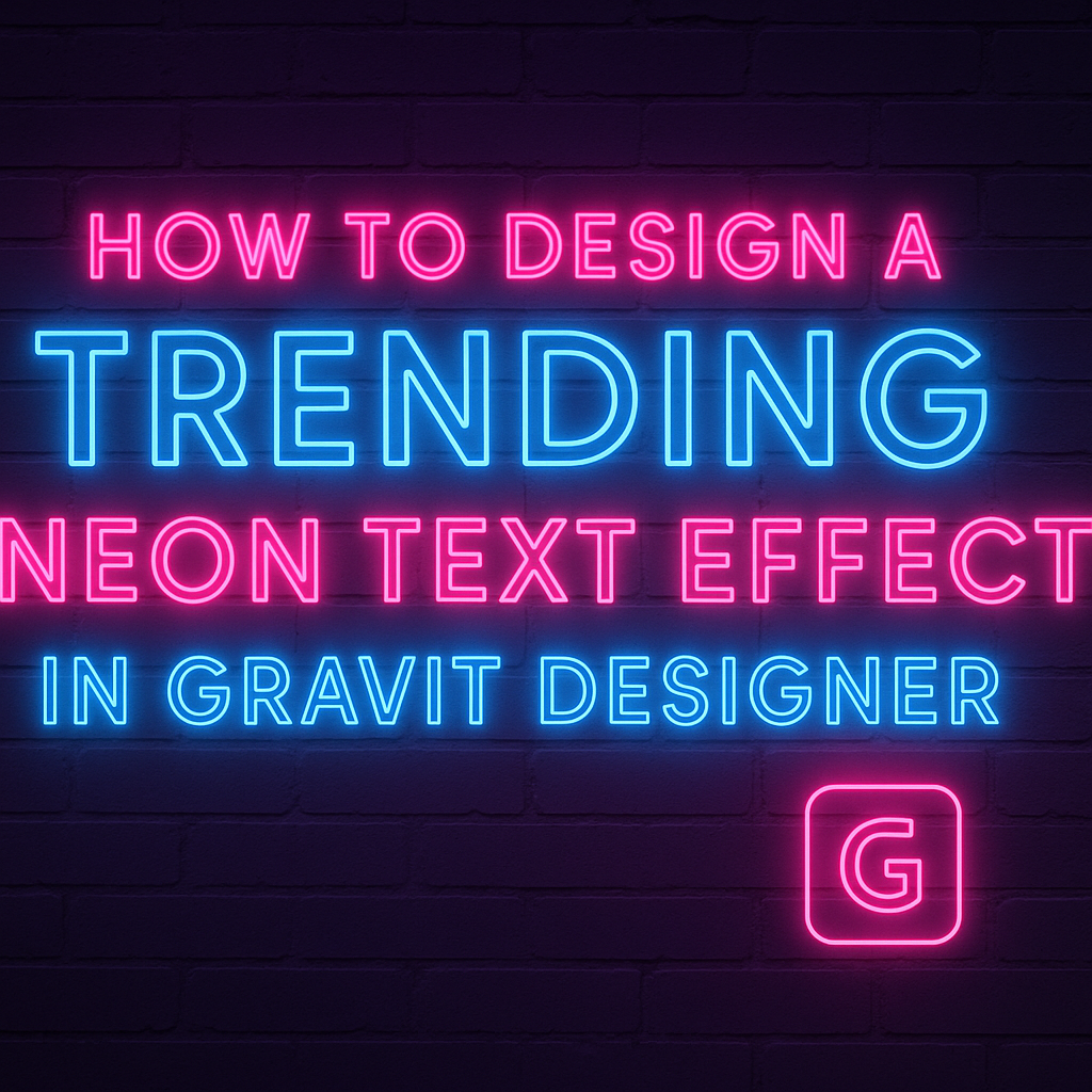
Creating a neon text effect can add a vibrant and modern touch to designs.
To design a trending neon text effect in Gravit Designer, one can use the software’s multiple fills, borders, and effects tools to bring their text to life. This technique is not only visually appealing but also allows for a lot of creativity and personal flair.
Learning this effect is simpler than it might seem. With clear steps and the right tools, anyone can transform standard text into a glowing masterpiece.
Many tutorials offer helpful tips to make the process enjoyable and rewarding.
Getting Started with Gravit Designer
Gravit Designer is a powerful tool for creating stunning graphics, including neon text effects. Understanding its interface and setting up the document correctly can enhance the design experience.
Overview of Gravit Designer Interface
When someone opens Gravit Designer, they will see a clean and user-friendly interface.
The workspace includes the canvas, where designs come to life, and the toolbar, located on the left.
Users can find essential tools like the Text Tool, Shape Tool, and Pen Tool on the toolbar.
The Properties Panel on the right provides options for customizing elements, such as color, size, and opacity.
Exploring the Layers Panel helps users manage different design components easily.
Familiarizing oneself with these elements is crucial for efficiency.
Setting Up Your Document for Neon Text
To create a neon text effect, starting with the right document settings is key.
First, users should create a new design by selecting File > New. A dialog box will appear, allowing them to choose dimensions.
For neon text, a canvas size of 1920×1080 pixels works well. It provides ample space for detailed work without losing quality.
Next, users should set the background to black. This step enhances the neon effect, as bright colors stand out against dark backgrounds. The background can be changed in the Properties Panel.
After setting up the canvas, they can use the Text Tool to add their desired text. Choosing a bold font helps achieve that glowing look, which is essential for a neon effect.
Creating the Neon Text Effect
Designing a neon text effect involves choosing an eye-catching font and applying techniques to simulate a glowing effect. Adjusting colors and brightness is essential to achieve the vibrant look that captivates the audience.
Choosing the Right Font
Selecting the right font is crucial for creating a stunning neon text effect.
Script fonts like “Burtons Script” or bold sans-serif fonts are popular choices. They provide the right curves and thickness to make the glow stand out.
It’s recommended to opt for fonts that have a bit of flair. This helps create a more dynamic look. Heavier fonts will hold the glow better, making the text pop against backgrounds.
Experimenting with different fonts can spark creativity too. Designers often find unique combinations that bring their visions to life.
Adding the Neon Glow: Basic Techniques
To simulate a neon glow, a few basic techniques can be applied.
Start by duplicating the text layer. This will allow for multiple effects to be layered seamlessly.
Next, add a glowing effect using a blur tool. Adjust the blur radius to achieve the desired strength of the glow. Using a soft brush can also enhance the organic look of the light around the letters.
Designers often create an outer glow effect. This can be done by applying a glow layer style to the duplicated text. Be mindful of the settings to ensure the glow feels natural yet vibrant.
Adjusting Color and Brightness
Color and brightness play vital roles in a neon design.
Bright and bold colors like electric blue, hot pink, or bright green are popular for neon effects. Opt for colors that evoke vibrancy and excitement.
After choosing a color, it’s important to tweak the brightness. Increasing brightness can enhance the glowing effect. It can create a more striking visual impact.
Using contrasting colors for the text and background also helps the neon effect stand out. Designers typically use dark backgrounds for optimum visibility.
Adjust these elements until the desired bright, glowing effect is achieved.
Enhancing the Effect
To make a neon text design stand out, it’s important to add depth and complexity. By applying advanced glow effects and utilizing layers and blends, a designer can create a more vibrant and eye-catching appearance.
Applying Advanced Glow Effects
Advanced glow effects can transform simple text into a radiant centerpiece.
A designer can start by selecting the neon text layer and applying a Gaussian Blur. This adds a soft glow, which mimics the light diffusion of neon signs.
To enhance the glow even further, they might duplicate the text layer. Each duplicate can be slightly offset and blurred more than the previous one. Color choices matter too; bright hues like electric blue or neon pink work well.
Adjust the opacity of each layer to achieve a balanced effect. This creates a radiant halo around the text, making it pop on the canvas.
Using Layers and Blends for Depth
Layering is essential in adding richness to the neon text effect.
By creating multiple text layers, designers can apply different blend modes. For instance, using Overlay or Soft Light can accentuate the brightness of the neon effect.
Additionally, designers can introduce shapes with gradients below the text. These shapes can serve as backdrops that enhance the glow.
By adjusting the opacity of these gradient shapes, they can create the illusion of depth.
Arranging the layers thoughtfully introduces a three-dimensional quality. This method adds visual interest, making the neon text more engaging and vibrant on any design.
Final Touches
This section focuses on enhancing the neon text design and preparing it for sharing. By adding background elements, the design can gain depth and style. Finally, exporting correctly ensures that the design maintains its quality.
Adding Background Elements
When creating a neon text effect, background elements play a vital role.
A simple yet effective approach is to use a dark gradient as the backdrop. This enhances the glow of the neon text.
Users can add shapes or patterns that complement the neon color. For example, adding geometric shapes can create a modern feel.
Adjust the opacity of these background elements so they don’t overpower the text.
Another option is to include images or textures that match the theme. If the neon text has a vintage vibe, a textured background can enhance that look.
Always remember to keep the focus on the neon text while adding these elements.
Exporting Your Design
Once the design is complete, it’s time to export it.
Correct exporting is important to preserve the quality of the neon effect.
Users should choose a high-resolution format like PNG or SVG for the best results.
Before exporting, ensure that all layers are properly aligned and visible.
It may also help to hide any unnecessary guides or elements. This step ensures the final image is clean and professional.
Finally, adjust the export settings for optimal quality.
Use the highest resolution possible if the design will be printed.
If sharing online, consider compressing the file for faster loading times while keeping quality intact.