Creating eye-catching visuals is essential in today’s digital world.
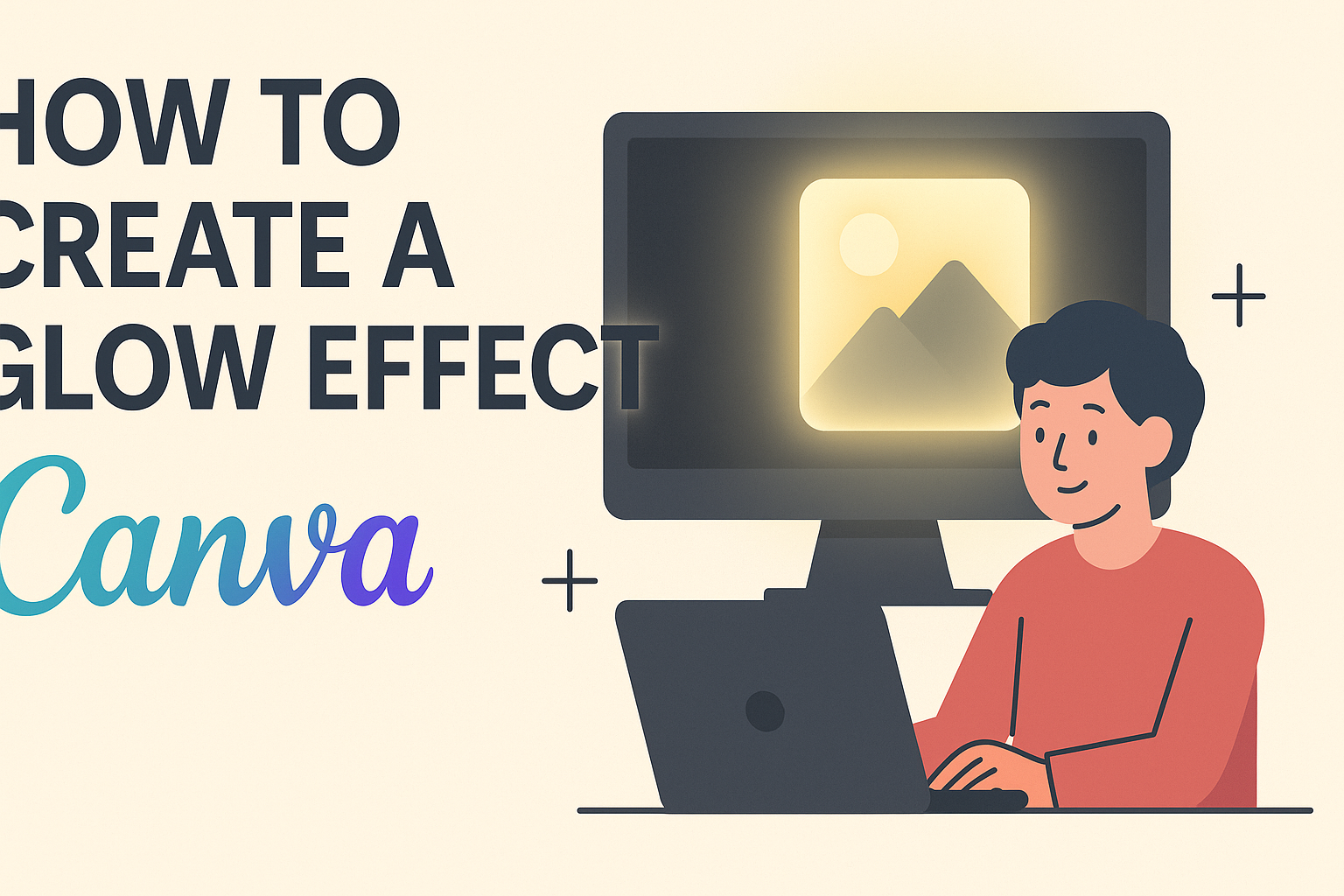
One of the easiest ways to enhance your designs is by learning how to create a glow effect in Canva. This simple technique can make elements pop and draw attention to key features in any project.
With a few easy steps, anyone can master the glow effect, whether for social media posts, presentations, or invitations.
By adjusting colors, brightness, and blur settings, he or she can achieve stunning results that elevate their designs.
Getting started with glow effects can seem challenging, but it is more accessible than many think. With the right guidance, they will be well on their way to transforming their creations into something special.
Getting Started with Canva
Canva is a user-friendly graphic design platform that allows anyone to create stunning visuals.
Before creating designs, it’s essential to set up an account and become familiar with the layout of the platform.
Creating an Account
To use Canva, the first step is to create an account. Users can sign up using an email address, Google account, or Facebook login. It’s a simple process that takes only a few minutes.
Once the account is created, users can explore the free and premium options available.
The free version provides various templates and tools. However, a premium account unlocks additional features like premium images and advanced design options.
It’s important to verify the email address to access all features. After that, users can log in anytime to start creating.
Understanding Canva Layout
Familiarizing oneself with the Canva layout enhances the design experience.
Upon logging in, users see a dashboard with various design templates. They can select from categories like social media, presentations, and posters.
On the left side, there’s a toolbar containing design elements such as text, photos, and backgrounds.
Clicking on any element allows users to drag and drop it onto the canvas.
The top of the screen has options for editing, where users can change colors, fonts, and sizes.
It’s helpful to take time to explore these features to maximize design potential. Knowing where everything is located makes the design process smoother and more enjoyable.
Fundamentals of Design
Understanding the basics of design is essential for creating visually appealing graphics. Key elements like color choices and font selection play a critical role in making designs effective and eye-catching.
Color Theory Basics
Color theory is a vital part of design. It explains how colors interact and influence emotions. Colors can be grouped into primary, secondary, and tertiary categories.
When creating a glow effect, choosing the right colors enhances the impact.
Warm colors, like red and orange, tend to grab attention, while cool colors, like blue and green, create a calming effect.
A simple way to choose a color scheme is using the color wheel. Contrasting colors make elements stand out, while analogous colors create harmony.
Consider using darker backgrounds to make glow effects pop.
Selecting the Right Fonts
Font choice affects readability and overall design. A good font should match the theme of the project. It’s important to consider font styles, weights, and spacing.
Serif fonts can evoke tradition and reliability, while sans-serif fonts offer a modern feel. Mixing fonts can create interest, but it’s essential to limit combinations to two or three to maintain clarity.
When designing with text, ensure it contrasts well with the background. This allows the glow effect to enhance the text without making it hard to read. Keeping text legible and appealing is key to strong design.
Crafting the Glow Effect
Creating a glow effect in Canva can make designs pop. This process involves adding elements, applying the glow, and adjusting its intensity and color for the best results.
Adding Elements to Your Design
To start, the user must choose the elements they want to enhance with a glow effect. This could include text, shapes, or images.
After selecting an element, they can place it on their canvas.
Once the element is positioned, it’s important to check the background color. A darker background works well to highlight the glow effect. The contrast between the element and the background can greatly enhance the glow’s visibility.
When everything looks good, the next step is to duplicate the selected element. Duplicating allows for a layered effect, making the glow more pronounced.
Applying the Glow Effect
After preparing the elements, the user can apply the glow.
Selecting the duplicated element opens options in the “Edit Image” menu. Here, the “Glow” option is available.
Clicking on this option will allow users to add a glow effect. Users can choose a color for the glow that complements the design. Often, soft colors like blues or yellows work well.
Once the color is selected, the user can adjust the blur settings. More blur creates a softer glow, while less makes it sharper. Finding the right balance is crucial for achieving a pleasing look.
Adjusting Glow Intensity and Color
After applying the glow effect, it’s time to adjust its intensity and color.
Users can return to the “Edit Image” section to make these changes.
For intensity, the brightness and blur settings can be adjusted. Increasing brightness makes the glow stand out more. Conversely, reducing it can create a subtle, elegant effect.
Color adjustments are also important. The user can experiment with different hues to see which looks best against the background. Understanding how colors interact can lead to stunning results.
By carefully managing these settings, users can craft a unique and eye-catching glow effect that enhances their design.
Enhancing Visual Appeal
Creating a captivating glow effect is not just about the glow itself. It involves careful consideration of design elements, text integration, and final adjustments to achieve a polished result.
Balancing Design Elements
To enhance visual appeal, it’s important to balance design elements. A glowing object should not overpower the entire design. Adjusting the size and position helps maintain harmony.
Color Contrast: Choose a glow color that stands out against the background. For example, a light glow on a dark background or vice versa creates effective contrast.
Layering: Use multiple layers for the glow effect. Duplicating the layer and adjusting each layer’s opacity can help create depth.
Spacing: Keep adequate spacing between elements to avoid clutter. This allows the glow to breathe and enhances its impact.
Incorporating Text and Glow
Integrating text with a glow effect can make the message pop. The glow should complement the text without making it hard to read.
Choosing Fonts: Select fonts that are bold and clear. Thin fonts can easily get lost in a glow effect.
Glow Adjustments: Apply the glow effect directly to the text. Use enough blur to soften the edges, but keep the text recognizable.
Text Positioning: Position text near the glowing element for a unified look. This draws attention and emphasizes both the text and the glow.
Final Touches
Making final adjustments can transform a good design into a great one.
Small tweaks can enhance the overall look.
Brightness and Contrast: Adjust brightness to ensure that the glow effect looks vibrant.
Too much brightness can wash out colors.
Testing Visibility: Check how the design looks in various settings, like different devices or screens.
This ensures that the glow remains effective.
Feedback: Seek feedback from others.
Fresh eyes can spot issues that might be missed, helping to improve the visual appeal further.