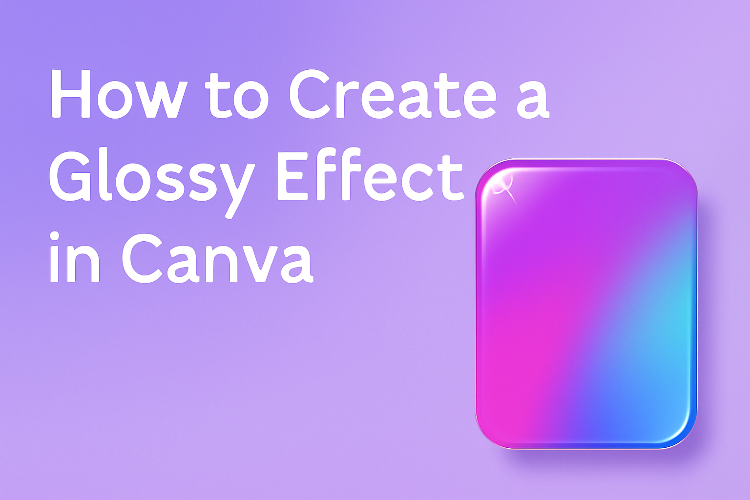
Adding a glossy effect in Canva can elevate any design, making it eye-catching and professional. For those looking to make their designs pop, mastering this effect is a game-changer.
The key to creating a glossy effect in Canva is using a combination of gradient fills and carefully selected color contrasts. This technique helps in creating a realistic shine that will enhance your text or images.
Design enthusiasts often struggle to find ways to make their visuals more vibrant. With the glossy effect, designs can move from ordinary to extraordinary. This effect is particularly popular for creating sleek, modern looks in digital graphics.
Using platforms like Canva, designers can easily learn and apply this effect to their projects, enhancing their overall appeal.
Readers of all skill levels will find value in learning how to create a glossy effect, whether they are new to design or seasoned pros looking to add new skills. The steps are straightforward, offering an approachable way for anyone to enhance their Canva prowess.
Engaging with this technique will not only improve specific projects but also broaden the designer’s toolkit for future creations.
Getting Started with Canva
Starting with Canva is an exciting journey into the world of design. Users can easily set up an account, explore the user-friendly interface, and choose the ideal canvas size for their projects.
Creating Your Account
Creating an account on Canva is quick and simple. Users can visit Canva’s website and sign up using an email address, Google, or Facebook account.
Each method is straightforward and secure.
After signing up, Canva sends a verification email. Users should click on the link in this email to verify their account. Once the account is verified, it is good to go.
Canva offers both free and paid plans. The free version provides a wide range of tools and templates, while the pro version includes additional features like premium templates and design elements.
Navigating the Canva Interface
The Canva interface is designed to be user-friendly. When users log in, they land on the homepage with easy access to various tools and projects.
On the left side, there is a toolbar with options like “Home,” “Templates,” “Projects,” and “Brand.”
At the top, users can access their account settings and notifications. To start a new project or open existing ones, users can click on the tabs available on the homepage.
The design area is intuitive, with options to add text, images, and other elements. Most functions are accessible through simple clicks and drag-and-drop features, making it easy for beginners and experienced users alike.
Selecting the Right Canvas Size
Choosing the right canvas size is crucial for any design project. Canva offers predefined sizes for common projects, such as social media posts, presentations, and posters.
Users can select from these sizes by clicking on the “Create a design” button at the top right.
For custom projects, users should click on the “Custom size” option. They can then input specific dimensions in pixels, inches, millimeters, or centimeters. This flexibility ensures designs fit perfectly across different platforms and media.
Whether using a standard size or a custom one, Canva’s size options make it easy to start a project with the perfect dimensions in mind.
Basic Design Principles
Creating a glossy effect in Canva involves understanding essential design principles. Key areas like color and contrast, typography, and the use of white space are crucial for achieving a pleasing visual impact.
Understanding Color and Contrast
Color and contrast are vital in making any design stand out. When using colors, it’s essential to choose shades that complement each other.
Complementary colors sit opposite each other on the color wheel, like blue and orange, and provide a balanced look.
Contrast helps differentiate elements in a design. For instance, using a dark text on a light background improves readability. Strong contrast, such as black against white, creates a striking appearance that draws attention.
Experiment with different hues to see what works best. Adjusting saturation and brightness can also impact the mood of your design.
High saturation can create a vibrant feel, while lower saturation offers a more muted look.
The Role of Typography
Typography plays a crucial role in shaping the design’s character. Choosing the right font style can set the tone, whether it’s formal or casual.
Serif fonts can appear traditional, while sans-serif fonts often seem more modern and clean.
Focus on readability. Ensure that texts are legible, especially if they include glossy effects.
It’s also important to maintain consistency by using a maximum of two or three fonts throughout the design to avoid a cluttered appearance.
Font size and weight can also enhance or diminish emphasis. Larger or bolder typography can highlight key points, while smaller sizes can be used for less critical information.
Using White Space Effectively
White space, or negative space, is the empty area around elements in a design. It prevents clutter and helps guide the viewer’s eye.
Using white space strategically can also emphasize important elements.
Don’t be afraid to leave some areas of your design empty. This can create a calming effect and provide balance.
White space can also improve text readability, ensuring that elements don’t overlap or appear too dense.
By strategically placing white space, designs look more organized and appealing. It can lead the viewer to focus on what truly matters without feeling overwhelmed.
Working with Elements and Shapes
Creating a glossy effect in Canva involves more than just adjusting colors; utilizing elements and shapes can significantly enhance your design. This section explores how to add and customize shapes and how layering elements can create depth in your design.
Adding and Customizing Shapes
In Canva, users can begin by selecting a shape from the Elements tab. Various options like circles, squares, or unique icons are available. Picking the right shape depends on the design’s theme and the desired impact.
Once selected, these shapes can be resized and recolored. Canva offers multiple color options; users can select a specific hue that complements their design.
Shapes can also be modified by changing the border thickness or applying a shadow to give them a pop.
Experimenting with these features allows for a distinct look. Additionally, using gradient fills or adjusting opacity can add a glossy finish. Exploring these tools helps designers achieve a polished and professional appearance.
Layering Elements for Depth
Layering various elements creates depth, which makes designs appear more dynamic. Choosing multiple elements, like shapes and icons, and stacking them strategically can achieve this effect.
In Canva, users can change the order of elements by using the Position tool. They can send certain shapes backward or bring others forward. This flexibility ensures that primary features stand out while background elements add context.
Using semi-transparent layers or adjusting opacity also enhances depth. Combining these methods with thoughtful color choices results in an engaging and visually appealing design.
This approach helps emphasize the glossy effect, subtly guiding the viewer’s focus to key aspects.
Creating the Glossy Effect
Creating a glossy effect in Canva involves selecting the right colors, applying gradient techniques, and adding highlights and reflections to enhance the overall look. Each step is crucial in making your text or object shine.
Choosing Your Base Colors
Picking the base colors for your glossy effect is essential. These colors will set the tone of your design.
Bright and contrasting colors often work well. For example, using a light blue and white combination can give a fresh and clean look.
It’s important to consider the mood you want to convey.
A bold, vibrant color can make a statement, while softer tones might create a more elegant feel. Experimenting with different color palettes can help achieve the desired result.
Applying Gradient Techniques
Applying gradient techniques adds depth to the design.
Start by selecting the object or text you want to modify. Use Canva’s Effects tool to access gradient options.
A smooth transition between two or more colors can give the illusion of a glossy surface. Adjust the angle and spread of the gradient to suit the design.
Keeping the gradient subtle can maintain a realistic look.
It’s often effective to use a lighter color at the top to mimic light shining on the surface.
Adding Highlights and Reflections
Adding highlights and reflections further enhances the glossy effect.
To simulate light reflecting off the surface, create a thin white or light-colored stripe across the object or text. Adjust the transparency to make it less harsh.
It’s helpful to place these highlights near the edges or curves to imitate real light behavior. Some creators use additional shapes or lines to accentuate these reflections.
By experimenting with placement and size, you can get the most realistic glossy appearance.
Enhancing Visuals with Textures
Adding textures can make designs more engaging and dynamic. Metallic and glossy textures are popular choices that add depth and shine, making visuals more appealing.
Incorporating Metallic Textures
Metallic textures bring a shiny, reflective look to designs. They are great for catching the viewer’s eye and adding a touch of elegance.
To use these textures in Canva, one can start by selecting a metallic image or background. Adjusting its color can help blend it well with the overall design.
It’s useful to experiment with different metallic hues, such as gold, silver, or bronze. These options are available in Canva’s library, providing flexibility in design.
Layering these with text or shapes can create a sophisticated look. A good tip is to balance metallic elements with more muted colors to avoid overpowering the design.
Utilizing Glossy Textures
Glossy textures give a sleek and modern feel to any project. They mimic the reflective quality of polished surfaces, making them excellent for modern and digital themes.
In Canva, utilizing gradient and opacity tools enhances this effect.
Users can start by picking a base design element and applying a gradient overlay. Adjusting opacity helps achieve the desired level of glossiness.
For a more customized look, experimenting with different angles and light reflections can bring out unique results.
Effective use of glossy textures can make text and images stand out, creating a professional appearance in presentations and marketing materials.
Finishing Touches
When creating a glossy effect in Canva, the final steps can significantly impact the overall look. Key areas to focus on include adjusting transparency, applying overlays, adding filters, and previewing your design. These tweaks help ensure that the design appears polished and professional.
Adjusting Transparency and Overlays
Adjusting transparency can make a design look more cohesive. By tweaking the opacity, different layers can subtly blend together, enhancing the glossy effect.
This technique allows certain elements to stand out or fade into the background, depending on the desired look.
Overlays are also great for adding depth. They can be used to introduce soft gradients or textures that contribute to the gloss.
By experimenting with different styles of overlays, such as light leaks or subtle patterns, the design gains extra dimension.
Balancing these elements can bring about a smooth, shiny finish that’s visually appealing.
Using Filters for Refinement
Filters can refine and enhance the glossy effect.
Using filters like brightness, contrast, and saturation adjustments can bring out the sheen in the design.
By increasing brightness and contrast slightly, the gloss may appear more pronounced.
Experimentation is essential here. Trying different filters can lead to various outcomes, some of which might be surprising and perfect for the project.
Canva offers a range of filter options that can alter the mood and tone of the design. Applying them thoughtfully helps in achieving the right balance of sheen and style without overpowering the original design elements.
Previewing and Finalizing Your Design
Previewing the design is a crucial step before finalizing. This allows for any last-minute adjustments and ensures all elements are in harmony.
Checking how the design looks on different devices can also be helpful.
Final edits often include adjusting minor details such as alignment and spacing. Making sure the glossy effect appears as intended is important for a professional finish.
Once satisfied, the design can be shared or exported in the required format, ready to impress its audience. Always consider revisiting elements that seem off, which can lead to a more polished and cohesive output.