Designing a multi-column blog layout can greatly enhance the readability and visual appeal of any blog.
In Gravit Designer, users can easily create an organized and attractive multi-column layout by applying simple grid techniques and CSS styles. This approach not only helps in showcasing content effectively but also makes the browsing experience enjoyable for readers.
When a blog uses a well-structured layout, it becomes easier for visitors to find the information they need.
This article will guide readers step-by-step through the process of designing a multi-column blog layout in Gravit Designer, offering tips and tricks along the way. With the right techniques, anyone can transform a standard blog into a professional-looking site.
Whether readers are beginners or have some design experience, this post will provide practical advice on how to achieve their desired layout.
By the end of the guide, they will be equipped with the knowledge to create a stunning blog that stands out in today’s digital world.
Getting Started with Gravit Designer
Gravit Designer is a versatile tool for creating beautiful designs. It offers a user-friendly interface perfect for beginners and advanced users alike.
This section covers how to get familiar with the software and set up a workspace for your project.
Overview of Gravit Designer
Gravit Designer is a free graphic design application available on multiple platforms, including web, Windows, macOS, and Linux. It provides a range of features like vector editing, design templates, and tools for layout compositing. Users can create anything from simple graphics to complex illustrations.
The design environment supports multiple artboards, making it easy to work on various projects simultaneously. There are robust export options, allowing designs to be saved in different formats.
Additionally, it includes helpful resources such as tutorials and templates. These give users a head start, especially when creating layouts like a multi-column blog.
Setting Up Your Canvas
To start designing, setting up your canvas is crucial.
Upon opening Gravit Designer, users should select File > New to create a new document. This brings up the document setup window, where one can choose the desired size and orientation.
For a blog layout, selecting a web format, like 1920 x 1080 pixels, can be advantageous. It’s important to set the units to pixels for better precision.
Once the canvas is set, users can adjust the grid settings from the view menu. Enabling the grid helps align elements easily.
Likewise, using guides can provide extra support while designing multi-column layouts. These tools make arranging text and images more organized and visually appealing.
Designing Your Blog Layout
A well-structured blog layout can enhance readability and provide a better user experience. Multi-column layouts allow designers to effectively organize content, showcase images, and attract visitors’ attention.
Understanding Multi-Column Layouts
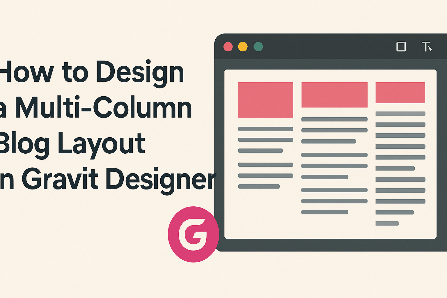
Multi-column layouts help display content in a clear and organized way. Commonly used in blogs, they can improve readability by breaking up large blocks of text. The most popular layouts include two, three, or even four columns.
Each column can serve a different purpose. For example, a main column can contain the primary blog content, while side columns may include links, ads, or related articles. Designers should consider their audience and the type of content when choosing the column structure.
Creating Columns in Gravit Designer
Gravit Designer makes it easy to create columns. Users can start by setting up a new project with their desired dimensions. To create columns, they can use guides or grids.
Grid lines help in aligning elements neatly. Users can draw rectangles to represent columns, adjusting the width and height as needed. It’s important to ensure uniformity in column sizes for a balanced look.
Remember to enable the snap-to-grid feature for better alignment. This makes positioning elements much easier. It also ensures that everything fits well within the design.
Arranging Content and Grids
Once the columns are in place, it’s time to arrange content. Each column should have a clear purpose, so it’s essential to consider what content belongs where.
For instance, the main column can house the blog posts, while side columns can feature testimonials or a newsletter sign-up. Consistent spacing helps maintain a clean layout.
Using grids in Gravit Designer will aid in placing images and text blocks. Users can create visual hierarchy by adjusting sizes and placements. This helps draw attention to important content while keeping the layout balanced.
Styling Your Blog Sections
Styling the sections of a blog is crucial for creating a cohesive and inviting design. By carefully selecting fonts, colors, and visuals, one can enhance the reader’s experience and engagement.
Choosing Fonts and Colors
Selecting the right fonts and colors is essential for a blog’s aesthetic. A consistent font pairing can define the blog’s identity. For headings, bold and legible fonts work best, while body text should be easy to read.
Suggested Font Pairings:
- Headings: Montserrat
- Body: Open Sans
Color selection impacts mood and readability. Stick to a color palette that complements the blog’s theme. A common approach is to choose two main colors and one or two accent colors. This helps maintain a clean look.
Adding Visual Elements
Visual elements such as lines, shapes, and icons can help organize content and guide readers. They can break up text blocks, making the blog more inviting.
Examples of Visual Elements:
- Divider lines between sections
- Icons for bullet points
Using consistent styles for these elements reinforces branding. It is important to choose visuals that fit the overall design style of the blog.
Incorporating Images and Videos
Images and videos add life to a blog layout. Quality visuals can draw readers in and enhance understanding of the content.
When selecting images, consider relevance and resolution. High-resolution images are essential for a professional look.
Tips for Using Images:
- Use original images when possible.
- Ensure images are properly attributed if sourced from the web.
Embedding videos effectively can also improve engagement. Position them strategically to complement the written content. Properly styled captions can provide context and enhance the reader’s experience.
Responsive Design Considerations
Creating a multi-column blog layout requires attention to responsive design to ensure a great user experience across all devices. Different screen sizes require unique adjustments to maintain readability and functionality.
Adapting Layout for Mobile
When designing for mobile, it’s essential to modify the multi-column layout. A common approach is to stack columns vertically, transforming a two or three-column layout into a single column. This change makes it easier for users to read on smaller screens.
Key tips for mobile adaptation:
- Use larger text sizes for better readability.
- Ensure touch targets are big enough for fingers.
- Consider using collapsible menus to save space.
Adjusting images to be responsive is also essential. Use CSS to set maximum widths to avoid overflow issues.
Testing Across Different Devices
Regular testing helps identify issues that users might face.
It’s crucial to check how the layout appears on various devices like smartphones, tablets, and desktops.
Each device brings its own challenges due to different screen sizes and resolutions.
Steps for effective testing include:
- Use emulators or simulators to quickly check layouts.
- Test on actual devices to gauge performance accurately.
- Pay attention to loading times and functionality across all formats.