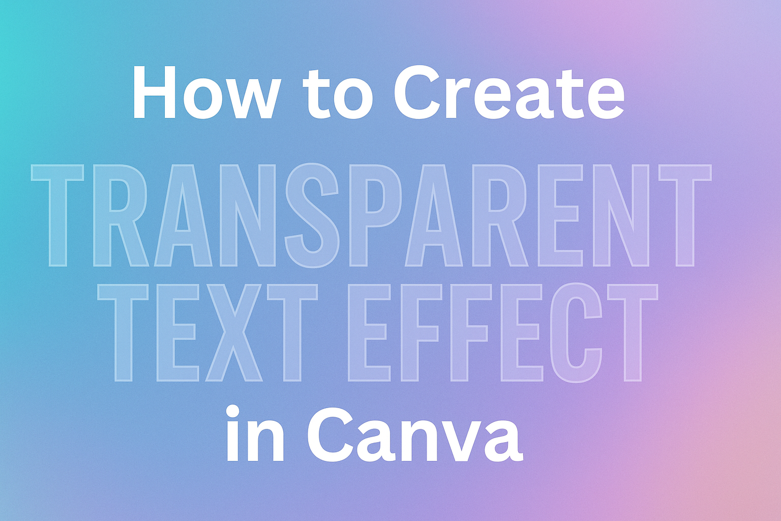
Transparent text effects can transform ordinary designs into eye-catching visuals that stand out on social media, presentations, and marketing materials. Users can create transparent text in Canva by adjusting the transparency slider or applying the hollow effect to make text see-through while maintaining readability. This popular design technique allows backgrounds to show through letters, creating a modern and professional look.
Many designers struggle with making text blend naturally into their images and graphics. The good news is that creating transparent text effects in Canva requires just a few simple steps that anyone can master. Whether someone wants subtle watermarks or bold overlay effects, the process remains straightforward.
Readers will learn multiple methods for achieving transparency, discover how to customize their designs with different elements, and get expert tips for professional-looking results that grab attention.
Understanding Transparency in Canva
Transparent text in Canva allows designers to create see-through effects that blend with backgrounds and other design elements. This feature opens up creative possibilities for watermarks, overlays, and stylish visual effects that enhance any design project.
What Is Transparent Text
Transparent text is regular text that has been made partially or completely see-through. In Canva, users can adjust element transparency to control how much of the background shows through their text.
The transparency effect works by reducing the opacity of text elements. When opacity is at 100%, text appears solid and opaque. As users lower the opacity percentage, the text becomes more transparent.
Canva offers two main methods to create transparent text. The first uses the transparency slider tool. The second involves the hollow effect feature.
Transparency levels in Canva:
- 100% = Completely solid text
- 50% = Half transparent
- 0% = Completely invisible
Users can adjust transparency to any level between these extremes. This gives designers precise control over their text appearance.
Benefits of Transparent Text Effects
Transparent text creates a professional look that makes designs stand out. It allows text to blend naturally with background images instead of blocking them completely.
Using transparent text for watermarks protects designs while keeping them visible. The see-through effect lets viewers see the main content while still showing ownership information.
Transparent text also helps create layered visual effects. Designers can stack multiple text elements at different transparency levels. This creates depth and visual interest in their designs.
The effect works well for subtle branding elements. Companies can add their logos or slogans without overwhelming the main design content.
Key advantages include:
- Better integration with backgrounds
- Professional watermark creation
- Enhanced visual depth
- Subtle branding opportunities
Common Uses for Transparent Text
Social media graphics often use transparent text for captions and quotes. The see-through effect helps text blend with photo backgrounds without covering important visual elements.
Presentations benefit from transparent text overlays on images. Speakers can add titles or key points directly over photos while keeping the images visible.
Marketing materials use transparent text for promotional messages. The effect creates eye-catching designs that don’t look cluttered or overwhelming.
Website headers frequently feature transparent text over hero images. This technique allows the background photo to show through while maintaining readable text content.
Popular applications:
- Instagram story templates
- Business presentation slides
- Marketing flyers and posters
- Website banner designs
- Digital watermarks
Photographers and artists use transparent text to sign their work. The see-through signature protects their images without distracting from the main content.
Getting Started with Canva
Before creating transparent text effects, users need to access Canva’s design platform and understand its basic layout. The toolbar and interface elements provide all the tools needed for text transparency projects.
Creating or Opening a Design
Users can start by visiting the Canva website and logging into their account with their email and password. New users can sign up for free in just a few minutes.
From the homepage, they have two main options. They can create a new design by clicking the ‘Create a Design’ button from the top right corner. This opens a menu with different design types like social media posts, presentations, and posters.
Alternatively, users can open an existing project. The Recent Designs section on the homepage shows all previous work. They simply click on any design thumbnail to reopen it in the editor.
For transparent text effects, popular design sizes include Instagram posts (1080×1080 pixels) and Facebook covers (1640×859 pixels). Users can also choose custom dimensions if needed.
Navigating the Canva Interface
The Canva editor has a clean, user-friendly layout with three main areas. The left sidebar contains all design elements like text, photos, and graphics.
The center area displays the design canvas where all editing happens. Users can click, drag, and modify elements directly on this workspace.
The toolbar appears at the top of the screen when elements are selected. This toolbar contains essential tools for creating transparent text effects. Key buttons include Effects, Transparency, and text formatting options.
The right side shows design panels and additional options. When working with text, font choices and styling tools appear here. Users can easily switch between different sections using the clear navigation tabs.
Methods to Create Transparent Text Effect
Canva offers two main approaches to make text transparent: adjusting opacity with the transparency slider or creating outline text with the hollow effect. Both methods give users complete control over how see-through their text appears.
Using the Transparency Slider
The transparency slider method provides the most straightforward way to make text transparent in Canva. Users start by clicking on their text element to select it.
After selecting the text, they click the Transparency button in the toolbar at the top of the screen. This opens a slider control that adjusts how see-through the text appears.
Dragging the transparency slider to the left decreases the text opacity. Moving it further left makes the text more transparent.
Users can also type a specific number in the field next to the slider. Values range from 0 (completely transparent) to 100 (fully opaque).
The changes apply instantly as they adjust the slider. This lets them see exactly how transparent their text looks before finalizing the effect.
Applying the Hollow Text Effect
The hollow text effect creates transparent text by showing only the outline of letters. Users click on their text element first, then select the Effects button from the toolbar.
A menu appears on the left side with various text effects. They click on the Hollow option to apply an outline effect to their text.
A thickness slider appears below the hollow effect option. Dragging this slider to the left reduces the outline thickness and makes the text more transparent.
Users can adjust the thickness until they achieve their desired level of transparency. They can also enter a specific thickness value in the number field and press Enter to apply the changes.
Customizing Transparent Text with Elements and Backgrounds
The right background and elements can make transparent text stand out or blend seamlessly into a design. Smart choices help create professional-looking graphics that grab attention.
Choosing Effective Backgrounds
Dark backgrounds work best with light transparent text. The contrast makes the text easy to read even when it’s see-through.
Light backgrounds pair well with dark transparent text. This combination creates a subtle effect that doesn’t overpower other design elements.
Image backgrounds need careful consideration when adding transparent text. Busy photos can make transparent text hard to read. Simple images with clear focal points work better.
Users can adjust element transparency for backgrounds too. This creates layered effects where both the background and text have different opacity levels.
Solid color backgrounds are the safest choice for beginners. They provide consistent contrast across the entire text area.
Gradient backgrounds add visual interest without being too distracting. The color transition creates depth while keeping the text readable.
Incorporating Elements with Transparent Text
Geometric shapes work well behind transparent text. Rectangles, circles, and triangles can frame the text without blocking it completely.
Icons and graphics should complement the transparent text, not compete with it. Simple line art or minimalist designs work best.
Layering elements creates depth in the design. Users can place transparent text over shapes, then add small decorative elements on top.
The spacing between elements and transparent text matters. Too much crowding makes the design look messy and hard to read.
Color coordination between elements and text keeps the design cohesive. Using colors from the same palette creates a unified look.
Border elements like frames or lines can help define transparent text areas. These guides draw the eye to important text without adding visual weight.
Tips for Best Results with Transparent Text
The right font choice and opacity level make transparent text effects shine in any design. These two elements work together to create professional-looking graphics that grab attention while staying easy to read.
Selecting the Right Fonts
Bold, thick fonts work best for transparent text effects in Canva. Thin or delicate fonts often disappear when transparency is applied, making the text hard to read against busy backgrounds.
Sans-serif fonts like Arial, Helvetica, and Impact create strong transparent effects. They have clean lines that stay visible even at lower opacity levels. Script fonts and decorative typefaces usually don’t work well because their fine details get lost.
The font size matters too. Larger text holds up better with transparency effects than small text. Designers should use at least 36-point font size for transparent text to ensure readability.
Font weight is crucial for transparent text success. Extra bold or black font weights maintain their presence when made transparent. Regular or light font weights often become too faint to read effectively.
When working with transparent photo overlay text effects, choose fonts that contrast well with the background colors. Dark fonts work better on light backgrounds, while light fonts shine on dark backgrounds.
Adjusting Opacity for Readability
The transparency slider in Canva lets users control how see-through their text appears. Most readable transparent text sits between 60-80% opacity, allowing backgrounds to show through while keeping text clear.
Test different opacity levels before finalizing any design. What looks good on screen might not work when printed or viewed on different devices. Users should preview their designs at various sizes to check readability.
Consider the background when setting opacity levels. Busy or colorful backgrounds need higher opacity text (70-90%) to stay readable. Simple or monochrome backgrounds can handle lower opacity levels (40-70%) without losing clarity.
Layering techniques help improve transparent text readability. Adding a subtle drop shadow or outline effect behind transparent text creates separation from complex backgrounds. This trick keeps text visible without losing the transparent effect.
The hollow effect method offers another approach to transparent text. This creates outlined letters that work well at any opacity level and stand out against most backgrounds.
Exporting and Saving Your Design
Once the transparent text effect looks perfect, users need to save their work properly to preserve the transparency. The right export settings ensure the transparent effect displays correctly when used in other projects.
Saving and Downloading Files
Users can save their transparent text design by clicking the “Download” button in the top-right corner of Canva’s interface. This opens the download menu with various file format options.
The download process is straightforward and quick. Canva prepares the file automatically once users select their preferences. The preparation time depends on the design’s complexity and chosen file format.
Users should always preview their design before downloading to catch any issues. This saves time and prevents having to re-export files. The preview shows exactly how the transparent text will appear in the final file.
Recommended Export Settings
PNG format works best for transparent text effects because it supports transparency layers. JPEG files don’t preserve transparency and will show a white background instead of the transparent effect.
Users need Canva Pro to access the transparent background feature. This premium feature requires checking the “Transparent background” box during download. Free users will get a white background with their transparent text.
The recommended settings for transparent text are:
- File Type: PNG
- Background: Transparent (Pro only)
- Quality: Standard or High