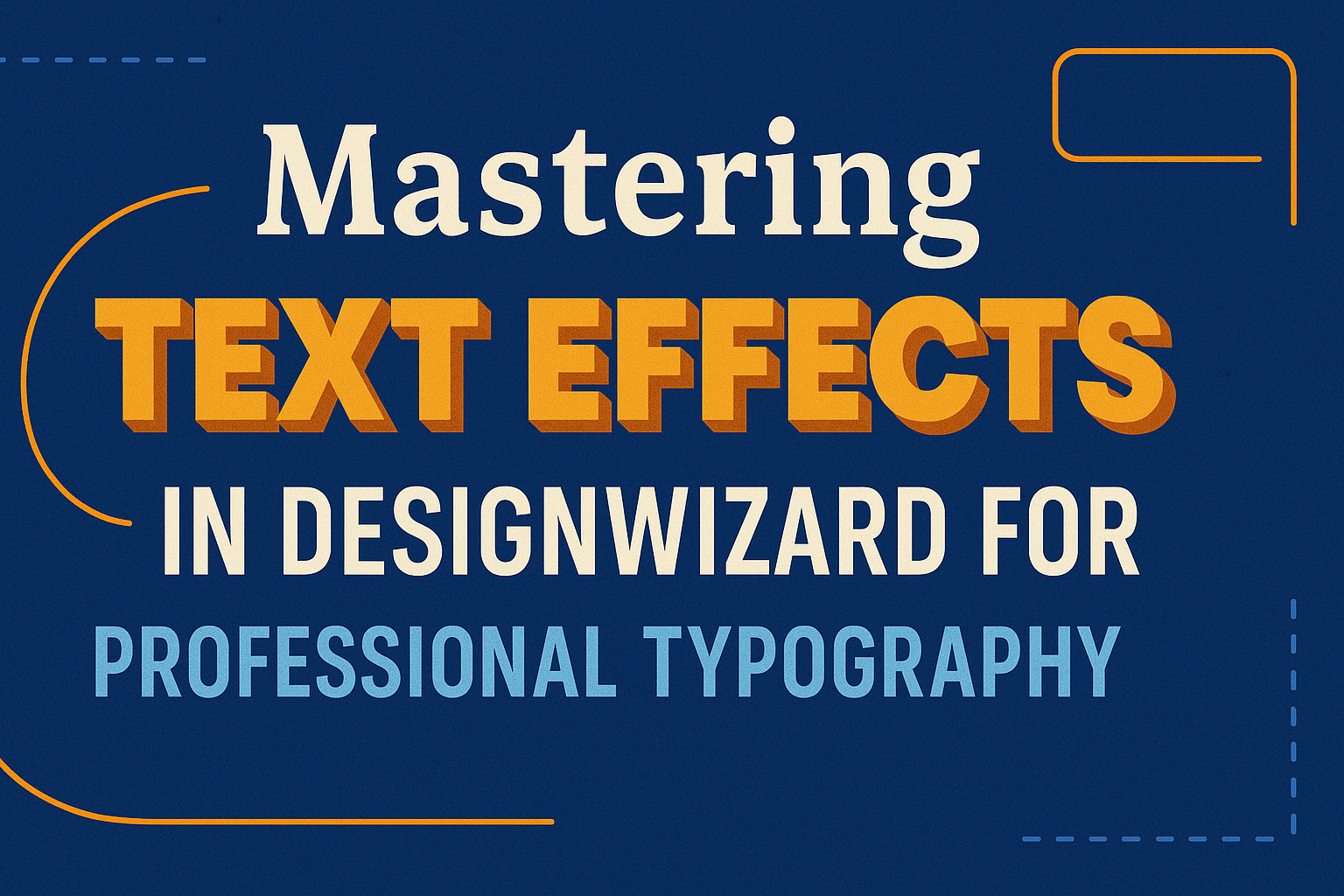
Design enthusiasts and professionals alike know the importance of excellent typography. Creating eye-catching text effects can elevate a simple design into something striking. Using the tools available in DesignWizard, users can explore countless creative options for text styling.
With the right blend of fonts, colors, and effects, text can transform a regular message into a visual masterpiece. Harnessing these elements in DesignWizard can lead to professional-level typography that stands out. This skill is crucial for anyone looking to make their design projects truly memorable.
For beginners and experienced designers, DesignWizard offers a user-friendly interface and powerful features. These attributes make mastering text effects a fun and rewarding process. Add depth to your projects and watch how expertly crafted typography can draw in your audience, enhancing the overall impact of your work.
Getting Started with DesignWizard
DesignWizard is a versatile tool for creating visually appealing designs with minimal effort. It offers a variety of features that make it easy to start new projects and navigate through the workspace efficiently.
Overview of DesignWizard Features
DesignWizard provides a range of tools that cater to both beginners and experienced designers. Users can choose from a variety of templates tailored for different needs, like social media posts, posters, and presentations.
The platform also includes options for editing elements, such as resizing images and adding text layers. A key feature is the ability to switch between color palettes using the color library, hex values, or the spectrum bar. This versatility makes creating unique designs a breeze.
Creating a New Project
Starting a new project in DesignWizard is simple. Upon logging in, users are presented with a choice of templates that suit their project goals. From there, selecting a template that aligns with their vision is straightforward, whether it’s for banners, flyers, or other formats.
Users can then customize their chosen template by adjusting the dimensions or adding personal elements like logos or images. Saving and sharing projects is seamless, ensuring that work can be easily accessed and distributed across platforms.
Understanding the Workspace Environment
The DesignWizard workspace is user-friendly and designed for efficiency. The layout features a main editing area where users can manipulate their designs directly. On the left, there are options for browsing templates and adding elements like text and images.
The top toolbar includes editing tools for precise adjustments, such as aligning elements and changing text colors. Users can manage layers effortlessly through a side panel, allowing for complex designs without hassle. This layout ensures a smooth and intuitive design experience for all users.
Text Essentials in DesignWizard
Mastering text in DesignWizard requires adding text, selecting fonts, and working with text boxes. This section guides users through each step, ensuring their designs are professional and eye-catching.
Adding Text to Your Designs
Adding text to your designs in DesignWizard is simple with its user-friendly interface. Users can insert text by selecting the “Text” option from the main menu. After choosing this, they can type directly onto the canvas. This feature is essential for labeling or enhancing visual presentations.
Positioning the text is flexible. Users can drag the text to any part of the design, ensuring that it fits perfectly with other elements. Additionally, the software provides options to adjust the alignment, making it easy to center or justify text as needed.
The text tool includes options for size, color, and opacity. This means users can experiment with different styles to see what best matches their design vision. Effortlessly changing text characteristics ensures that each project has a unique look. Taking advantage of these tools helps achieve a polished and cohesive design.
Selecting and Managing Fonts
Text in design is more than just words; it’s about expression. DesignWizard offers a library of diverse fonts to help users convey the right tone. Users can browse through different styles, ranging from formal to casual, and select the one that suits their project.
Managing fonts is straightforward. After selecting a font style, users can adjust its size and color directly on their workspace. This allows for easy experimentation to find the right balance. By highlighting and editing text, users maintain control over their design process.
Fonts affect both readability and aesthetics. Therefore, DesignWizard includes options for customizing spacing between letters and lines. This feature ensures the text not only looks good but is also easy to read. Users can make small adjustments that have a big impact, enhancing the visual flow of their design.
Working with Text Boxes
Text boxes in DesignWizard help organize content effectively. Once inserted, users can adjust the size and position to fit the design layout, making them ideal for blocks of text or captions.
DesignWizard allows customization of text boxes through its styling options. Users can change the background color or apply borders, which helps in distinguishing text from other components. These features allow for creative freedom and can add style to the project.
Editing text within a box is simple. Users click inside to edit or replace content, ensuring that updates are quick and efficient. Text boxes also allow for dynamic interactions, such as linking to external websites or embedding multimedia elements, making them a powerful tool in any design arsenal.
Advanced Text Editing Techniques
Advanced techniques in text editing can greatly enhance the impact of your designs. By focusing on how text is styled, layered, and utilized strategically, designers can effectively capture and retain a viewer’s attention.
Styling Text for Emphasis
Emphasizing text is all about making key information stand out. Designers use bold and italic styles to draw attention to specific words or phrases. Changing text size and color can also highlight important messages. Using contrasting colors between the text and background is a simple yet effective way to ensure readability and focus.
Bulleted or numbered lists help in organizing information clearly. These elements streamline information absorption, making design more user-friendly.
Using Text Effects Strategically
Strategic use of text effects enriches the visual appeal of a design. By adding shadows, outlines, and gradients, designers can create depth and dimension. These effects can make text appear more three-dimensional, adding interest and focus.
It is important to use effects tastefully. Overusing them can make a design look cluttered. Instead, apply effects to enhance key elements without overwhelming the viewer.
Text Layering and Composition
Layering text thoughtfully can convey hierarchy and organization in a design. By arranging text layers in size and spacing, designers can guide the viewer’s eye. Larger headings can draw initial focus, with smaller text providing supporting information.
Whitespace is also vital. It prevents the design from becoming too crowded. This space improves readability and creates a balanced composition, allowing each element to have its own presence and significance.
Color and Contrast in Typography
Color and contrast are key factors in creating visually appealing and readable text. They play a crucial role in how the typography stands out and how effectively it communicates the intended message.
Understanding Color Theory
Understanding color theory is the foundation of using color in typography. It involves knowing how colors interact and the emotions they evoke. For example, warm colors like red and orange can create excitement, while cool colors like blue and green are calming. Designers must consider complementary colors, which are opposite on the color wheel, to add vibrancy. Analogous colors, which are next to each other, offer harmony. By understanding these relationships, designers can create text that is both attractive and communicates the right mood.
Applying Color to Text
Applying color to text should be done thoughtfully to enhance design without overwhelming the reader. It is important to choose colors that reflect the brand or message of the text. For instance, a soft pastel might suit a calm and friendly message, while a bold primary color could highlight important information or calls to action. Contrasting colors can be used to draw attention to specific sections or keywords. By using color mindfully, text can become an integral part of the design rather than just an afterthought.
Maximizing Readability with Contrast
Maximizing readability with contrast ensures that text is easy to read. High contrast between text and its background is essential for clarity. For example, black text on a white background is a classic high-contrast combination. Even subtle shifts, like dark text on a slightly lighter background, can improve readability. Designers should also consider tone and saturation to ensure that text stands out. Proper use of contrast allows typography to be both functional and aesthetically pleasing, ensuring the message is conveyed effectively.
Text Effect Library
DesignWizard offers a comprehensive text effect library that provides users with a wide range of creative options. Users can easily explore pre-set text styles and customize them to fit their unique design needs. This makes crafting professional typography both easy and fun.
Exploring Pre-set Text Effects
DesignWizard’s text library includes a variety of pre-set text effects that cater to different design styles. These effects range from classic typographic styles to more modern and dynamic designs. Users can find options like neon lights, vintage fonts, and 3D effects, which are ready to apply with just a click.
For beginners, experimenting with these pre-set effects is a great way to understand the different possibilities available for enhancing typography. It saves time and effort, allowing creators to quickly achieve professional results without extensive design knowledge.
A helpful approach is to try various effects on the same text to see which one best suits the project’s needs. This experimentation can spark new creative ideas and bring a fresh perspective to the design process.
Customizing Text Effects
While pre-set effects are convenient, customizing text effects allows for greater personalization. In DesignWizard, users can adjust elements like color, shadow, and texture to match their design requirements.
The customization tools are user-friendly, making it easy even for novices to create unique text effects. By tweaking these settings, users can develop a signature style that sets their designs apart.
For more advanced customization, combining multiple effects can also lead to innovative results. Layering different styles can make typography stand out, providing a dynamic and engaging visual element to any project.
Animating Text for Impact
Creating animated text can make a design lively and engaging. By mastering text animation, designers can create dynamic visuals. Key aspects include understanding animation basics, working with individual letters, and ensuring smooth animation sequences.
Basics of Text Animation
Animation begins with understanding the fundamentals of movement and timing. Designers should focus on smooth transitions to keep the viewer’s attention. Techniques like fading in and out, sliding, or bouncing text can add interest.
Control over the duration and speed is crucial. Short animations that repeat can sustain engagement without overwhelming the viewer.
Software Tools: Many tools like Adobe After Effects offer easy-to-use features to create basic animations. With practice, these animations can become more sophisticated, involving color changes or dynamic movement paths.
Animating Individual Letters
Animating letters individually adds a unique touch to text. By focusing on each letter, designers can create effects that feel personal and engaging.
Isolation of each character allows more creative freedom. For instance, letters can rotate, tilt, or shift in various directions.
Example Techniques:
- Rotation: Spin letters for a playful effect.
- Scaling: Change the size gradually to emphasize certain parts.
- Color Transitions: Shift hues as letters animate for added vibrance.
Tools that support keyframing allow precise control over individual letter animations. This precision makes it easier to align movement with audio cues or other visual elements.
Sequencing Animations for Flow
Sequencing ensures that animations have a natural flow. By arranging animations in a logical order, the viewer’s experience remains smooth and cohesive.
Starting with simpler movements and progressing to more complex ones can help maintain interest. Sequencing can also involve layering animations to create depth.
Tips for Effective Sequencing:
- Gradual Transitions: Move from simple to complex effects.
- Layering: Add additional animations as others start to fade.
- Timing: Synchronize animations with other media for a unified feel.
Skills in sequencing can transform text into a storytelling medium. Designers can use these techniques to guide the viewer’s focus and enhance the impact of the message.
Practical Typography Projects
In the world of design, knowing how to apply typography effectively can make your work stand out. Projects often involve creating visually appealing and engaging text elements. These projects are crucial in areas like social media graphics, advertisements, and event promotions. Each project requires a unique approach to typography to capture attention and convey the right message.
Crafting Social Media Graphics
Social media graphics need to grab attention quickly. Designers often use bold fonts and vibrant colors to ensure their posts stand out on users’ feeds. Selecting the right typeface is key. It should reflect the brand’s personality and be readable at a glance.
Using tools like DesignWizard, designers can experiment with different typography styles. Adjusting text alignment, size, and spacing helps achieve visual balance. Adding creative text effects, such as shadows or outlines, can enhance the appeal of these graphics. The goal is to communicate the message clearly while making the graphic visually striking.
Designing Engaging Advertisements
Advertisements are crafted to attract and persuade potential customers. Typography plays a significant role in conveying the message effectively. Choosing a font that aligns with the brand’s identity is crucial. It must also be legible at various sizes and distances, ensuring it can be read easily on billboards and posters.
Designers often use advanced typography techniques to create depth and emphasis. Incorporating contrasting colors and unique text placements can highlight key information. Experimenting with letter spacing and line height can give the text a professional look. Each element should work together to direct the viewer’s focus to the most important parts of the ad, making it memorable.
Creating Event Promotions
Event promotions need to capture the essence of an event at first glance. Fonts and typography styles set the tone, whether it’s formal, playful, or cutting-edge. Using appealing layouts and creative text effects can help convey excitement and importance.
With tools like GIMP’s Text Tool, designers can add enhancements such as textures and patterns. Arranging text in dynamic shapes or paths adds an eye-catching element. These techniques ensure that promotional materials not only inform but also entice and engage the audience, driving interest in the event.
Optimizing Typography for Different Media
Successfully optimizing typography is crucial for delivering a clear message regardless of the medium. Factors such as readability, legibility, and design aesthetics need to be adjusted for each type of media to ensure an engaging user experience.
Best Practices for Web Typography
When designing for the web, choosing the right font is key. Sans-serif fonts like Arial or Verdana are popular for their readability on screens. Consider using font size that is easily readable across devices, usually around 16 pixels for body text.
Line spacing and line length also play crucial roles. Adequate spacing between lines makes text easier to read, while keeping line length between 50-75 characters ensures the content isn’t overwhelming. Additionally, using web-safe fonts ensures consistency across different browsers and operating systems.
Incorporate responsive design by setting type size and spacing in relative units like ems or percentages. This allows the text to scale properly on different screen sizes. Lastly, ensure contrast between text and background is strong for easy readability.
Preparing Text for Print Media
In print media, typography needs to account for resolution and physical factors. Serif fonts such as Times New Roman or Georgia are traditionally chosen for their elegance and readability in print.
Pay attention to font size, often a bit smaller than on the web, typically around 10-12 points for body text. Consistent margins and alignment are vital to maintain a professional look.
Kerning and tracking should be adjusted carefully to ensure even spacing between letters and words. Using high-quality printing paper can affect how your text appears, with thicker paper often yielding better results. Consider color printing but ensure text colors stand out against any background.
Adapting Typography for Mobile Displays
Mobile typography requires careful design choices due to limited screen space. Readable fonts such as Roboto or Open Sans are good choices. A standard body text size should be at least 14-16 pixels to ensure clarity.
Responsive design techniques ensure that text adjusts on various screen sizes. Using flexible layouts helps keep text readable on both smartphones and tablets.
Clear hierarchy through varying font sizes for headings and body text helps guide the reader’s eye. Be mindful of contrast to maintain readability in different lighting conditions. Limiting the amount of text on each page ensures users have a smooth reading experience without feeling overwhelmed.
Finalizing and Exporting Your Designs
To wrap up your work in DesignWizard, it’s important to review and proof your text carefully and choose the best export formats and settings for your project. Making sure everything looks great and is in the right format will ensure a professional final product.
Reviewing and Proofing Text
Before exporting, reviewing and proofing text is crucial. Spelling mistakes or incorrect formatting can undermine a design’s professionalism. Checking for typos ensures clarity. It’s also a good idea to look for issues like inconsistent spacing or misaligned text. Reading the text out loud helps catch errors that might otherwise go unnoticed.
DesignWizard tools make editing easy. Users can adjust spacing, change alignment, or tweak styling. Paying attention to these small details can greatly improve the appearance of the text. Reviewing this carefully supports producing high-quality work that accurately communicates messages.
Export Formats and Settings
Choosing the right export format is key to how a design is used. DesignWizard offers several options. Users might choose file types like JPEG or PNG for images or PDF for print-ready designs. Trying different formats can help find the best option for the situation.
Export settings are equally important. Ensuring the resolution and size match the final use is vital. Users should select higher resolutions for print and lower resolutions for digital use. Understanding these settings allows designers to create files that look great on any platform or medium.