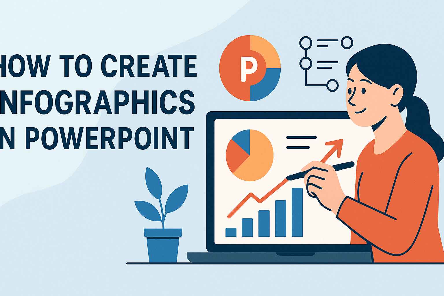
Infographics have become a powerful tool for presenting information visually. Using PowerPoint to create infographics allows anyone to easily transform complex data into engaging visuals that are easy to understand and remember.
This blog post will explore simple steps and tips to design infographics that stand out.
With the help of features like SmartArt and customizable templates, she can create infographics that suit various needs, from business presentations to educational materials. By learning how to effectively incorporate images, charts, and icons, he can enhance his message and capture the audience’s attention.
Whether one is a beginner or looking to improve their skills, this guide provides practical advice for making professional-looking infographics in PowerPoint. It’s time to bring data to life and make a lasting impact with visual storytelling!
Understanding Infographics
Infographics are powerful tools that combine visuals and text to convey information clearly. They help simplify complex data and engage viewers more effectively than plain text. Understanding their purpose and how they differ from traditional presentations is essential for anyone looking to create impactful visual content.
The Purpose of Infographics
The main purpose of infographics is to present information in a visually appealing way. They make it easier for the audience to grasp challenging concepts quickly. Infographics often include elements like charts, graphics, and icons.
They serve several key functions:
- Simplification: Infographics break down large amounts of data into digestible pieces.
- Engagement: Visuals attract attention better than text alone.
- Retention: People tend to remember visuals more than written content.
By connecting ideas visually, infographics can tell a story, making them ideal for presentations or reports.
Infographics Vs. Traditional Presentations
Infographics differ significantly from traditional presentations. In traditional formats, slides often contain lengthy paragraphs and bullet points. This can overwhelm viewers and lead to disengagement.
In contrast, infographics emphasize visuals. They prioritize images, charts, and icons, which help to convey messages swiftly.
Key differences include:
- Content Density: Infographics use fewer words to present information.
- Visual Appeal: They rely heavily on design elements.
- Information Flow: Infographics often lead the viewer through a narrative visually.
These characteristics make infographics a valuable choice for effectively sharing information with a diverse audience.
Getting Started with PowerPoint
Before diving into creating infographics, understanding the essential tools and setting up the slide layout in PowerPoint is crucial. This knowledge helps in designing effective and visually appealing presentations.
Overview of PowerPoint Tools
PowerPoint offers a variety of tools to create engaging graphics. Users can find features like SmartArt, which allows for easy creation of diagrams and timelines. This tool offers numerous styles that can be customized to fit the infographic theme.
Additionally, the Shapes tool helps in adding different elements to the slides. Users can choose from basic geometric shapes to more complex icons, enhancing the visual aspect of their data.
Another useful feature is the Insert tab, where users can add images, text boxes, and charts. This tab provides flexibility in combining various elements into one cohesive infographic.
Setting Up Your Slide Layout
Setting up the slide layout is a vital step in creating an infographic. Users should start by selecting the Blank Slide option to have full control over the design. This helps in arranging elements without distraction from pre-existing layouts.
Next, choosing the slide dimensions is important. Clicking on the Design tab lets users customize the slide size. For infographics, a vertical layout is often suitable, making it easier to present information in a linear fashion.
After that, considering a color scheme is key. Using consistent colors and fonts throughout the slides keeps the infographic visually appealing. PowerPoint includes themes under the Design tab that can provide a good starting point for color choices.
Design Principles for Infographics
Creating effective infographics involves understanding key design principles that enhance clarity and engagement. These principles focus on color, typography, and layout, all of which contribute to a visually appealing and easy-to-understand infographic.
Color Theory Basics
Color plays a vital role in infographic design. It can evoke emotions and establish a visual hierarchy.
-
Choose a Color Scheme: Limit the palette to 2-4 main colors. This simplicity prevents overwhelming the viewer.
-
Use Contrast: Ensure there is enough contrast between background and text to enhance readability. Dark text on a light background usually works best.
-
Emphasize with Color: Use bolder or brighter colors for key data points to draw attention where it matters most.
Understanding color theory helps in creating a cohesive and effective visual experience.
Typography and Readability
Typography can make or break an infographic’s success. Clear text conveys information efficiently.
-
Limit Font Types: Stick to two font types—one for headings and another for body text. This keeps the design consistent and polished.
-
Font Size Matters: Ensure headings are significantly larger than body text. This helps in establishing a clear information hierarchy.
-
Readability is King: Use simple, sans-serif fonts for body text to enhance readability. Avoid overly decorative fonts that may distract or confuse readers.
Prioritizing typography improves the overall effectiveness of the infographic.
Effective Use of Space and Layout
Utilizing space wisely can lead to a well-structured infographic. A clean layout guides the viewer’s eye through the information.
-
Create a Focal Point: Design should lead the viewer’s gaze. Placement of elements should naturally draw attention to the most important information first.
-
White Space is Essential: Don’t overcrowd the infographic. Adequate white space helps separate different sections and improves comprehension.
-
Balance Elements: Distribute visual elements evenly. A balanced layout ensures no part feels heavy or neglected, helping maintain viewer interest.
Applying these layout strategies enhances the viewer’s ability to absorb information.
Creating the Infographic Elements
When creating an infographic in PowerPoint, it is important to focus on key visual elements. This includes selecting the right images, charts, and icons that convey information clearly. Interactivity can also enhance engagement, making the data feel more dynamic.
Choosing and Editing Images
Images play a crucial role in infographics. They can grab attention and help tell a story. Choosing high-quality images is essential. You can use free stock photo websites like Unsplash or Pexels.
Once the images are selected, editing is important. PowerPoint allows users to crop, resize, and apply filters. This can help images fit the overall theme and style of the infographic. It’s also helpful to maintain a consistent color palette to ensure harmony in design.
Creating Charts and Graphs
Charts and graphs are essential for visualizing data. They can simplify complex information. PowerPoint offers several options, including bar charts, line graphs, and pie charts.
She can easily insert charts by selecting the Insert tab and choosing Chart. After inserting, data can be typed directly or linked from an Excel sheet for auto-updating. This feature keeps the infographic accurate. Choosing the right type of graph is key. Bar graphs are great for comparisons, while line graphs show trends over time.
Incorporating Icons and Shapes
Icons and shapes help to break up text and highlight information. They can make an infographic more visually appealing. PowerPoint has a library of icons that can be inserted quickly.
Using shapes can also guide the viewer’s eye and emphasize key points. You should consider using circles for highlighting numbers or rectangles for section dividers. Keeping a consistent style and color will also create a professional look.
Adding Interactivity
Interactivity can make an infographic stand out. Adding links to external sources or embedding videos can enhance the viewer’s experience. It makes the infographic more engaging.
To add links in PowerPoint, you can select text or an object, right-click, and choose Hyperlink. This allows users to explore further information easily. Simple animations can also draw attention to specific elements, making data presentation more dynamic.
Assembling Your Infographic
Creating an effective infographic involves careful organization of information and a well-thought-out design. By following specific strategies, one can create visuals that communicate ideas clearly and attractively.
Organizing Information Hierarchically
When assembling an infographic, it’s crucial to present information in a clear, hierarchical manner. This means starting with the most important points and supporting them with detailed data below.
For example:
- Main Ideas: Use bold text for key facts.
- Supporting Data: Place corresponding data or images underneath.
Group similar ideas together to help guide the viewer’s eye. Using a flowchart or a list can simplify complex information. This structure ensures that viewers easily grasp the main messages and don’t get lost in details.
Maintaining a Cohesive Design
A cohesive design unifies the infographic and keeps it visually appealing. Start by choosing a color scheme that fits the topic. Limit the palette to three or four colors for harmony.
Use consistent fonts throughout. Mixing too many styles can confuse viewers.
Incorporate visuals, such as icons or images, that align with the text. For instance, if discussing marketing insights, use relevant business icons.
Alignment and spacing are key for neatness. Ensure all elements are spaced evenly to avoid clutter. This makes the infographic more inviting and easier to read.
Finalizing Your Infographic
When creating an infographic, the final touches are crucial for clarity and impact. Ensuring a consistent style and thorough review can make the difference between a good infographic and a great one.
Applying Consistent Styles
To make an infographic visually appealing, it helps to use consistent styles. This includes uniform colors, fonts, and image types. For instance, sticking to a color palette of three to five colors keeps the design cohesive.
Using the same font family throughout ensures that the text is easy to read. Bold headings can highlight key points while regular fonts can be used for body text. Additionally, aligning images and text properly creates a clean layout.
Consider using shapes to segment different sections. For example, circles for statistics and rectangles for descriptions can guide the viewer’s eye seamlessly. A consistent approach enhances the infographic’s professionalism.
Review and Edit
Reviewing the infographic is essential to catch any mistakes or areas for improvement. Check for spelling and grammar errors as these can undermine credibility.
It is also important to ensure that all visual elements support the message. If an image doesn’t add value, consider replacing it. Feedback from others can provide fresh perspectives, so sharing the work can lead to useful insights.
Finally, ensure that the data presented is accurate and up-to-date. This reinforces the infographic’s purpose. By reviewing and editing carefully, the finished product will communicate its message effectively.
Exporting and Sharing Infographics
After creating a stunning infographic in PowerPoint, it’s important to know how to export and share it effectively. The right exporting options will ensure a high-quality image, while best practices for sharing will help reach the intended audience.
Exporting Options
PowerPoint offers several ways to export infographics. Users can go to File > Export and select the format they need. Common formats include:
- JPEG: Good for images, though quality may vary.
- PNG: Offers better quality and a transparent background.
- PDF: Ideal for sharing without losing formatting.
To save a slide as an image, select the slide, then choose File > Save As, and pick the desired location. Changing the file type to your preferred format before clicking save is crucial for the right output.
Best Practices for Sharing
When sharing infographics, consider the audience and platform. Here are some tips:
- Platforms: Use social media, emails, or websites for distribution. Each platform may have preferred formats or sizes.
- File Size: Optimize images for fast loading. Large files can slow down or fail to load.
- Tagging and Descriptions: Include relevant tags and descriptions to improve visibility and searchability.
Encouraging feedback can also help refine future infographics. Engaging with viewers through comments or messages creates a more interactive experience.