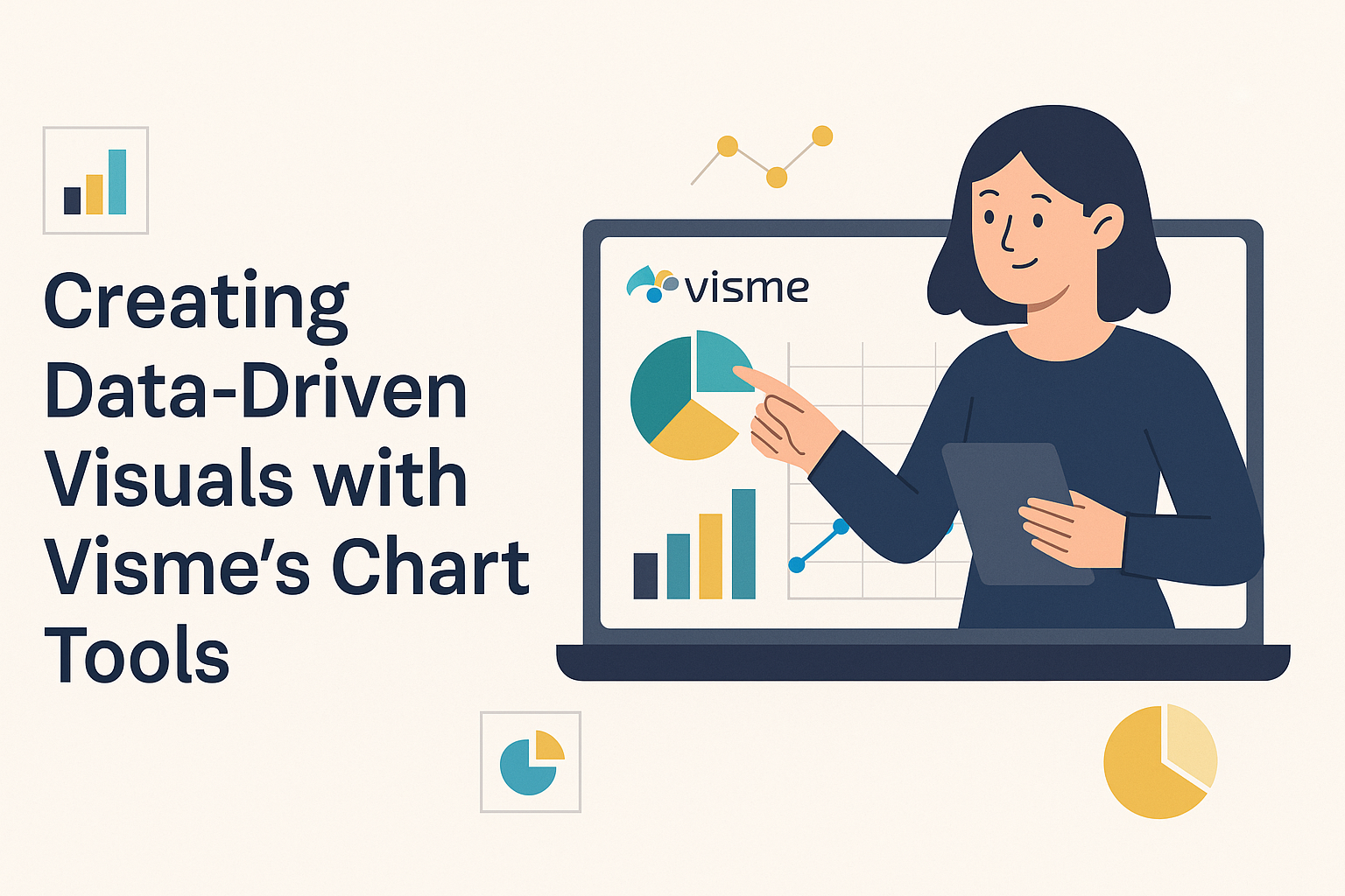
Creating visual content can be a challenging task, especially for those without a design background. Visme’s chart tools offer a solution by allowing users to convert data into engaging visuals. These tools transform raw data into clear, appealing charts with minimal effort, making it accessible even for beginners.
Visme provides a variety of templates and interactive features that can enhance any presentation. From animated infographics to interactive maps, users can choose elements that best fit their data storytelling needs. This flexibility means that educators, marketers, and business professionals can tailor their visuals to suit any audience or purpose.
With Visme’s user-friendly interface, crafting data-driven visuals becomes an enjoyable process. Whether they’re creating charts for reports or infographics for social media, the tools make complex data easily understandable. By offering a straightforward platform, Visme empowers users to focus on sharing their message effectively.
Understanding Visme’s Chart Tools
Visme offers a range of chart tools that help users create visually appealing, data-driven visuals. These tools allow users to effectively communicate complex information through various chart types. Visme’s platform is designed to make the process user-friendly and efficient.
Overview of Chart Types
Visme provides a wide variety of chart types to suit different data visualization needs. Users can create bar charts, line graphs, pie charts, and scatter plots. Each type is customizable to highlight specific data points.
Beyond the basics, Visme allows the creation of more interactive charts and maps. These charts engage audiences by incorporating real-time updates, animations, and interactive elements. This flexibility makes it easier for users to present their data in a way that captures the audience’s attention and conveys the intended message clearly.
Benefits of Using Visme for Data Visualization
Visme’s tools come with several benefits that enhance the data visualization process. First, the platform is designed for both beginners and experts. Its ease of use ensures that users spend less time learning the tools and more time creating impactful visuals.
Another benefit is the customization options. Users can alter colors, fonts, and layouts to match their brand identity or the specific message they wish to communicate. Visme also supports template-based designs, which saves time and helps maintain consistency in presentations.
Lastly, Visme’s data visualization tools integrate seamlessly with other platforms. Users can import data from various sources and update it in real-time without losing quality. This integration ensures that visuals remain current and accurate, making Visme a powerful tool for data-driven storytelling.
Getting Started with Visme
To begin creating data-driven visuals with Visme, users will first need to set up an account and familiarize themselves with the platform’s dashboard. From there, accessing the chart tools becomes straightforward and user-friendly, enabling anyone to craft stunning visuals.
Creating an Account
Getting started with Visme involves creating an account, which is a simple process. Users can sign up using an email address or through a social media account like Google or Facebook. After submitting basic information, such as a username and password, they are ready to log in.
Visme provides a welcoming experience for new users by offering a free plan. This option allows individuals to explore many features without any upfront cost. For those who need more advanced functionalities, there are paid plans available that unlock additional features and templates.
Navigating the Dashboard
Once logged in, users are greeted by a clean and intuitive dashboard. This central hub allows easy access to all of Visme’s tools and projects. Each option is clearly categorized, making it easy to locate specific tools, whether it’s for presentations, infographics, or charts.
On the left side, users will find a navigation bar that includes options like “Projects,” “Brand Kit,” and “Templates.” The “Projects” section is particularly helpful to track past work. Meanwhile, the “Templates” section offers plenty of preset designs that can be customized to meet specific needs.
Accessing Chart Tools
To start using chart tools, users should head to the “Create” button on the dashboard. A menu will appear with various options, including “Chart.” Selecting this option leads to a variety of chart types like bar graphs, pie charts, and more.
Visme offers over 15 types of interactive charts and graphs. By choosing a ready-made template, users can save time and start customizing immediately. Each chart can be adjusted with features like color schemes, legends, and data input, giving full control over the visual style.
Designing Your First Chart
Creating your first chart with Visme involves a few important steps. You’ll need to choose a suitable chart type, bring your data into Visme, and adjust the chart’s look to match your style or presentation needs.
Selecting the Right Chart Type
Choosing the right chart is crucial for effectively communicating your data. Visme offers a range of options such as bar charts, pie charts, and line graphs. Bar charts work well for comparing quantities across categories, while pie charts show proportions. Line graphs are great for displaying trends over time.
Understanding your data’s story helps determine which chart will best highlight your key points. Spend a bit of time thinking about what you want your audience to see first. Make sure to explore Visme’s tools that let you try different layouts before deciding on the best fit.
Importing Data into Visme
Once you have chosen a chart, the next step is to import your data. Visme simplifies this by allowing direct data entry or importing from spreadsheets. Users can upload Excel files or use Google Sheets integrations.
This feature streamlines the process, saving time and reducing errors. Adjusting your data after import is easy, ensuring flexibility if initial changes are needed. Accurate data input sets a solid foundation for the entire creation process, and Visme ensures you have the tools to make it happen smoothly.
Customizing Chart Appearance
Customizing how your chart looks can improve clarity and visual appeal. In Visme, adjust colors, fonts, and sizes to align with your presentation style. You can tweak elements like axes, legends, and labels for better readability. These small adjustments emphasize important data points, making the chart more engaging.
Visme provides themes and templates that you can apply to make your chart consistent with your brand or project. It’s not just about making the chart look good; these tools also help ensure that your message is conveyed clearly and effectively to your audience.
Enhancing Charts with Advanced Features
Creating impactful charts often requires more than just data. Visme’s chart tools allow users to include multimedia and interactive elements, making visuals not only informative but also engaging. Collaboration and sharing tools further enhance how these visuals are utilized.
Incorporating Multimedia Elements
Adding multimedia elements can significantly enhance the visual appeal and effectiveness of charts. Visme allows users to embed images, videos, and audio files directly into charts. For instance, including an instructional video alongside a chart can help explain complex datasets more clearly.
Images can serve as background elements or be used to highlight important data points. Thus, multimedia integration transforms static visuals into dynamic presentations that capture the viewer’s attention and facilitate understanding.
Using Interactive Elements
Interactive elements such as hover effects, click-to-reveal sections, and embedded links can make charts more engaging. These features help in exploring data in a layered manner. Users can interact with individual data points to reveal deeper insights without cluttering the visual space.
For instance, using interactive filters and zoom features can allow users to focus on specific data ranges or categories. This functionality empowers users to customize their viewing experience based on their interest, making the data more relevant and accessible.
Sharing and Collaboration Tools
Visme offers robust sharing and collaboration tools that enhance teamwork. Users can share interactive charts through direct links, email, or social media, reaching a wider audience. Moreover, collaborative features allow team members to provide feedback, edit, and comment in real-time.
This seamless interaction contributes to efficient workflow and quick decision-making. Shared access ensures everyone involved stays updated, fostering a more cohesive work environment. Features like live data sync guarantee that everyone views the most current data, minimizing miscommunication.
Best Practices for Data-Driven Visuals
To create compelling data visuals, it’s important to ensure accuracy, use color and fonts wisely, and simplify complex information. These practices help present data in a way that is both engaging and easy to understand.
Maintaining Data Accuracy
Accurate data is crucial for building trust with your audience. Always double-check numbers, values, and labels to ensure everything aligns correctly. This is especially important in visuals like bar charts and line graphs.
When using a tool like Visme, importing data directly from a spreadsheet can minimize errors. Use verification steps to cross-reference the data with your source documents. This ensures every visual reflects the true story behind the numbers, leading to trustworthy insights.
Effective Use of Color and Typography
Color and typography play a key role in making visuals attractive and readable. Choose a color scheme that aligns with the purpose and tone of the data. Consistent styling throughout the visual aids in comprehension.
Bold texts and headers draw attention to key points, while contrasting colors can highlight important data. Use a readable font size and style. Avoid clutter by sticking to a few font types and limiting the number of colors used.
Simplifying Complex Data
Complex information can overwhelm viewers if not presented well. Break down complicated datasets into smaller, digestible parts. Tools like interactive filters or drill-down features can be useful to reveal specific insights without cluttering the main visual.
Simplifying doesn’t mean removing data—it’s about making it more accessible. Use charts and graphs that best fit the data’s story, and take advantage of features like hover effects to show additional information only when needed. These techniques help communicate complex data clearly and effectively.
Resources and Support for Visme Users
Visme offers a variety of resources to help users make the most out of their tools. Learning opportunities and community support are great ways for both beginners and experienced users to enhance their skills.
Accessing Visme’s Learning Center
Visme’s Learning Center is packed with helpful guides and tutorials. Users can find step-by-step articles and videos that cover a range of topics, from basic features to advanced customization options. The Learning Center is designed to be user-friendly, making it easy for anyone to find the information they need. It includes FAQs, beginner tips, and detailed guides on creating interactive visuals. Whether someone is looking to learn more about designing graphs or looking for creative inspiration, the Learning Center is a useful resource for all levels.
Community Forums and User Groups
Community forums and user groups provide a platform for users to connect with each other. These spaces are perfect for sharing tips, asking questions, and finding solutions to common challenges. Users can join discussions or start their own threads to gain insights from fellow Visme users. Active participation in these forums helps users stay updated on the latest features and best practices. It also allows them to network with other professionals and exchange ideas. From troubleshooting technical issues to sharing success stories, these community spaces are invaluable for enhancing a user’s experience with Visme.