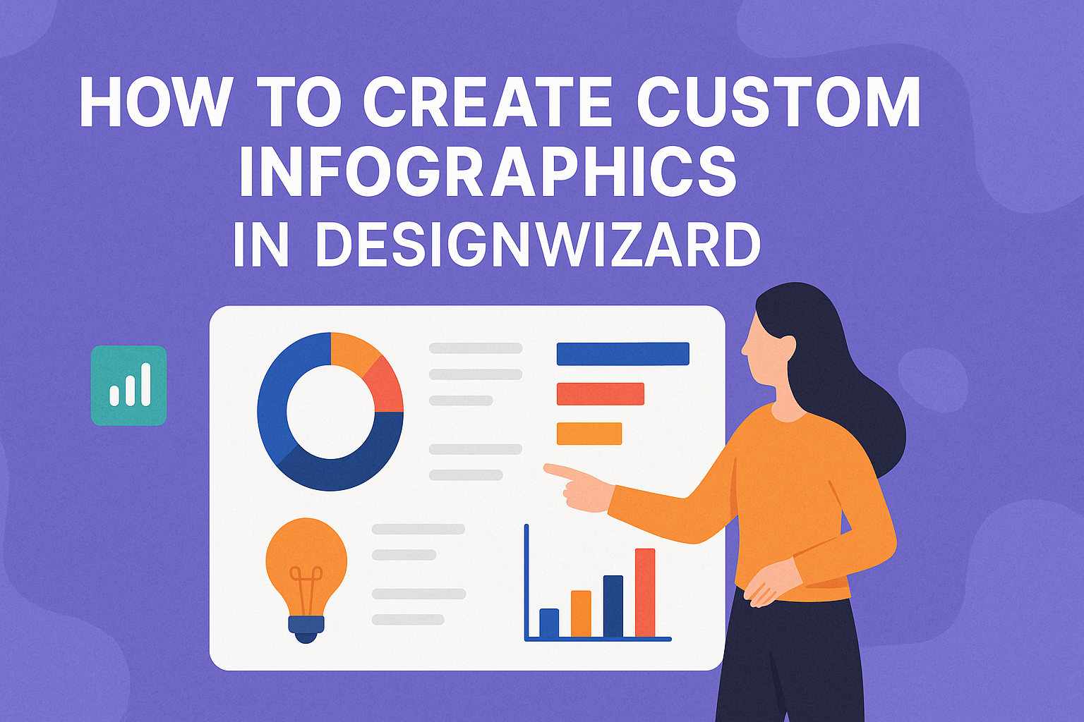
Creating custom infographics can be a game-changer for anyone looking to communicate complex information clearly and engagingly. DesignWizard makes this process easy and accessible for everyone, offering a plethora of tools and templates designed to suit your unique style. With DesignWizard, users can edit every element of their infographic using a simple interface, effectively bringing their vision to life.
DesignWizard’s library features over 1.2 million images, graphics, and videos, ensuring a rich selection of materials to construct the perfect infographic. Users can easily modify colors, fonts, and layouts to align with their brand’s identity. This flexibility encourages creativity and allows tailor-made designs that captivate the audience.
By utilizing DesignWizard’s features, anyone can transform complex data into visually appealing infographics. This tool also supports interactive elements like animations and maps, enhancing viewer engagement. The options provided ensure that every infographic created is both informative and visually stunning, offering readers a truly unique experience.
Understanding Infographics
Infographics combine visuals and information to communicate complex data in an easy-to-digest format. They help viewers grasp ideas quickly by presenting details through images, charts, and text.
Visual Appeal: Infographics not only convey information but also engage the viewer visually. Using bold colors, shapes, and engaging fonts is essential for attracting attention.
Structure: A well-organized infographic includes a clear title, succinct data points, and visuals that align with the content. This structure helps guide the viewer’s eye and allows for easier comprehension.
Types of Infographics:
- Statistical: Displays data and statistics using charts and graphs.
- Informational: Breaks down information or concepts step-by-step.
- Timeline: Shows events or processes in chronological order.
- Comparison: Highlights differences or similarities between options.
Creating Balance: While creativity is important, maintaining a balance between aesthetics and function is crucial. This means using visuals that support, not overwhelm, the information provided.
Infographics must aim for clarity and simplicity. Designers should avoid cluttered designs. Each element should have a purpose, enhancing the message without distracting from it.
Benefits: Infographics are powerful tools for education, marketing, and communication. They make content more shareable and engaging, boosting audience understanding.
Infographics can be used across various platforms, such as social media, blogs, and presentations, making them versatile tools for any field. They can summarize reports, explain concepts, or highlight trends, reaching diverse audiences effectively.
Getting Started with DesignWizard
DesignWizard is a user-friendly tool that allows even beginners to create impressive designs quickly. The following sections guide users through creating an account, navigating the interface, and setting up a design project.
Creating an Account
To start using DesignWizard, users need to create an account. This process is simple and requires basic information. Users visit the DesignWizard website and click on the sign-up button. They can choose to sign up using an email address or through social media platforms, such as Facebook or Google.
After entering the necessary details, users should confirm their accounts through an email sent to their inbox. Once confirmed, they gain full access to the platform’s features. This step ensures a personalized experience, allowing users to save their designs and access them from any device.
Navigating the Interface
The DesignWizard interface is designed to be intuitive and easy to navigate. Once logged in, users are greeted by a dashboard that displays different design options. This dashboard includes a menu with various categories like social media, posters, and invitations.
Each category offers multiple templates, providing a good starting point for designs. Users can customize and edit these templates to suit their needs. The interface includes easy-to-reach tools for editing, such as text and image insertion, color adjustments, and layout changes.
Setting Up Your Design Project
Setting up a design project in DesignWizard starts with selecting a suitable template. Users can explore different categories based on their project’s purpose. Clicking on a template opens the design editor, where all elements can be customized.
Customization options include adding images, changing text, adjusting fonts, and modifying colors. Users can also upload their own images or elements to make the design truly unique. After customization, it’s important to review the design for any adjustments needed.
Finalizing the setup involves saving the project frequently. DesignWizard allows users to download their completed projects in various formats suitable for printing or online sharing. This flexibility makes it easy for users to showcase or publish their designs.
Design Principles for Infographics
Creating infographics involves using color, typography, and space effectively to communicate information clearly and attractively. These elements work together to enhance readability and engagement.
Choosing a Color Scheme
Selecting the right color scheme is crucial for an infographic. Colors should complement each other and align with the subject of the infographic. A balanced palette can guide the viewer’s attention and highlight important information. It’s often helpful to use a primary color and then add one or two accent colors to create visual interest. Tools like color wheels can aid in selecting harmonious colors. Using consistent hues also helps in maintaining the infographic’s branding when applicable.
Selecting Fonts and Typography
Typography plays a significant role in the effectiveness of an infographic. It’s important to choose fonts that are readable and suitable for the content. Sans-serif fonts are often preferred for their clarity. Combining a bold font for headings with a simpler font for body text can create a hierarchy that guides the reader. Limit the number of fonts to two or three to prevent a cluttered appearance. Font size and weight should feel balanced and attractive across different sections.
Utilizing White Space
White space, or negative space, is the unmarked area around elements in an infographic. It prevents the design from looking crowded and enhances readability. By separating different elements with white space, the reader can focus on each section without feeling overwhelmed. Strategic use of white space makes the infographic look clean and organized. It also helps in emphasizing important points by allowing them to stand out.
Selecting Templates and Elements
Creating a custom infographic in DesignWizard starts with selecting the right templates and elements. Users can choose from a variety of pre-designed templates, incorporate icons and shapes, and add images and graphics to bring their ideas to life.
Using Pre-Designed Templates
Pre-designed templates in DesignWizard offer a great starting point for those who want a polished look without designing from scratch. These templates are tailored for different themes and industries, making it easier to find one that suits the purpose of the infographic. Users can modify fonts, colors, and layouts to match their branding.
By using a template, the structure and flow of information are already established. This helps save time and keeps the design consistent.
Templates also include text boxes and placeholders. These guide users in adding their content efficiently. Choosing the right template is crucial to ensure a professional and cohesive design.
Incorporating Icons and Shapes
Icons and shapes add visual appeal to infographics. DesignWizard provides a wide range of icons for various topics. They are used to highlight key points or break down complex information into more digestible parts.
Shapes, like circles and rectangles, can organize information into sections. They help create a clear hierarchy and guide the viewer’s eye through the infographic.
Layering icons and shapes can elevate the design, making it more dynamic. Users have the option to adjust colors and sizes to ensure that everything fits well with the overall aesthetic.
Adding Images and Graphics
Images and graphics make infographics more engaging. DesignWizard lets users upload their own images or choose from a library of stock photos. Using high-quality images enhances the infographic’s impact.
Graphics, like charts and diagrams, are essential in displaying data. They make complex information easier to understand. Users can customize these graphics to align with the infographic’s theme and message.
When adding images, it is important to maintain balance. Overcrowding the design can lead to confusion. Therefore, choosing images that complement the information, not overpower it, is crucial.
Customization Techniques
Creating custom infographics using DesignWizard involves multiple key techniques. These include editing text, adjusting layouts, and adding branding elements.
Editing Text and Headlines
Editing text and headlines in DesignWizard is simple. Users can select text boxes to change font styles, colors, and sizes easily. It’s important to ensure that the text is clear and aligns with the overall design of the infographic.
Highlighting key points with bolder fonts can make the information stand out. Users can also choose from various font styles to match their content’s tone. Adjusting line spacing and text alignment helps in keeping the infographic neat and readable.
Adjusting Layout and Sizing
Adjusting the layout and sizing ensures that the infographic looks organized and visually appealing. DesignWizard offers flexible layout options that allow users to drag and drop elements with ease.
Users can resize elements by clicking and dragging the corners. This feature helps in emphasizing important data or visuals. Properly balancing different elements within the layout prevents clutter and maintains the flow of information. Using grids and alignment tools, users can ensure everything is neatly arranged.
Incorporating Branding
Incorporating branding is crucial to maintain consistency with the brand’s visual identity. DesignWizard allows users to upload logos and select brand colors, creating a cohesive look.
Custom fonts that reflect the brand’s style can also be applied to the text. Using unique brand elements like slogans or taglines further aligns the infographic with the brand message. DesignWizard makes it easy to repeat these elements across different infographics, ensuring brand recognition.
Working with Data
When creating custom infographics in DesignWizard, effectively handling and presenting data is essential. It’s important to know how to import data, create clear charts, and make statistics visually appealing.
Importing Data
Getting data into your design tool is the first step. DesignWizard allows users to import data directly from spreadsheet software. Ensure the data is clean and well-organized. Spreadsheets should have clear labels for columns and rows.
Users should confirm that imported data aligns with the design format. It’s crucial to double-check that all figures and data points are accurate before starting the design process. Keeping data in a consistent format helps avoid errors during design.
Creating Charts and Graphs
DesignWizard has a variety of tools to create visual representations of data. Users can choose from bar charts, line graphs, pie charts, and more. Selecting the right type of chart depends on the nature of the data.
For instance, bar charts are great for comparing quantities, while pie charts are best for showing parts of a whole. Properly labeled axes and legends enhance the readability of charts. It’s important to ensure that colors and fonts are easy to read and match the overall design style.
Visualizing Statistics Effectively
Visual appeal plays a big role in communicating data. DesignWizard offers numerous editing tools to make statistics engaging. Users can employ color schemes and font types that attract attention while maintaining clarity.
Using visual cues like icons or images alongside numbers can make statistics more understandable. For example, using icons for sections of a pie chart can help viewers quickly grasp the information. Ensuring alignment and spacing is consistent across infographic elements is key to a professional look.
Enhancing Your Infographic
To make your infographic stand out, consider adding interactive elements, applying various filters, and even animating parts of it. These enhancements can help in capturing and holding the viewer’s attention, making your infographic more engaging and informative.
Adding Interactive Elements
Interactive features can elevate your infographic from a static image to an engaging experience. Consider incorporating buttons or links that guide viewers to more detailed information. This technique can be especially effective in digital formats, where users can click to explore further.
Interactive features should be intuitive. The goal is to provide additional value without distracting from the main message. For example, hover effects can reveal additional details or statistics, turning your infographic into a dynamic source of information. This creates an enriching experience for the user.
Using tools like DesignWizard allows you to integrate these elements seamlessly. Implementing interactive features can enhance the depth of your content, making your infographic not just visually appealing but also functionally robust.
Applying Filters and Effects
Filters and effects can significantly alter the look and feel of your infographic. Applying shadows and highlights can add depth and dimension, helping different components stand out. This technique, as noted here, creates a more compelling visual flow.
Experiment with color filters. This can adjust the mood or tone of your infographic, aligning it with the subject matter or your brand’s aesthetic. Subtle gradients and textures can bring a professional touch while ensuring the message remains clear.
Careful application of effects maintains clarity and prevents the design from becoming cluttered. DesignWizard provides an array of filters and effects that can be employed to enhance your visual storytelling.
Animating Your Infographic
Animation can add an extra layer of dynamism to your infographic. Simple animations, such as transitions or sequence reveals, can guide the viewer through the information, highlighting key points.
Using animation conservatively ensures it complements rather than overwhelms the content. It can help break down complex data into digestible steps or series, making it easier for viewers to follow and understand.
Tools within DesignWizard offer capabilities for embedding animations directly into your designs. This feature can make your infographic engaging and memorable, capturing the viewer’s interest from start to finish.
Review and Edit
Creating infographics in DesignWizard is fun and engaging. After designing, it’s essential to review and edit your work carefully. This process ensures clarity, accuracy, and appeal, making sure your infographic effectively conveys the intended message.
Proofreading Content
Proofreading is important to catch any spelling, grammar, or punctuation errors. First, they should read through the content to ensure all information is accurate. Mistakes can easily slip through while designing, so attention to detail is key.
They can use built-in spelling and grammar check tools to help identify issues. Reading the text out loud can also be very effective, as it highlights awkward phrasing or unclear points. Consistent font and size should also be checked to keep the design neat.
Soliciting Feedback
After initial proofreading, feedback from others can provide valuable insights. Sharing the infographic with colleagues or friends can highlight areas that need improvement. Fresh eyes often catch mistakes or offer new ideas.
Encourage constructive criticism by asking specific questions. For example, they might ask if the infographic is easy to follow, or if the visuals align with the content. Make sure to ask for feedback on both the design and the content to get a complete picture of the strengths and weaknesses.
Final Adjustments
Once they have gathered feedback, it’s time to make final adjustments. This step involves incorporating suggestions or making decisions about changes. It’s important to be open to changes that enhance clarity and visual appeal.
They should also check that the infographic layout is balanced and the color scheme is visually pleasing. Consistency in style and branding ensures that the infographic looks professional. Finally, they should save the updated version in a format suitable for their intended use, whether it be for print or online sharing.
Exporting and Sharing
Once an infographic is created in DesignWizard, it’s important to know how to export it in the best format, optimize it for different platforms, and share it effectively on social media. These steps ensure your infographic reaches the intended audience with clarity and impact.
Choosing the Right File Format
Selecting the right file format is crucial for maintaining quality and flexibility. JPEG is a good choice for small file sizes with decent quality, perfect for web use. For better detail and quality, PNG is ideal, particularly if your infographic includes transparent elements. If you need the highest quality for printing, opt for PDF.
SVG format is preferable for vector graphics as it maintains the scalability of your design for different screen sizes. Each format has its strengths, so consider the use case when choosing. Using the correct format can greatly affect the quality and compatibility of your infographic.
Optimizing for Different Platforms
Each platform has its own specifications for images and graphics. Ensuring that your infographic fits these specifications enhances its appearance and reach. For example, when posting on Instagram, square images work best, while Pinterest favors vertical images. Facebook and Twitter often display images in rectangular formats.
Resize and optimize file sizes to ensure quick loading times without compromising on quality. Reducing file size can involve using tools or software within DesignWizard that compress images without losing clarity. Keeping your designs optimized ensures that your audience sees them at their best.
Sharing on Social Media
Sharing infographics on social media can significantly boost engagement. Tailor your posts to fit each platform’s style.
On Instagram, use hashtags and stories to increase visibility. Pinterest boards allow you to group similar infographics for cohesive storytelling.
When it comes to Twitter, include eye-catching captions with links to additional information. On Facebook, you can create albums or use engaging captions to invite interaction. Using social media tools available on these platforms can track performance and reach a wider audience effectively.