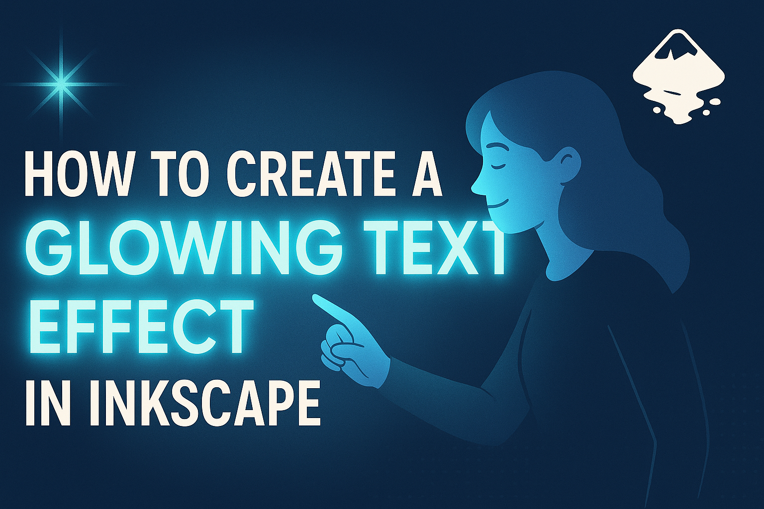
Creating a glowing text effect in Inkscape can add an eye-catching element to any design project. To achieve this effect, utilize the Filters feature in Inkscape where the Shadows and Glows options offer a way to produce stunning text outlines. This approach not only enhances visual appeal but also helps text stand out against various backgrounds.
For beginners, starting with Inkscape’s Neon Text Effect is a good choice. By opening a new document and selecting the text tool, users can begin crafting their desired text. Adjusting font choices and experimenting with glow settings can result in unique and vibrant text effects.
Exploring the variety of tutorials available, including many video guides, can provide users with valuable tips and tricks. For instance, some tutorials discuss using the eyedropper tool to perfect color choices. Learning these techniques can transform any simple text into a glowing masterpiece.
Getting to Know Inkscape
Inkscape is a powerful tool for creating detailed vector graphics. Its user-friendly interface is ideal for both beginners and professionals alike. By setting up documents properly, users can optimize their workflow.
Understanding Vector Graphics
Vector graphics are images created through mathematical commands rather than pixel patterns. This means they are resolution-independent, allowing for scaling without losing quality. Unlike raster images (like JPEGs), vector graphics maintain crisp edges and clear lines regardless of size adjustments. They are commonly used in logo design, illustrations, and other graphic elements where precision is essential. Inkscape is ideal for creating these types of images, utilizing paths and nodes to form shapes. Mastery of vector graphics involves understanding how to manipulate these elements for desired effects.
Exploring Inkscape’s Interface
Inkscape’s interface is designed to be intuitive yet versatile. The main components include the Toolbox, which houses various drawing tools like the Pen and Bezier tools. The Canvas is where most design work happens. Above, the Menu Bar offers access to basic functions such as saving files and adjusting preferences. Dockable dialogs on the right side hold options for color, layers, and more. Users can customize the layout to fit their workflow. Familiarizing oneself with these elements helps streamline the creation process and improves efficiency. Whether adjusting tool preferences or layering artwork, knowing what each feature does is key to productivity in Inkscape.
Setting Up Your Document
Proper document setup is crucial for any project in Inkscape. Start by defining the page size, which can be customized or selected from standard sizes like A4 or Letter. This ensures the design fits intended paper or screen dimensions. Set units of measurement to match the project’s needs, such as pixels for screen-based work or inches for print materials. Adjust the default grid and snap settings to align objects accurately. Additionally, decide on color modes, typically RGB for web graphics or CMYK for print. Choosing the right settings from the start saves time and potential headaches during the creative process. A well-prepared document allows for smoother execution of ideas.
Creating and Organizing Text
When working on creating a glowing text effect in Inkscape, it is crucial to start by adding and formatting the text effectively. This will help create a neat and visually appealing design. This section covers the basics of adding text, adjusting its font and size, and using layers to keep everything organized and easy to edit.
Adding Text to Your Canvas
To start with, one needs to open Inkscape and select the Text tool from the toolbox. This tool is typically represented by a letter “A.”
Click on the canvas where the text should appear, and start typing. It’s best to think about the message or word that will be used for this design. Inkscape allows the text to be edited directly on the canvas, making it easier to see changes instantly.
Once the text is added, make sure it’s properly aligned. Use the alignment tools if needed to position the text in the center or any preferred location on the canvas.
Adjusting Font and Size
Changing the font and size of the text is simple yet important in creating an eye-catching design. After selecting the text, options for font and size will appear in the top panel.
Choose a font that matches the desired style of the glowing effect. Bold or decorative fonts often work well for glowing text. Adjust the size to ensure the text is neither too small nor too large, keeping in mind the overall design space.
Experiment with different fonts and sizes to see what looks best for the final effect.
Working with Layers and Objects
Using layers in Inkscape helps keep different elements organized. After adding the text, open the Layers panel to create a new layer specifically for the text. This way, other design elements remain separate and easier to manage.
It’s crucial to name each layer descriptively, such as “Text Layer,” to avoid confusion later. Layers can also be reordered or grouped, allowing for easy adjustment without affecting other parts of the design. By efficiently organizing elements using layers, modifications can be made seamlessly, ensuring a smooth workflow throughout the design process.
Applying Basic Text Effects
Creating a glowing text effect in Inkscape involves understanding how to use fill and stroke properties and adding shadows and outlines. These techniques can make any text stand out visually, transforming simple letters into captivating designs.
Using Fill and Stroke Properties
Fill and stroke are essential in giving text a bold appearance. With Inkscape, users can select their text and open the Fill and Stroke menu. This menu allows them to change the color, pattern, or gradient of the fill. They can also adjust the stroke, which is the outline of the text.
For a glowing effect, choose a bright or neon fill color. Set a contrasting stroke color that complements the fill. Adjust the stroke width to balance the text’s visibility and elegance. Experiment with gradient fills to create a subtle transition in color and perhaps use a soft blur to amplify the glow effect further.
Adding Simple Shadows and Outlines
Shadows and outlines add depth to text, making it seem more dynamic. In Inkscape, users can duplicate the text object and convert it to a shadow by changing its color to dark gray or another shadow-like hue.
Position the shadow behind the original text slightly offset. Use the Blur slider in the Fill and Stroke menu to soften the shadow for a more realistic look. For outlines, also known as strokes, increase the stroke width in the Stroke Style tab. This can create an eye-catching border around the text. Each adjustment alters the overall visual impact, so try different settings for the best result.
Designing the Glow Effect
Creating a glowing text effect in Inkscape involves choosing the right colors, adjusting blurs and opacity, and layering elements for depth. Each step contributes to making text stand out with a luminous appearance.
Choosing the Right Colors
Selecting the right colors is crucial for a glowing effect. Bright, vivid hues like neon blue, green, or pink are effective. These colors contrast well against dark backgrounds, making the glow more pronounced. It’s important to think about complementary colors to enhance the overall look. Using a color wheel can be helpful. Pairing colors that sit opposite each other, such as blue and orange, can create a striking effect. It’s also useful to test the colors in different lighting to see how they impact the overall glow.
Manipulating Blurs and Opacity
Blurs and opacity adjustments are key to creating a realistic glow. In Inkscape, blurring the edges of text helps simulate the soft, diffused look of real light. Users should first select the text, then apply a Gaussian blur. The blur value can be adjusted until the desired effect is reached. Opacity settings can also be tweaked to make the glow more subtle or intense, depending on the design’s requirements. Reducing opacity can help blend the glow naturally with the background. Experimenting with these settings can lead to various compelling visual outcomes.
Layering for Complex Glows
Layering is an effective technique for creating depth and complexity in the glow effect. By duplicating layers of text and altering their thickness, color, or opacity, users can add a more dynamic appearance. Each layer can be slightly offset or rotated for additional visual interest. Stacking several layers, each with subtle differences in blur and opacity, can create a sense of depth. This technique yields a more engaging and professional-looking glow. It’s helpful to experiment with different combinations to find the mixture that best enhances the design.
Advanced Glow Techniques
Creating a sophisticated glow effect in Inkscape requires a few advanced techniques. These can enhance your design by adding dynamic lighting and using specialized filters for more impact.
Creating Dynamic Lighting Effects
Dynamic lighting effects can bring your design to life by adding depth and intensity. In Inkscape, users can achieve this by layering different gradients and adjusting their opacities. Positioning multiple light sources around the text adds a sense of movement and dimension.
Adding a soft gradient background behind the text can further enhance these effects. Adjusting the blur and transparency of each layer, artists can create a realistic glow that mimics how light interacts with surfaces in the real world. This technique requires experimentation with light intensity and direction to get the desired look.
Using Filters for Added Impact
Filters can transform a basic glow effect into something much more striking. Inkscape offers a range of filters, such as Drop Shadow and Gaussian Blur, which can enhance the glow significantly. These filters can be accessed through the menu, allowing users to tailor the glow’s strength and style.
For a unique glow, combining different filters can yield creative results. By using the Blur filter and adjusting its settings, users can create a softer glow effect. Experimenting with color variation in these filters can also add vibrancy and interest to the text. This approach gives the design an artistic and impactful finish.
Finalizing Your Text Art
Completing your glowing text art in Inkscape involves proper alignment and smooth exporting of your project. These steps ensure your artwork looks polished and is ready for use in various platforms.
Aligning and Positioning Text Effectively
Aligning and positioning your text art correctly helps make a strong visual impact. First, use the Align and Distribute panel in Inkscape. This tool allows you to center your text horizontally or vertically on the page.
For multiple text lines, ensure consistent spacing. Even spacing between each line creates a harmonious look. Use guides for precision, drawing vertical and horizontal lines to help position elements exactly where you want them. If needed, use the Snap feature for even more accuracy.
Grouping your text with backgrounds or other elements helps maintain alignment when resizing or moving your design. It ensures that your elements move together, keeping the composition intact. Proper alignment can make your artwork stand out and look more professional.
Exporting Your Artwork
When your text art is ready, it’s time to export it for use elsewhere. Inkscape offers several file formats, each suitable for different purposes. For print projects, consider exporting to PDF to preserve quality. For web use, formats like PNG or SVG are ideal as they maintain image quality at various sizes.
Navigate to the File menu and select Export. Choose your preferred file format and determine the resolution based on your needs. For web graphics, a lower resolution can suffice, while print requires higher settings.
Before exporting, use the Preview option to review how your final image will look. This step helps catch any small errors or adjustments needed. Once satisfied, export your artwork and save it in your desired location, ready to share or use!